At a glance
What it is. A public tool that evaluates any URL against Nielsen’s 10 usability heuristics and returns a score plus a qualitative read.
Problem. Design roles today ask you to demonstrate skill with AI, not to claim it. The claim is easy to write, less easy to verify from outside.
My role. Product and UX, end to end. Concept, agent design, the call to ship it public, deployment.
Built with. Claude AI as design and build partner; Make.com and the Anthropic API in the engine.
Status. Live. Public release (v1).
Currently
- Live at /checker. Version 1, June 21, 2026.
- In progress (sprint 2): image upload and analysis, to reach interfaces behind a login and mockups.
Release notes
June 21, 2026. First public release
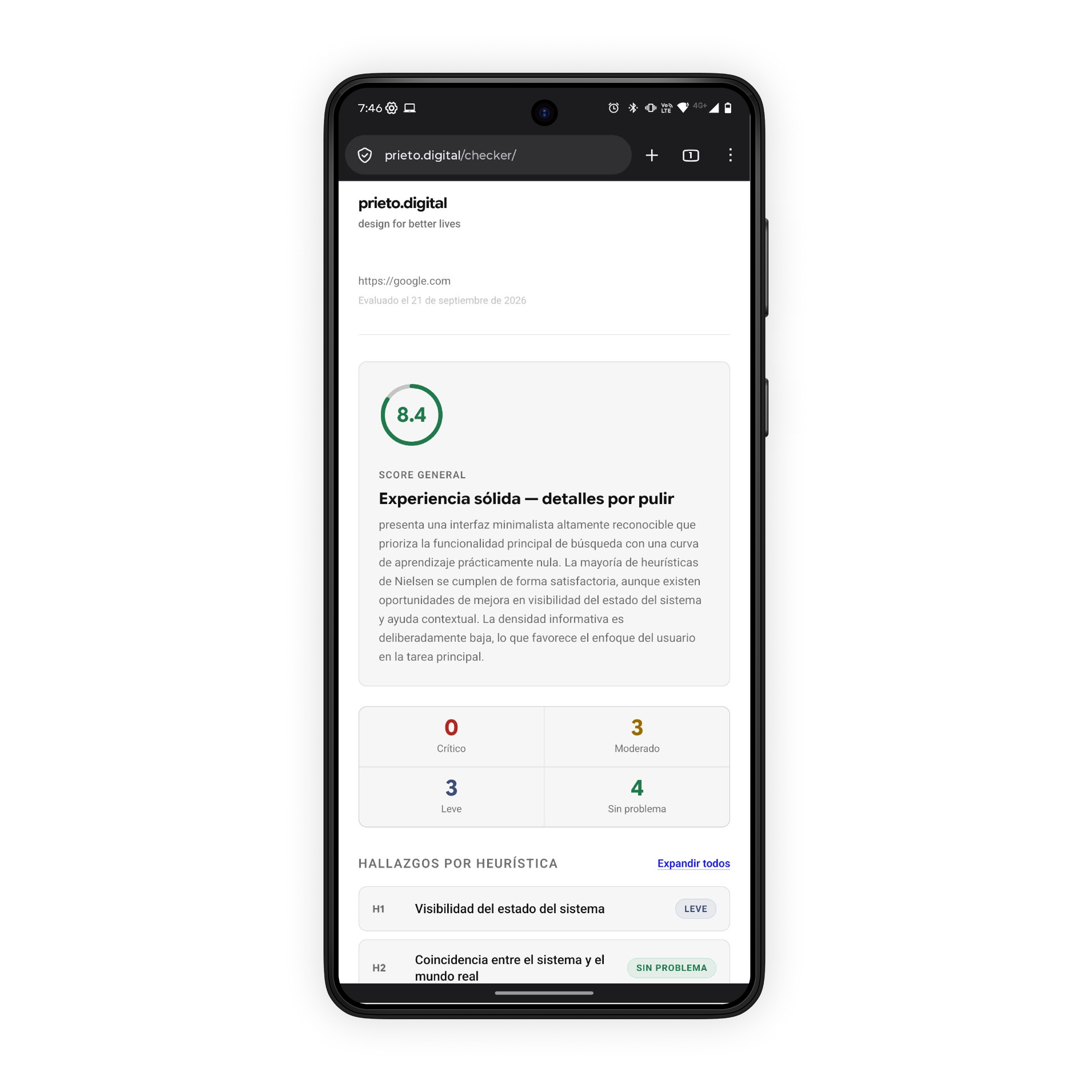
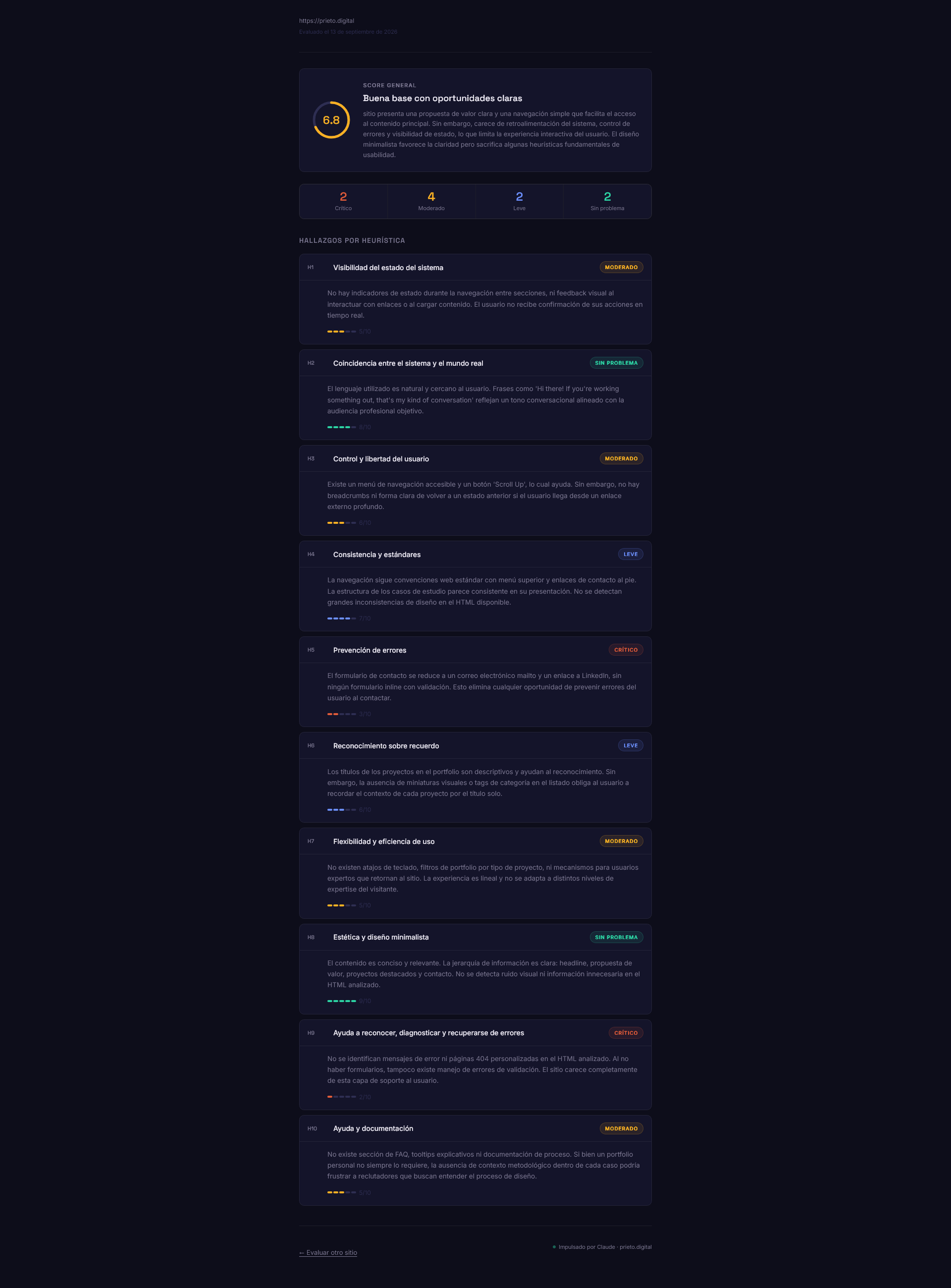
- A URL goes in, the Nielsen-10 evaluation comes out: an overall score (average per heuristic) plus a qualitative read (general + one per heuristic).
- Single-page frontend (own server) + webhook + Make.com + Anthropic API.
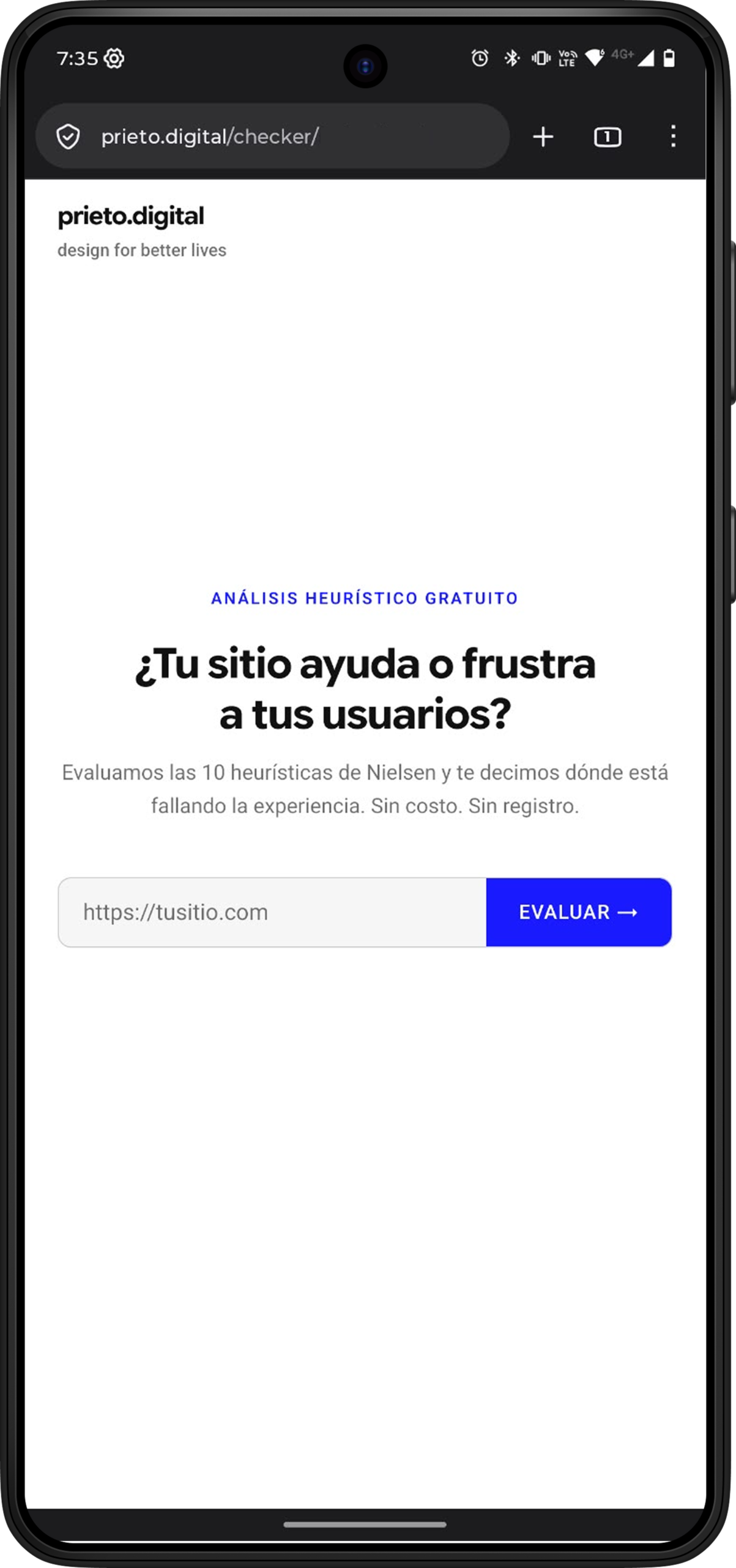
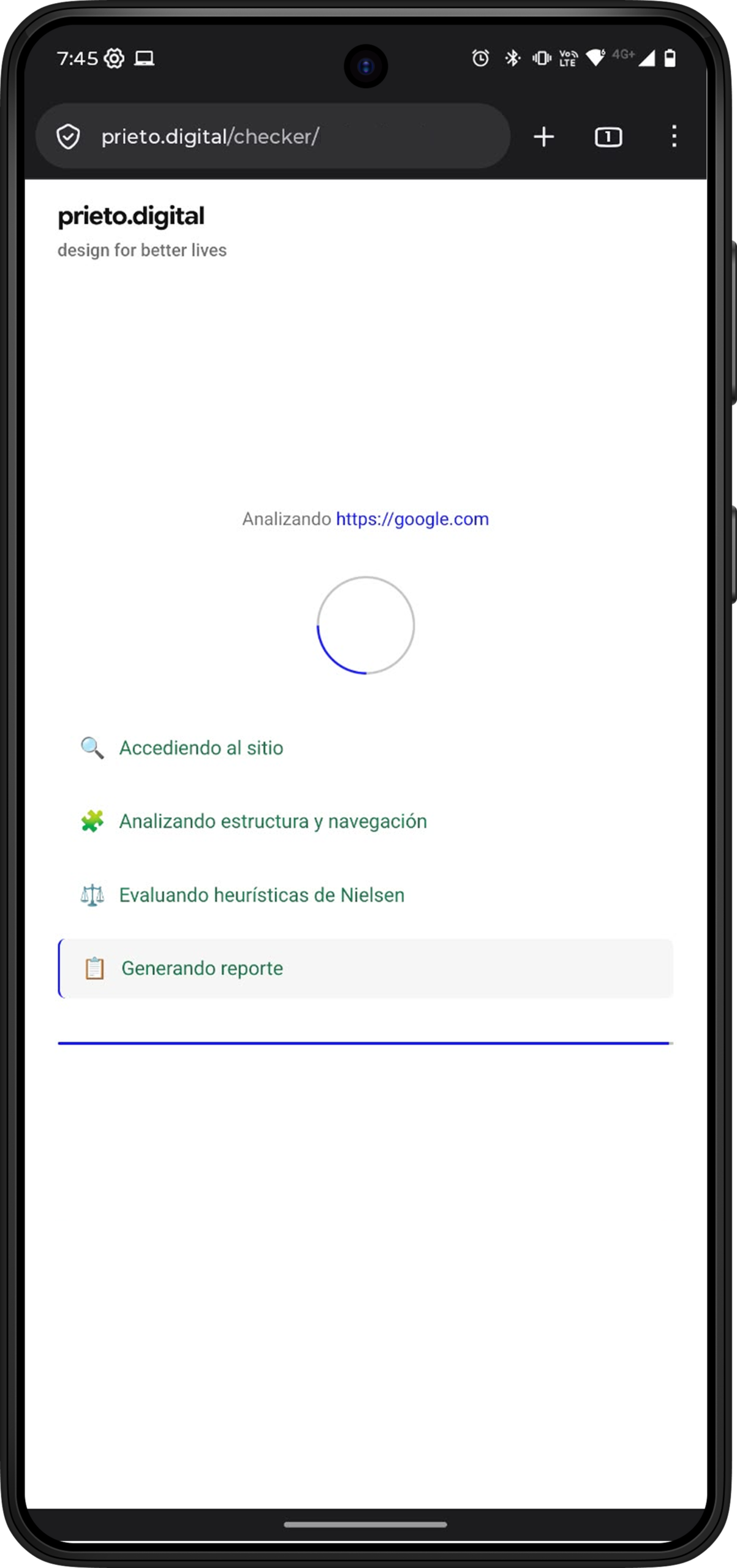
- Artifacts: screenshots of the v1 in production (with its usability rough edges); sample report.
- Metrics: Pending.
June 18, 2026. PoC (Claude AI, chat)
- Agentic heuristic-analysis assistant. Concept shaped from the start for an AI-crafted build.
- Artifact: full Claude AI chat with the initial PoC.
Problem
The doubt this answers
Scanning design-role postings on LinkedIn, the ask repeats: show me you can work with AI, don’t tell me you use it. It’s not a hunch. Forbes places the design of tools usable by both humans and agents among the skills employers want, and Analytics Insight is blunter: the ones getting hired today are those who picked a lane, used AI to move faster within it, and built something you won’t find in five hundred identical copies.
From there, two doubts stacked. The loud one: almost everyone says AI now, and from outside it’s hard to separate the person who builds with it from the one with a chat open in another tab. The quiet one, older: does this person turn a fuzzy problem into a product, or only into screens?
This case answers both without asking you to take my word for it. The tool is right there. Open it, paste a link, and the text tells you how it came to exist.
Approach
What I did
I had a small, recurring pain of my own. Heuristic evaluation against the Nielsen 10 is how many of us get a quick, defensible read on an interface, the read that feeds foundational research early in a project. Done well, it takes time. A technical test gives you almost none. I built something to run that first pass for me, under that pressure.
Two decisions carry the case, and neither is obvious:
The UX decision was about legibility. A heuristic review usually lives in the designer’s head and comes out as jargon. I made the tool put it outside: a number per heuristic, averaged into an overall score, plus a read in words (one general, one per heuristic). The mix isn’t a whim. I come from education, where a grade alone isn’t enough for anyone to understand their own frictions: the number locates, the read explains. That’s why it later worked for people who don’t design.
The product decision had two edges. One of market: the PoC solved my problem and could have stopped there, but I shipped it public and free. (The reason is old: I believe knowledge should be freely accessible. Typescale or Colour Contrast Checker put design know-how within anyone’s reach, ready to use in their own work; I wanted mine to do the same.) The other edge, of scope: the tool evaluates one interface, the exact URL you paste in the field, not the whole site. I started small on purpose. Crawling an entire site is more ambitious, spikes complexity, and drifts from Nielsen’s promise, which is about interfaces; I’m leaving that to explore with users later.
Starting from a single URL was also what made it viable to ship an MVP fast and learn in public.
Craft
Built with AI, on purpose
This is the part that carries the argument, with a principle behind it: AI amplifies, you arbitrate. Speed and options to the machine; judgment and responsibility, yours. That split separates building with AI from letting AI build for you.
I started in Claude AI as a chat PoC, shaped from the first message to be crafted with AI, not merely helped by it. Out came an agentic assistant that runs the analysis itself. Then I took it to production, and that jump is the point: I moved the product from zero to public, from modeling the agent to deploying it live, a range I wouldn’t have covered alone before. AI didn’t save me a step, it extended my role. And it compressed the whole cycle: what a designer spreads across weeks, concept, prototype, build, ship, ran as one continuous move.
I’m not asking you to trust the claim. The tool is published for the same reason this case exists: paste it a link and see what it does.
The contract
The enduring shape
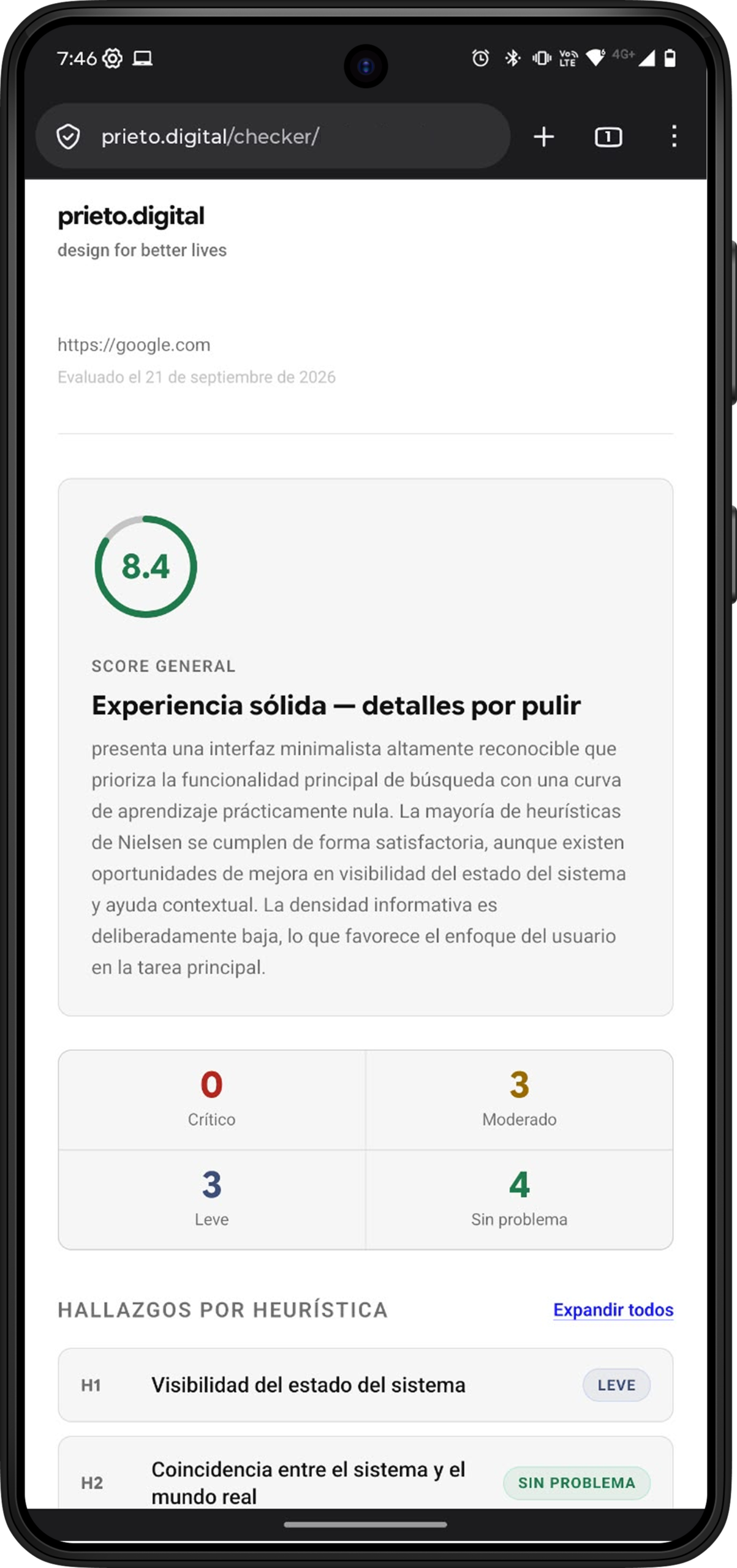
Independent of any release, the contract is the same. A URL goes in. Out comes a score (the average per heuristic) and a qualitative read: one general, one per heuristic. Releases change what’s around it, not that.
A simple flow
Architecture
How it’s built
The schematic, for anyone who wants to see the engine. The frontend is a single page on my own server: an index.html that acts as the whole interface. The URL travels to a webhook that fires a scenario in Make.com; the scenario calls the Anthropic API, which runs the analysis; the response comes back to the client, which parses it and assembles the report.
I chose Make.com for its visual canvas, its native Anthropic integration, and its price (Free!). And I stayed on a single page for the same reason that governs everything here: the least that holds the promise.
Tradeoffs
Debt in plain sight
I shipped with technical debt, and I knew which when I took it on. The rubric, the copy, and the language live embedded in the code. It wasn’t carelessness: it was an MVP to ship, observe, and learn from. Publishing fast let me see how it was actually used and decide, with that in hand, whether it was worth advancing the product and where.
One limit does weigh on me: since it only sees the URL, the tool stays outside everything that lives behind a login. That wall is what pushes the next step, letting you upload an image of the interface and evaluate it without depending on access.
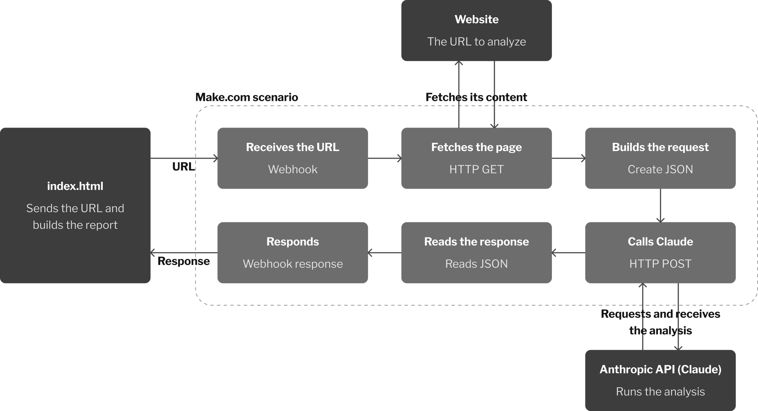
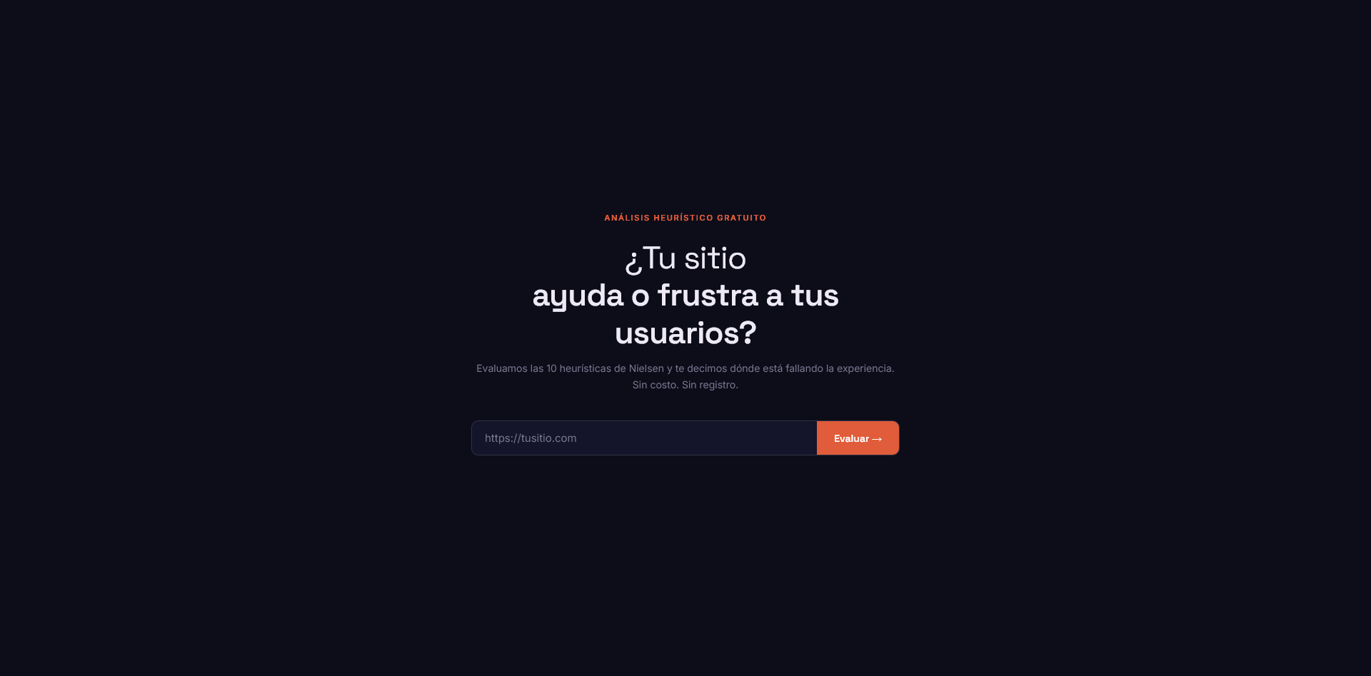
The irony isn’t lost on me: I built a usability evaluator and my v1 had rough edges. It still asks about your “site” when it actually reads one URL, among other things the first screenshots reveal. Naming them is part of the job.
The rest of the roadmap shares one pattern: get the configuration out of the code. Rubric, copy, and language were born embedded; freeing them is the direction.
Outcomes
The signal so far
Here I’ll be straight, because the alternative is inflating it. Today the result is thin: the tool exists and it’s live. The strongest signal is adoption, and it’s the good kind. I shared it with designer and developer colleagues, and it found traction beyond its intended user, most of all among non-designers, who could suddenly identify and understand the problems in their own interfaces. They used it enough to send back concrete requests: upload images instead of pasting a URL, and the report that pages behind a login wouldn’t analyze. That feedback, not a hunch, is what’s shaping the next release.
It’s not filler and it’s not off-topic. Low adoption is one of the problems I claim to solve; that something gets adopted on its own, and by people it wasn’t built for, is a small, real instance of exactly that.
Hard numbers (time saved per evaluation, volume, agreement with a manual expert review). I won’t invent figures to fill it; I’d rather leave the gap visible. Defining what to measure, and setting up how to measure it, is explicit work for the second release.
Takeaway
A functional link
It started as a shortcut for me, alone, against a deadline everyone in this field recognizes. It became the most concrete thing in my portfolio. It’s not a bullet that says I work with AI. It’s a link you can open.