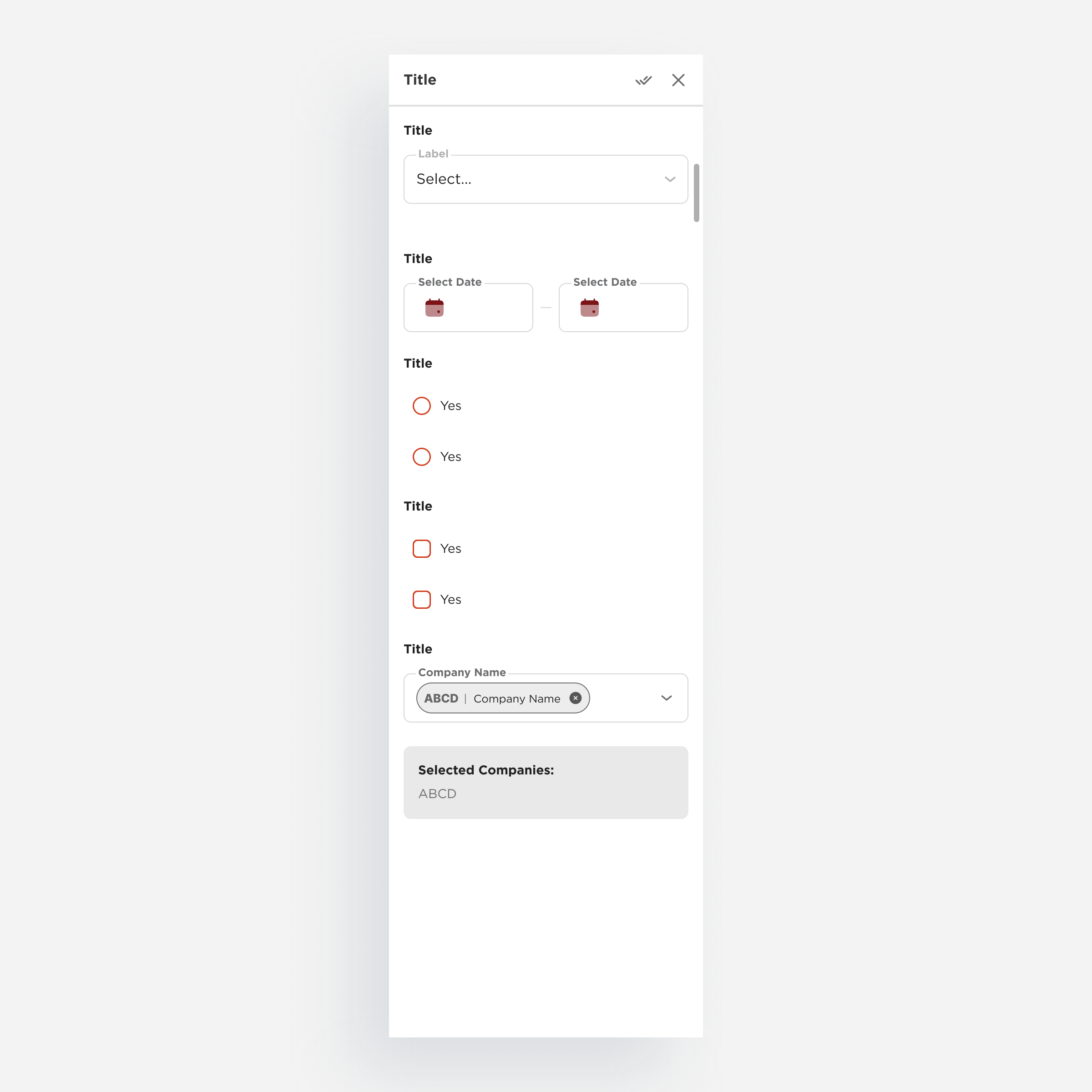
At a glance
Product
A cross-product design system built for DCLI’s suite of enterprise logistics platforms, internal ops tools and customer-facing portals, all developed in parallel with active product delivery.
Problem
Four products evolving independently, with no shared foundation. Duplicated components, inconsistent patterns, and repeated effort compounding into slower delivery and growing friction across teams.
Goal
Build a shared system that gives design and engineering a common foundation: cutting duplication, aligning patterns across products, and making delivery faster without trading away consistency.
Team
~10 designers and ~20 engineers across 4 active product teams, coordinated through a cross-functional Architecture Team we built to govern system contributions.
My role
Co-creator with deep ownership over the system’s foundations: Design Principles, Scale atom, typography system, variable and token architecture, and the Architecture Team governance model.
My responsibilities
- Defining the system’s Design Principles
- Introducing the Scale atom for adaptive sizing
- Designing the full typography system
- Building the variable and token architecture
- Writing component documentation
- Co-structuring the Architecture Team governance
- Driving adoption through reviews, critiques, and onboarding
Overview
DCLI’s enterprise suite, growing in parallel without a shared foundation
DCLI is the largest provider of marine and domestic container chassis to the U.S. Intermodal Industry. Behind its operations sits a suite of enterprise platforms spanning internal tools and customer-facing products.
As the product suite grew, each platform evolved on its own terms: different teams, different timelines, different decisions. What started as reasonable product-level autonomy gradually became a coordination problem. Interfaces diverged, components multiplied, and gaps compounded.
What follows covers the decisions behind the system’s structure, the governance model we built, and what it took to get it adopted.
Context
Four active products, each moving at its own pace
~10 designers and ~20 engineers contributing across ~4 active products simultaneously, each with its own priorities, roadmap, and approach to design and engineering problems.
Autonomy works well in the short term. But over time, the gaps compound: a table pattern here, a form validation behavior there, a navigation structure that differs by product. The more products you add, the more expensive those gaps become.
By the time the design system initiative kicked off, the inconsistency was slowing down engineering, creating friction for users switching between products, and making onboarding harder than it needed to be.
Problem
Fragmented products, duplicated solutions, and the compounding cost of going it alone
The same task could look and behave differently depending on which product you were in.
Inconsistent interfaces
Different layouts, different interaction patterns, different flows for identical operations. For users working across multiple tools, the inconsistency added up to real cognitive friction.
Duplicated components
and logic
Tables, forms, and controls built from scratch in each product independently. Similar enough to cause confusion, different enough to require separate maintenance.
Accessibility gaps
Contrast ratios, focus states, and error feedback each handled differently across products, making consistent WCAG compliance difficult to achieve and harder to audit.
Slower delivery cycles
Without shared components, every new feature meant building from the ground up. Design and engineering re-solved the same problems repeatedly.
Impact
- Scalability was limited: adding a new product meant inheriting all existing inconsistencies
- Delivery was slower than it needed to be, across the board
- Coordination between design and engineering required more effort than the work itself warranted
Examples
Layout
Layout structures diverged across products, with inconsistent grids, spacing, and alignment rules. Similar screens presented different hierarchies, reducing scanability.
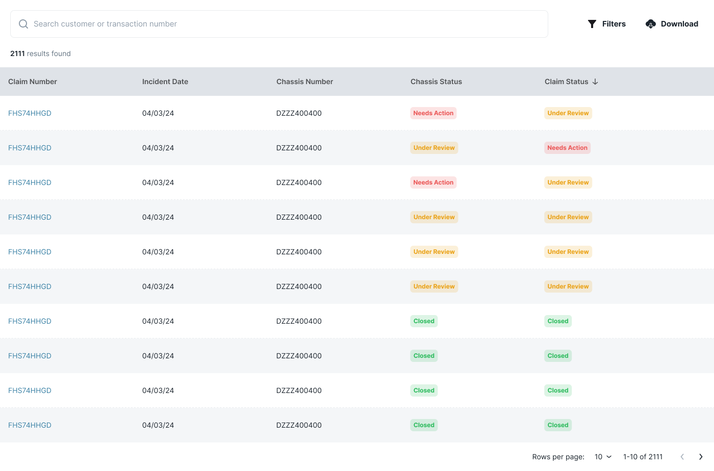
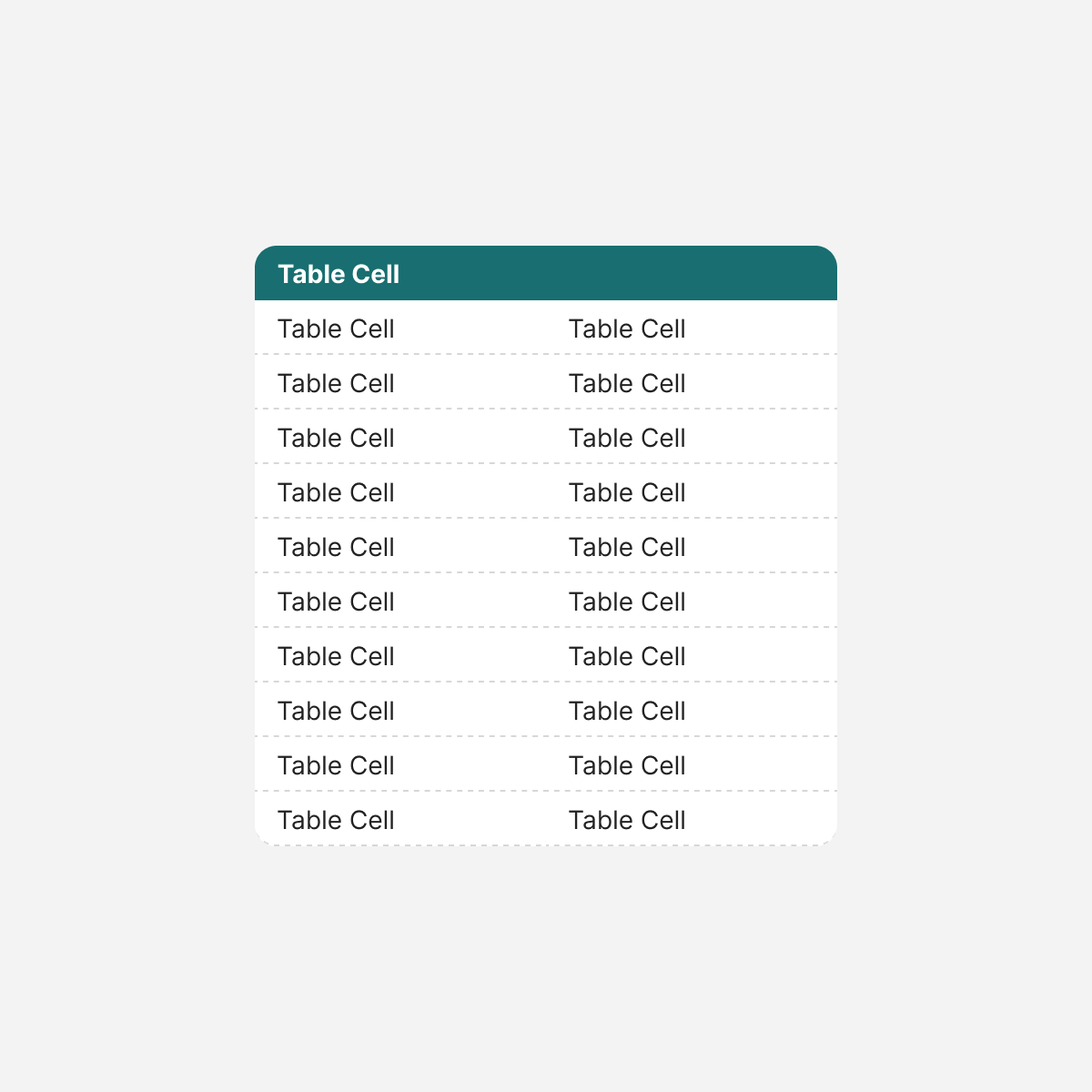
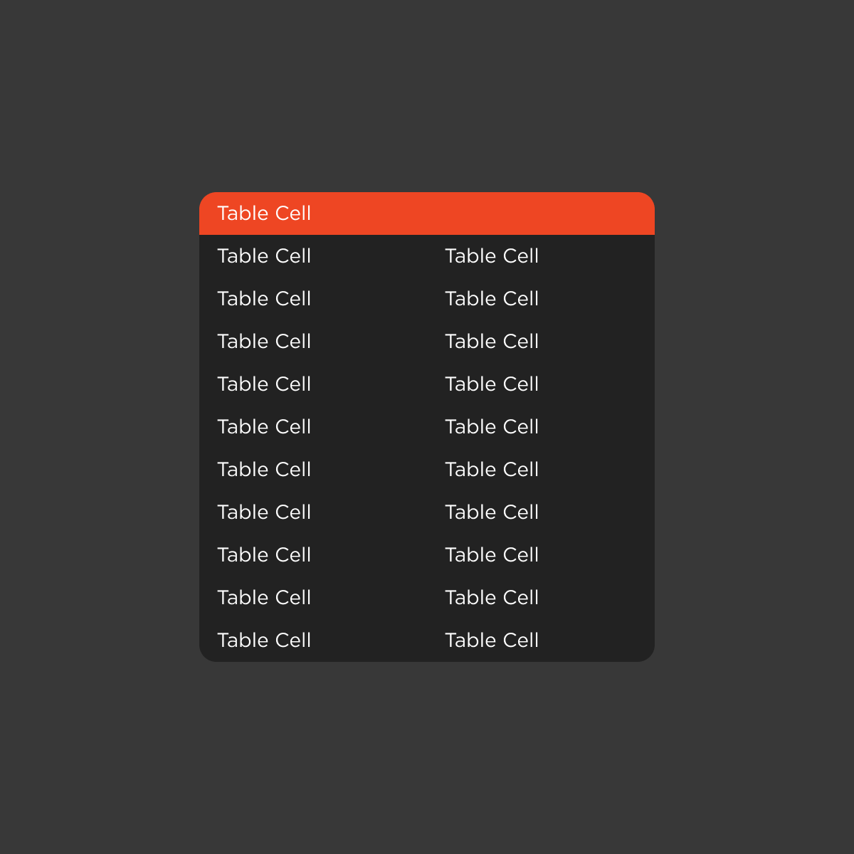
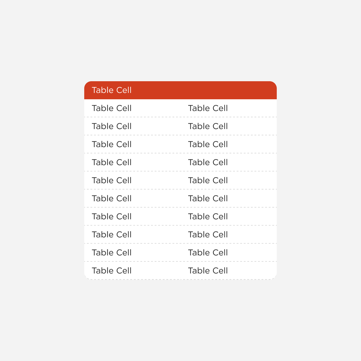
Tables, system feedback
Tables solving similar tasks differed in structure, density, and interaction patterns. Feedback mechanisms also lacked consistency, weakening usability and increasing maintenance effort.
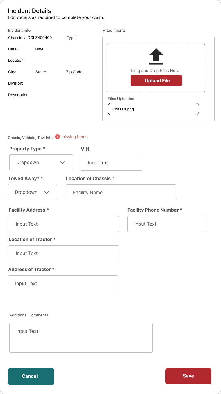
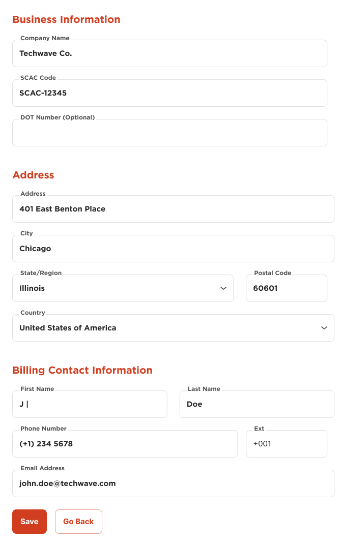
Forms
Forms varied in field structure, validation behavior, and feedback states. Users encountered different interaction patterns for similar inputs, increasing friction and error rates.
Challenge
Building shared structure without erasing product identity
The system needed to work across four products and two brands without becoming a constraint on either. The right layer of abstraction: standardized enough to eliminate duplication, flexible enough to support brand-level variation in color, typography, and copy.
Three non-negotiables from the start:
- Consistent component behavior and structure across products
- Scalable architecture that could support new products without requiring a refactor
- WCAG accessibility built into the foundation, not retrofitted
Design Principles
The north star before any component was drawn
Before a single component was designed, I defined and documented the principles the system would be built on. These weren’t aspirational statements. They were working criteria: if a proposed component couldn’t be justified through at least one, it didn’t belong.
01
Human-Centered Design
Enterprise tools are often built around systems logic, not user logic. Every component needed to support real user goals, not just technical requirements.
In the system:
Existing product flows were audited before designing anything. Real workflows were the benchmark for validating new components.
02
Consistency
At the system level, consistency becomes structural: the same component should look, feel, and behave identically regardless of which product renders it.
In the system:
Semantic token roles over hardcoded values. Consistency propagates automatically rather than requiring manual enforcement across teams.
03
Simplicity
DCLI’s platforms handle complex operational workflows. Simplicity means removing friction that doesn’t serve the task, not reducing functionality.
In the system:
If a component required explanation to use, it needed redesign. The Scale atom is invisible to end users; a single variable for designers.
04
Accessibility & Mobility
Accessibility was a baseline requirement, not a feature. WCAG compliance was built into the token layer from the start.
In the system:
Semantic color roles, contrast ratios, and focus states were system-level decisions. Accessibility came included, not retrofitted.
05
Feedback
Operational users need to trust their tools. Ambiguous states break that trust: loading without indicators, submissions without confirmation, errors without context.
In the system:
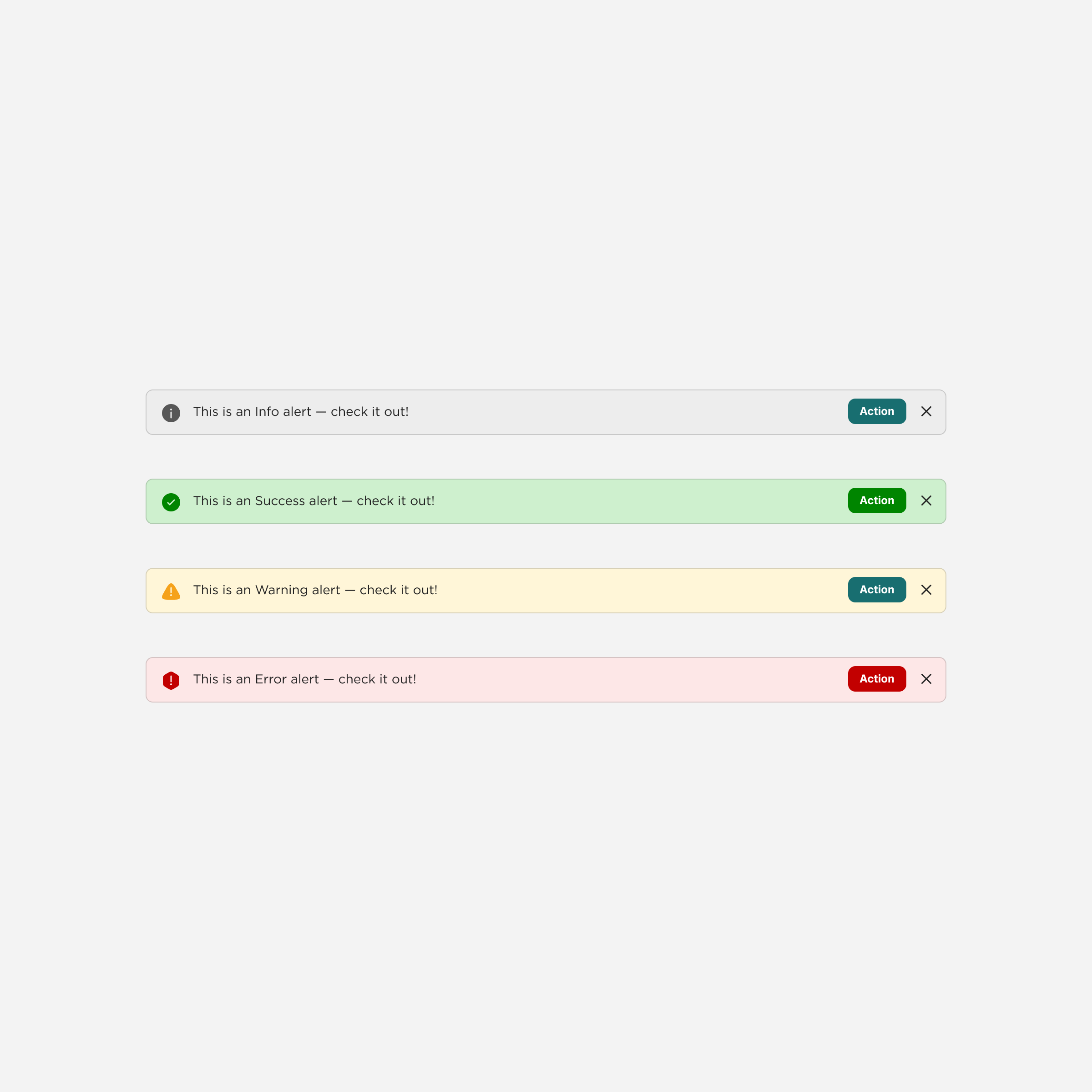
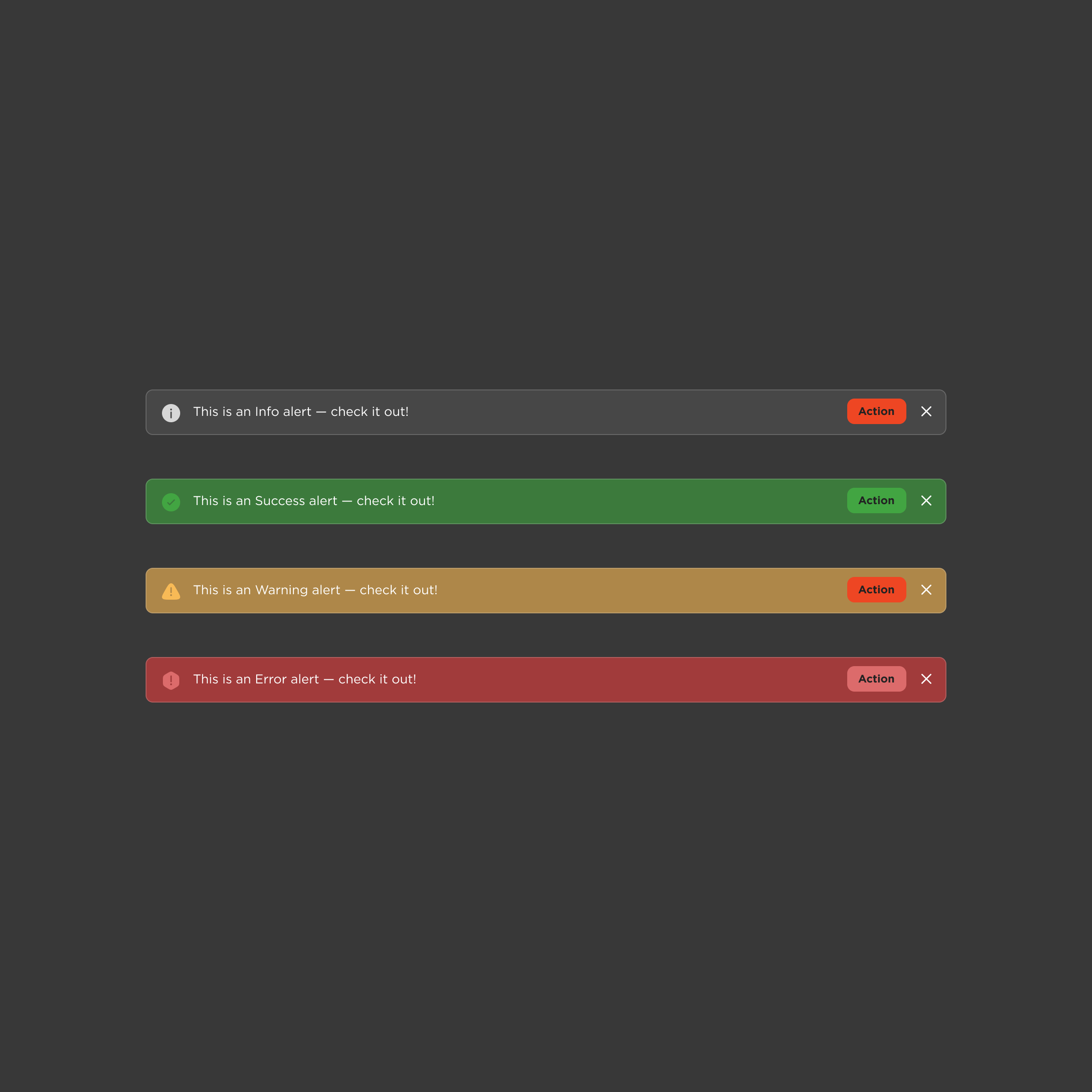
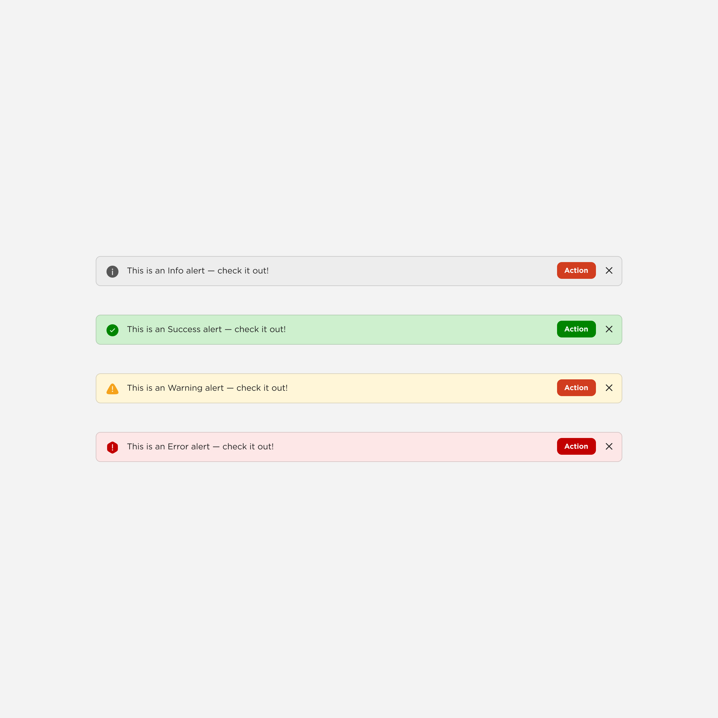
Loading, empty, error, and success states designed as a unified set, ensuring consistent communication across the suite.
Approach
Consolidating fragmented solutions into a shared system that teams would actually use
Extract and validate patterns
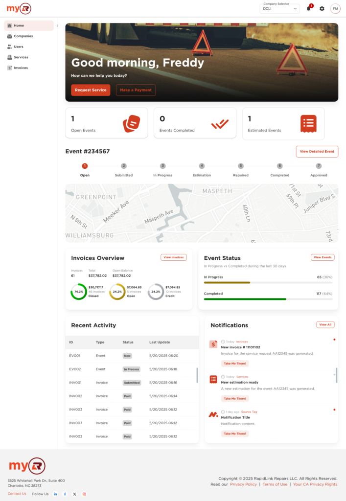
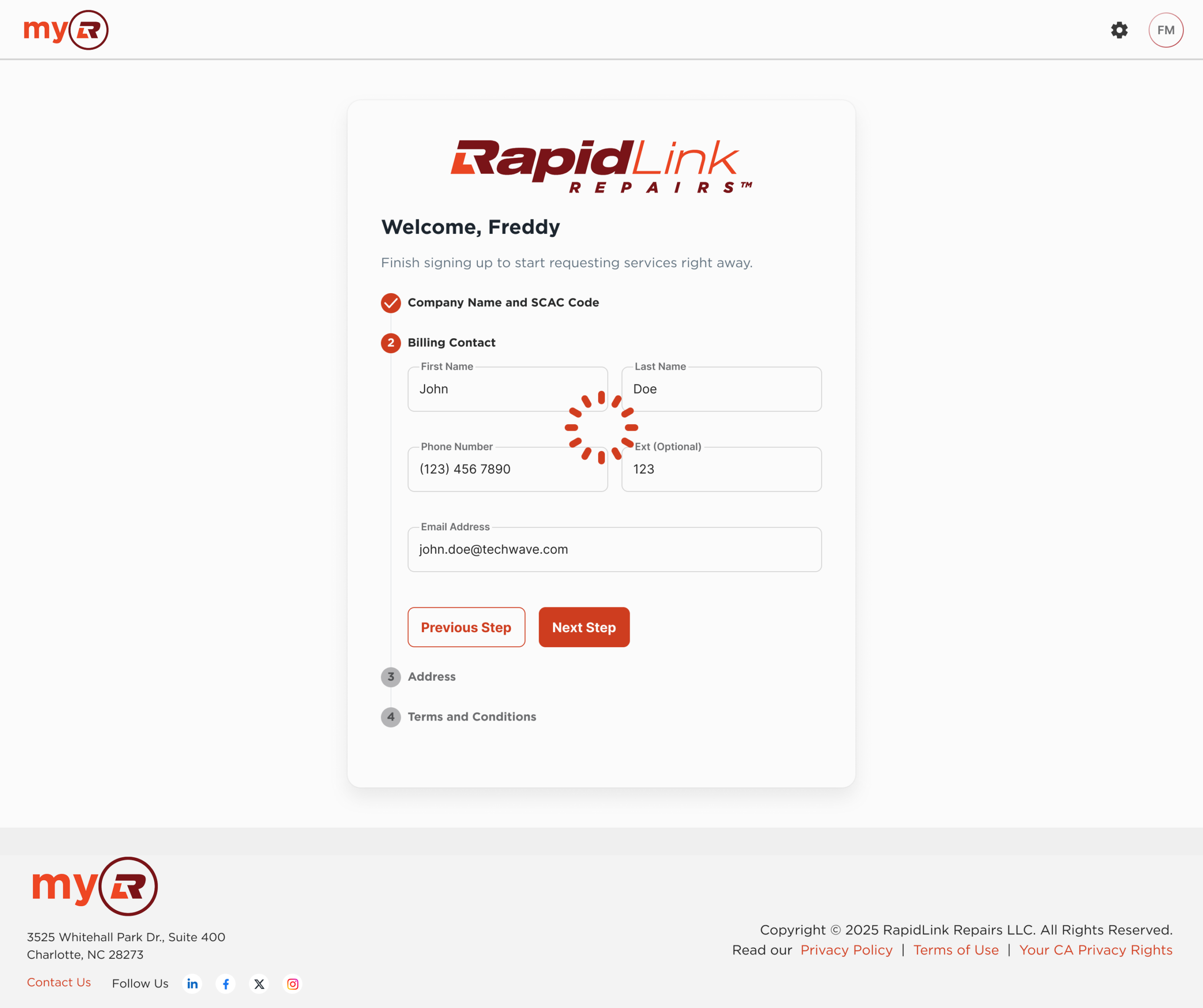
We audited what already existed, with a focus on MyRLR as the most mature reference. The goal: identify which UI patterns had genuine reuse potential. Anything too product-specific stayed at the product level.
Define the system architecture
We structured the system using Atomic Design: tokens first, then components, then higher-level assemblies. I introduced the Scale atom at this stage, a custom dimension for adaptive sizing across densities and screen sizes.
Align teams through governance
The system needed a governance model, not just guidelines. We created the Architecture Team: designers, engineers, and product stakeholders evaluating every contribution before it went in. The criteria: reusable, implementable, serving a recurring need. Anything that didn’t qualify stayed at the product level.
Integrate with delivery workflows
The system was never a parallel track. Components were built as part of active product delivery, meaning real usage from day one. That kept design and engineering on the same source of truth and gave immediate signal on what worked.
System structure
Four layers, one source of truth
Atoms
→
Molecules
→
Organisms
→
Templates
→
Pages
Each layer builds on the one below. Two-brand support is handled at the token level, keeping structure shared while allowing variation in color, typography, and copy.
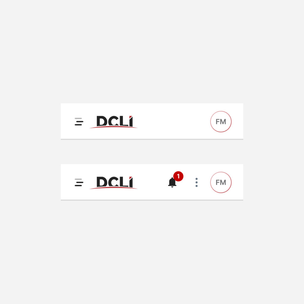
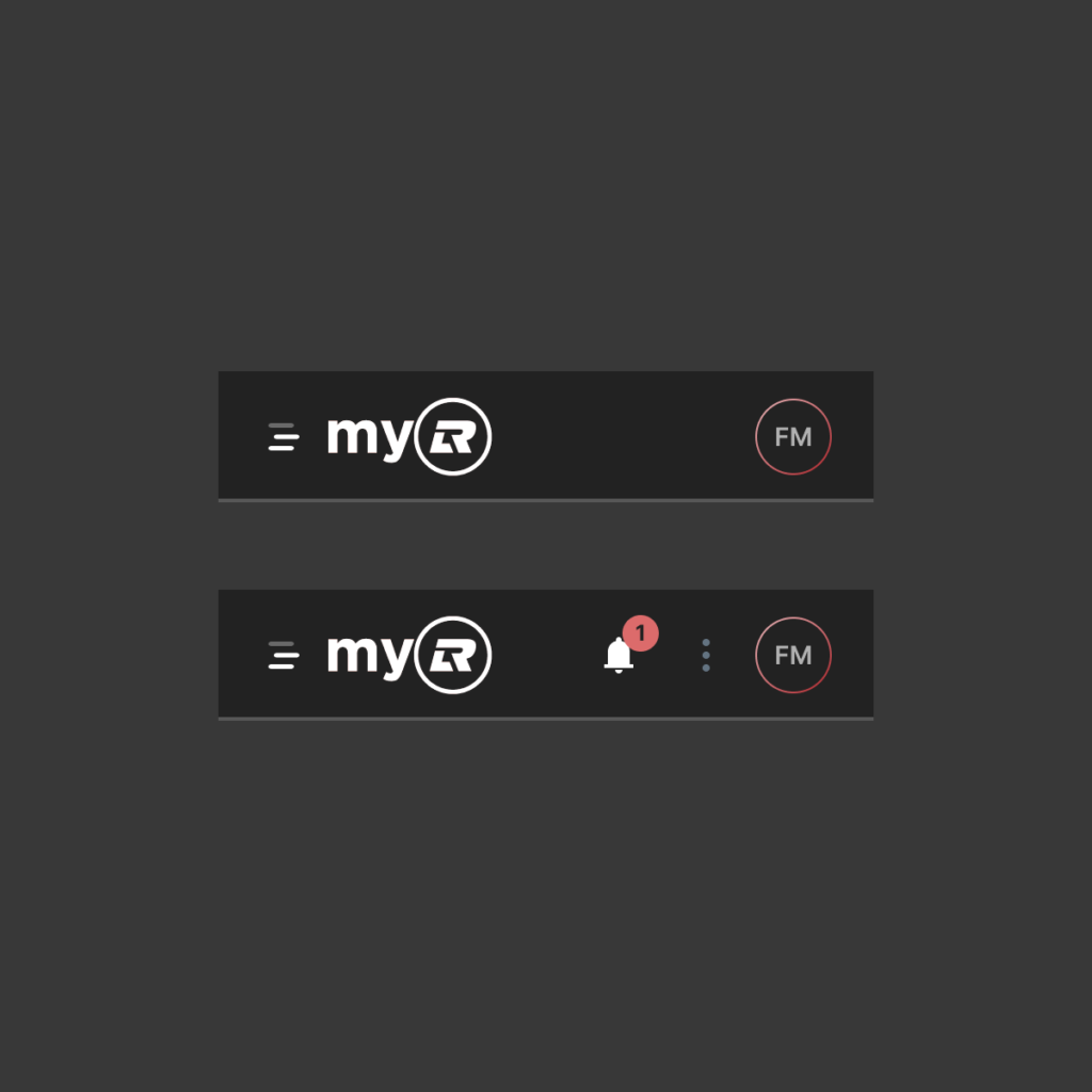
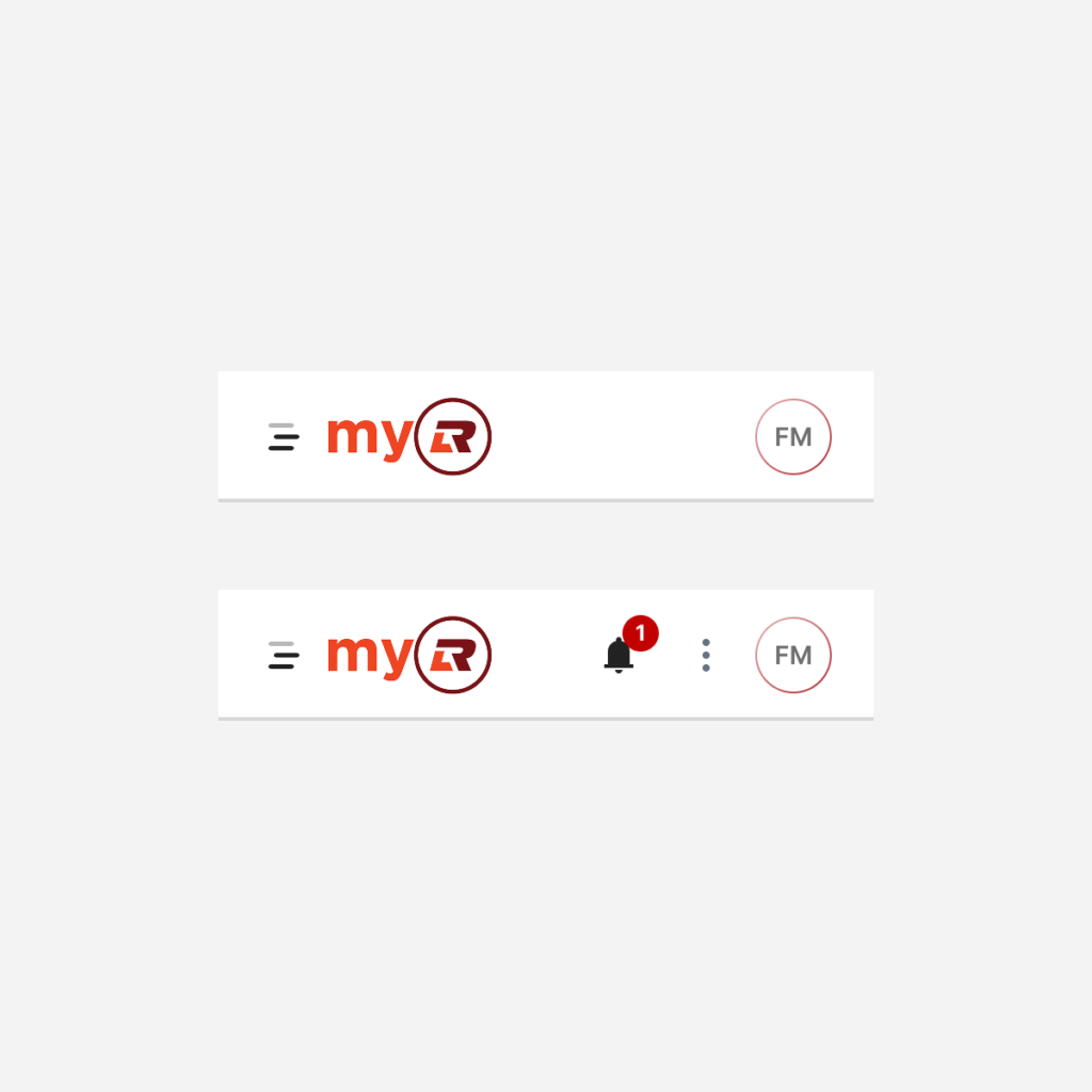
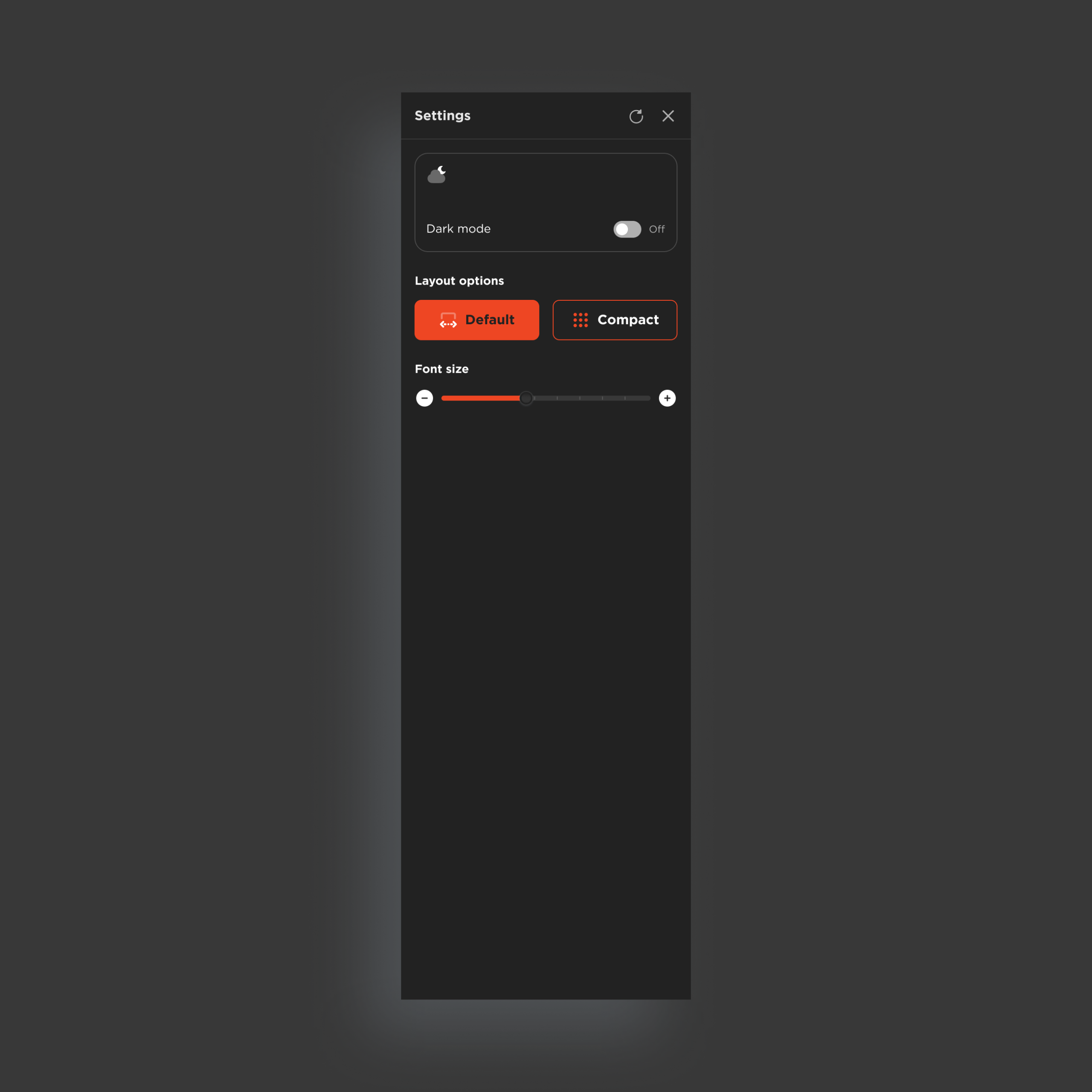
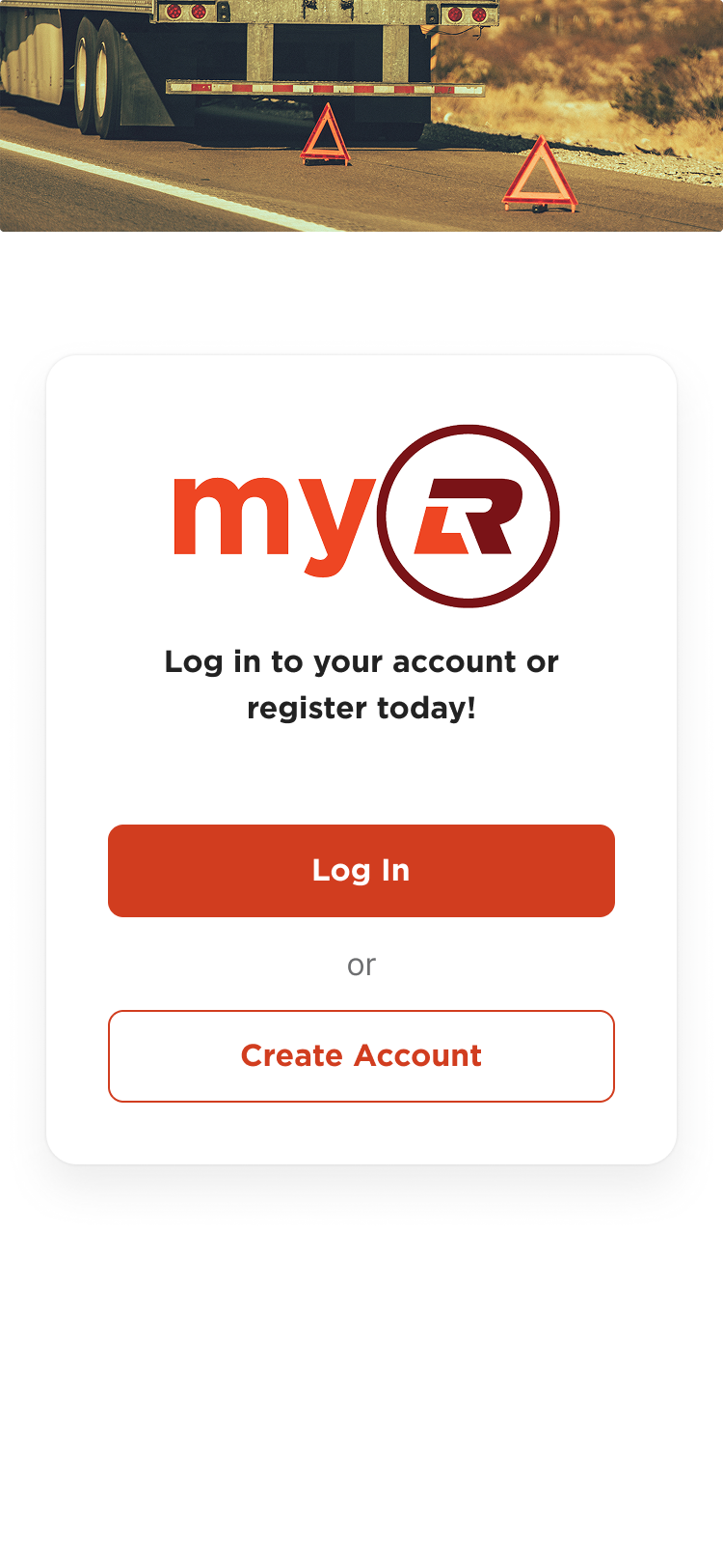
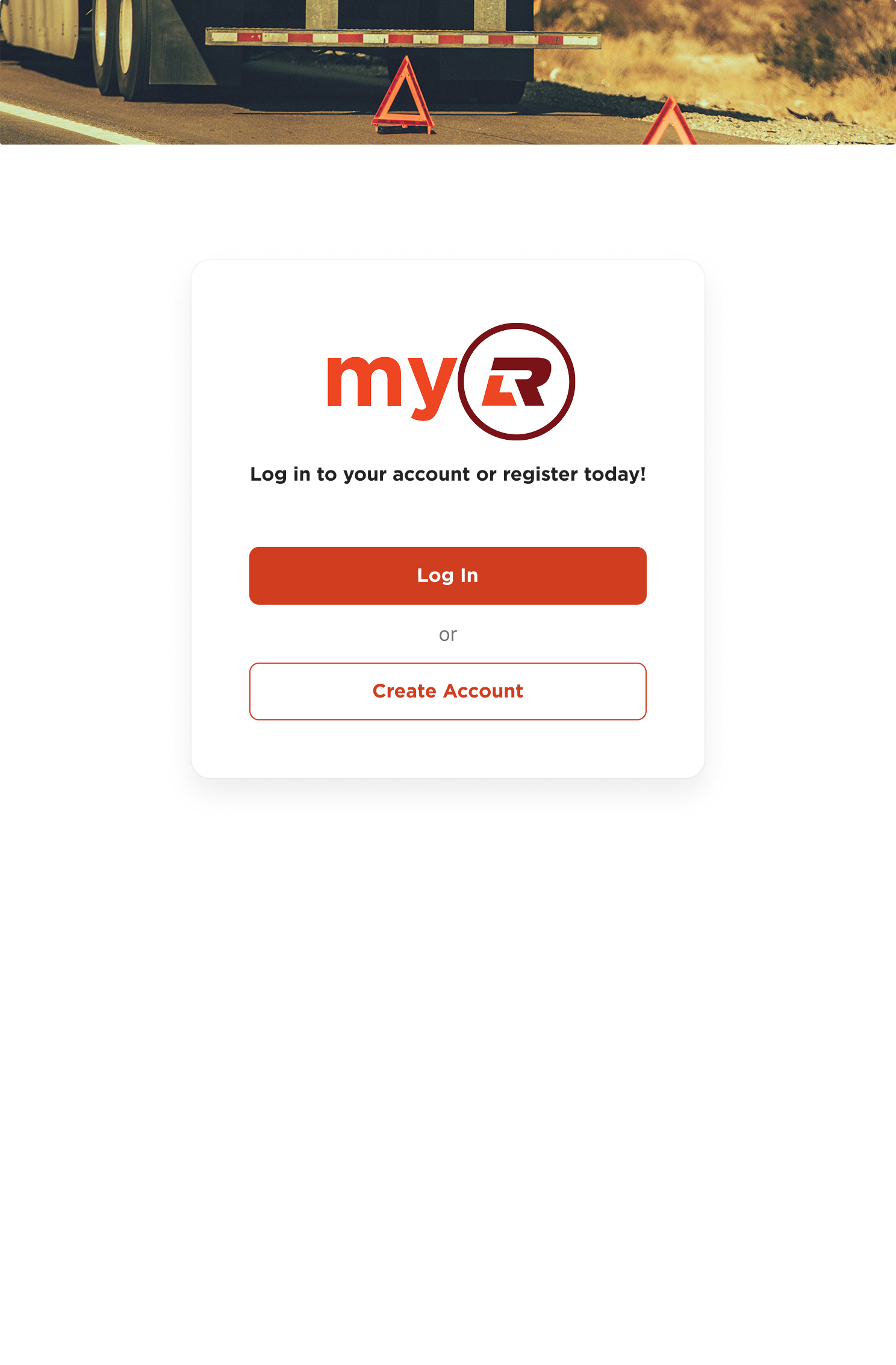
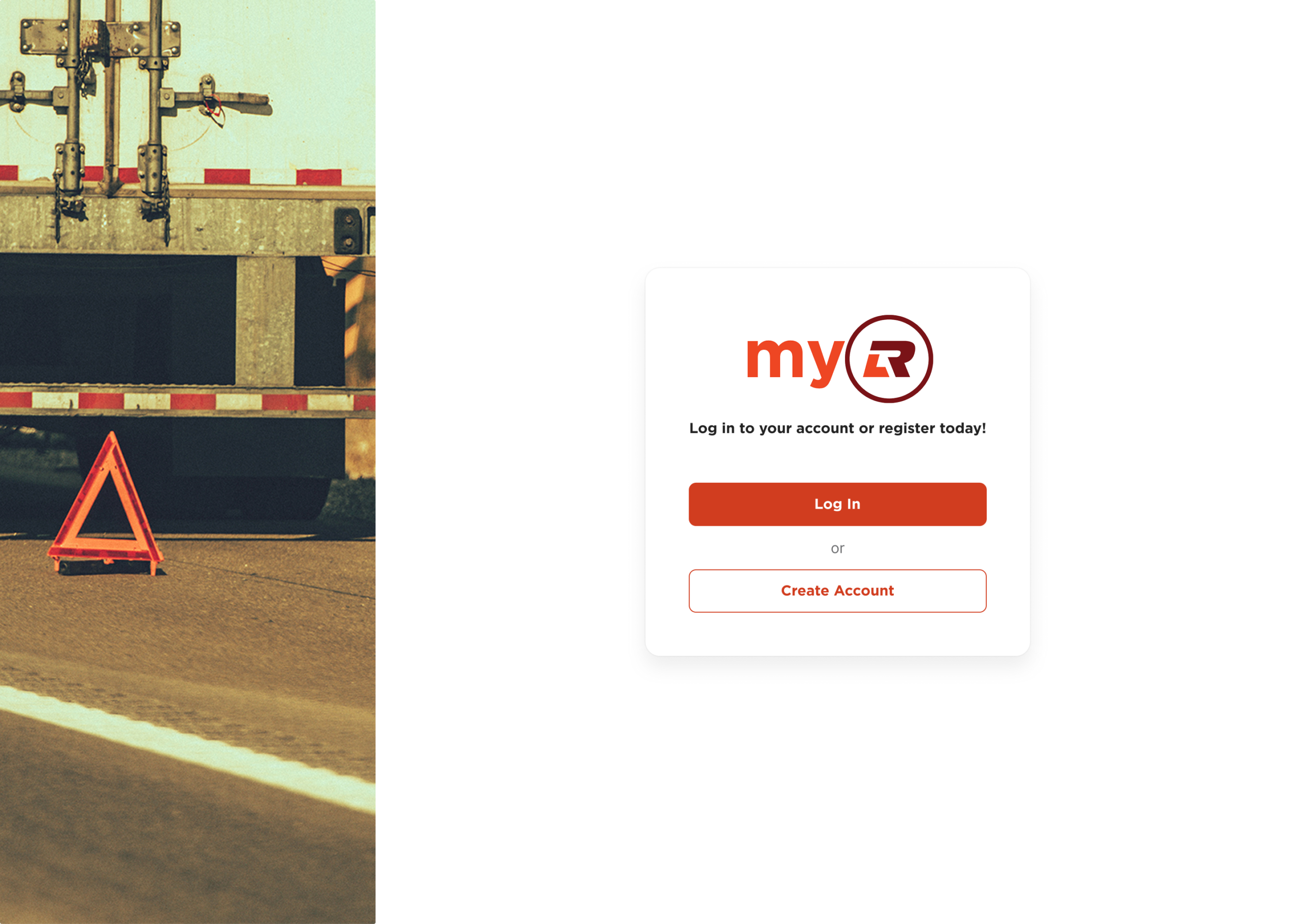
Two brands, one system
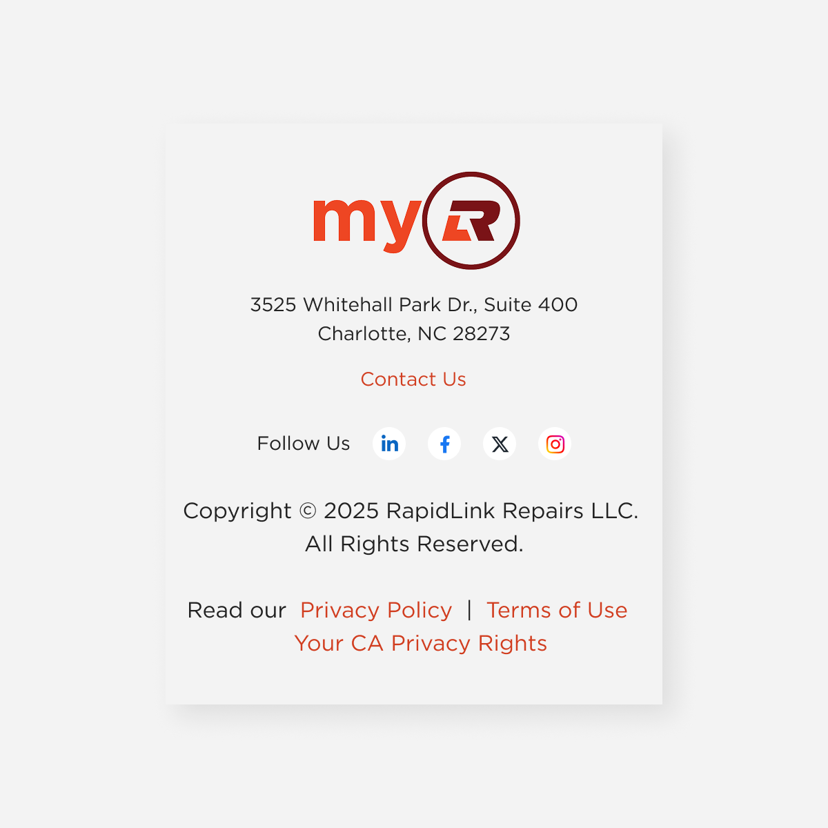
DCLI
Green · Red · Navy · Moss
MyRLR – RapidLink Repairs
Safety Orange · Brick Red · Slate
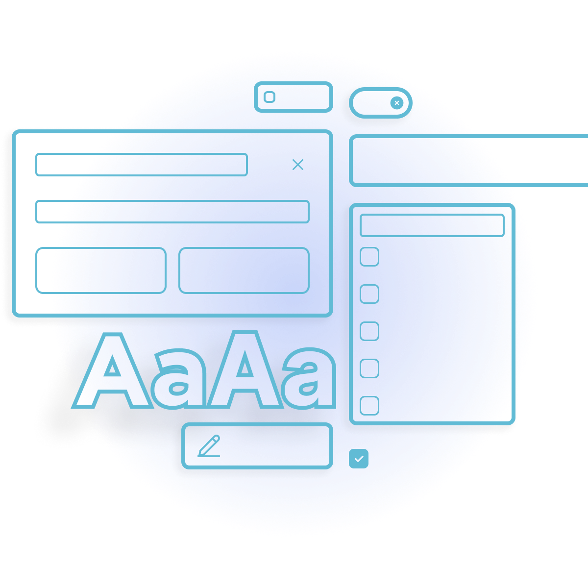
Atoms
The raw material: tokens that everything else is built on
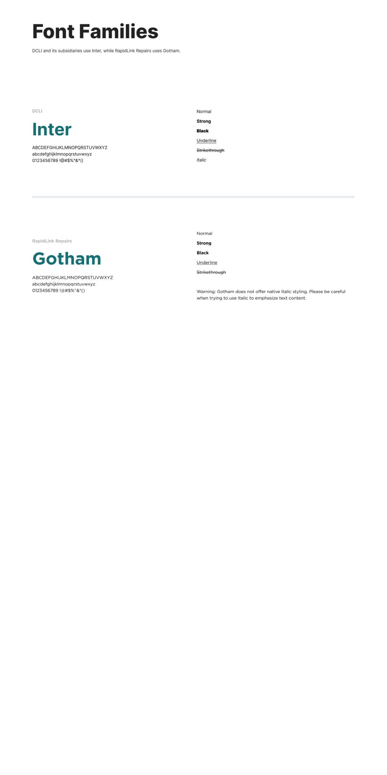
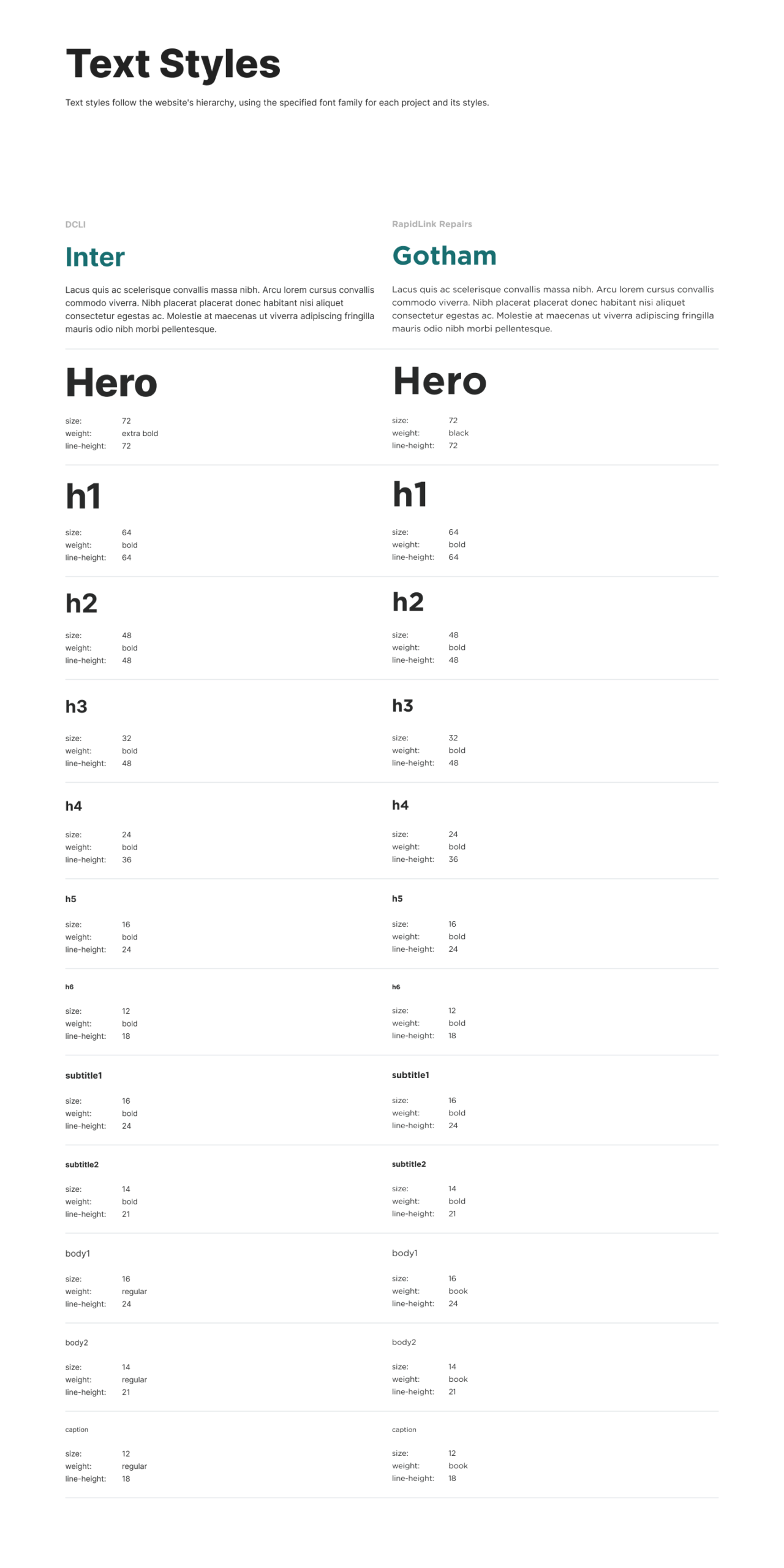
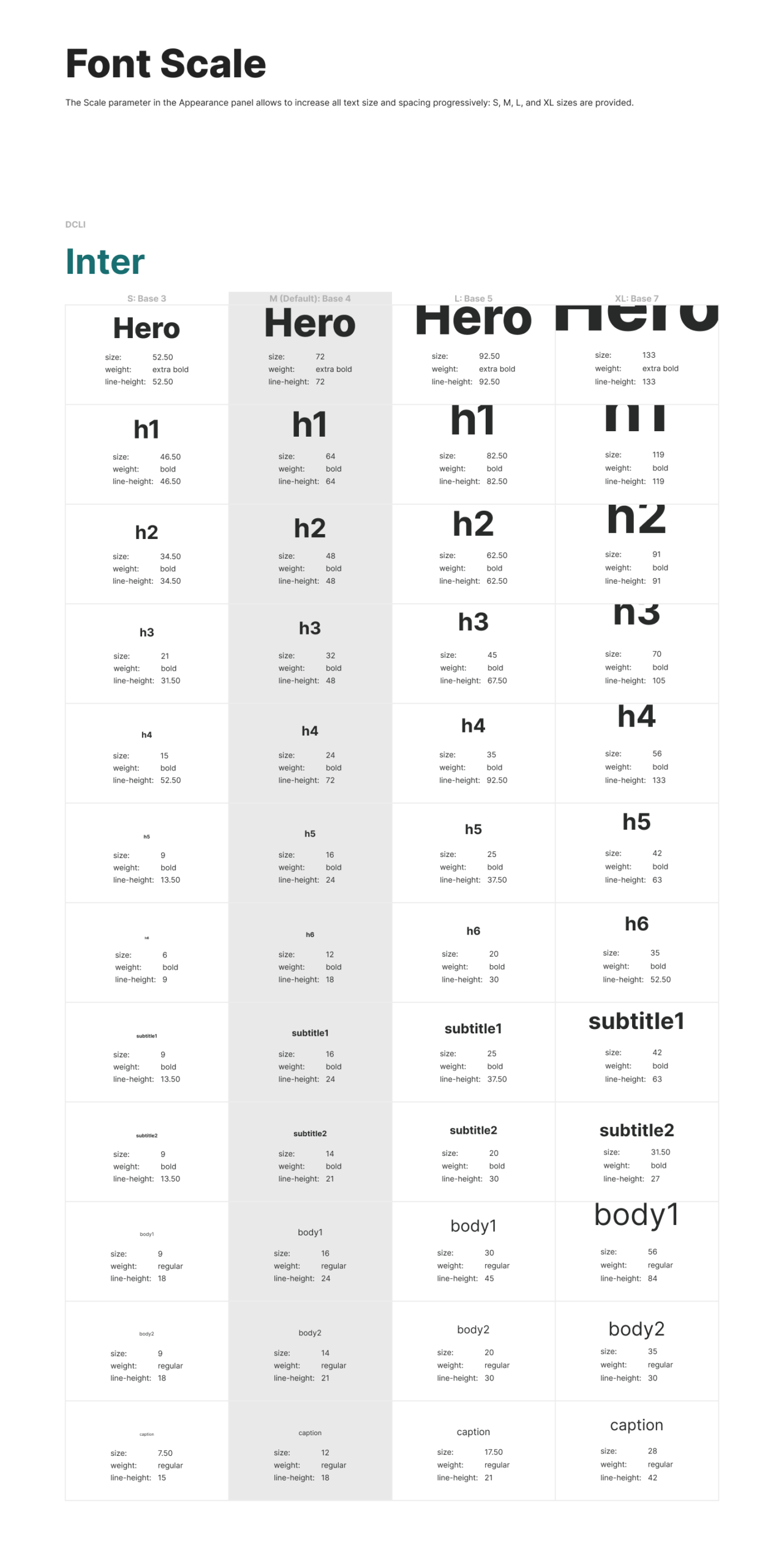
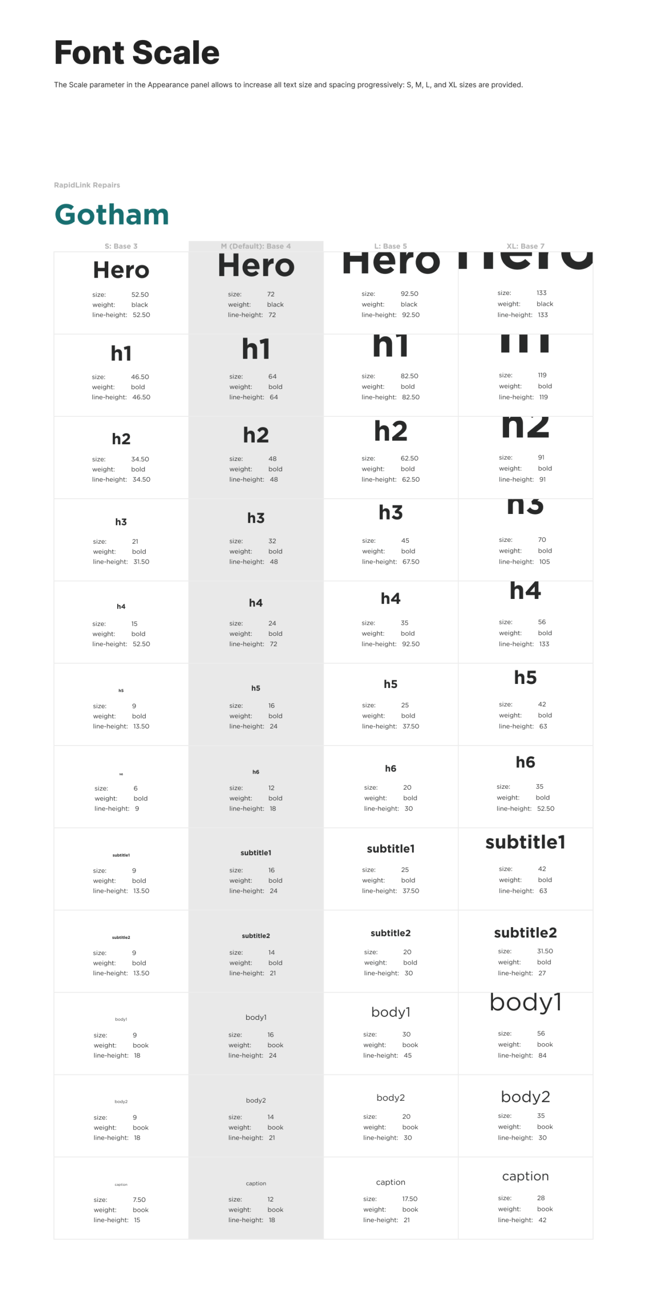
Typography
Defined through three layers: font families, text styles, and a custom font scale. Text sizes adjust to context rather than being locked to fixed values.For both brands: Font Families, Text Styles, and Font Scale charts.
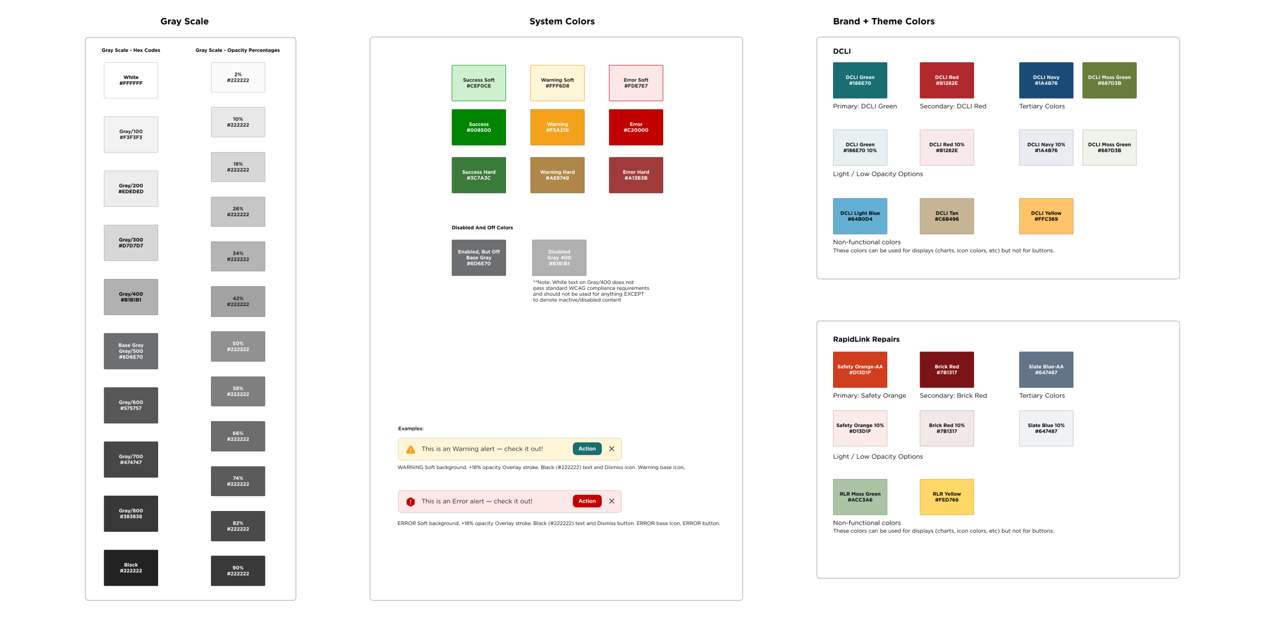
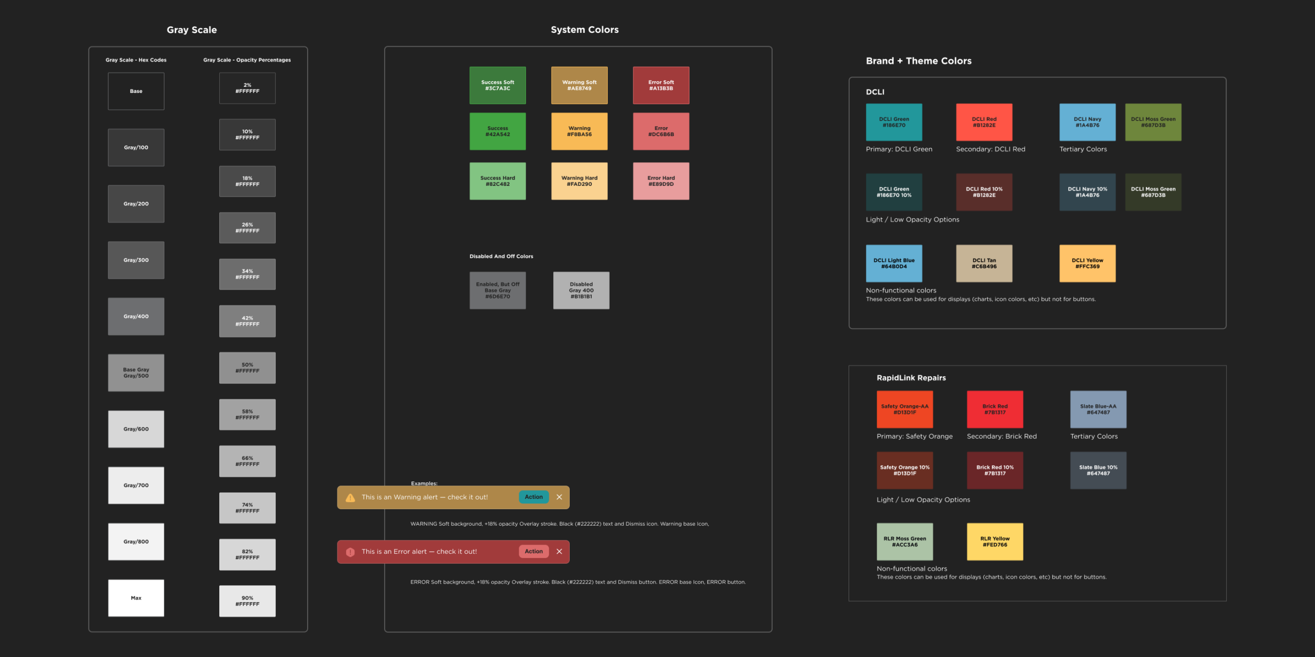
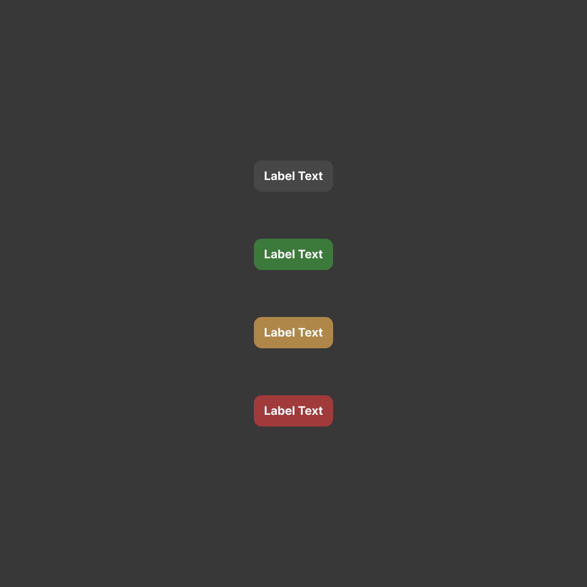
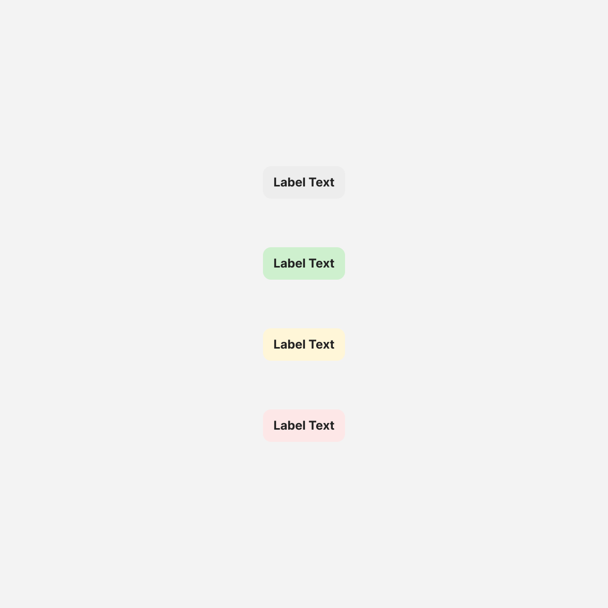
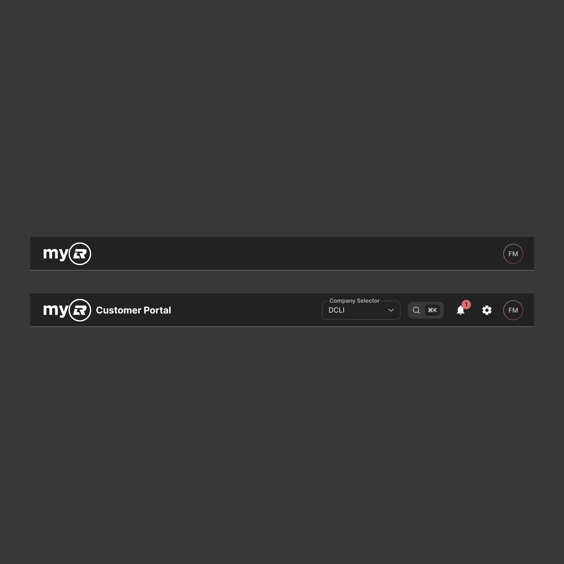
Color system
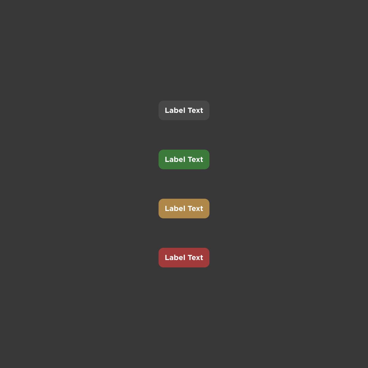
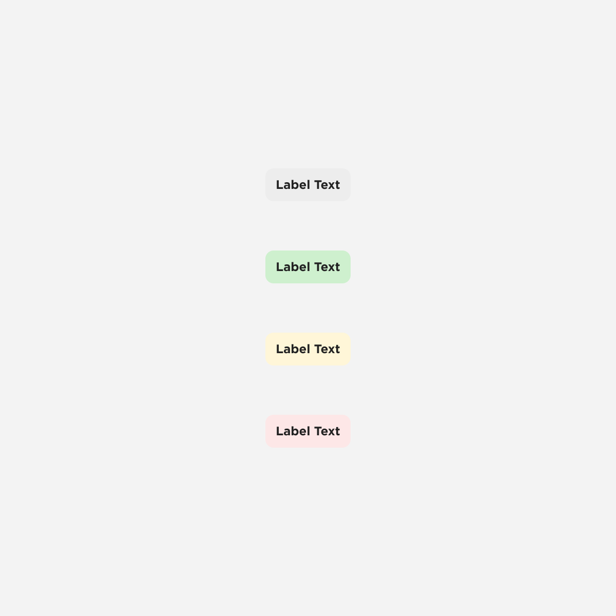
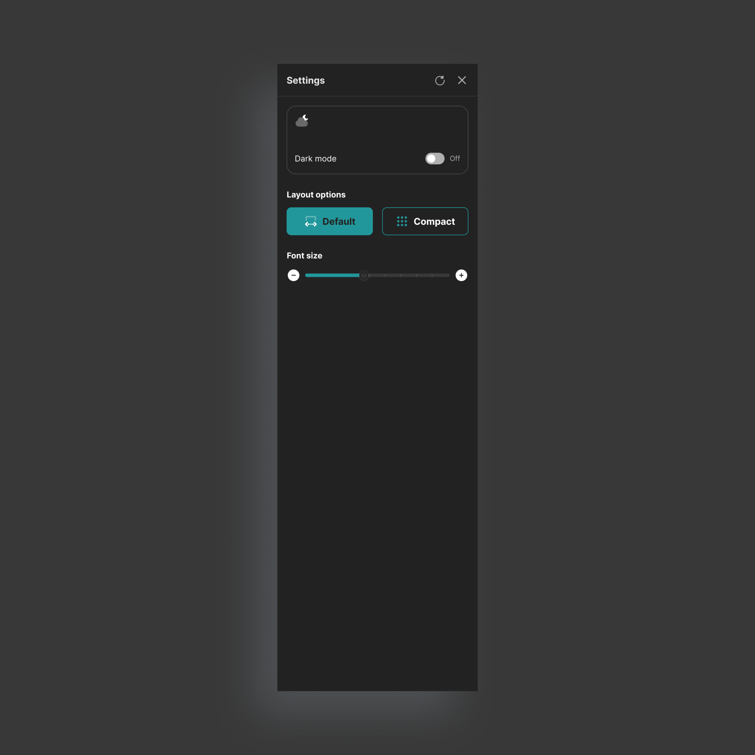
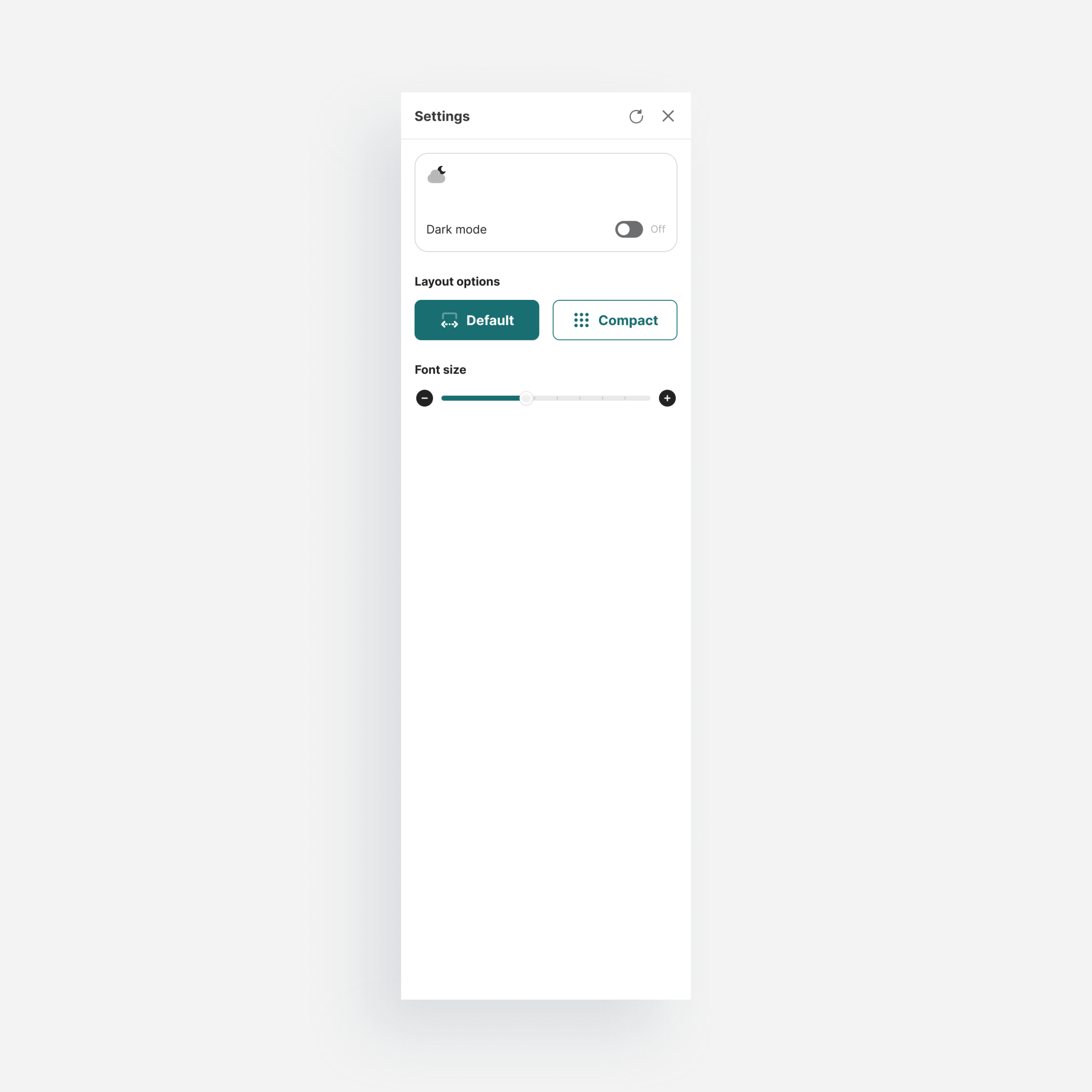
Organized into semantic roles: primary, secondary, feedback, and neutral. A color change at the token level propagates across every component that references it. Light and dark mode built in.Top: Light mode. Bottom: Dark mode.
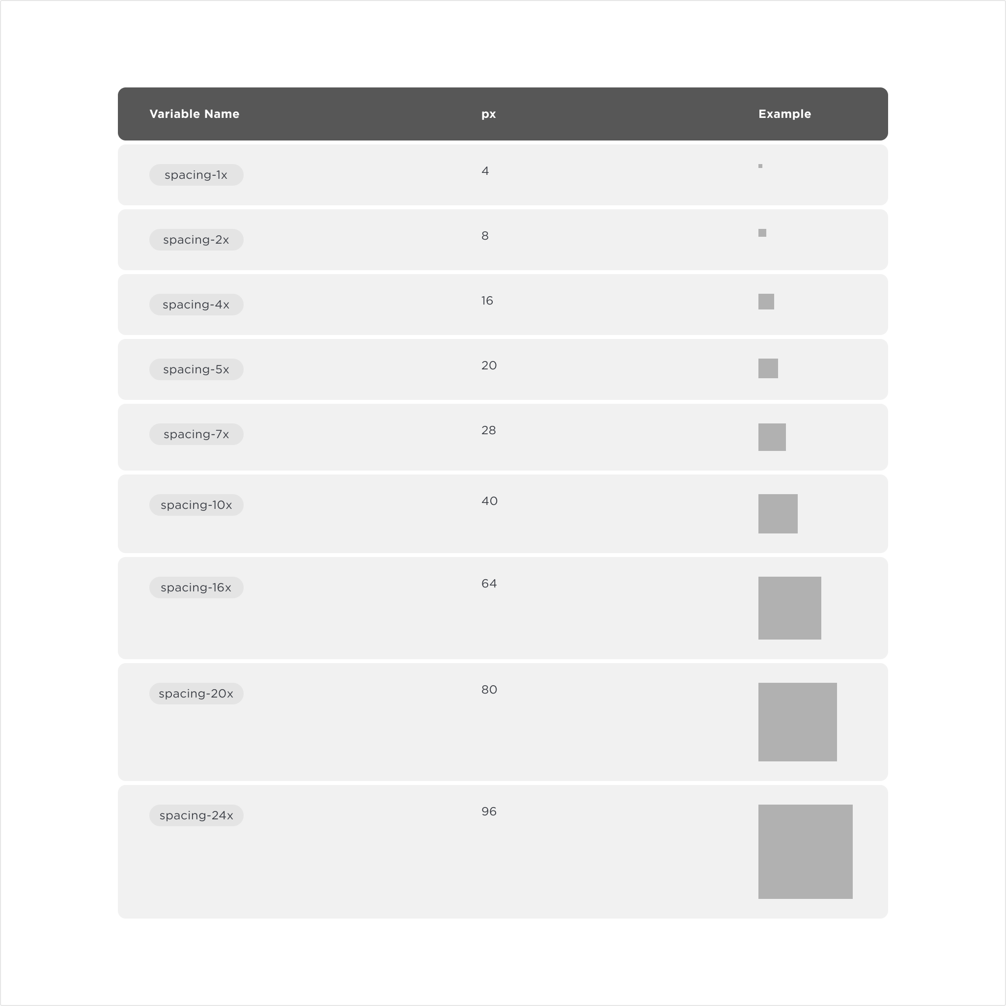
Spacing
A token scale applied consistently across layouts and components. Nothing is arbitrary, and there’s no negotiating values on every new screen.Spacing scale.
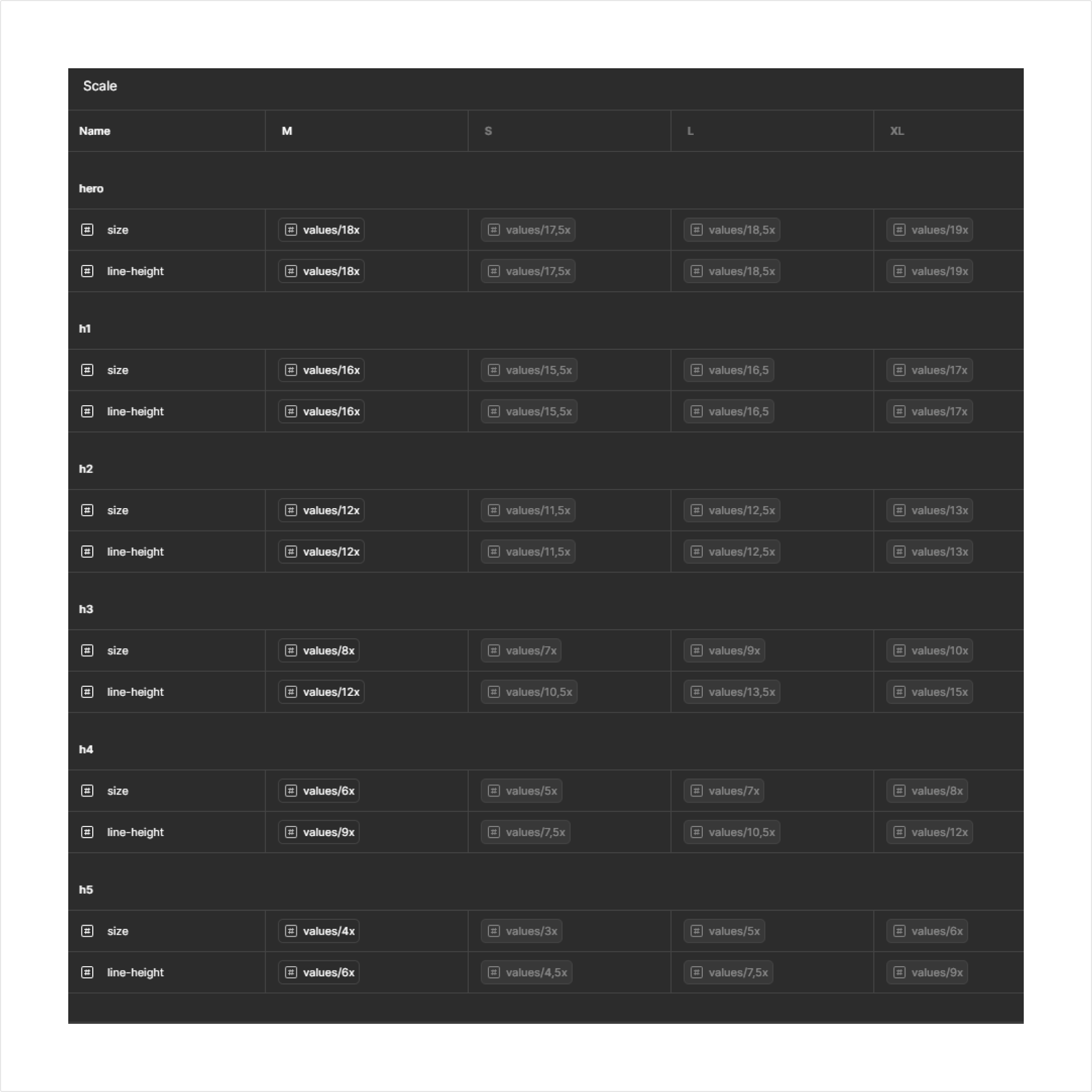
Scale
A custom dimension I introduced for adaptive sizing. Predefined ratios let designers adjust density and layout through a single variable. Less visible, but what makes responsive composition manageable.Scale as seen in Figma’s variables panel.
Molecules
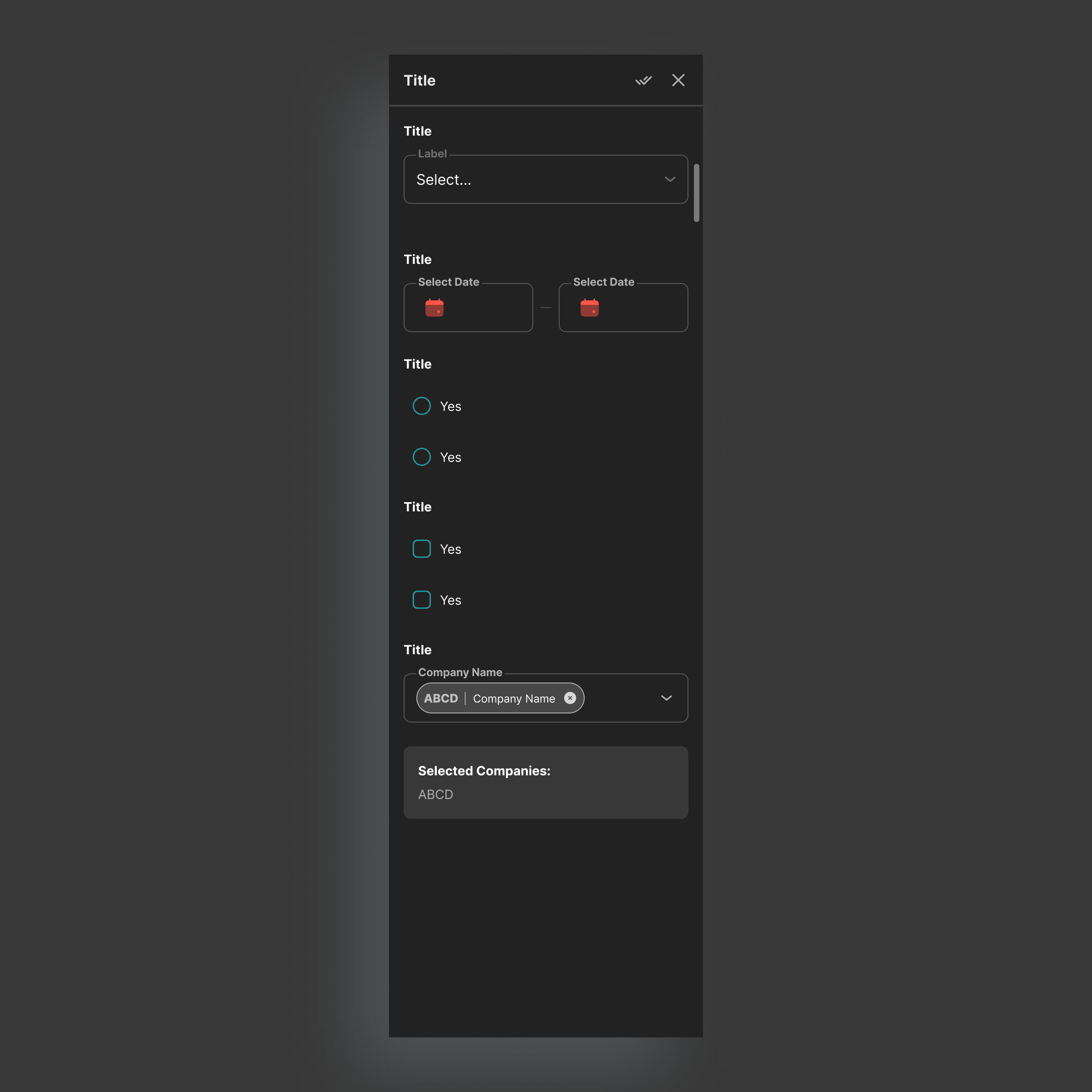
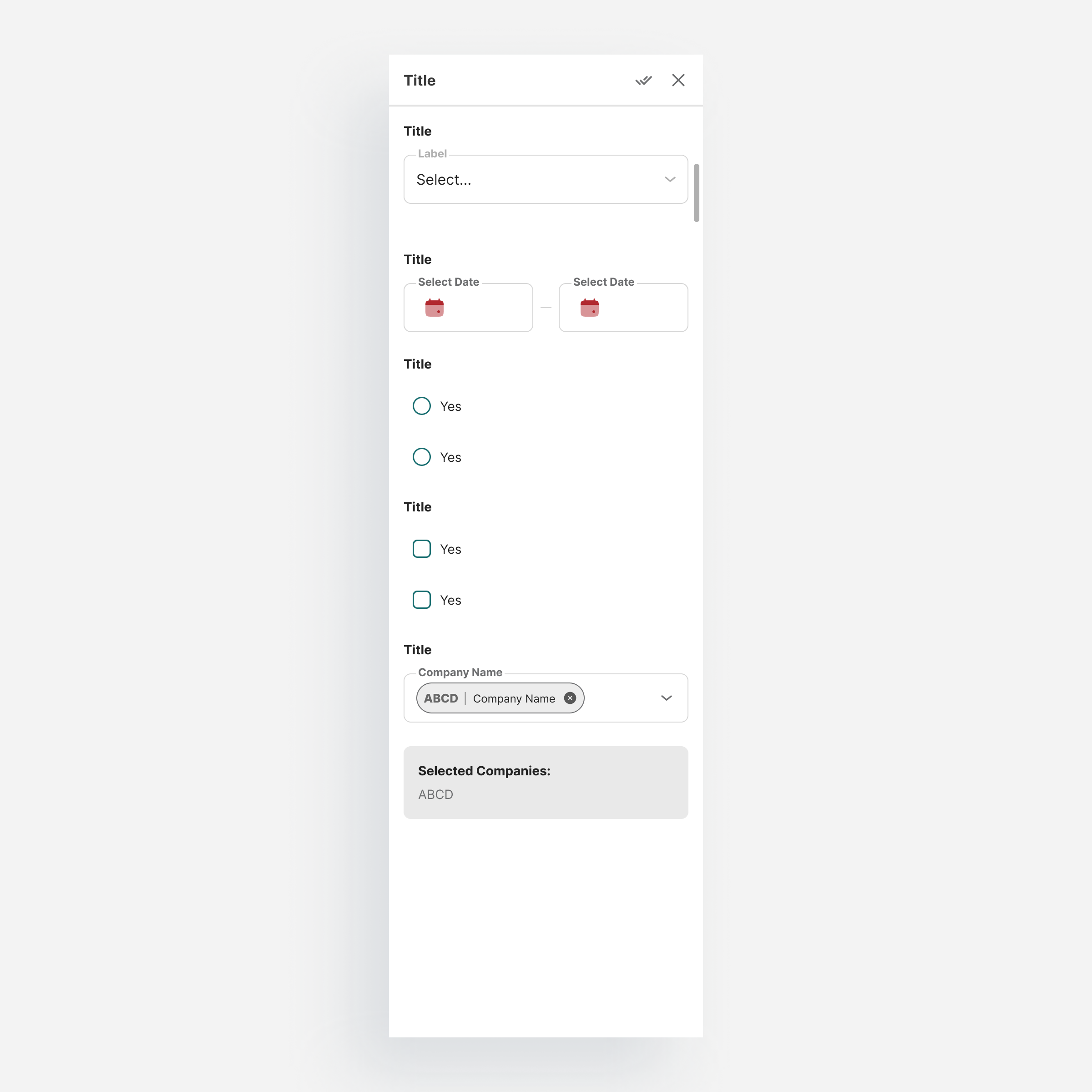
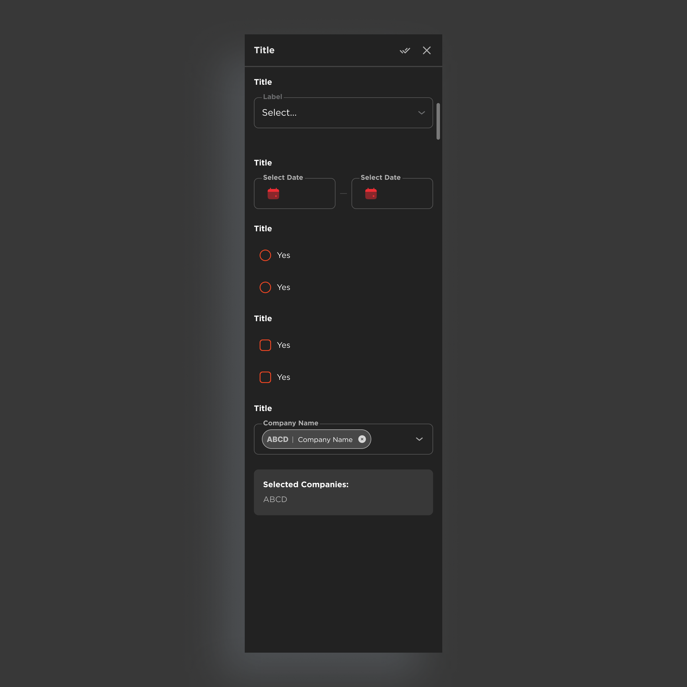
Reusable components with interaction logic, covering the core actions users perform across every product
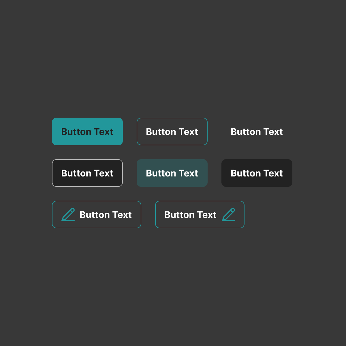
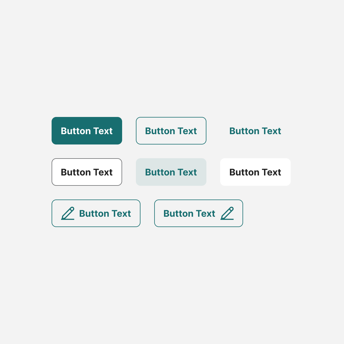
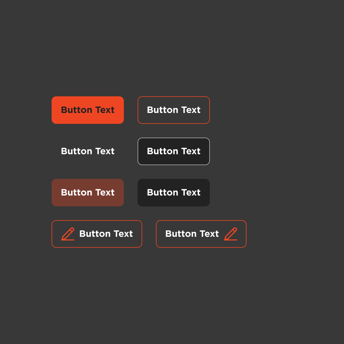
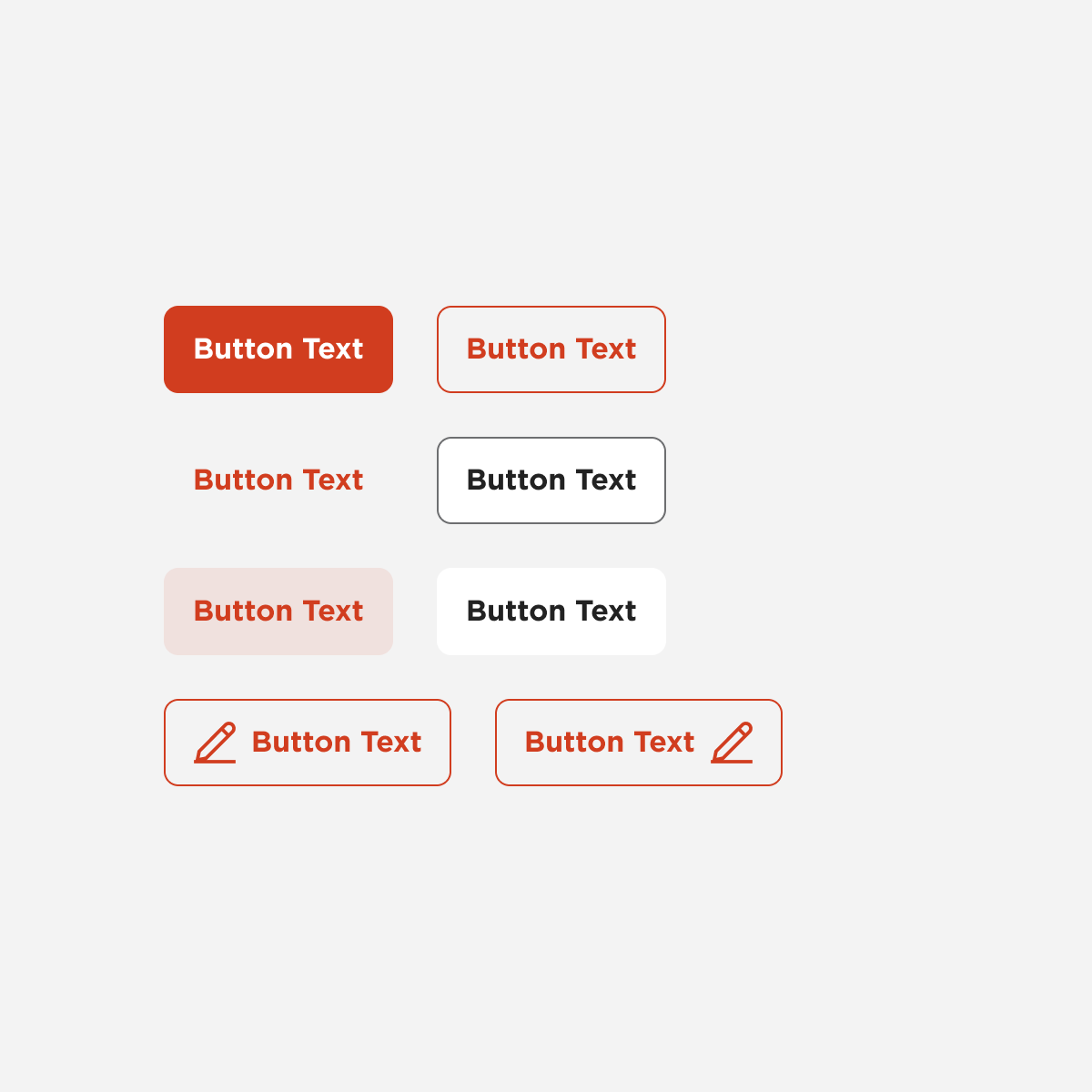
Buttons
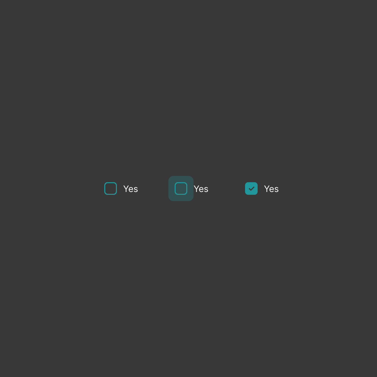
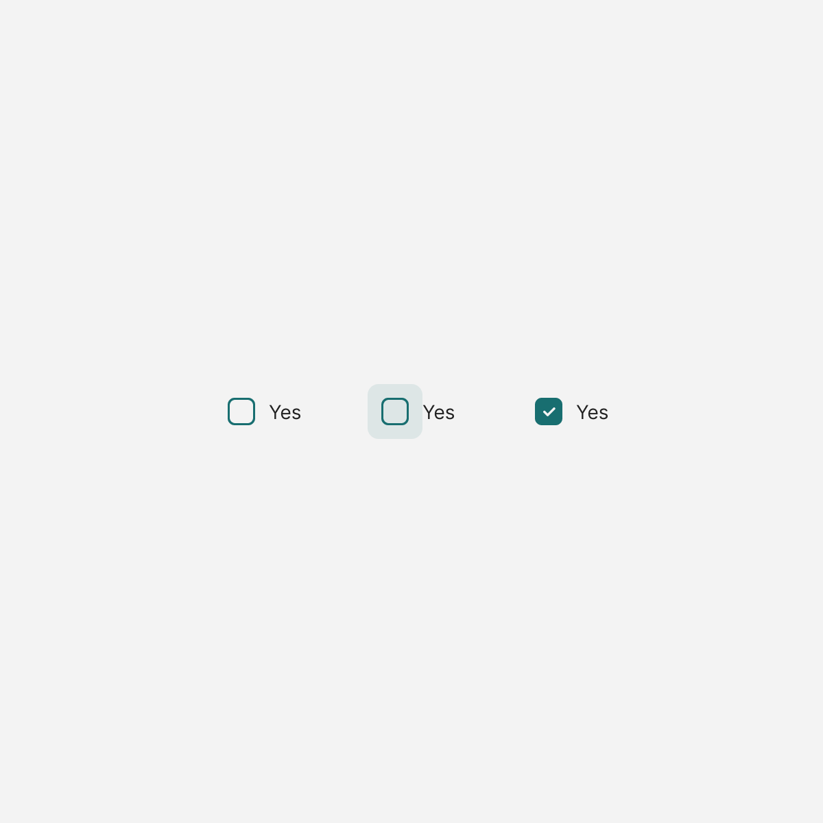
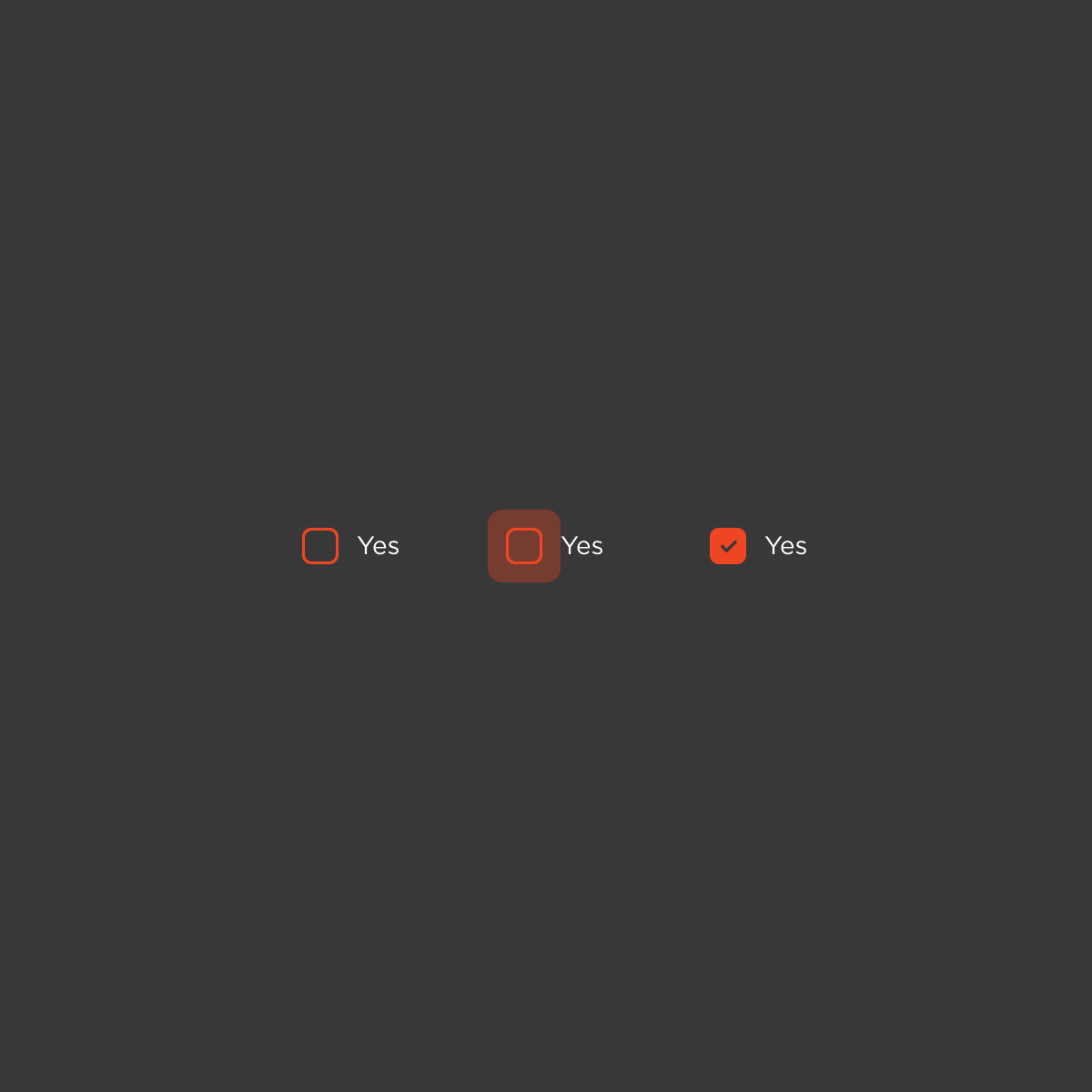
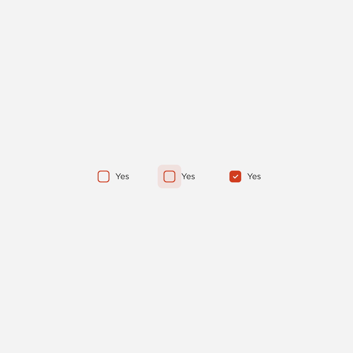
checkbox
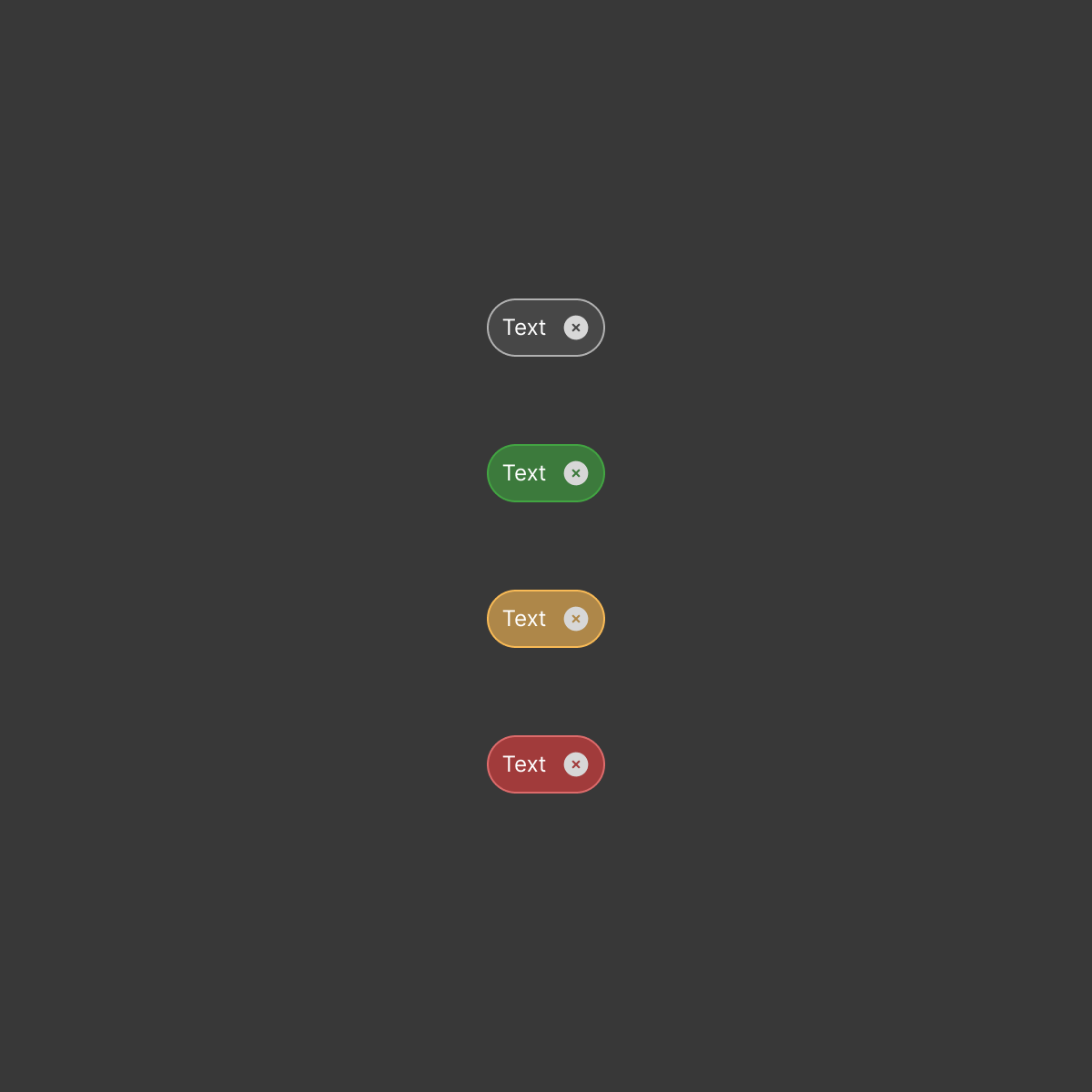
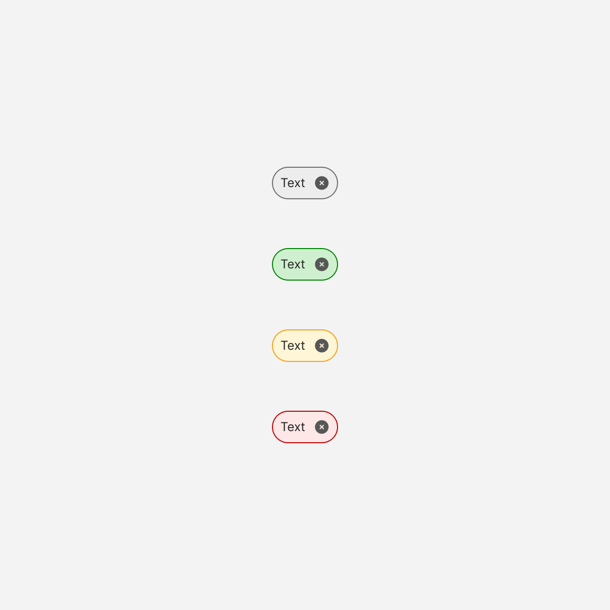
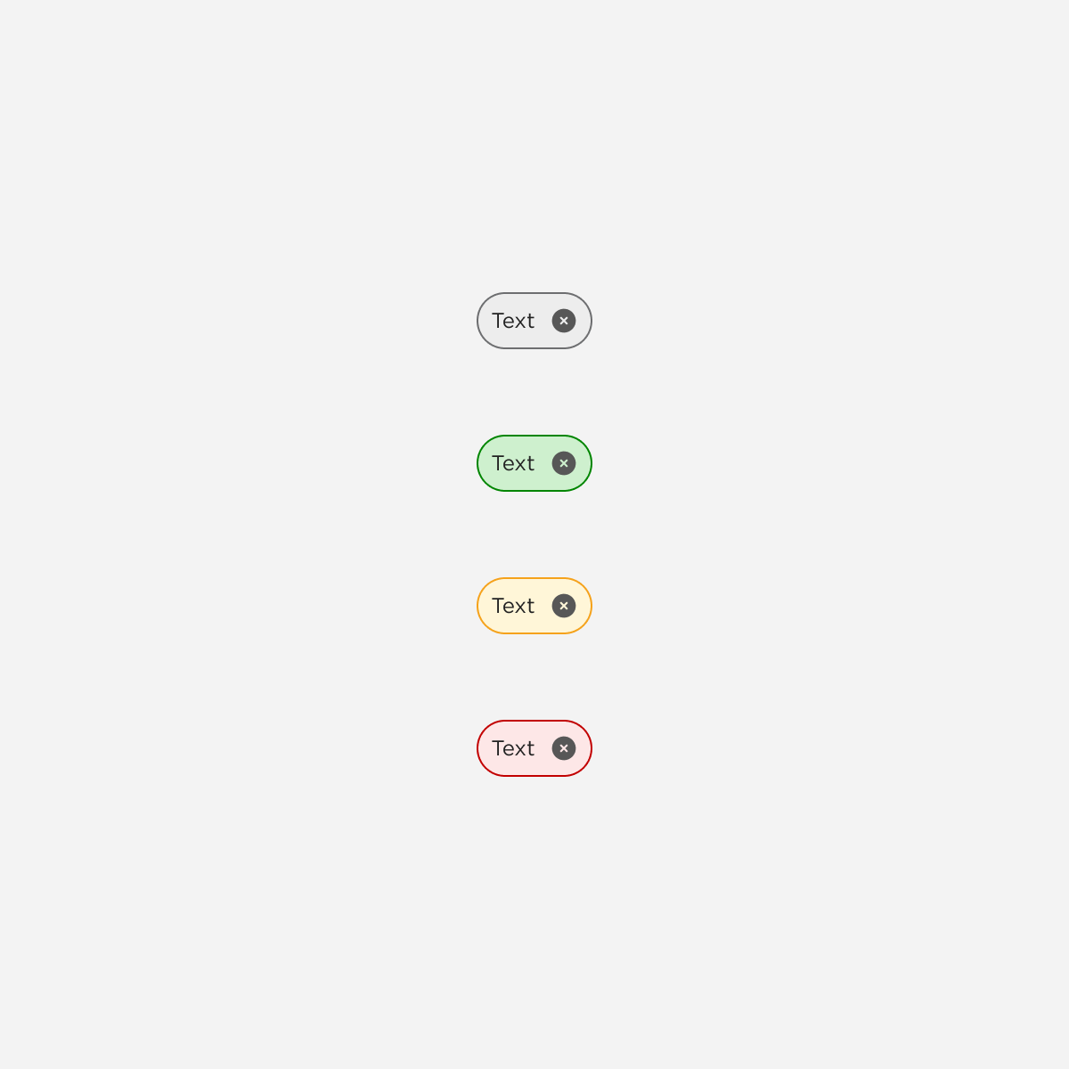
Chips
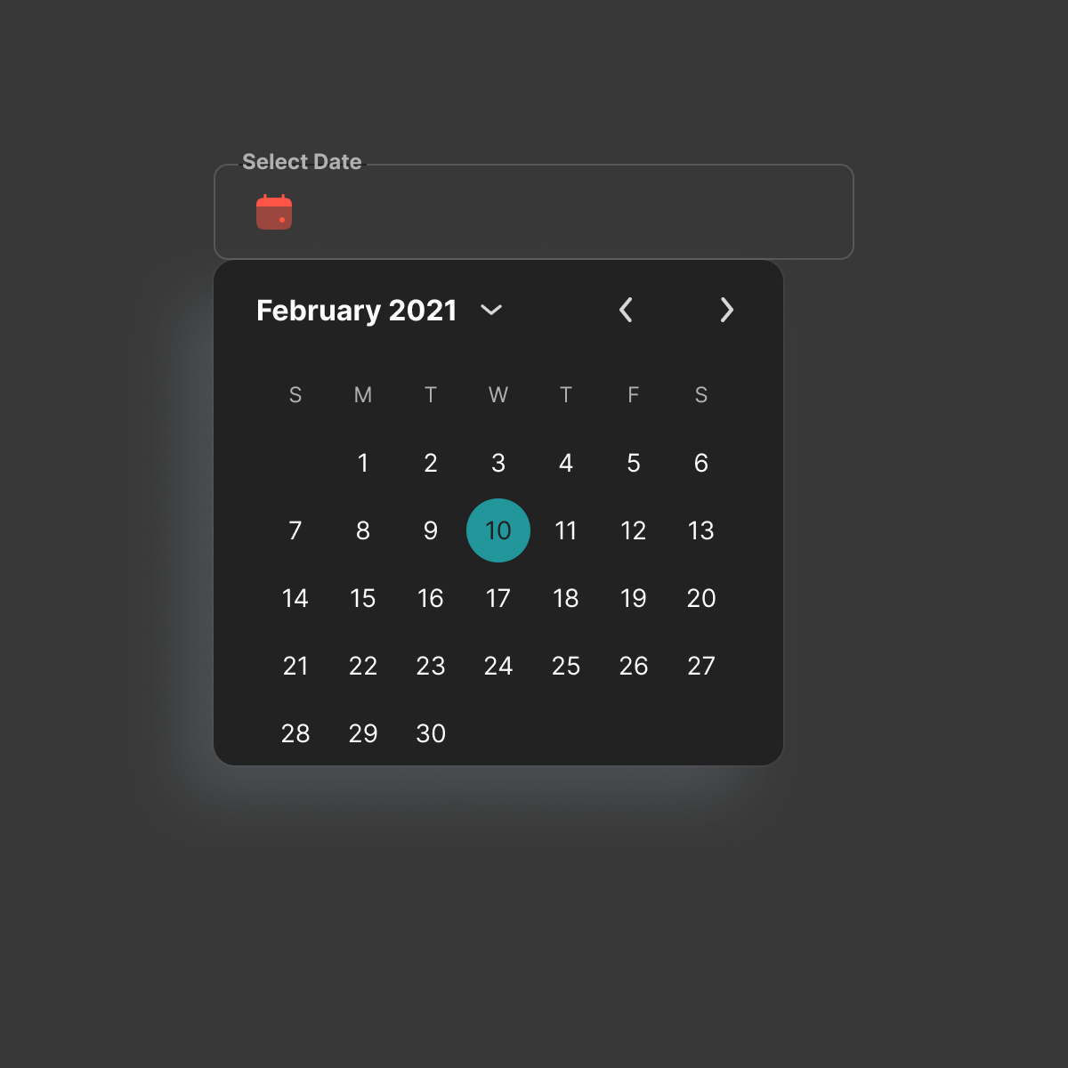
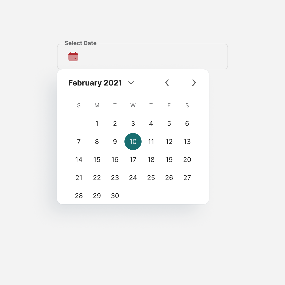
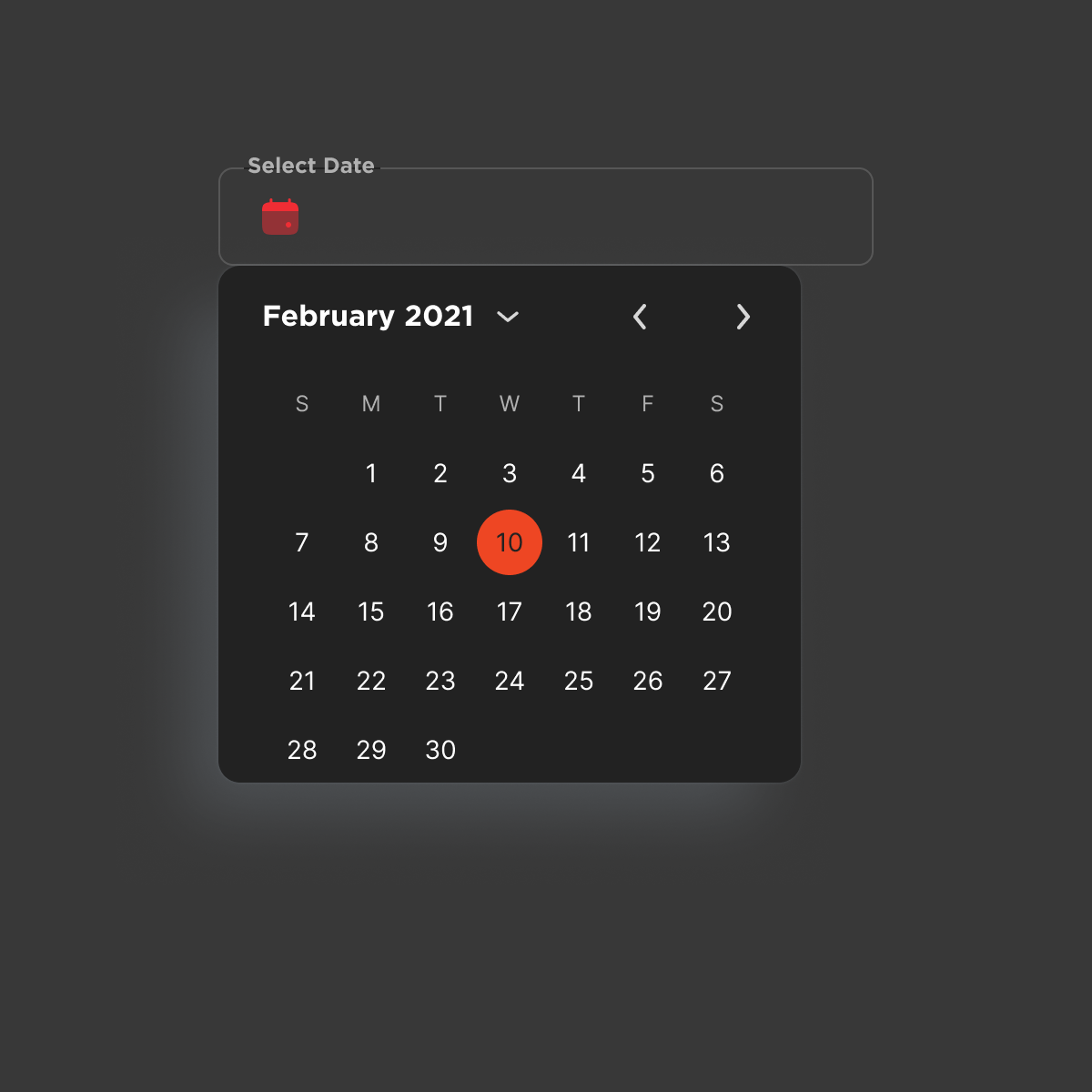
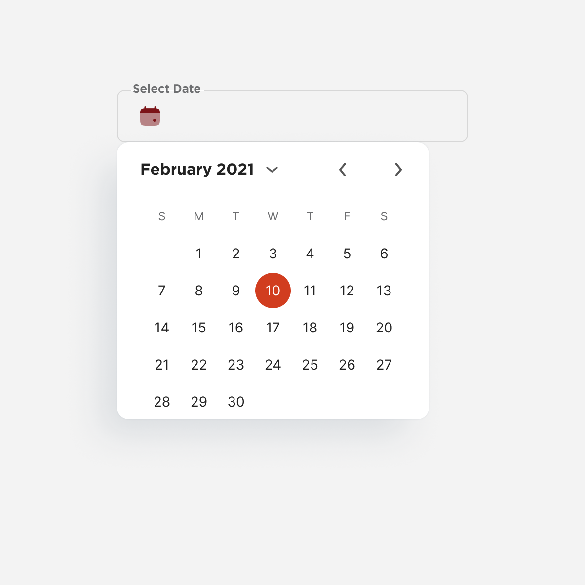
dateselect

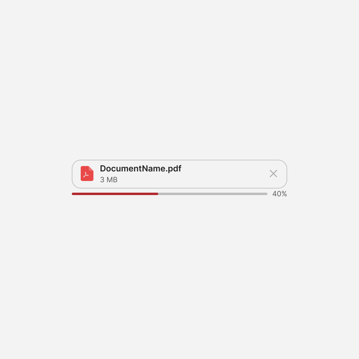
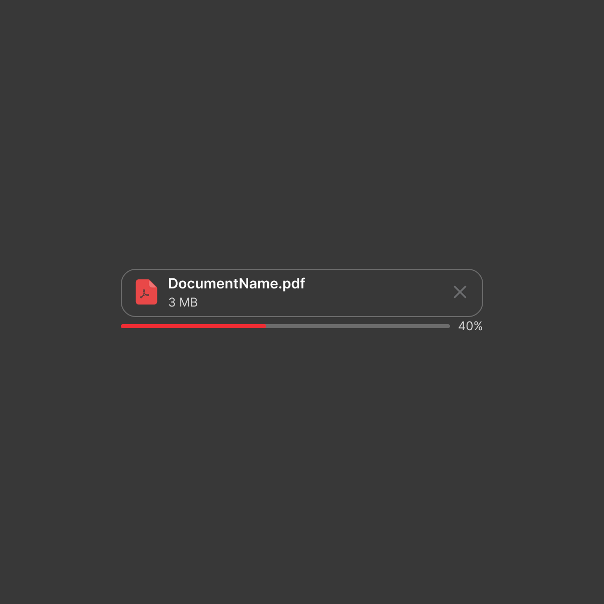

File uploader
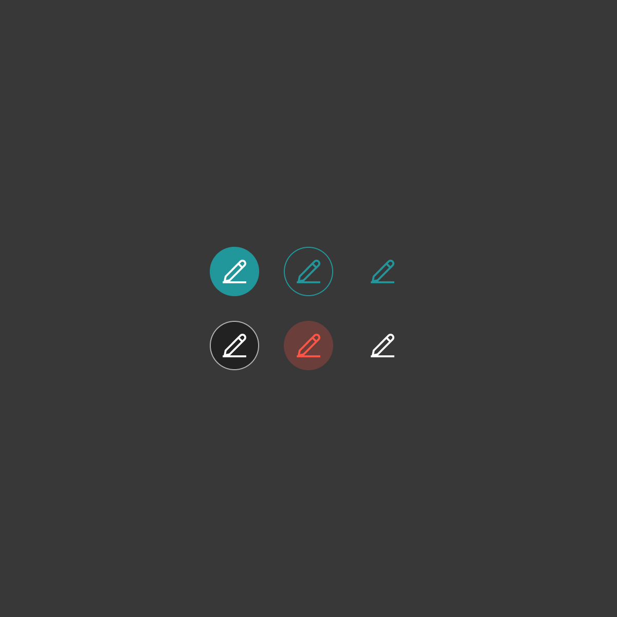
Icon Buttons
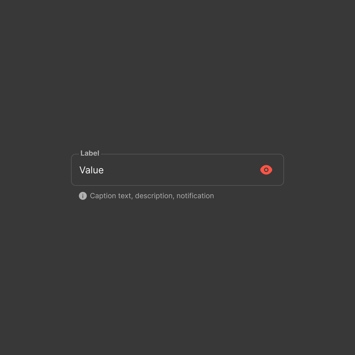
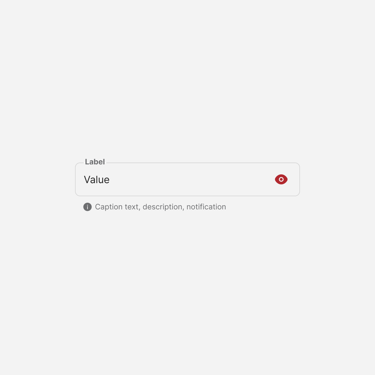
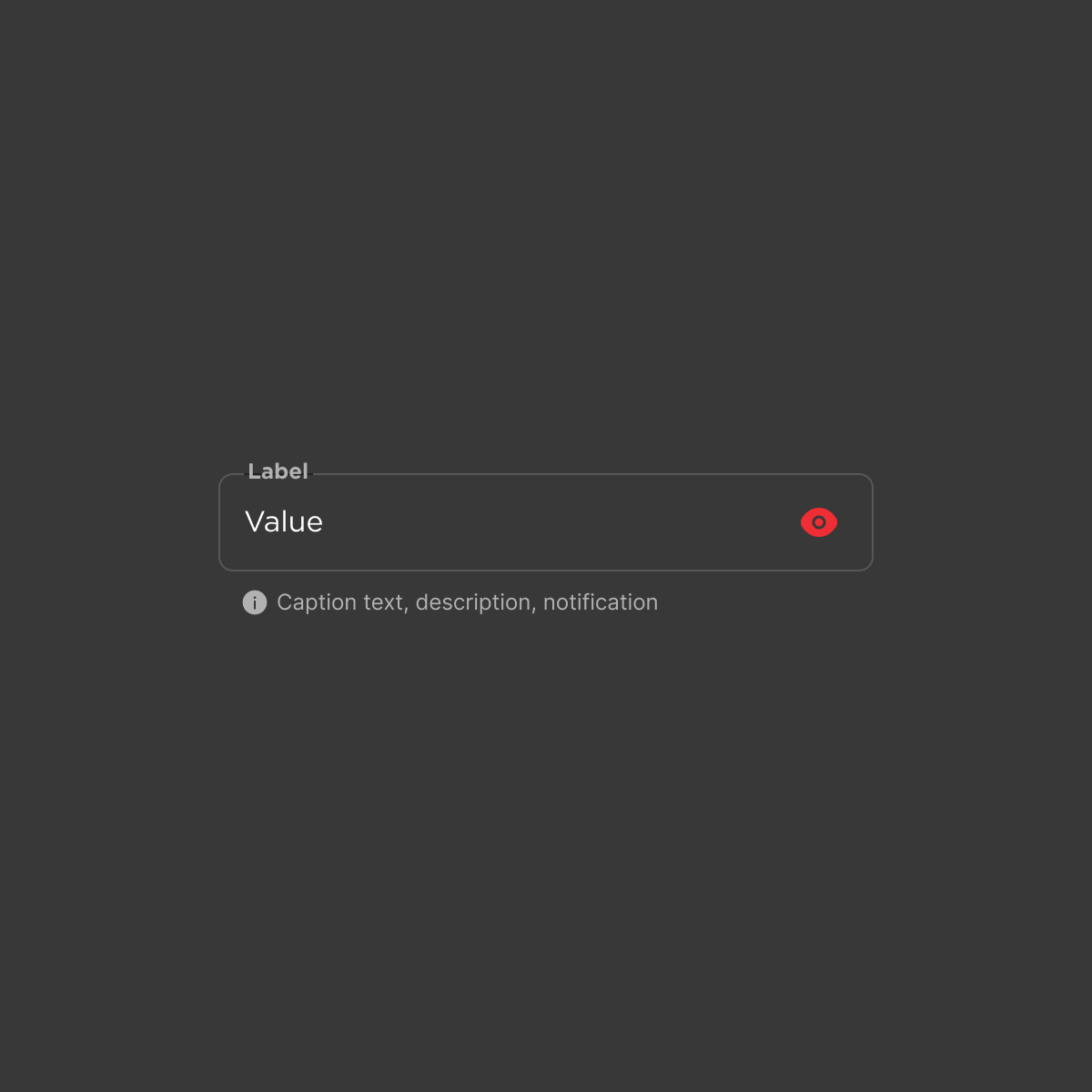
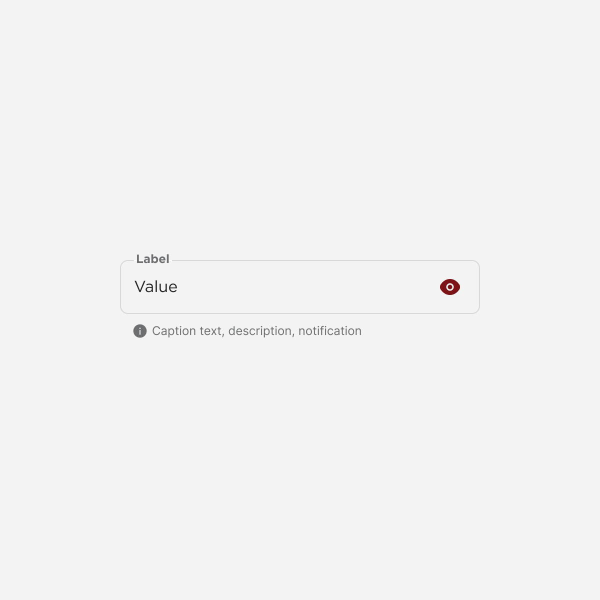
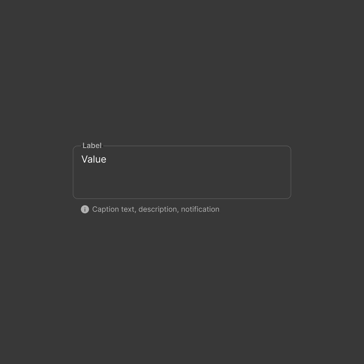
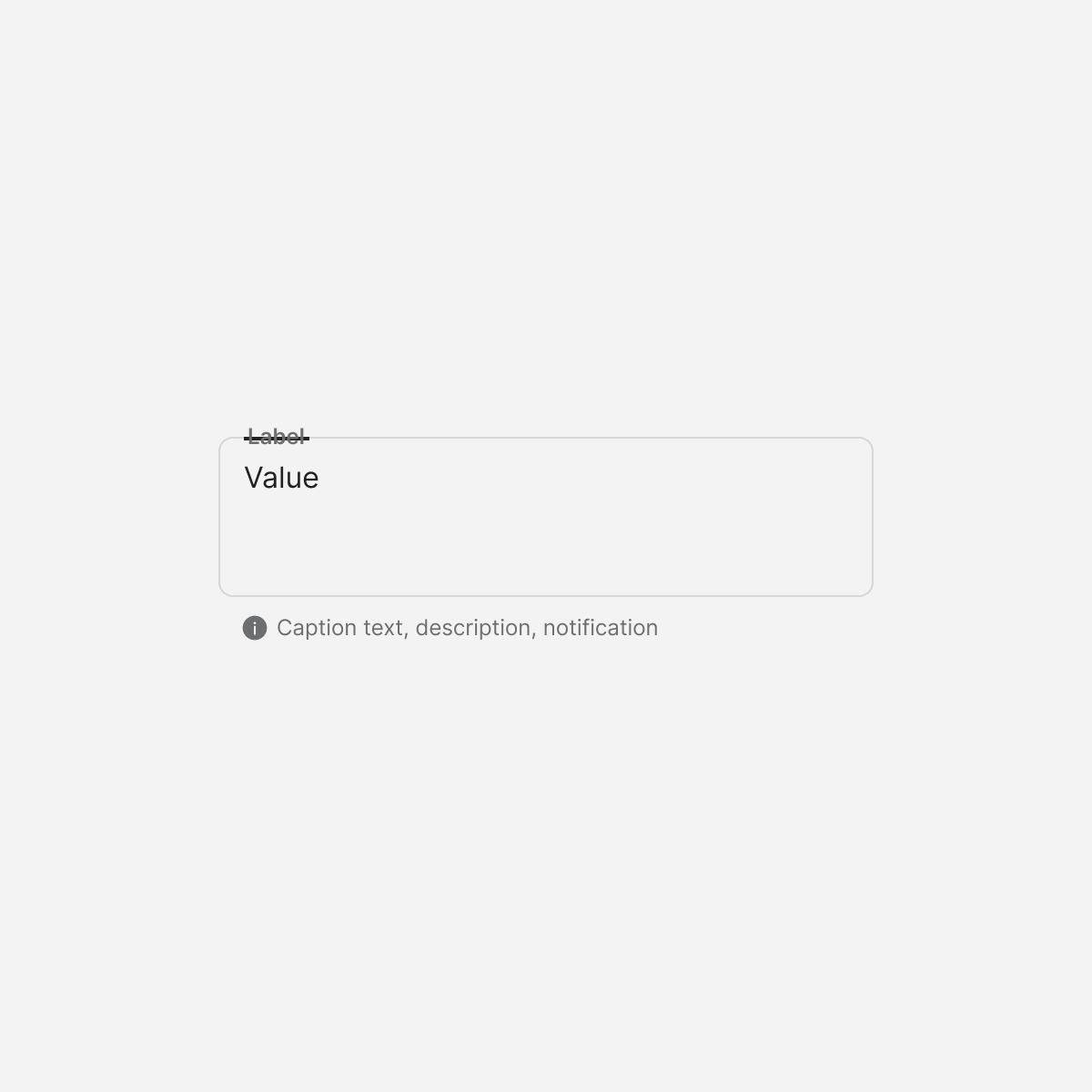
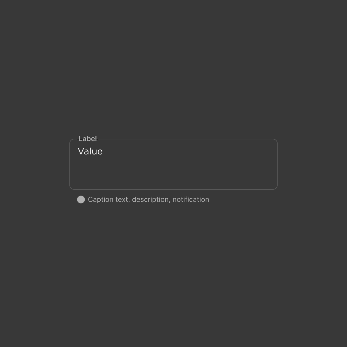
Input-base
Labels


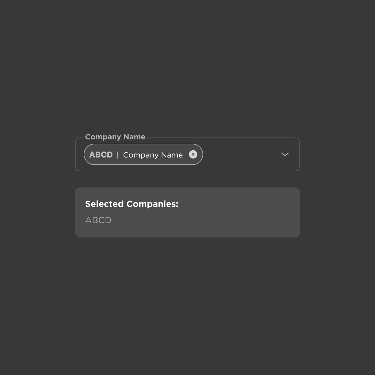
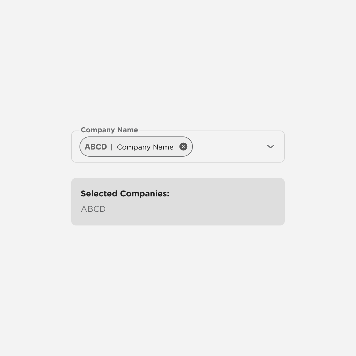
multiselect
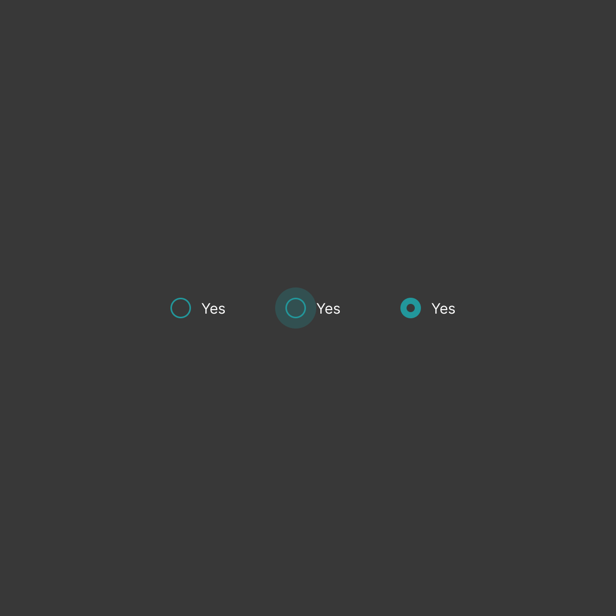
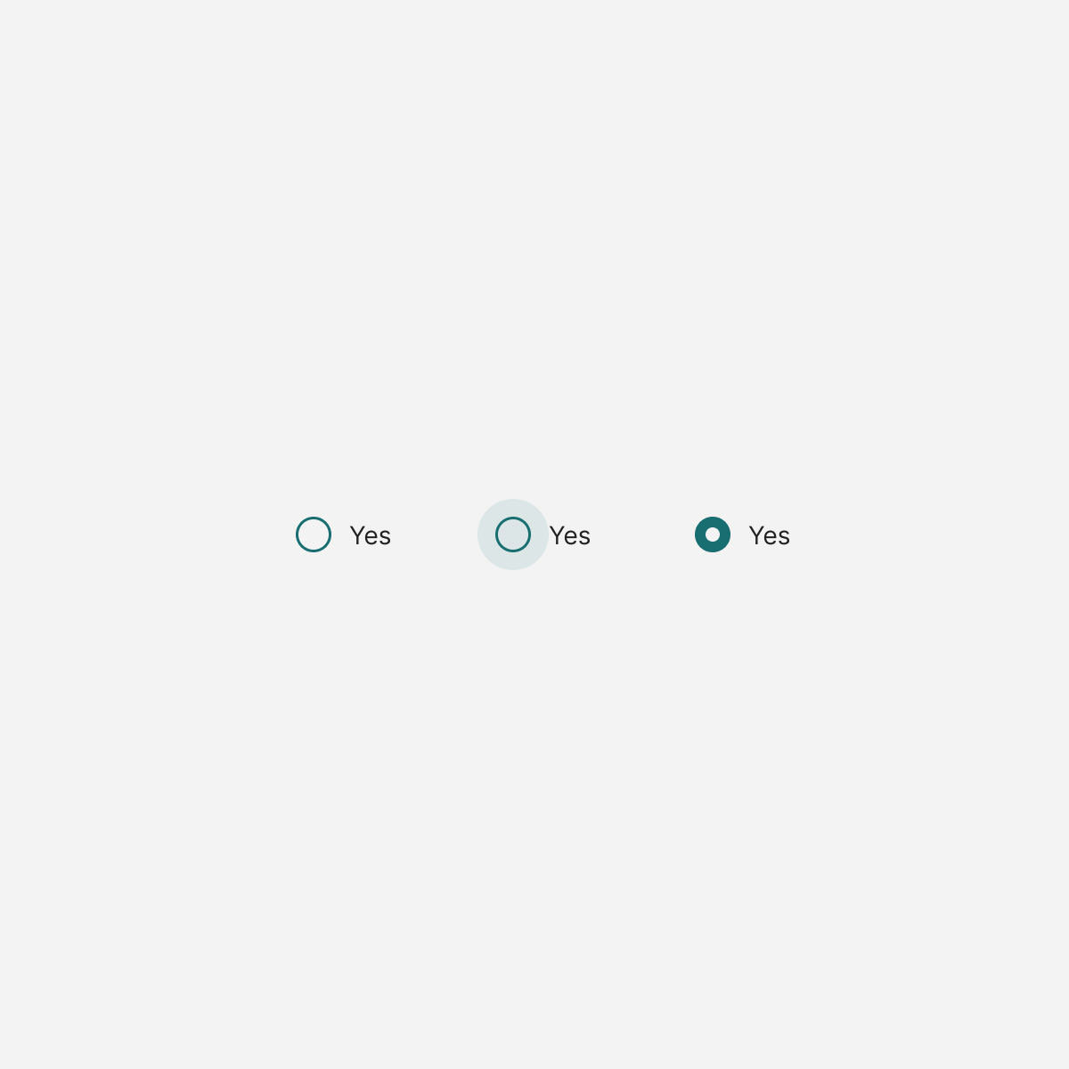

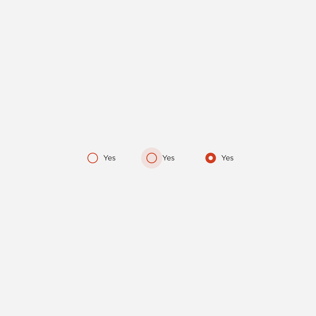
radio

Scroll
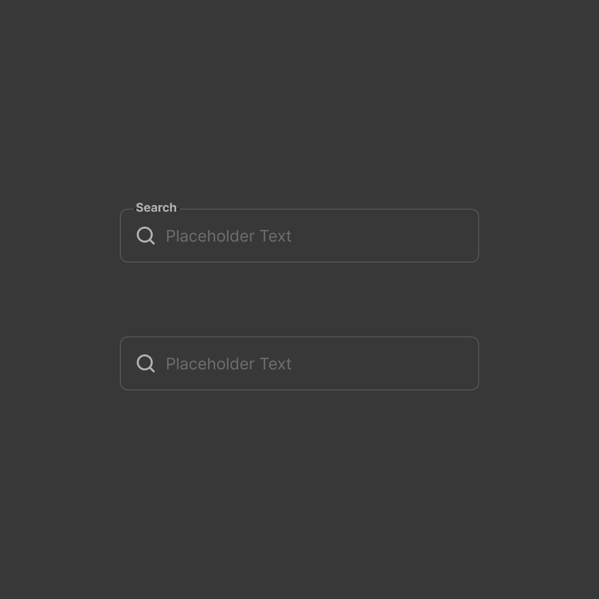
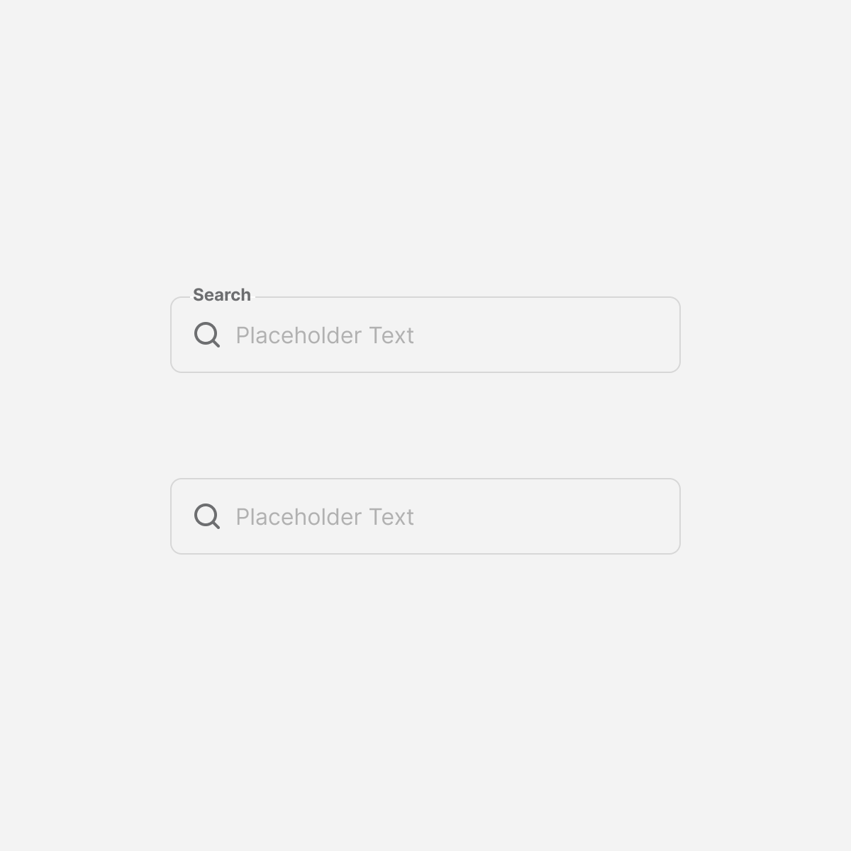
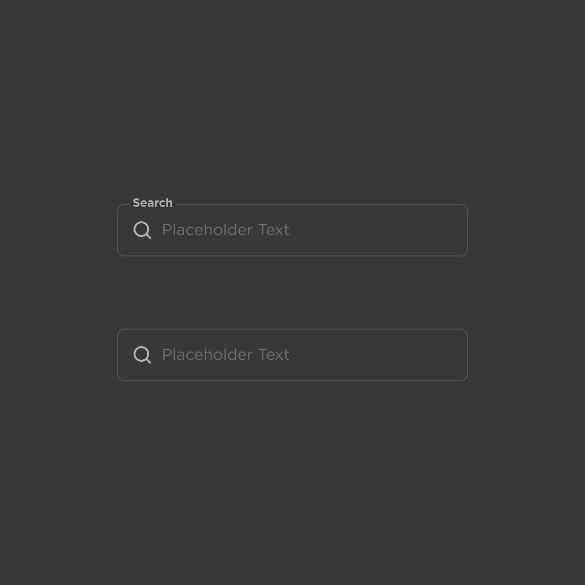
search
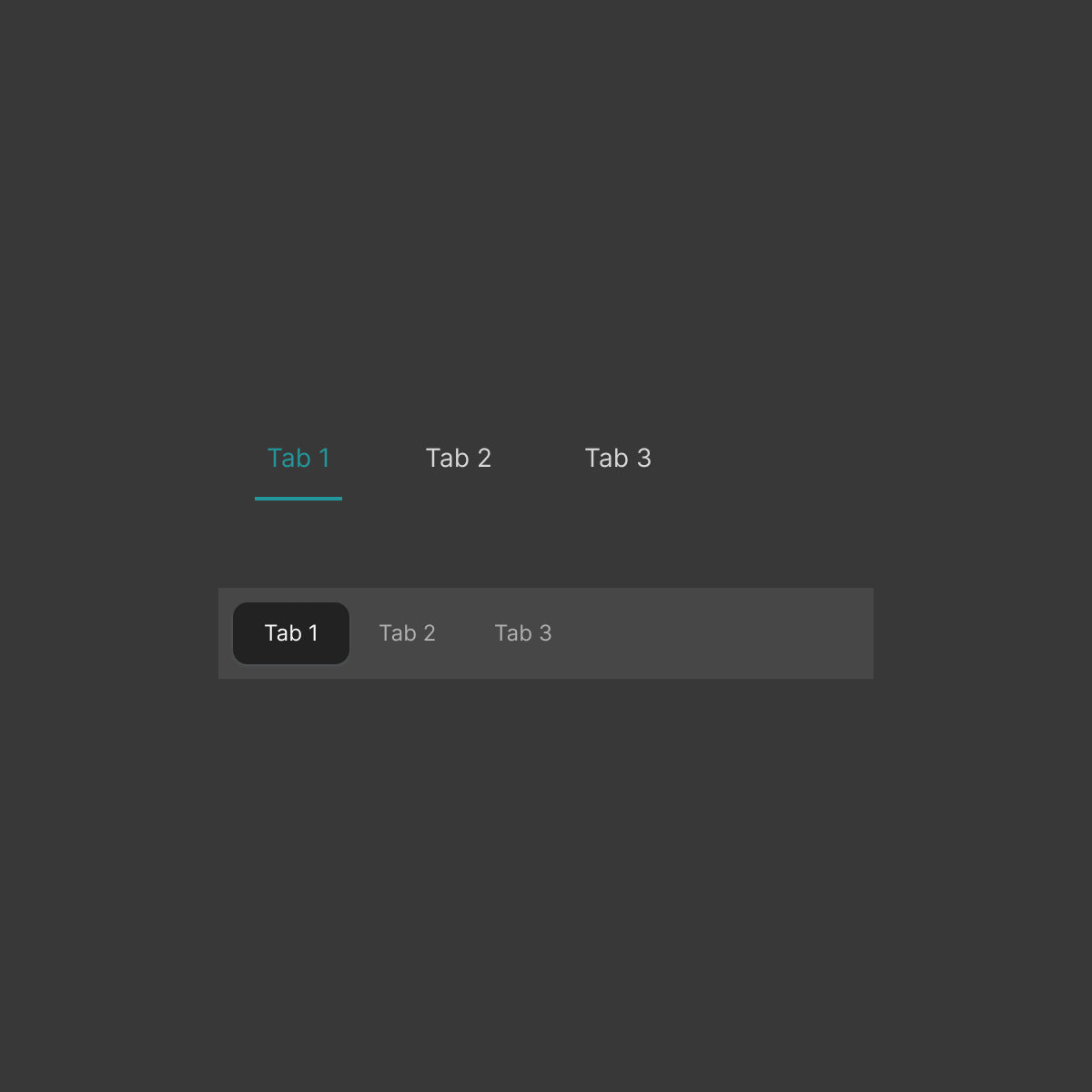
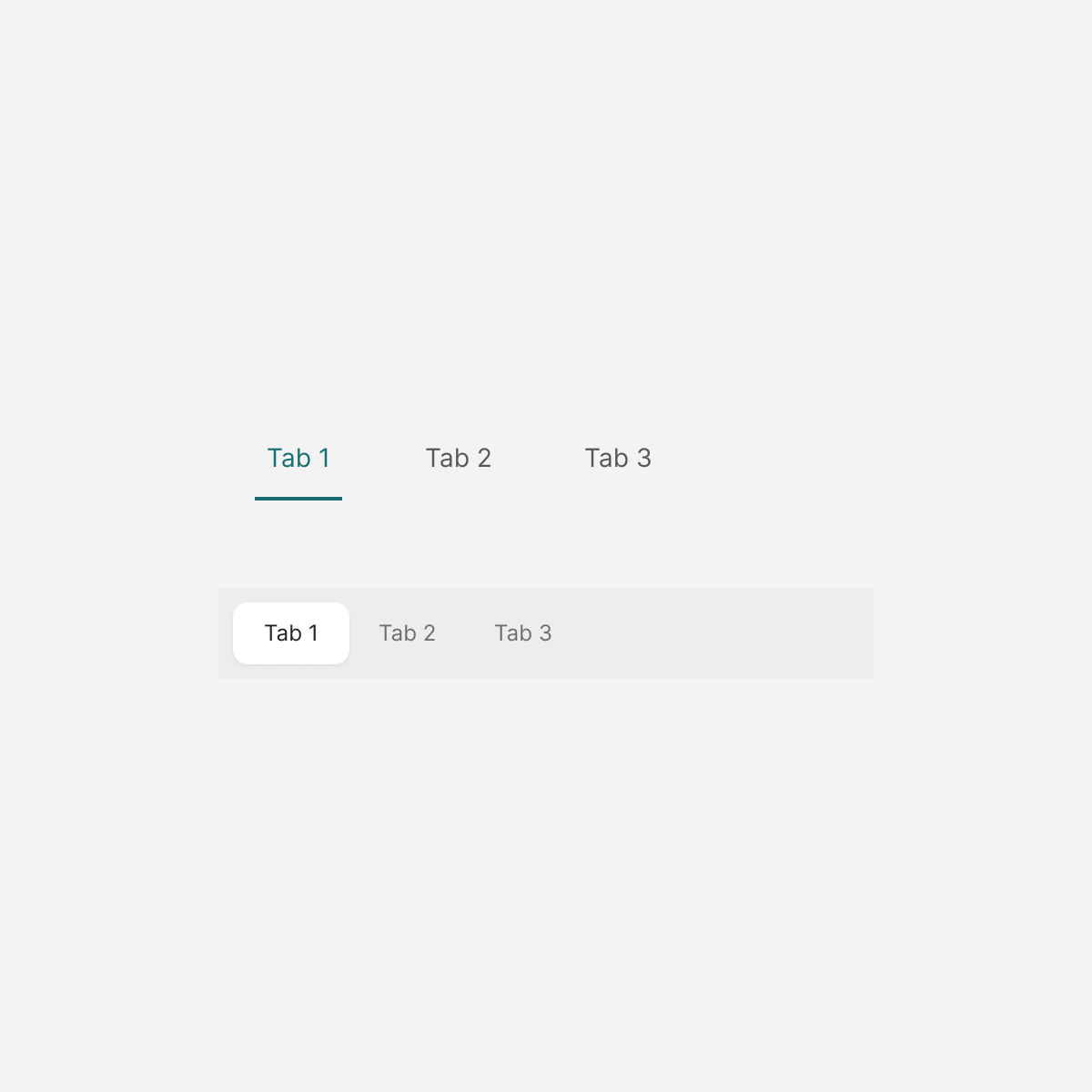
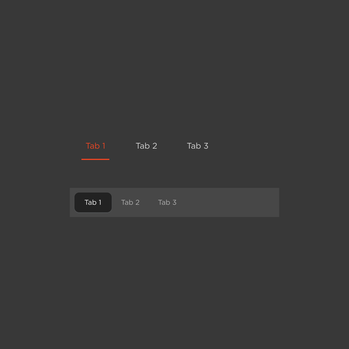
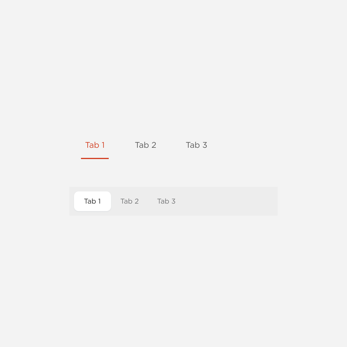
Tabs
textarea

Timer
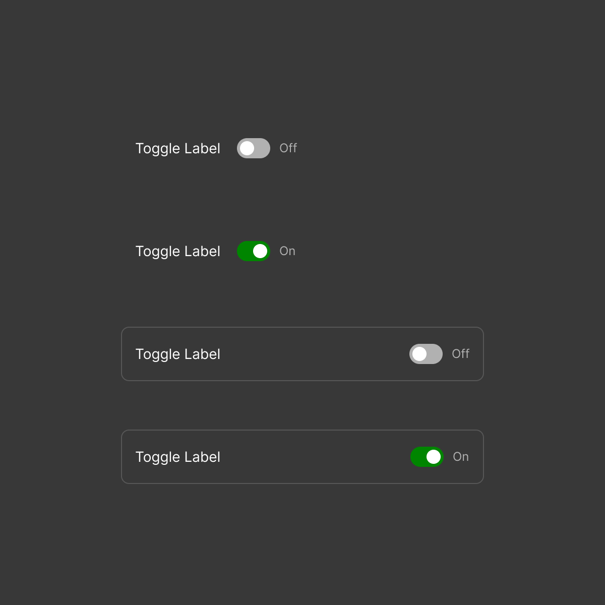
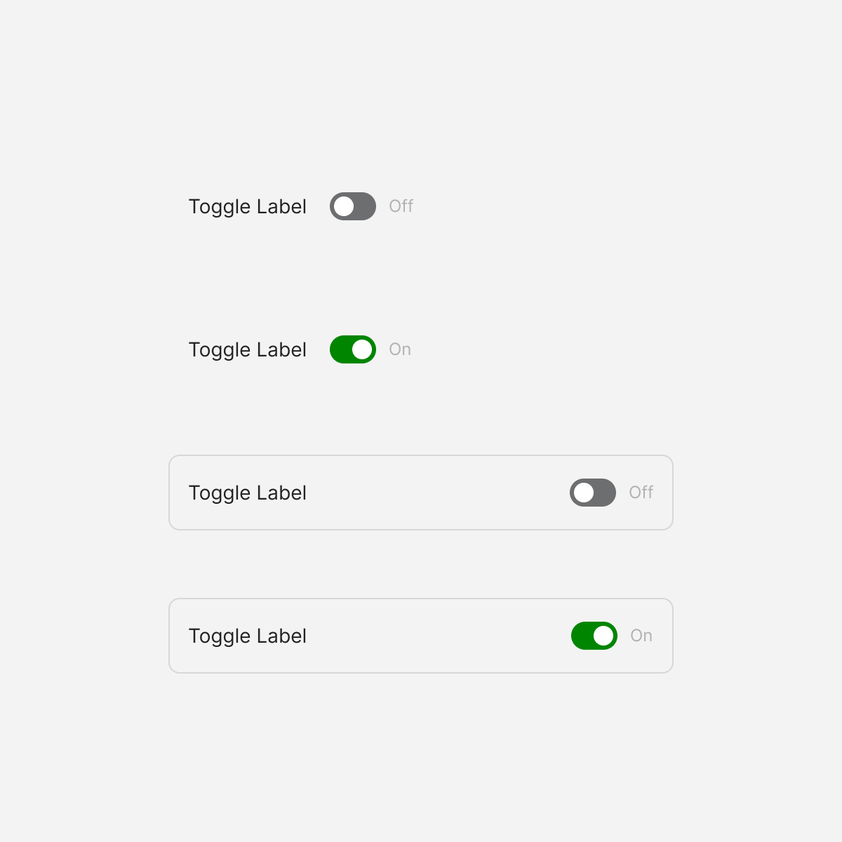
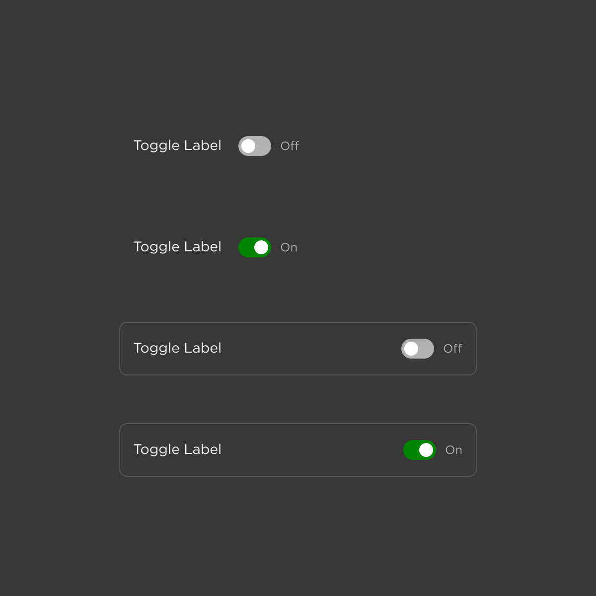
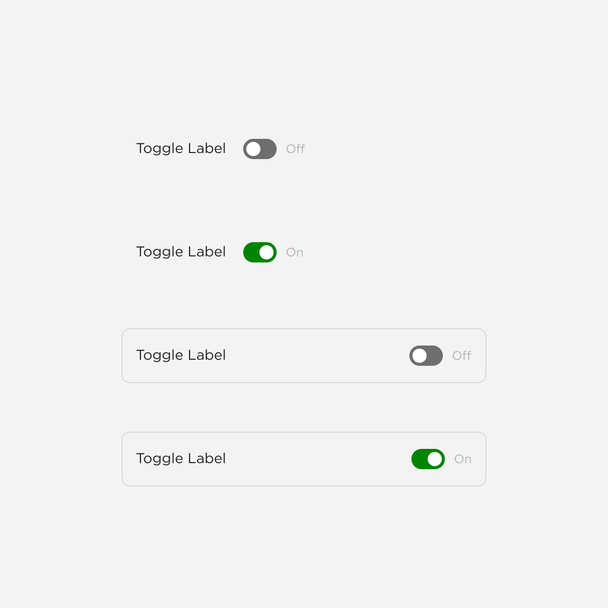
Toggle
Organisms
Composite components that combine molecules into functional interface sections
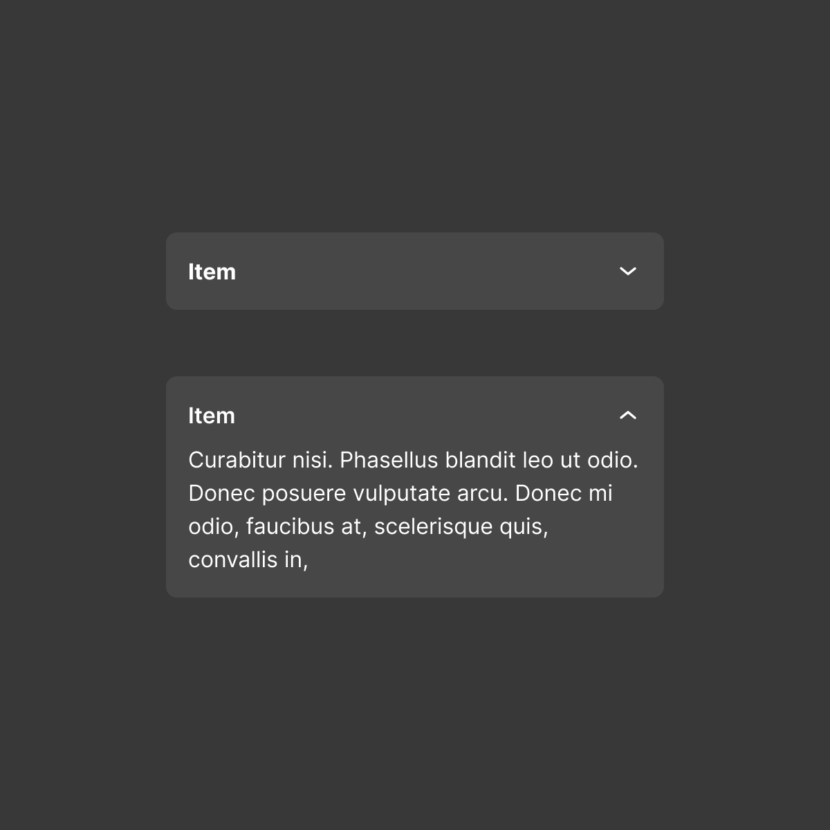
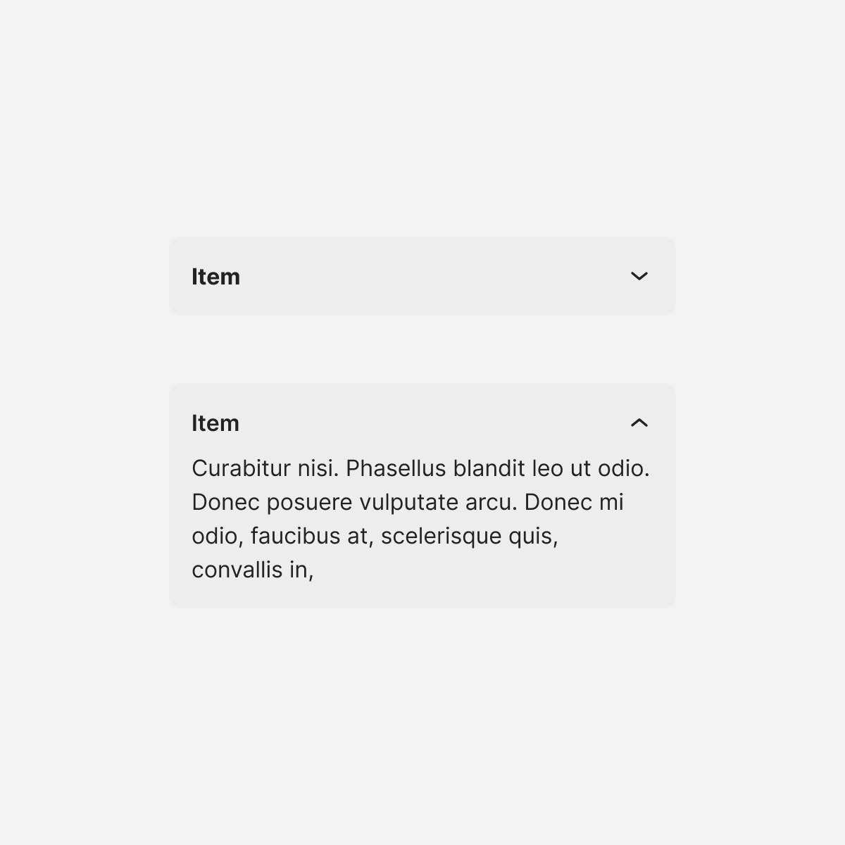
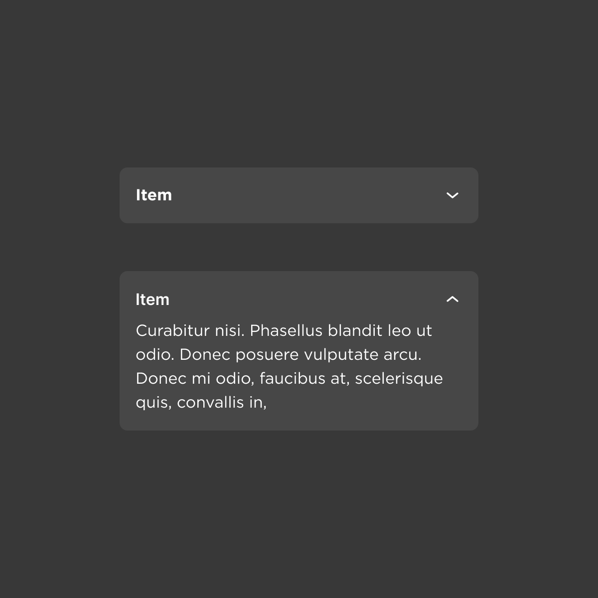
Accordion
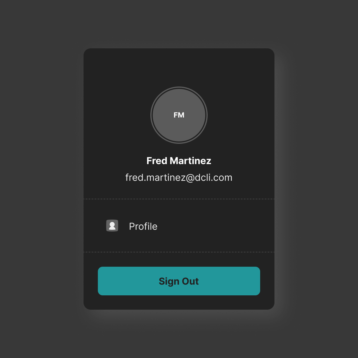
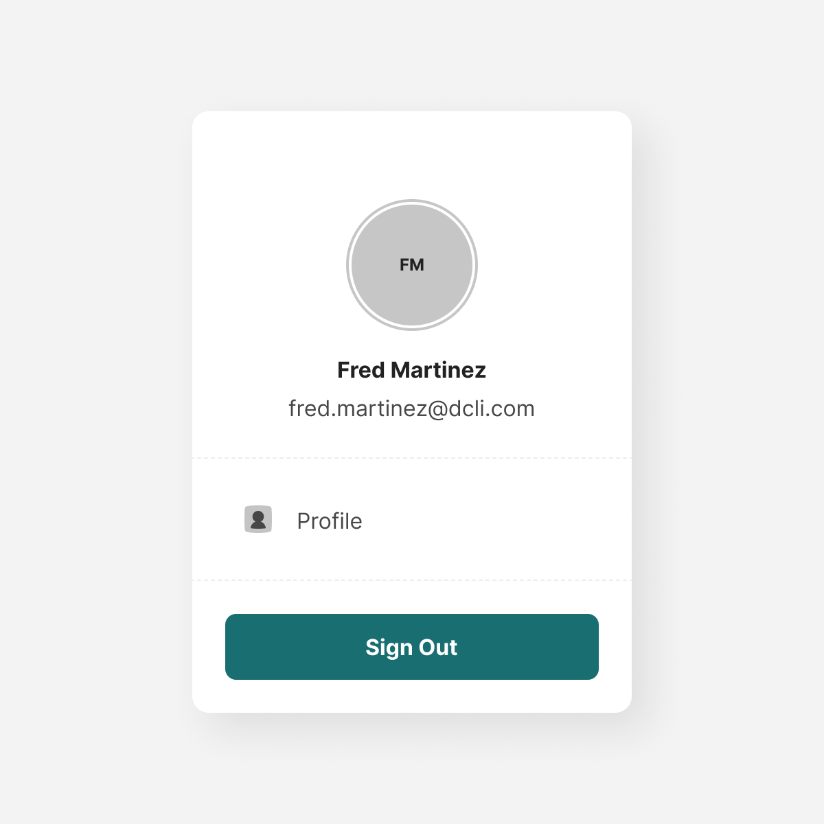
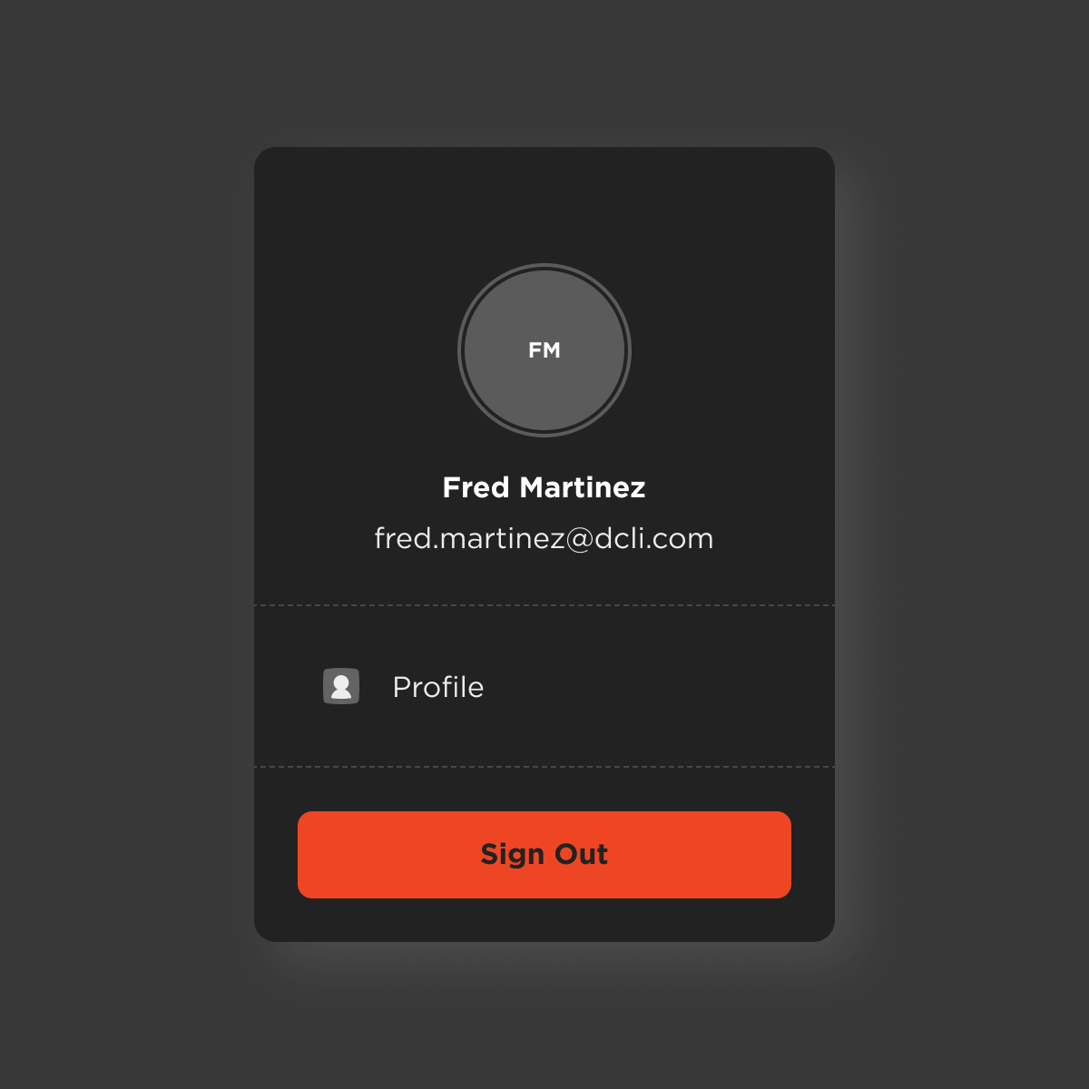
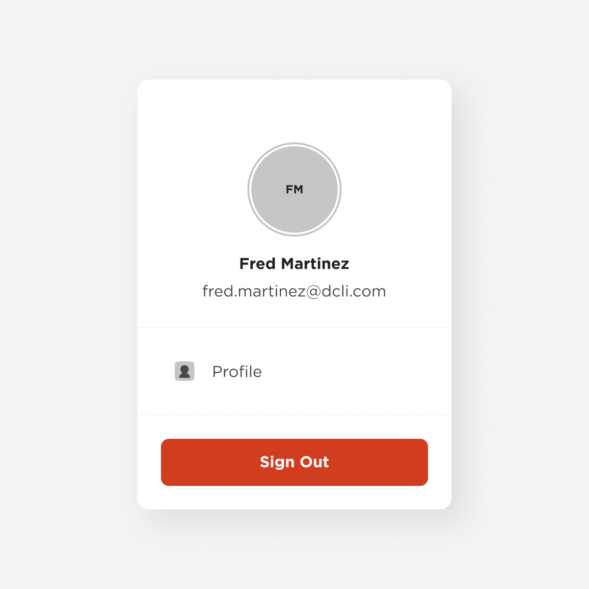
Account Drawer
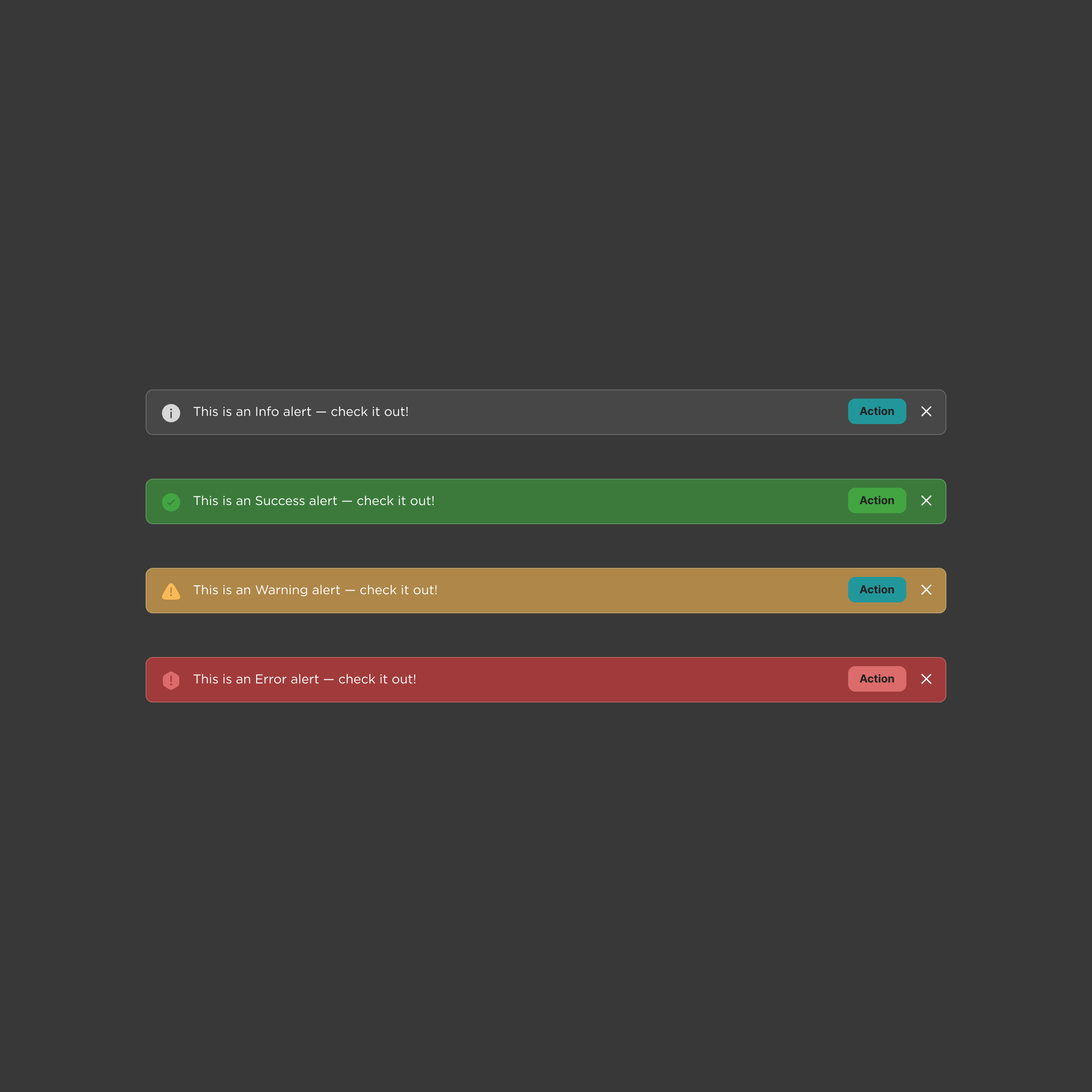
Alert
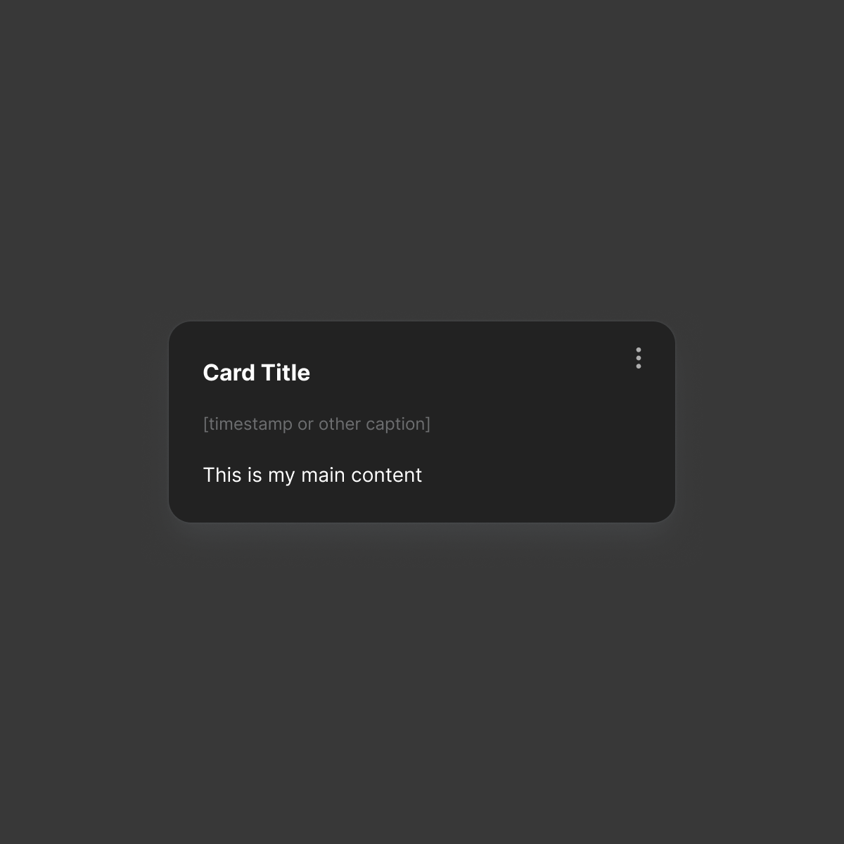
Card: Generic
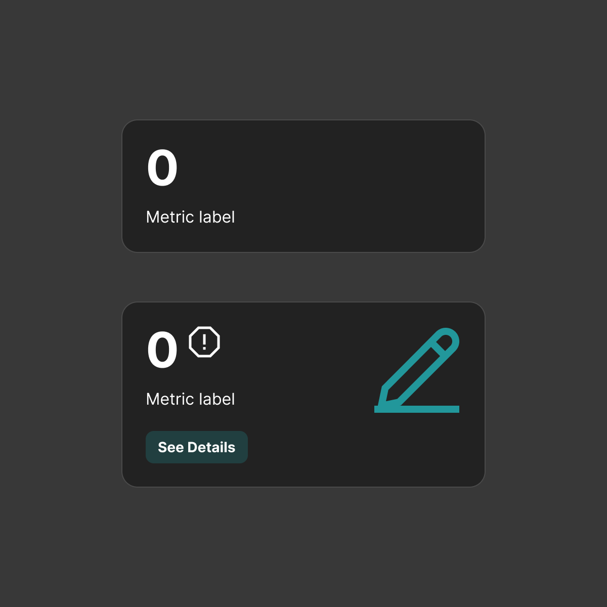
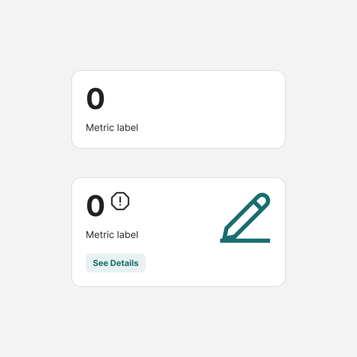
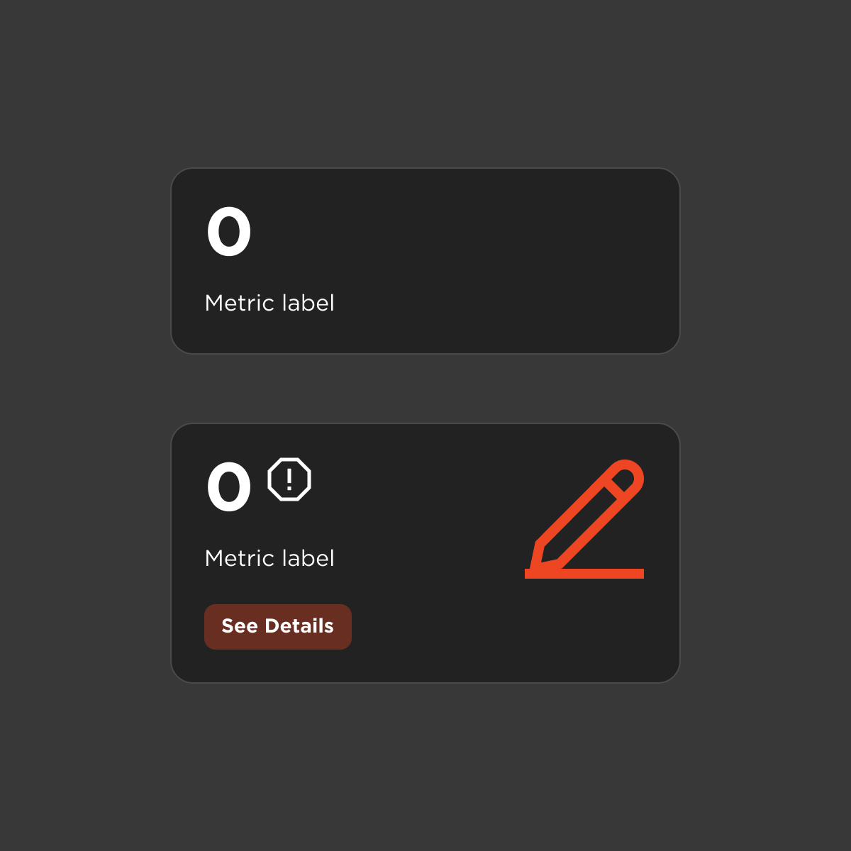
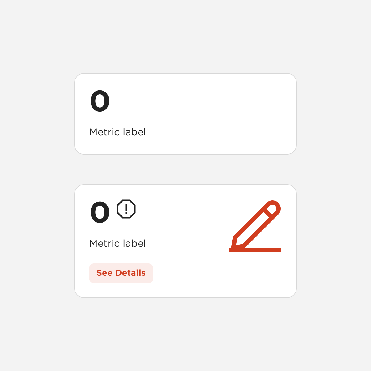
Card: KPI
Tabs
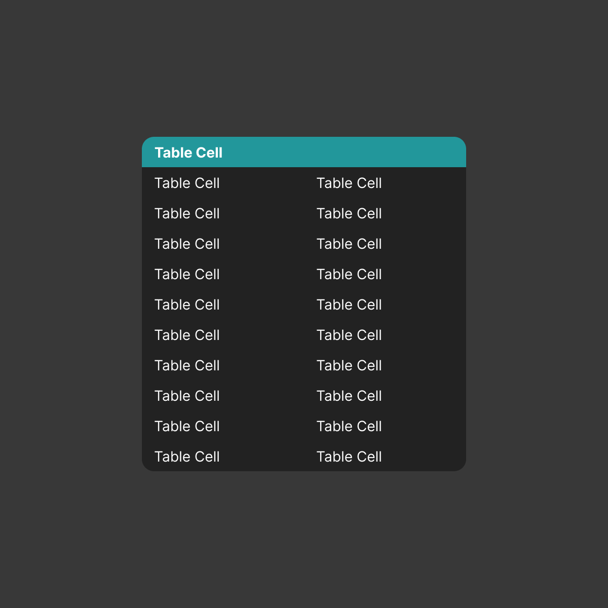
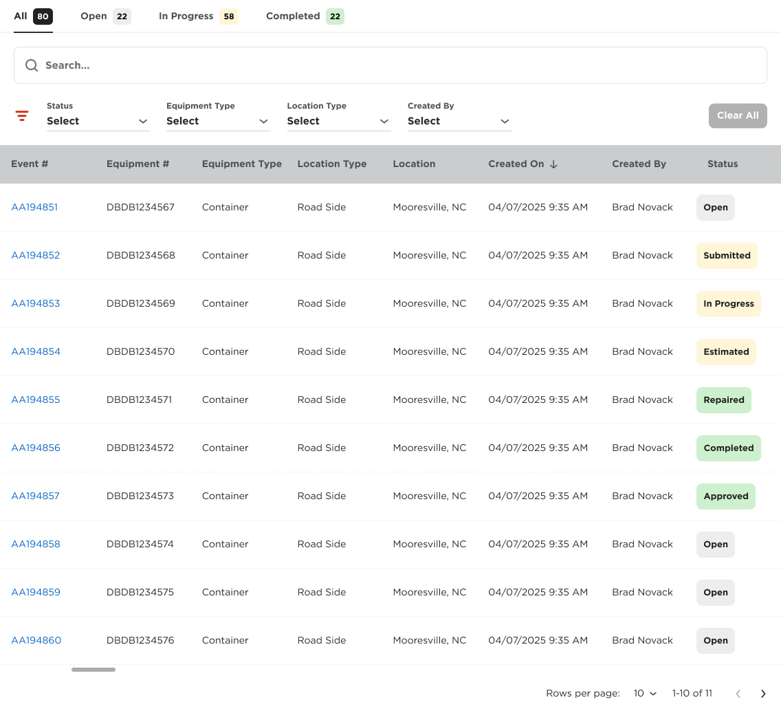
Detail Table
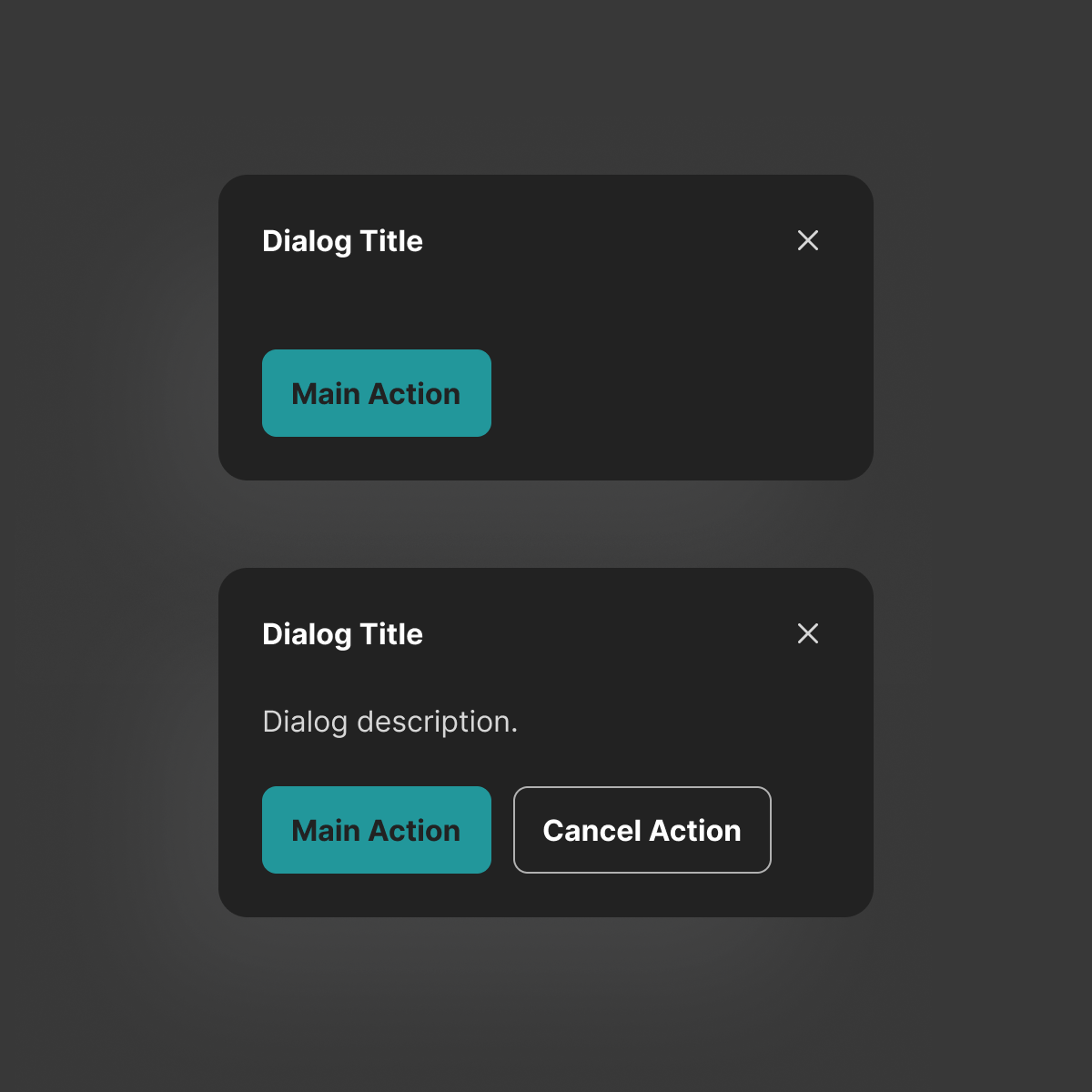
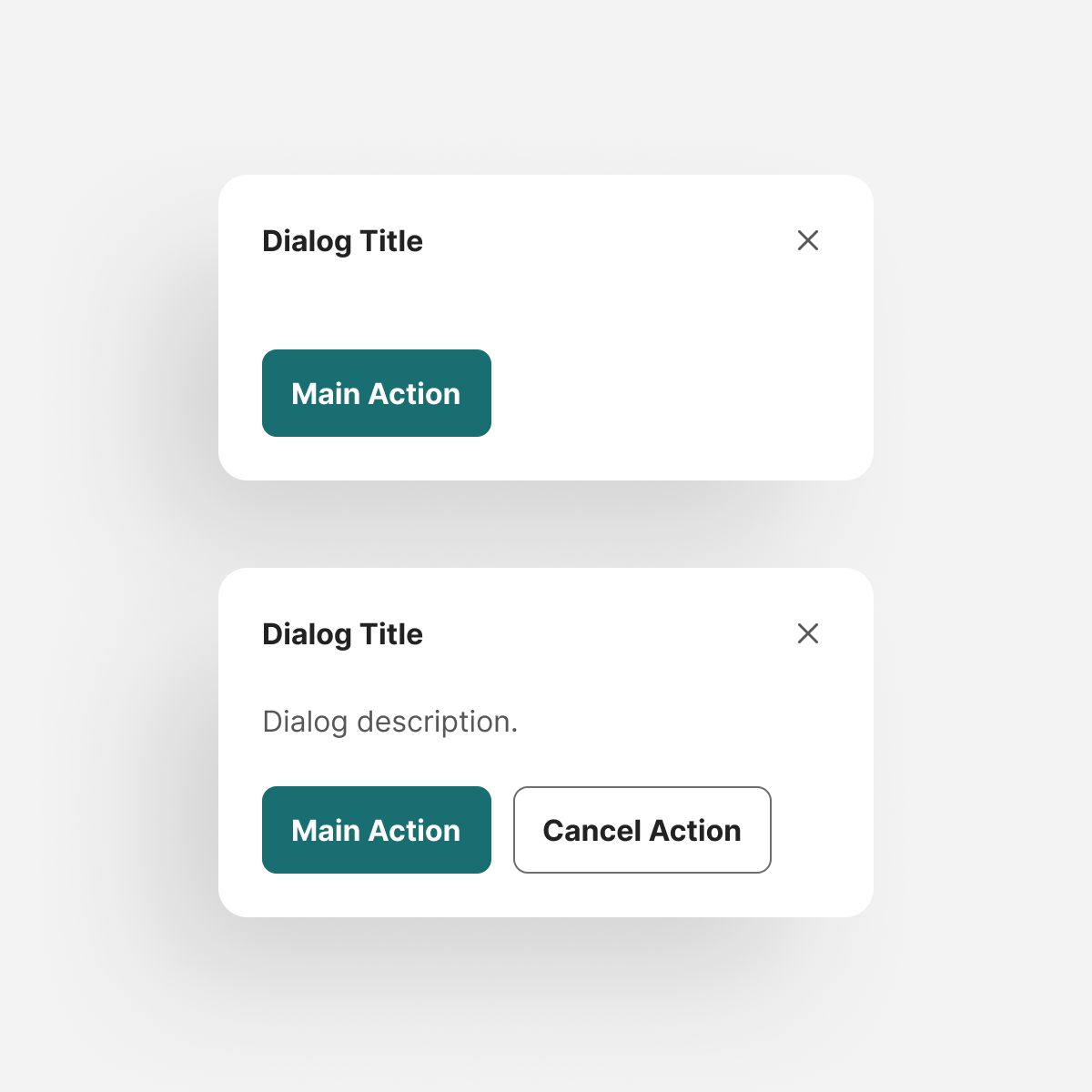
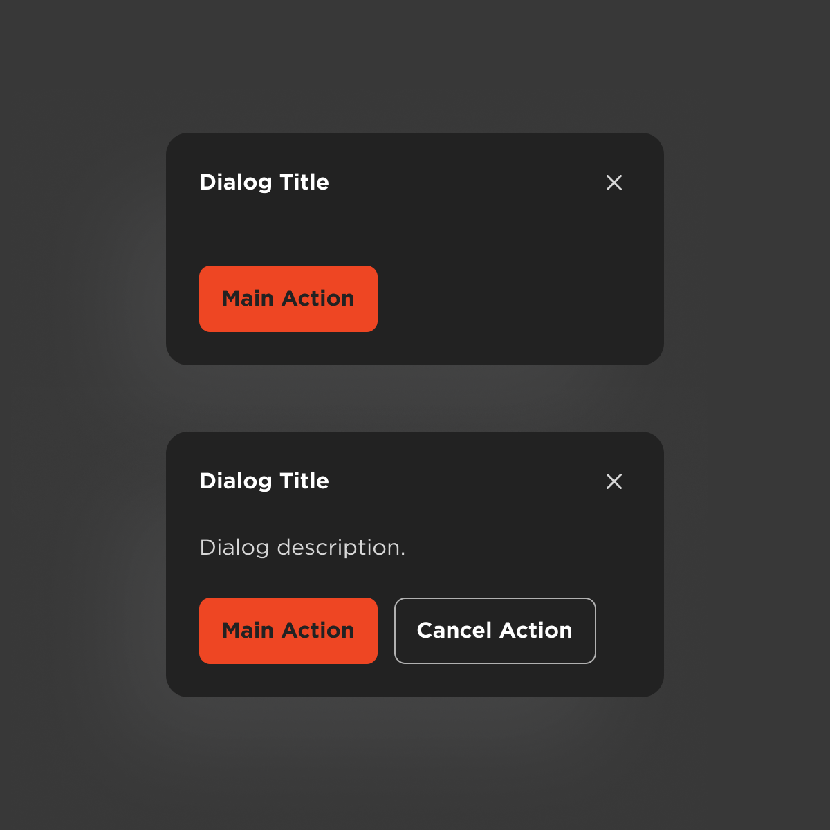
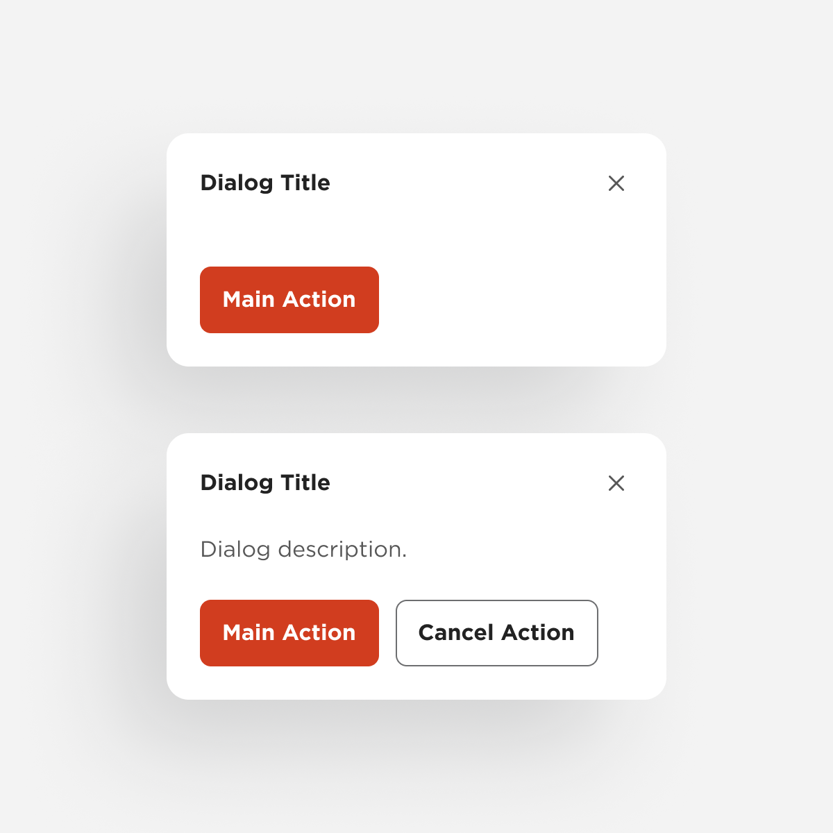
Dialog


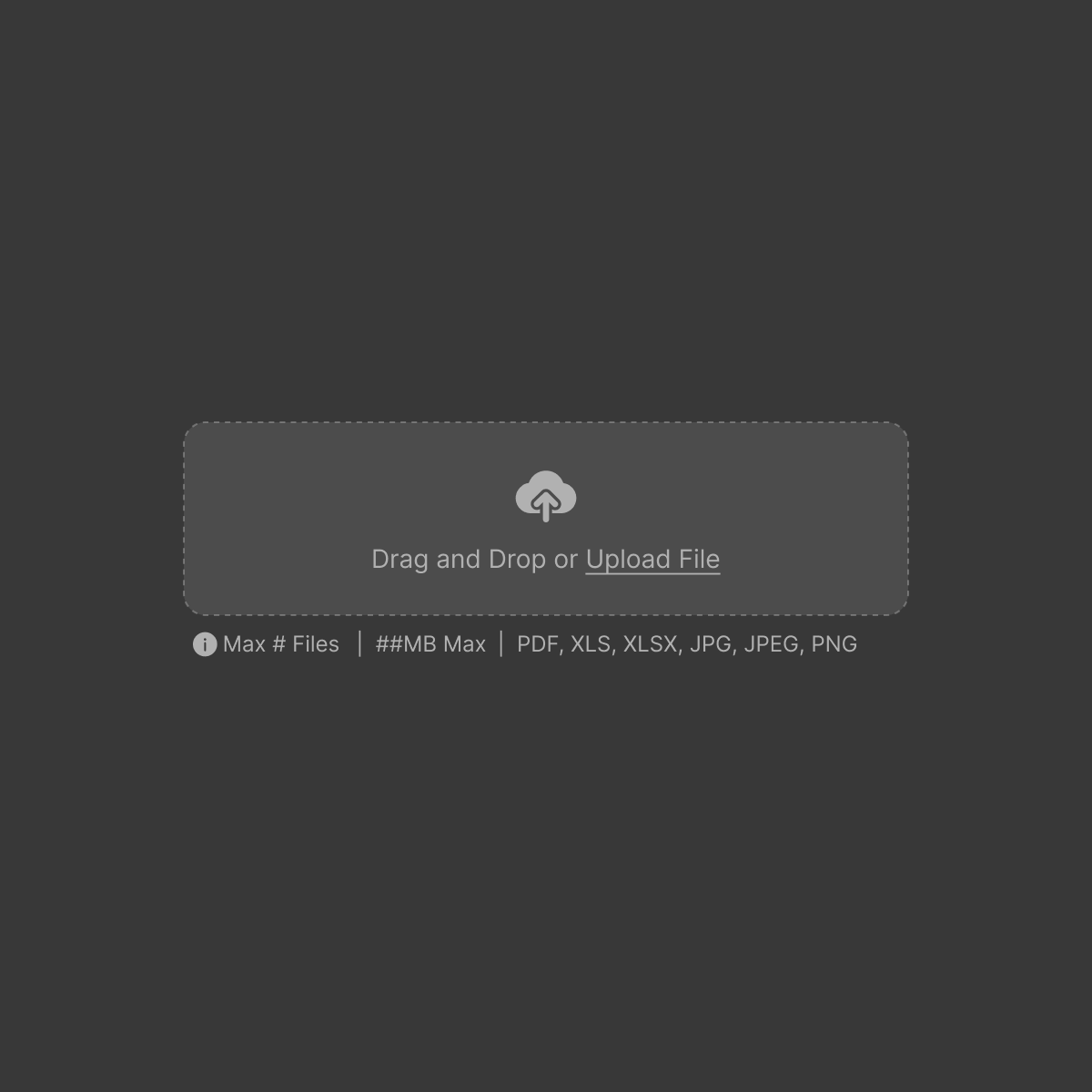
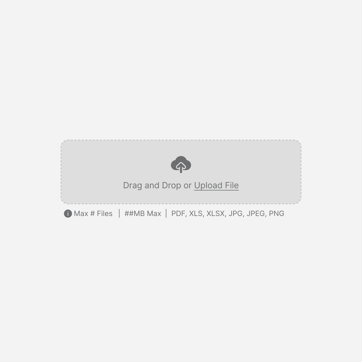
File Uploader
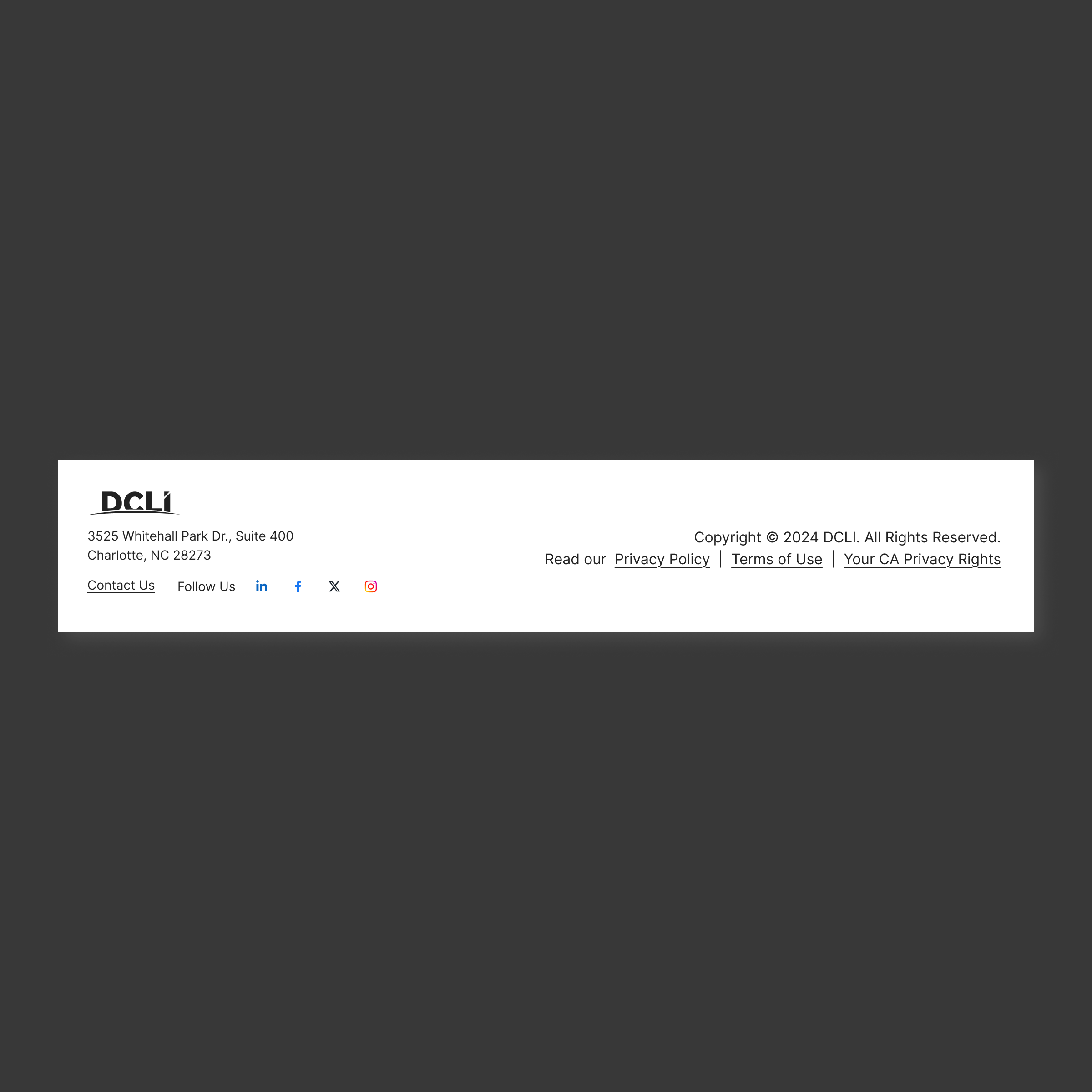
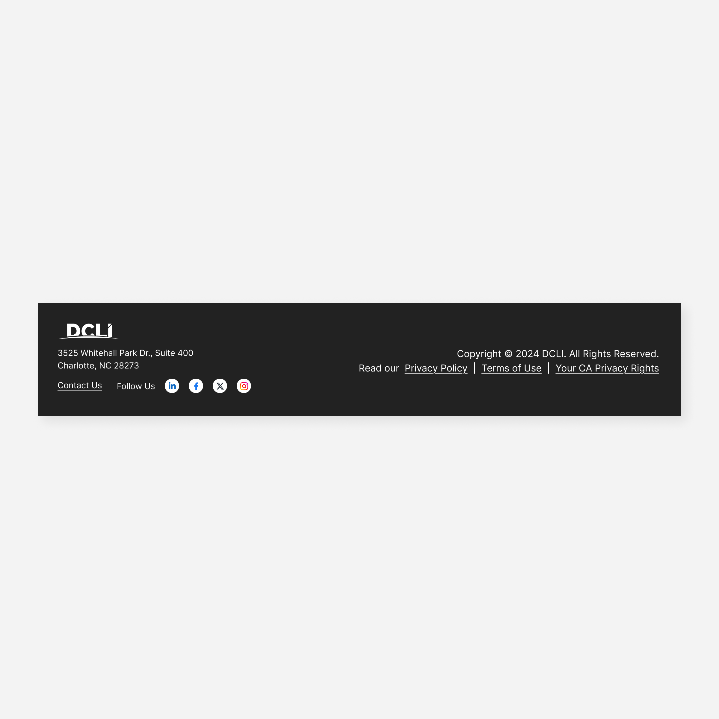
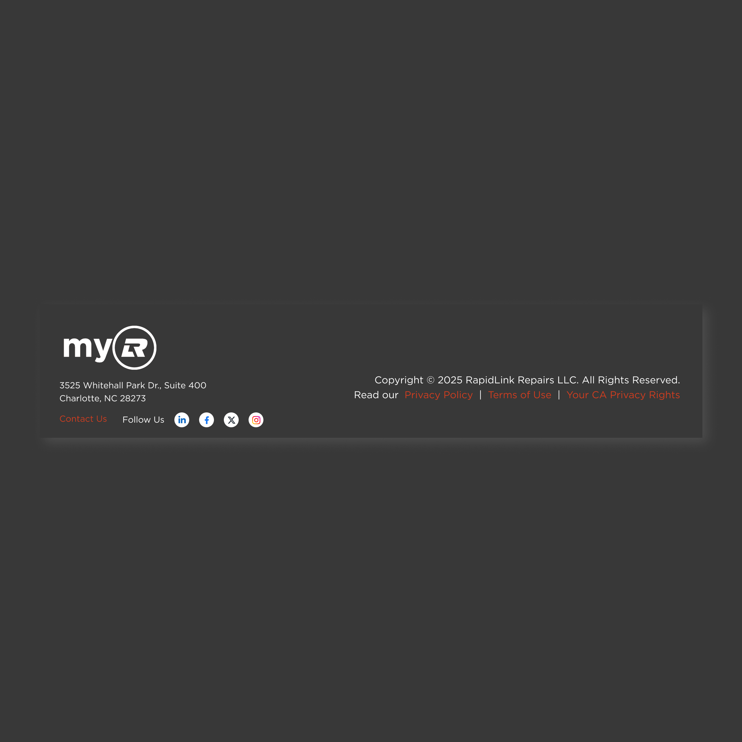
Footer
Footer: small

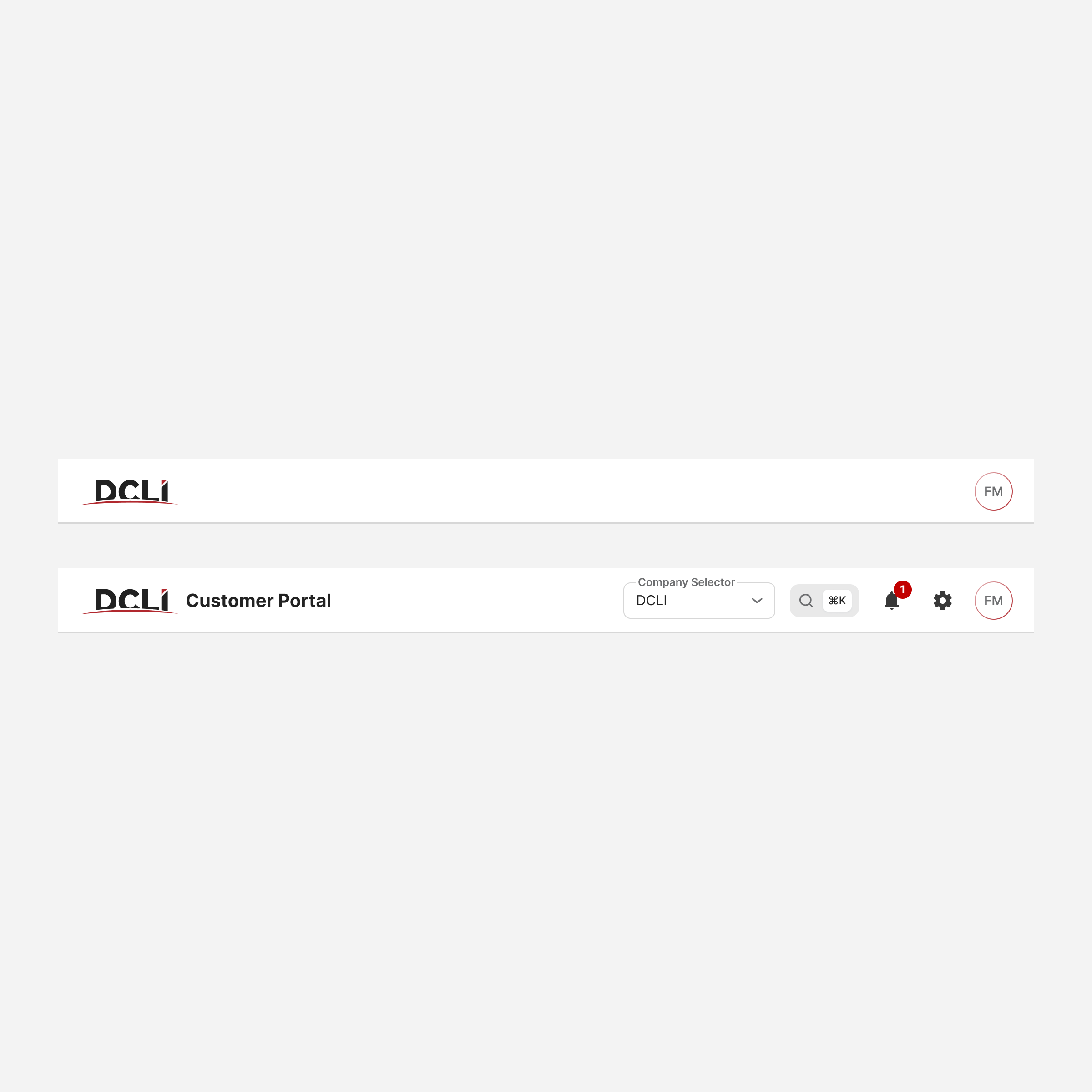
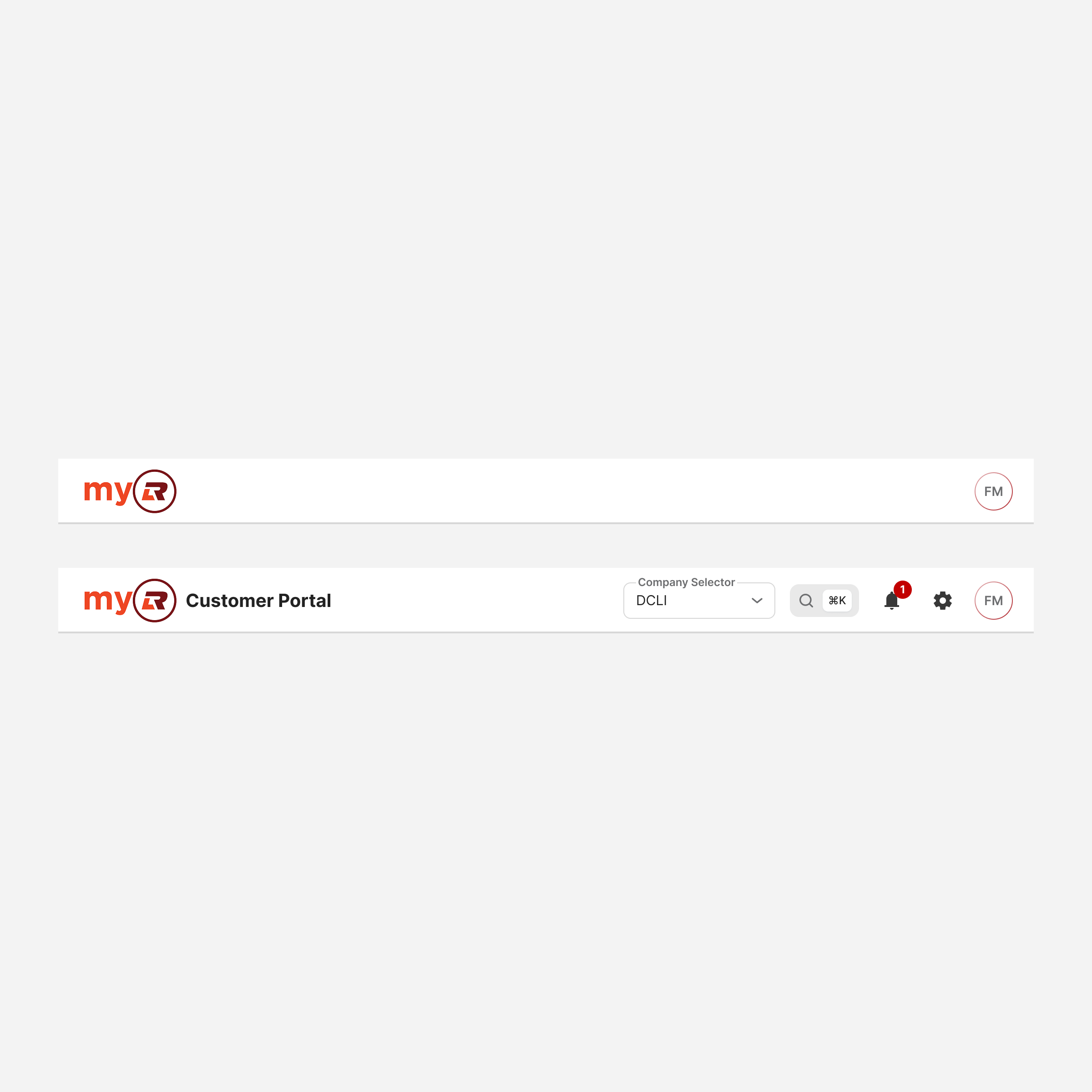
Header Bar

Header Bar: small
Menu
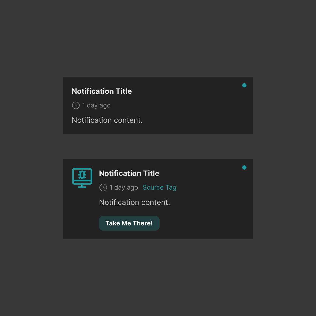
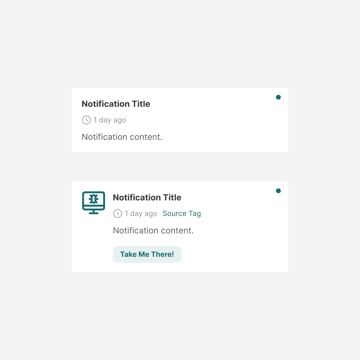
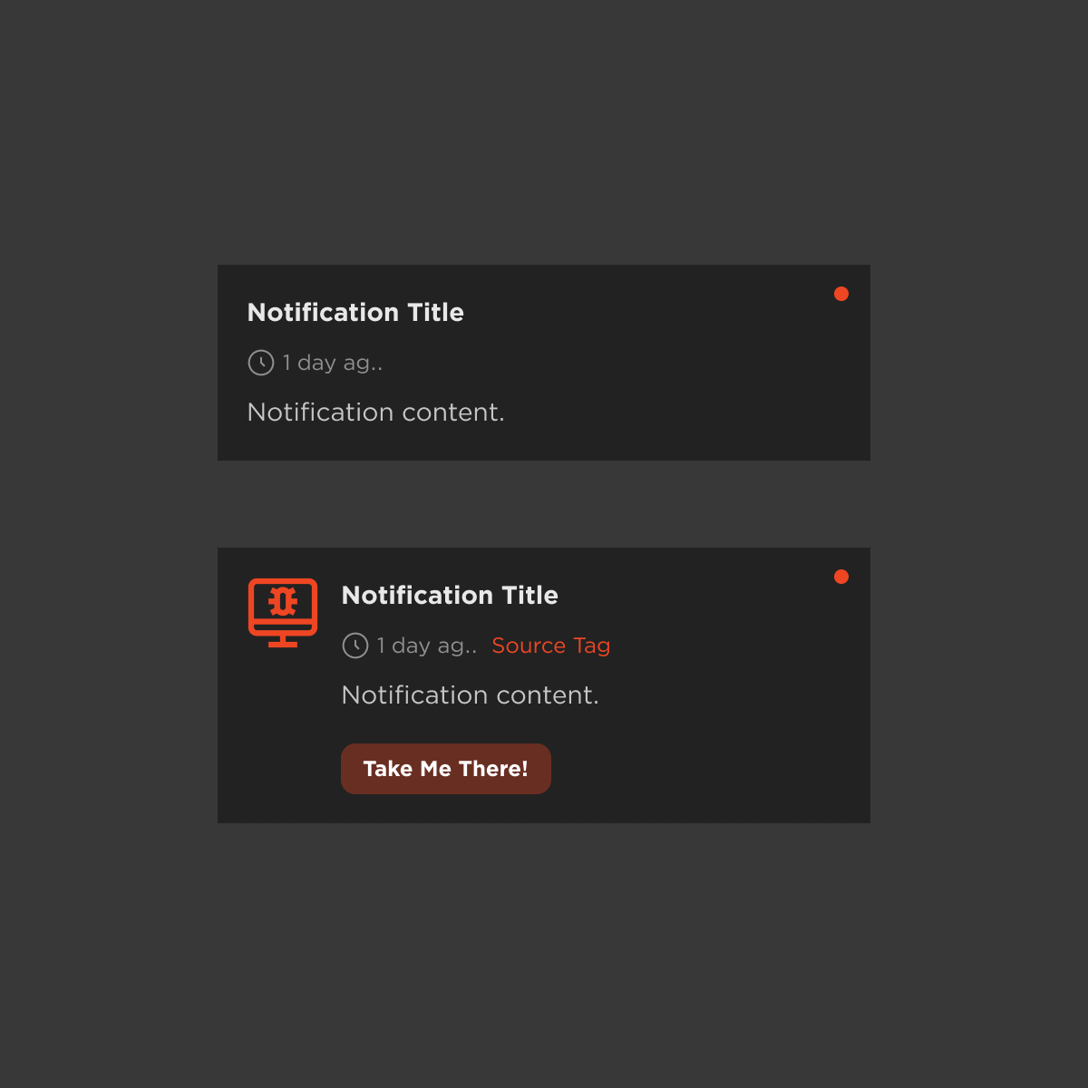
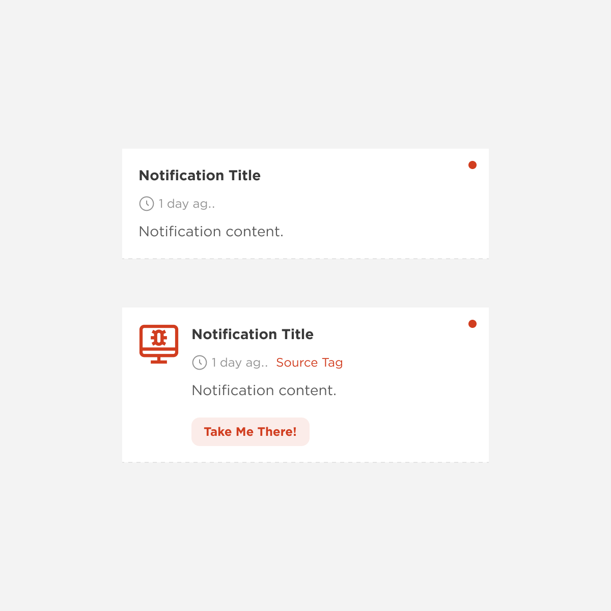
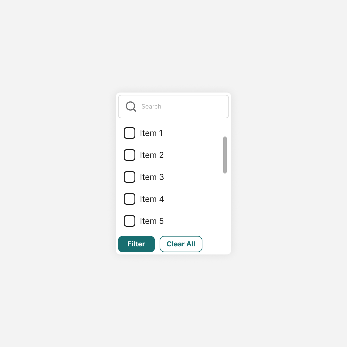
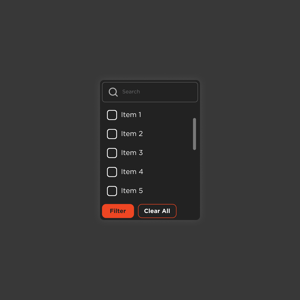
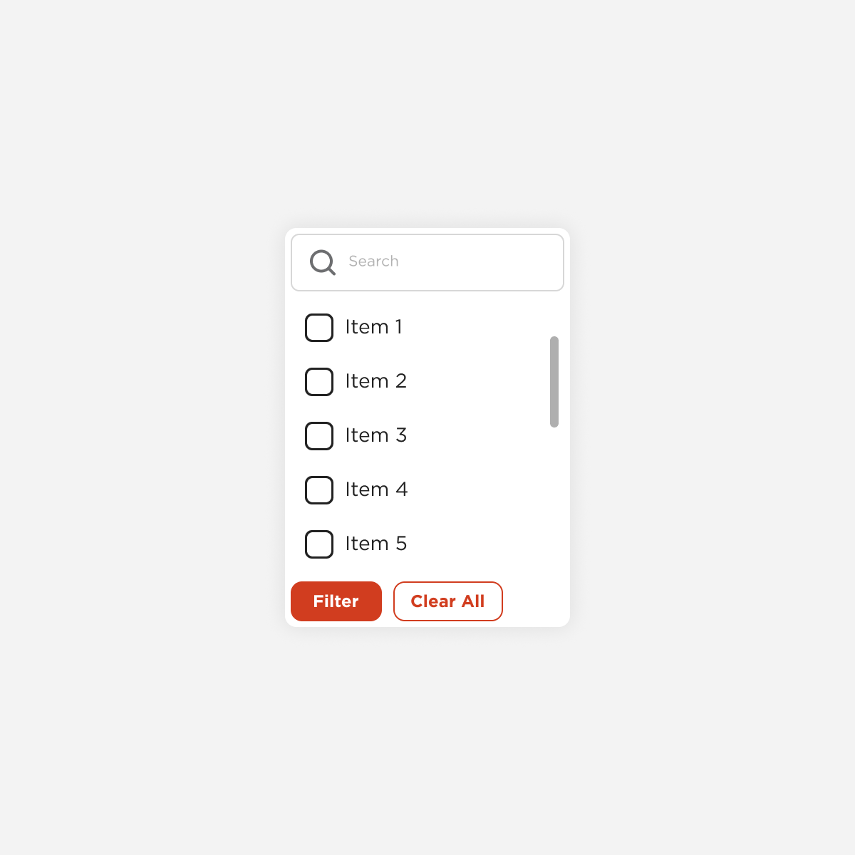
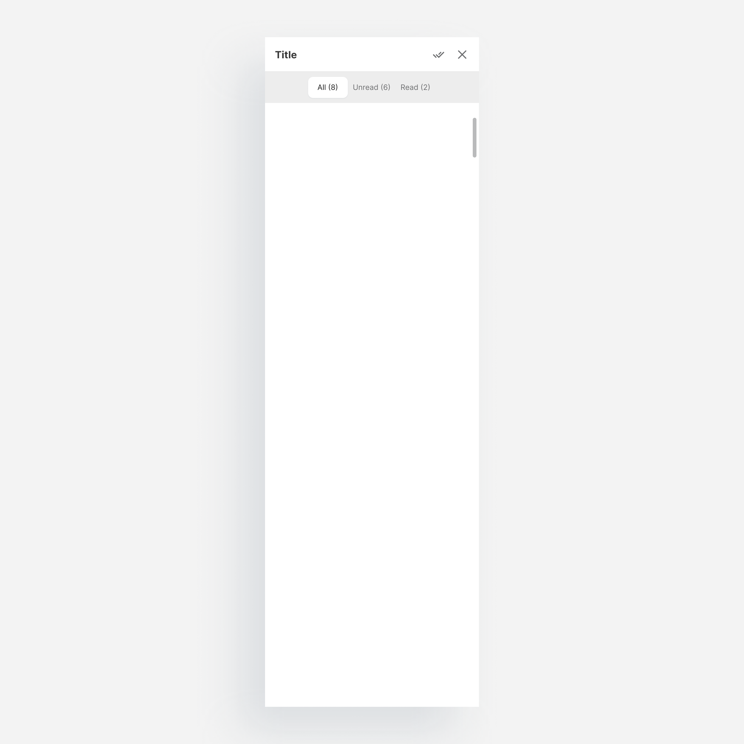
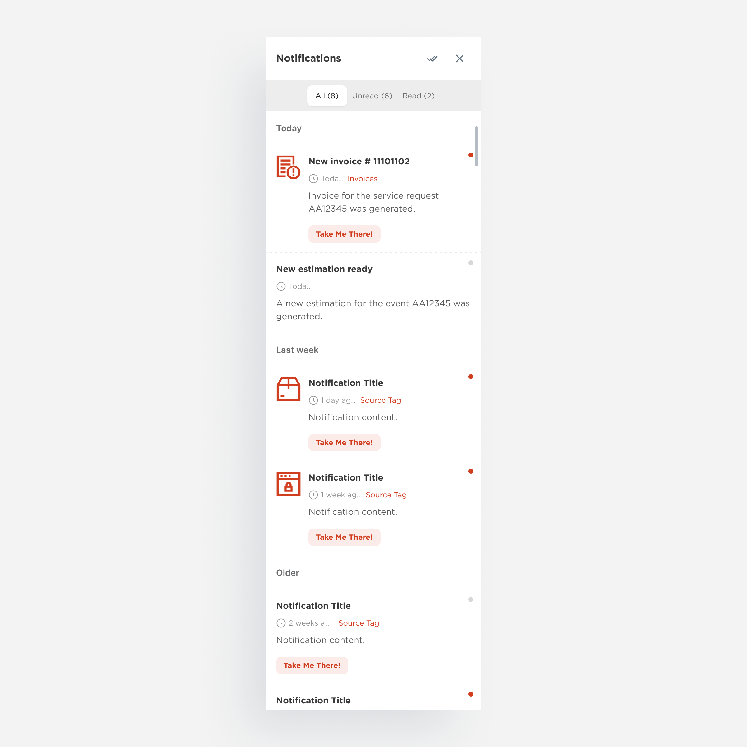
Notification
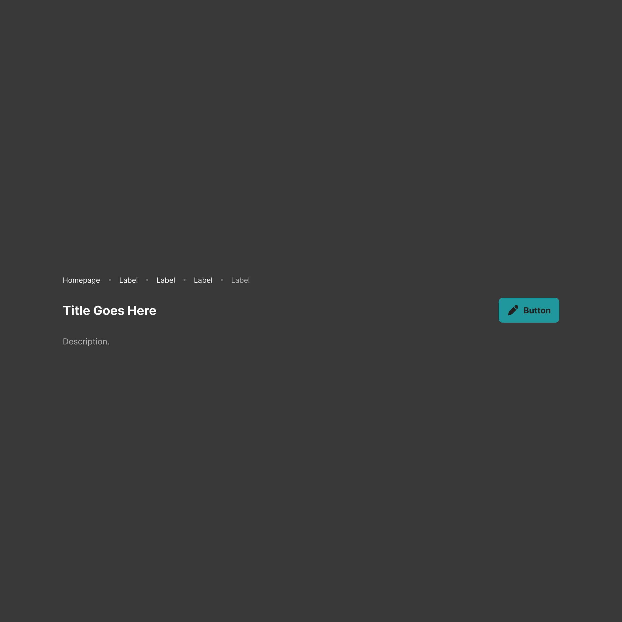
Page Header
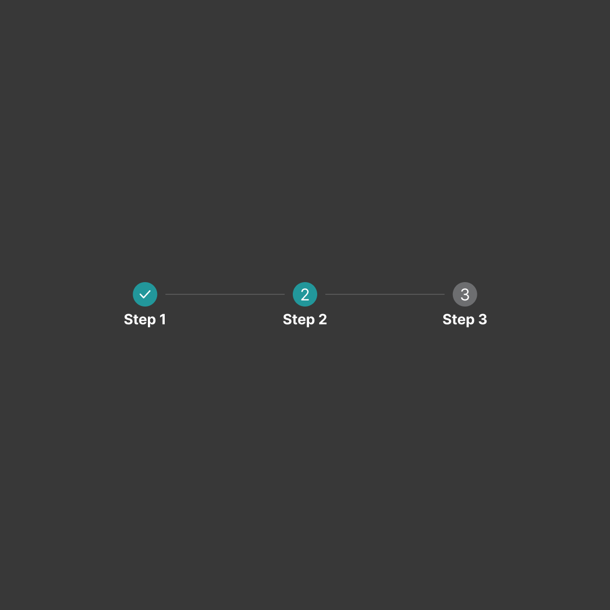
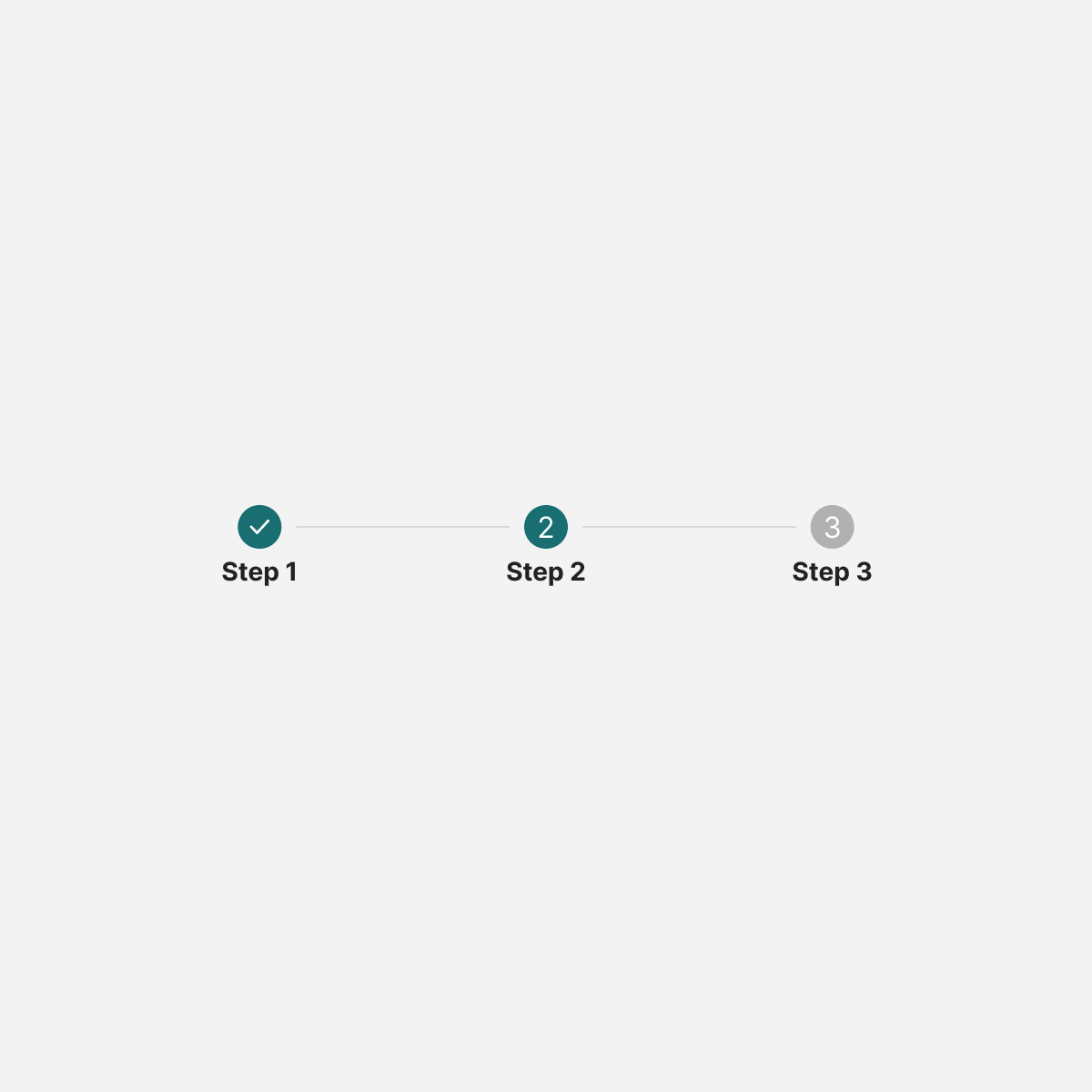
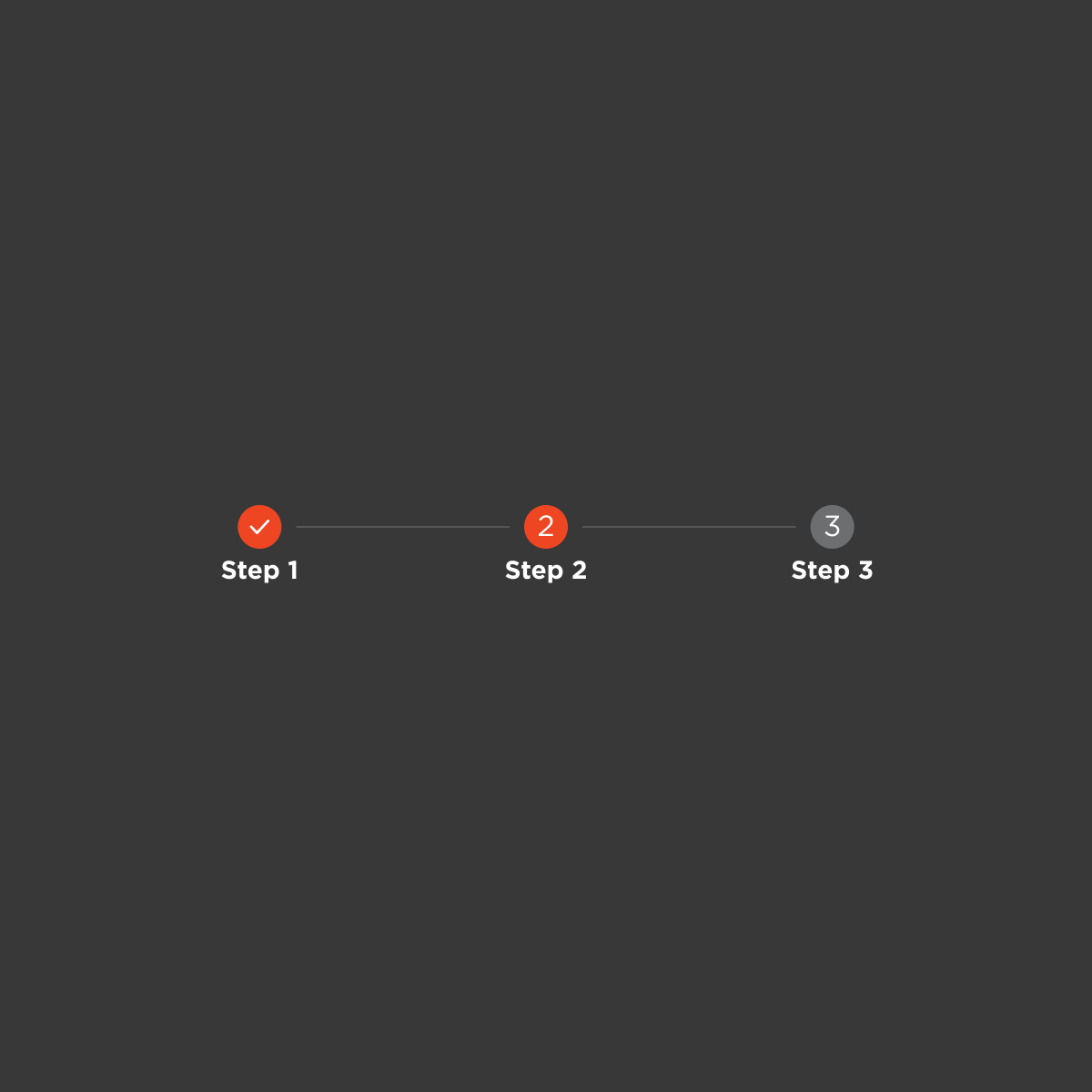
Stepper
Tabs
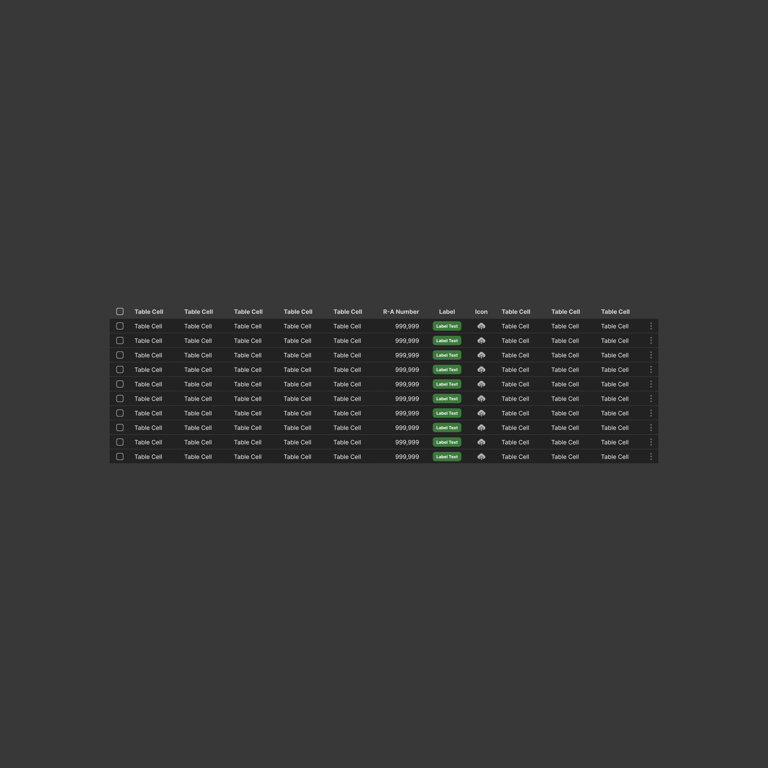

Full Table
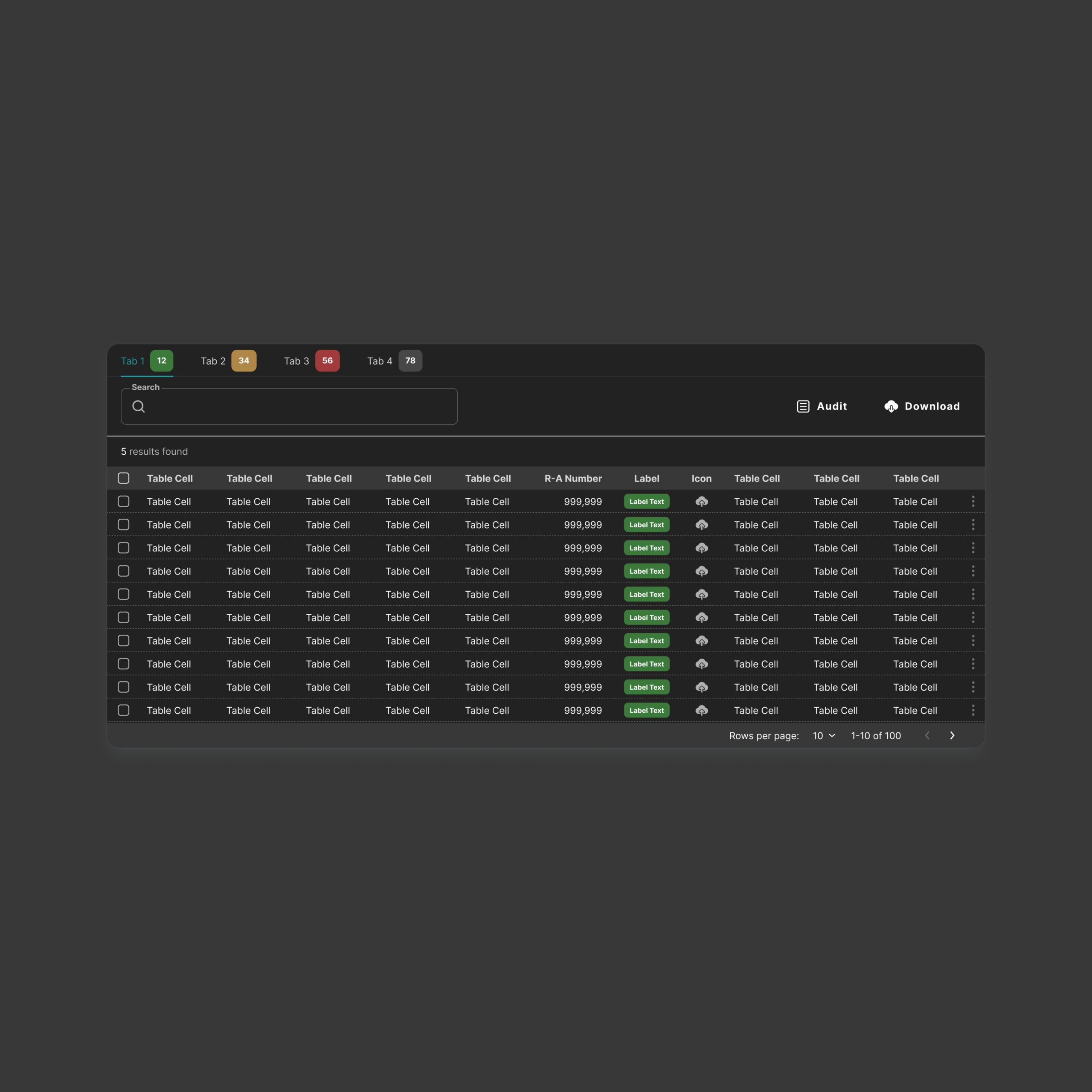
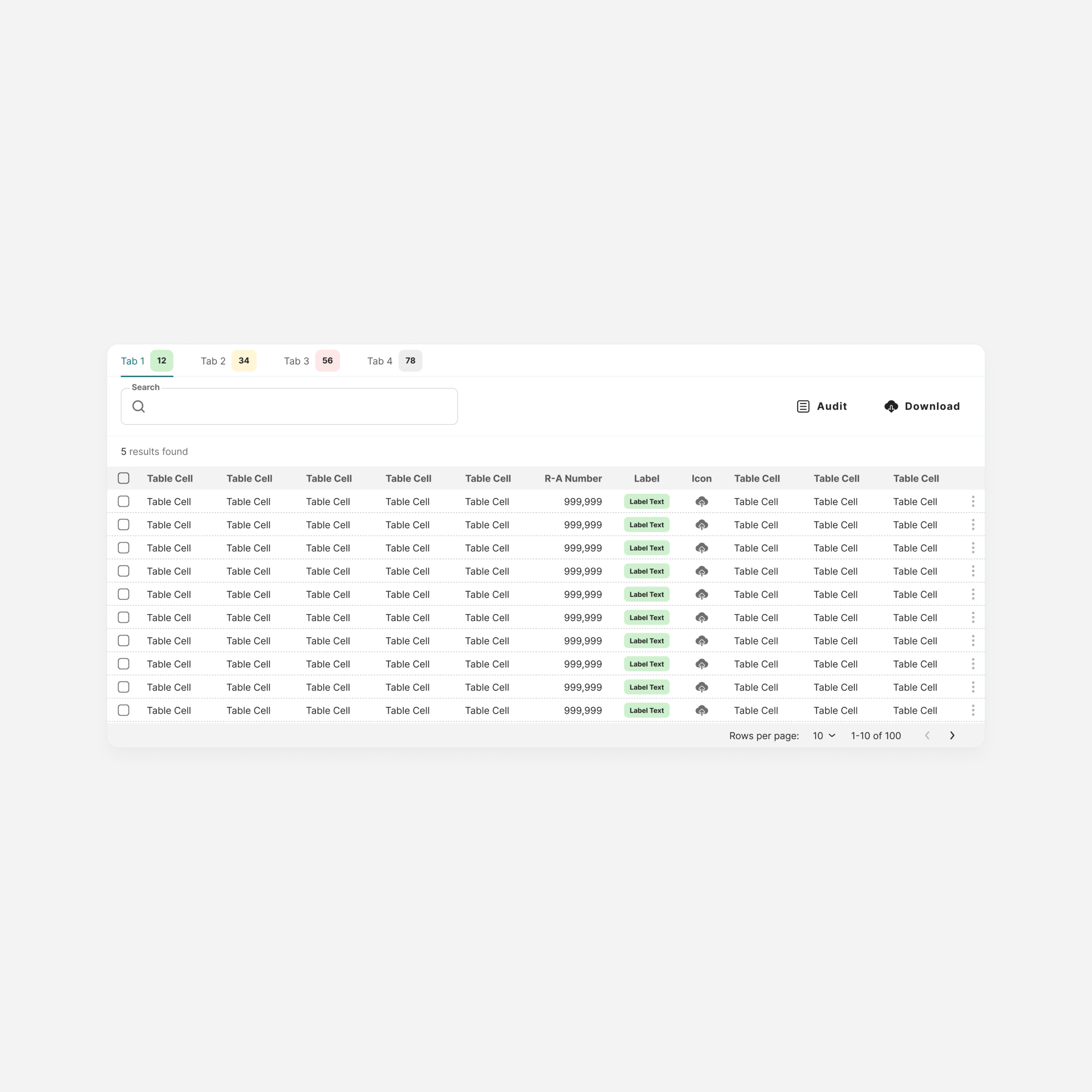
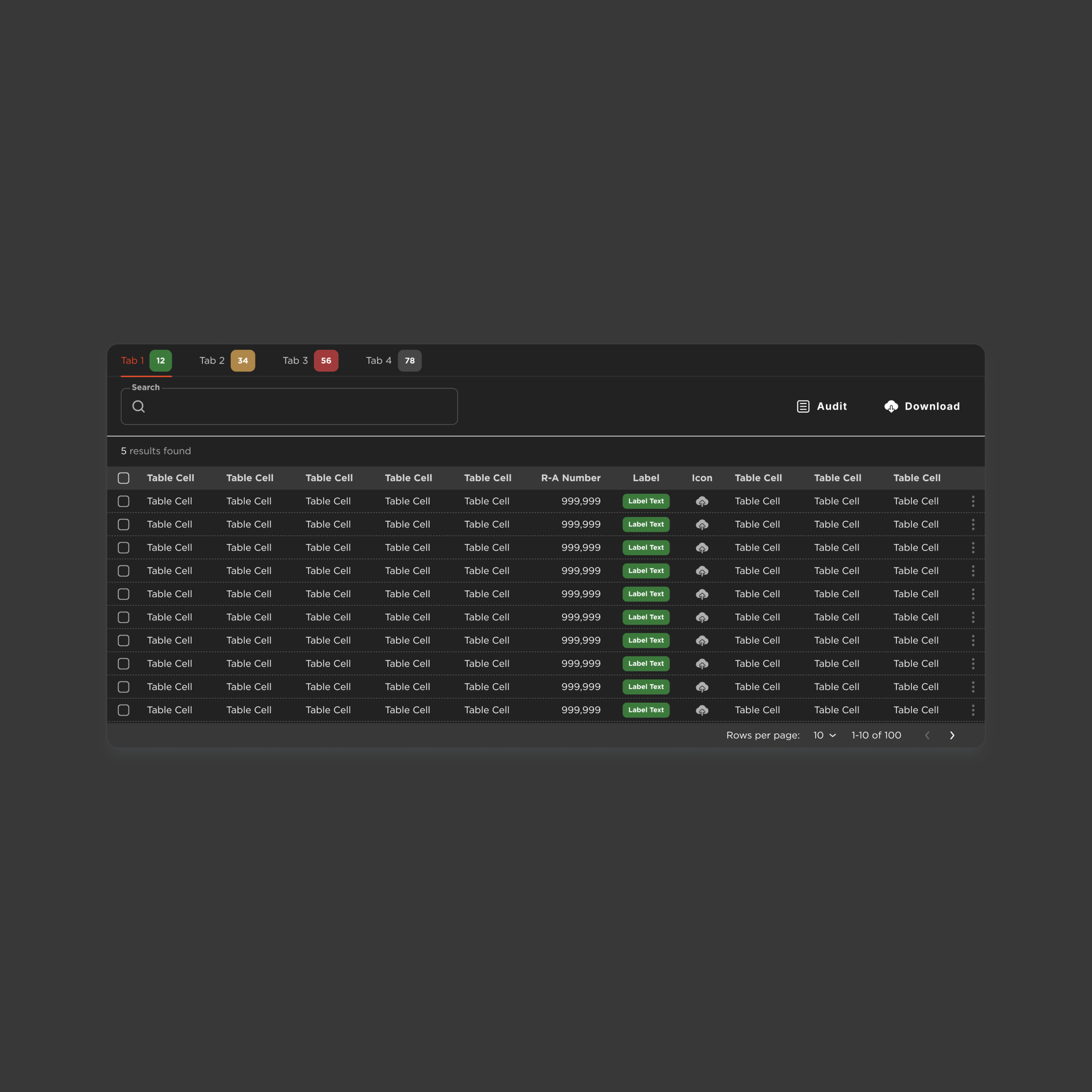
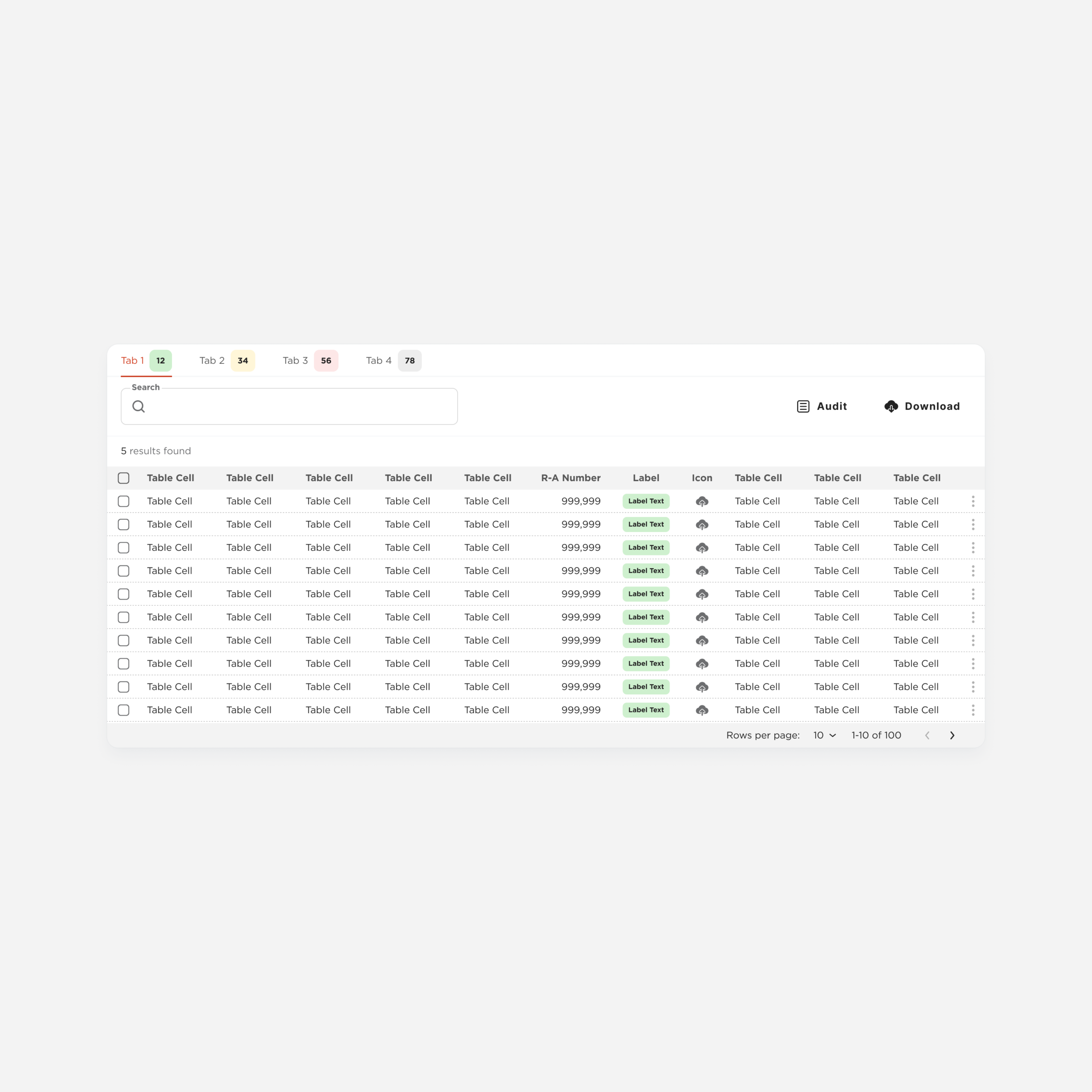
Table-Full
Navigation Panel
A high-complexity component that structures the main navigation of the system.
It demonstrates how atoms, molecules, and organisms combine to support multiple navigation scenarios within a consistent framework.
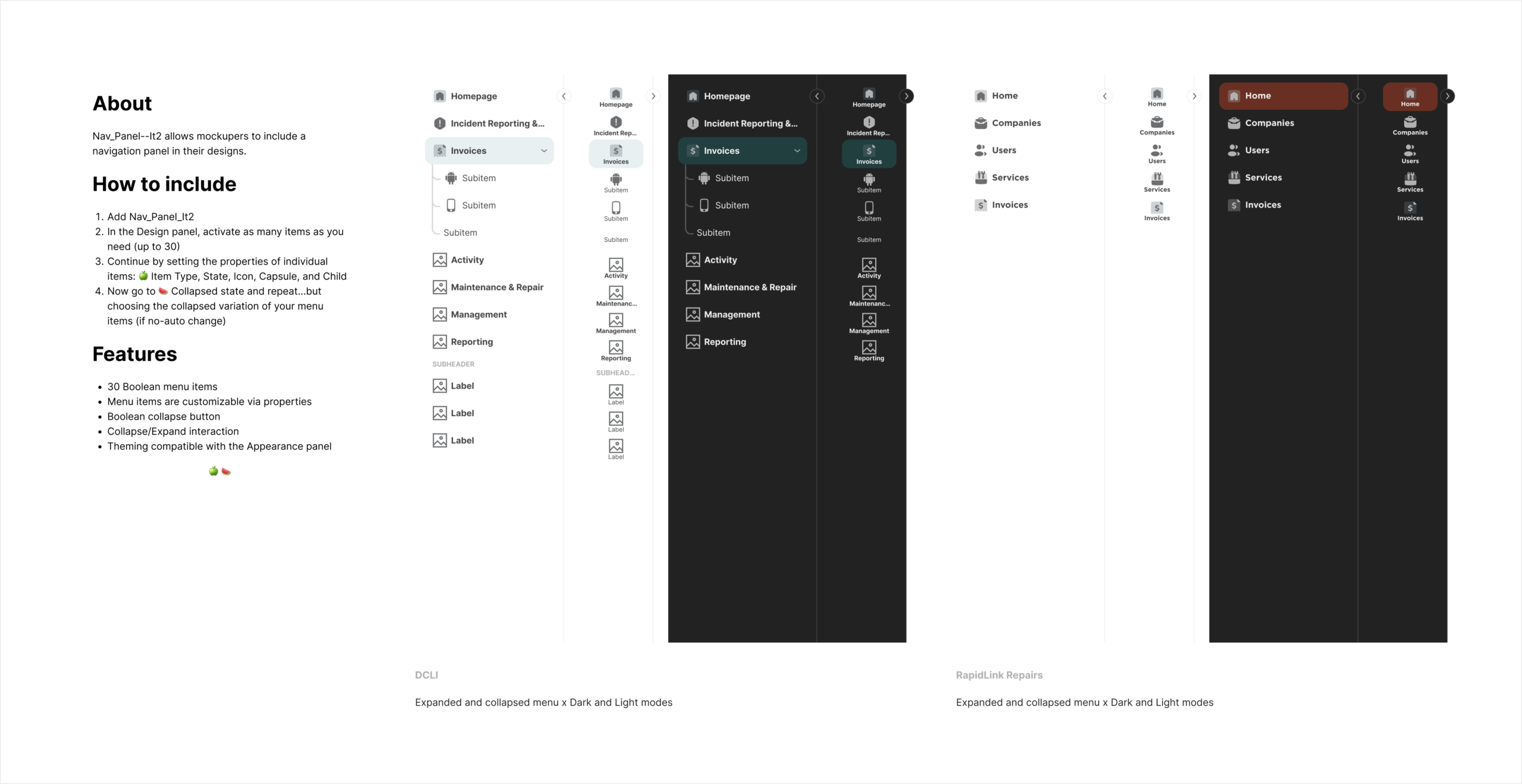
drawer
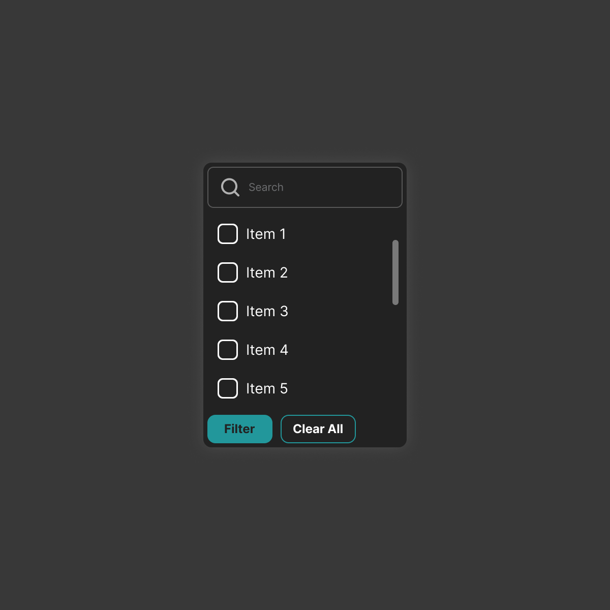
A flexible container for contextual content that avoids full navigation changes.
By combining it with different tools, teams can build filters, notifications, or settings while maintaining consistent structure and behavior.
Drawer-Base


Drawer-Filters
Drawer-Notifications
Drawer-Settings
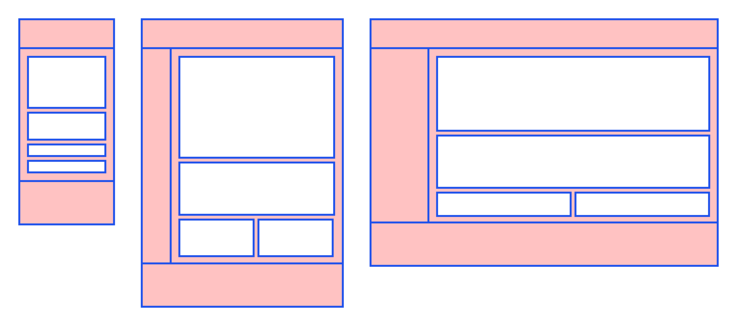
Templates
Layout structures that define how components come together on a page
The system supports progressive composition: a page can start blank and grow into a widgetized dashboard without breaking the structure.
Blank
An open canvas with no predefined regions. The starting point for any new page type.
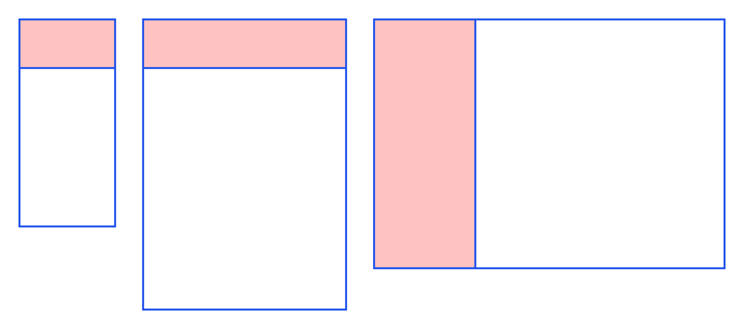
Cover
A split layout that surfaces key information before the user goes deeper. Landing and overview screens.
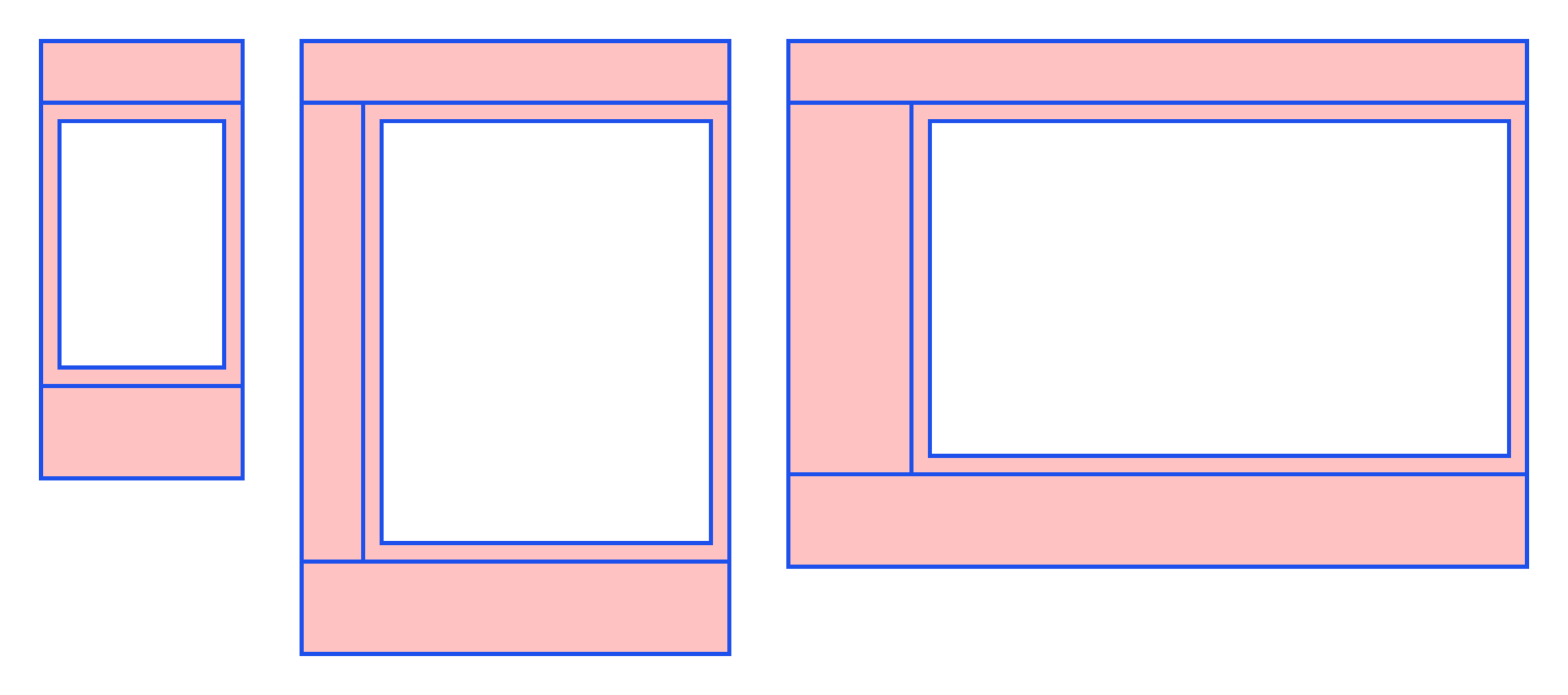
Basic
A focused layout with a clear primary content area. For tasks that don’t need multiple simultaneous contexts.
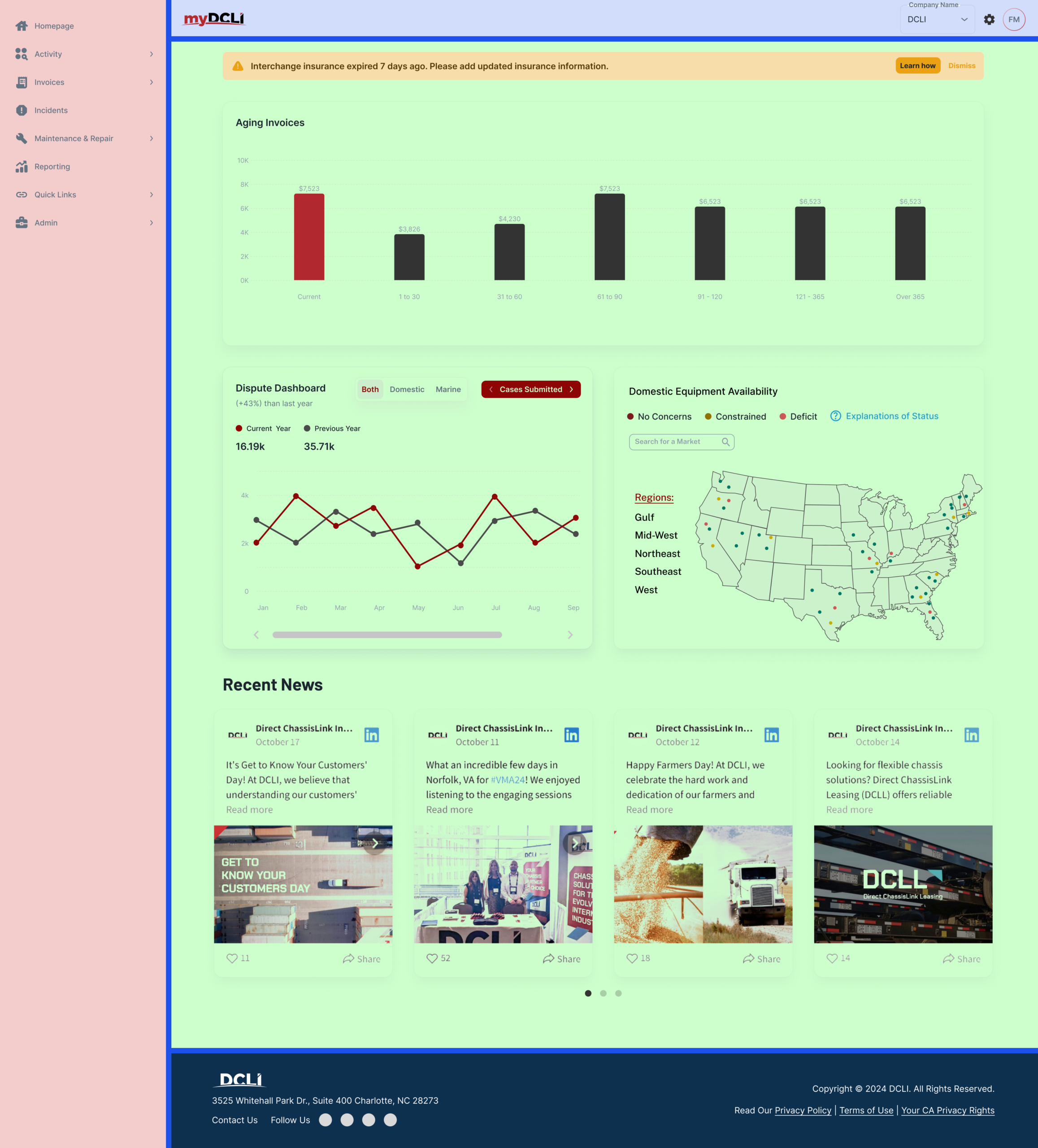
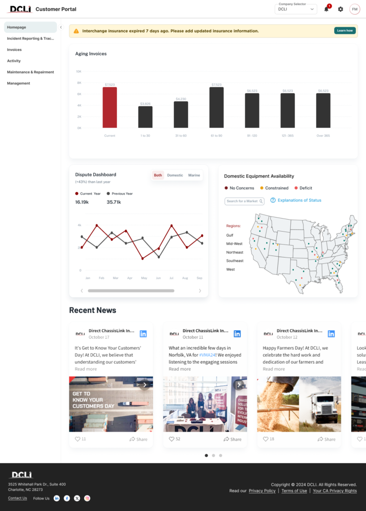
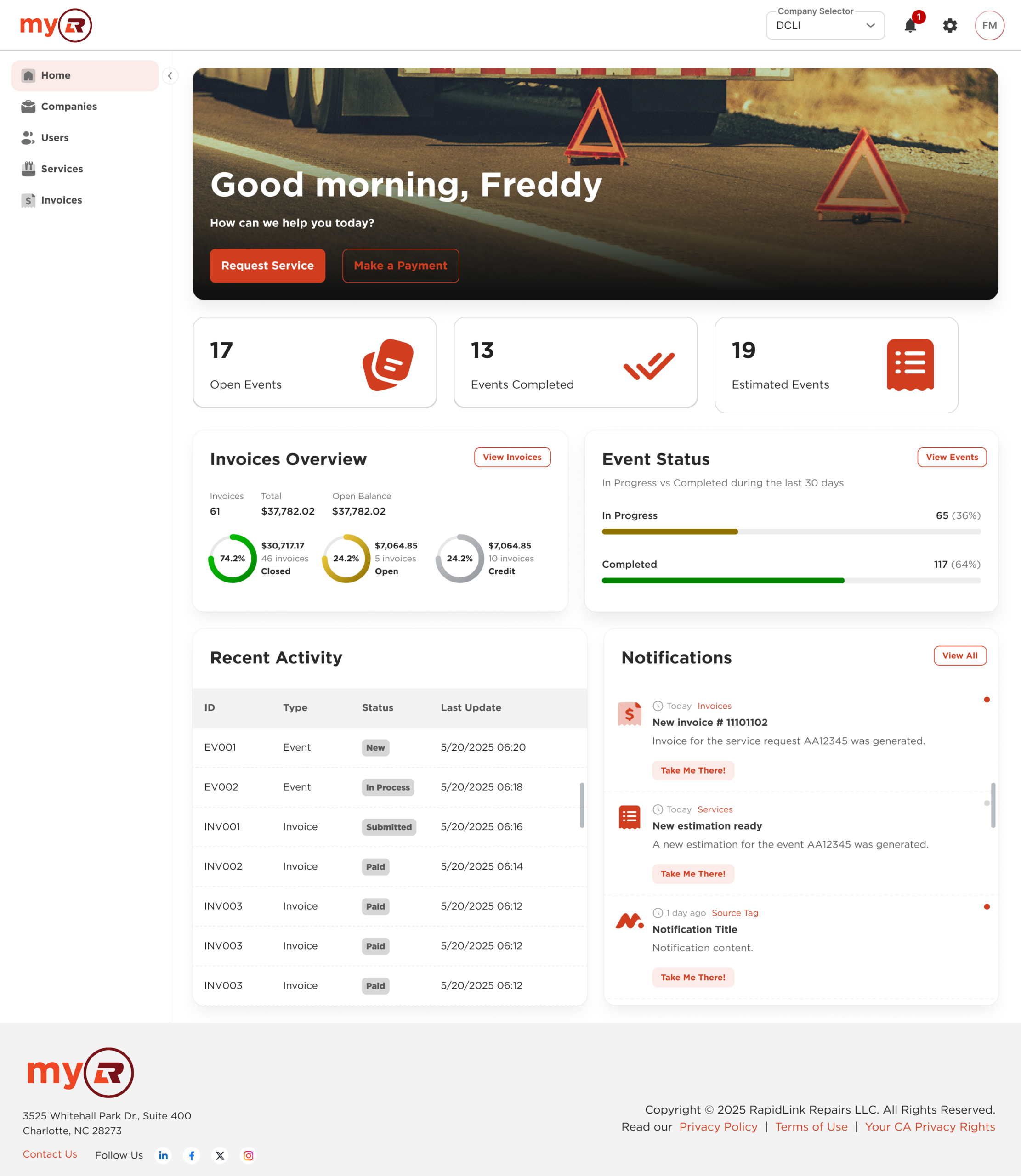
Homepage and Dashboards
Multi-zone layout built for overviews: widgets, summaries, and quick-access actions for high-frequency workflows.
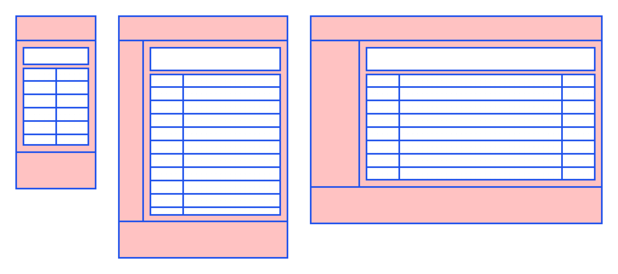
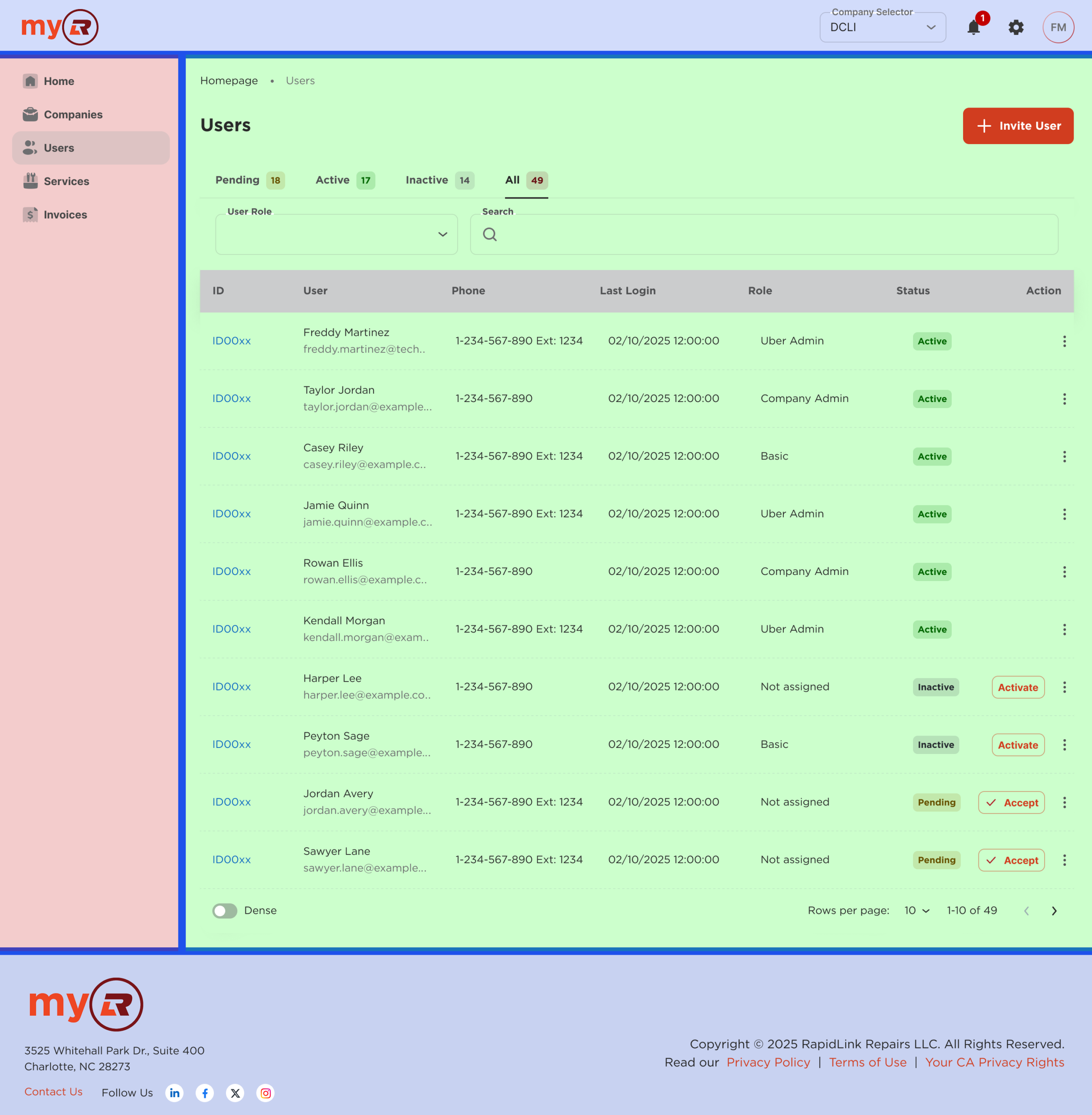
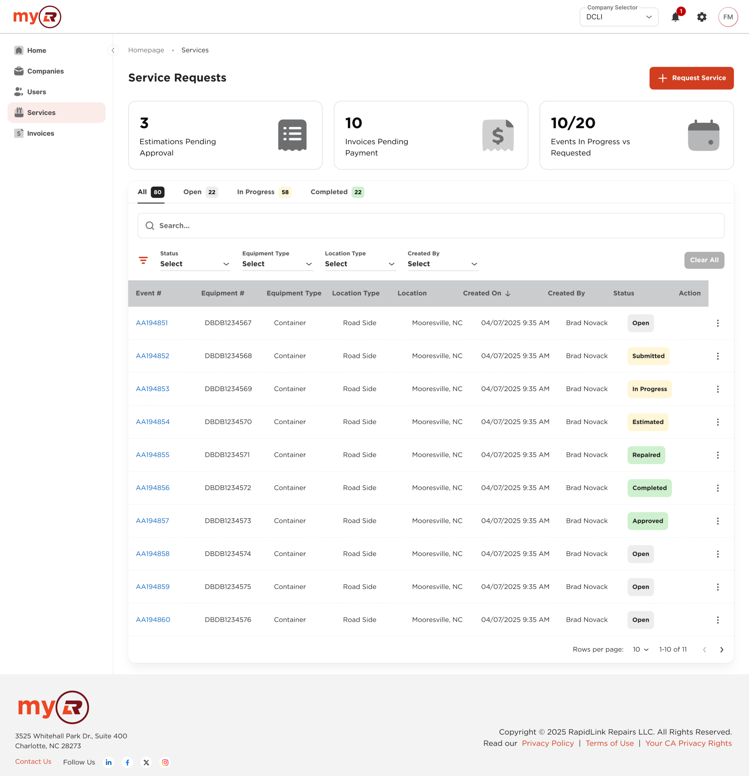
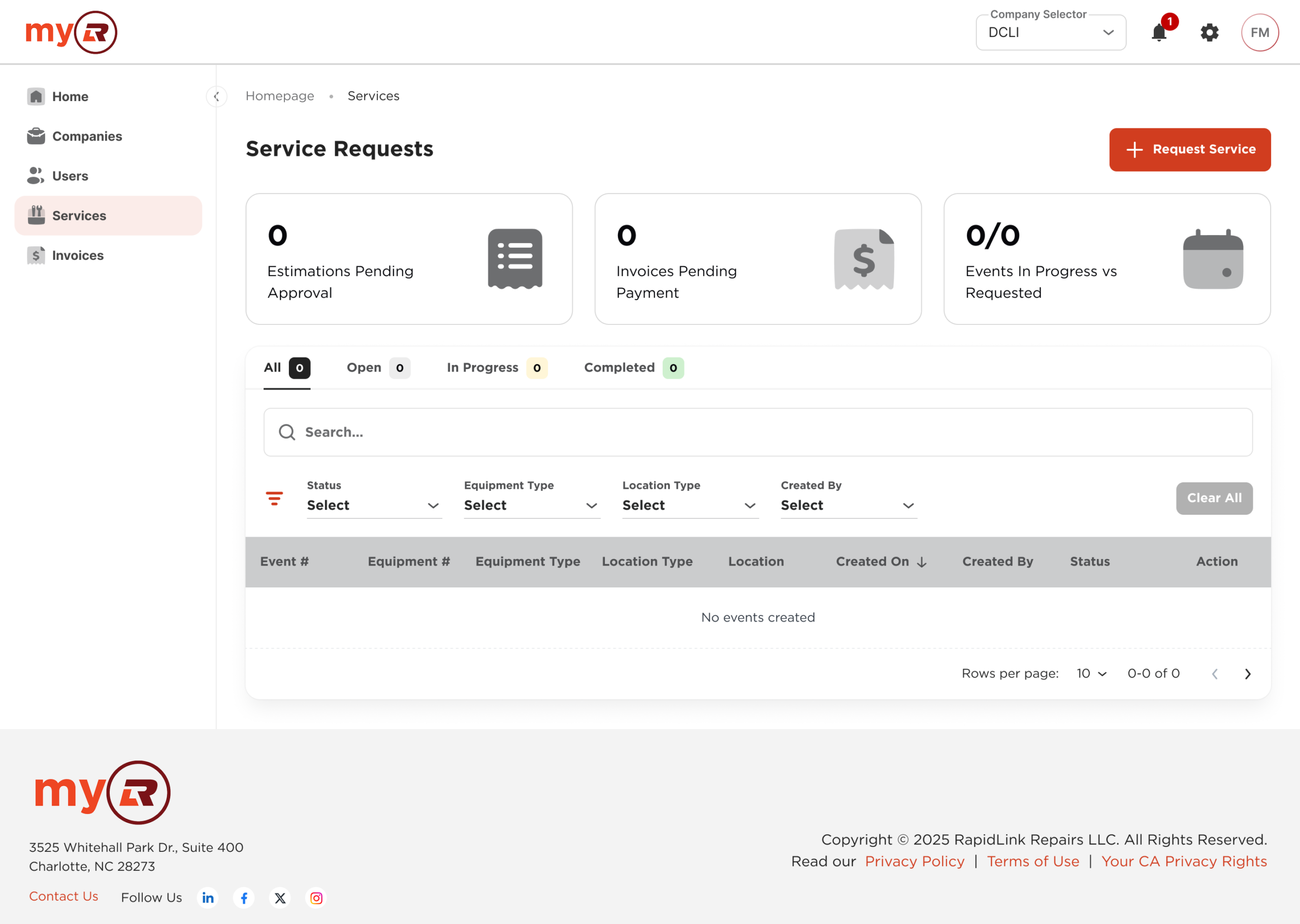
List of items
A data-first layout centered on a list or table, with filters, sorting controls, and contextual actions. Built for scanning and bulk operations.
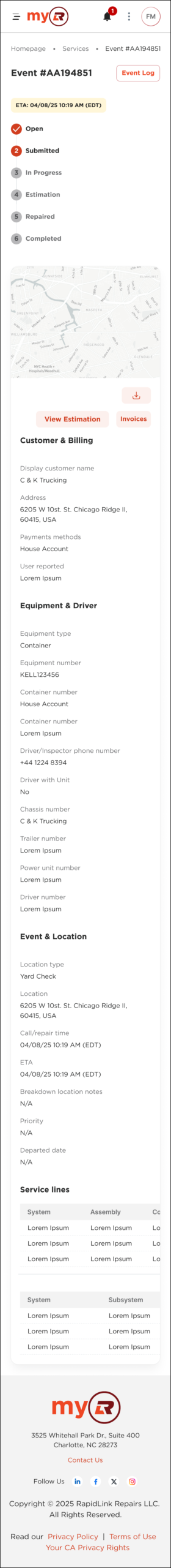
Inner
Detail view combining primary content with contextual panels and actions. Used when a task requires depth without a full context switch.
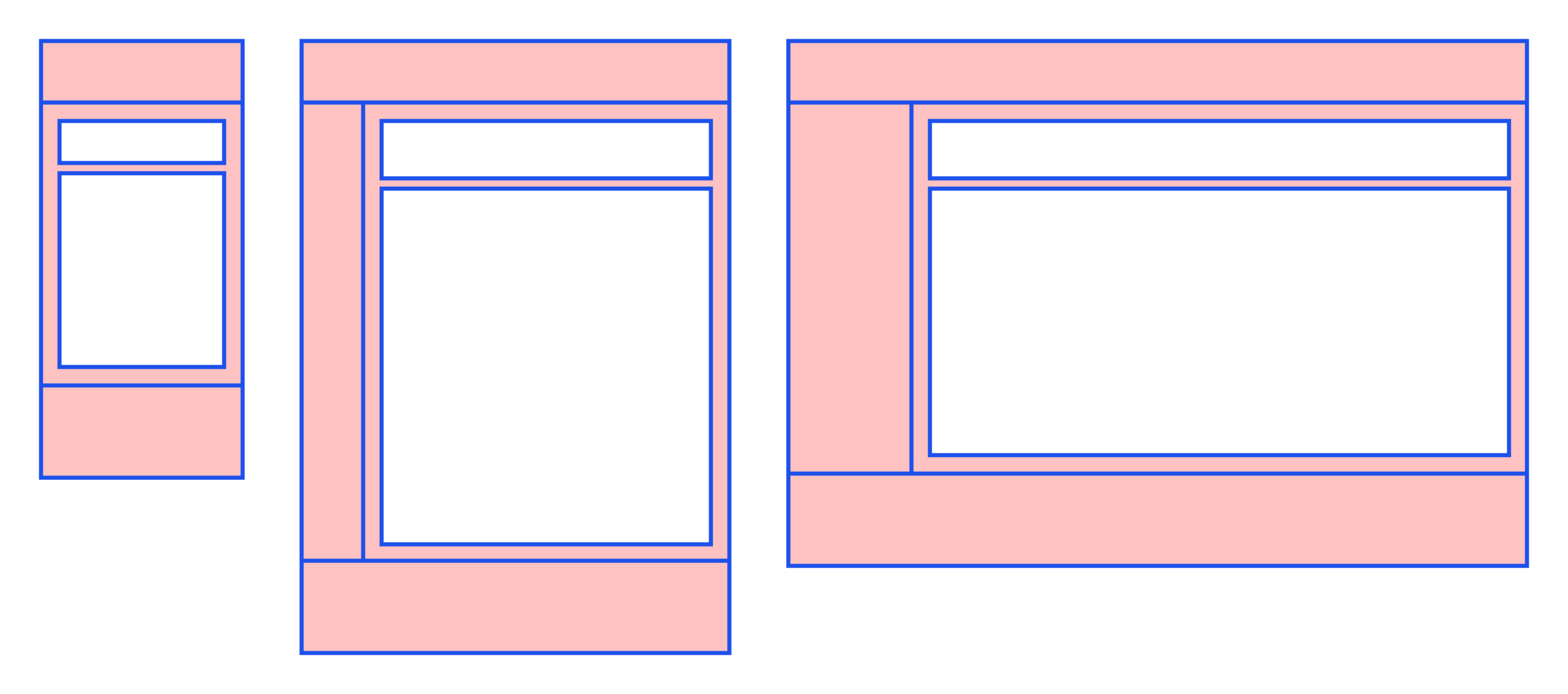
Pages: the system in action
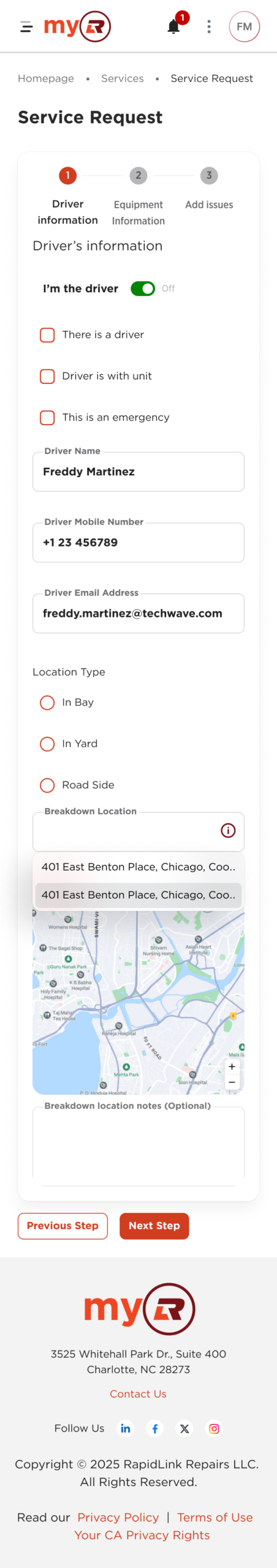
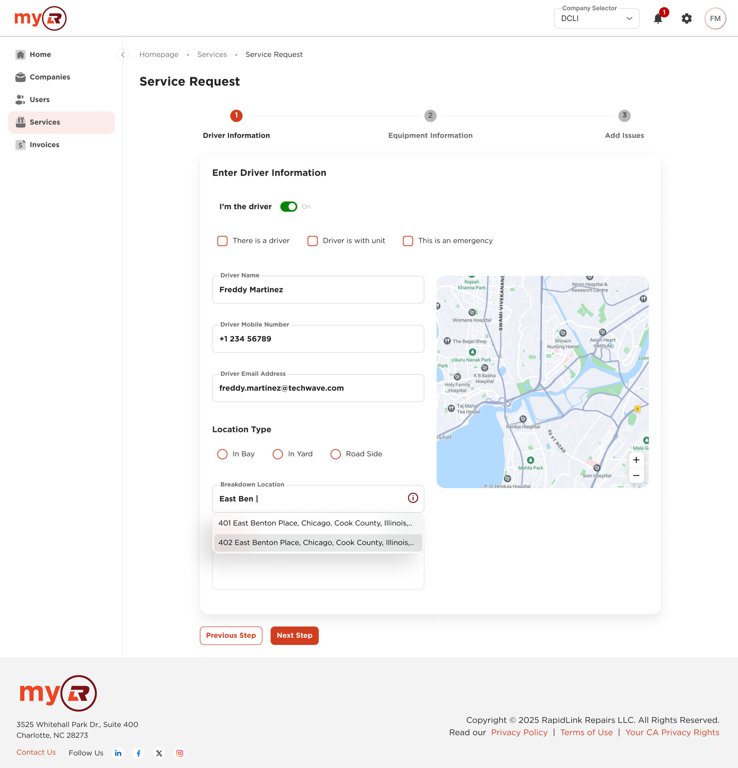
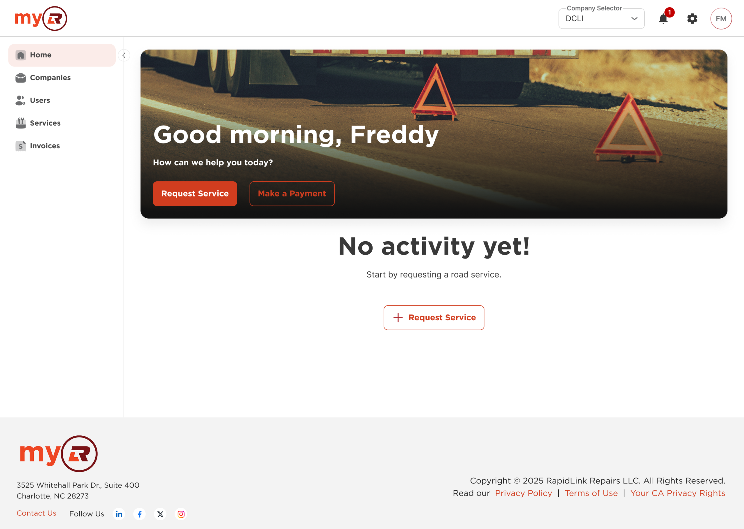
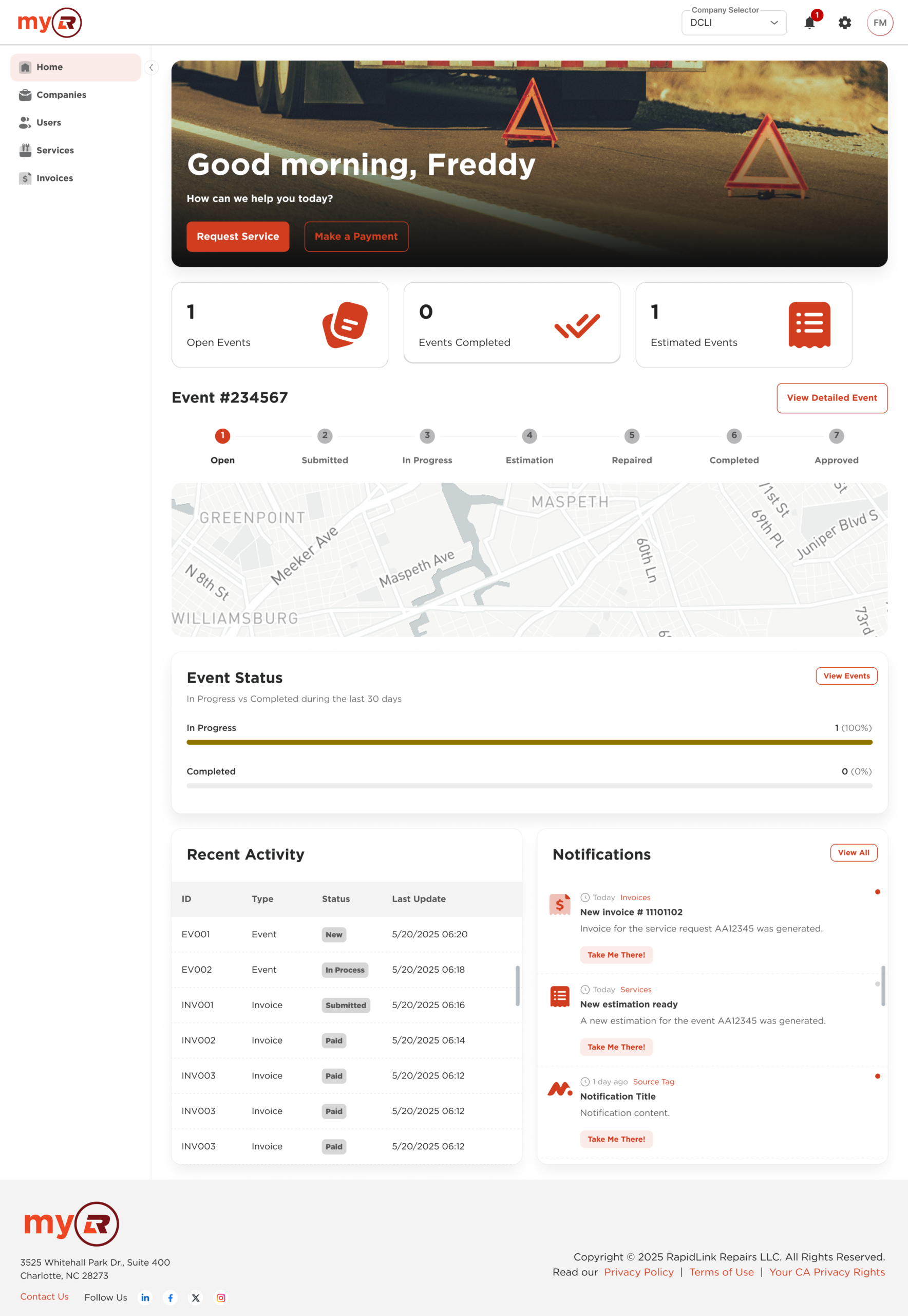
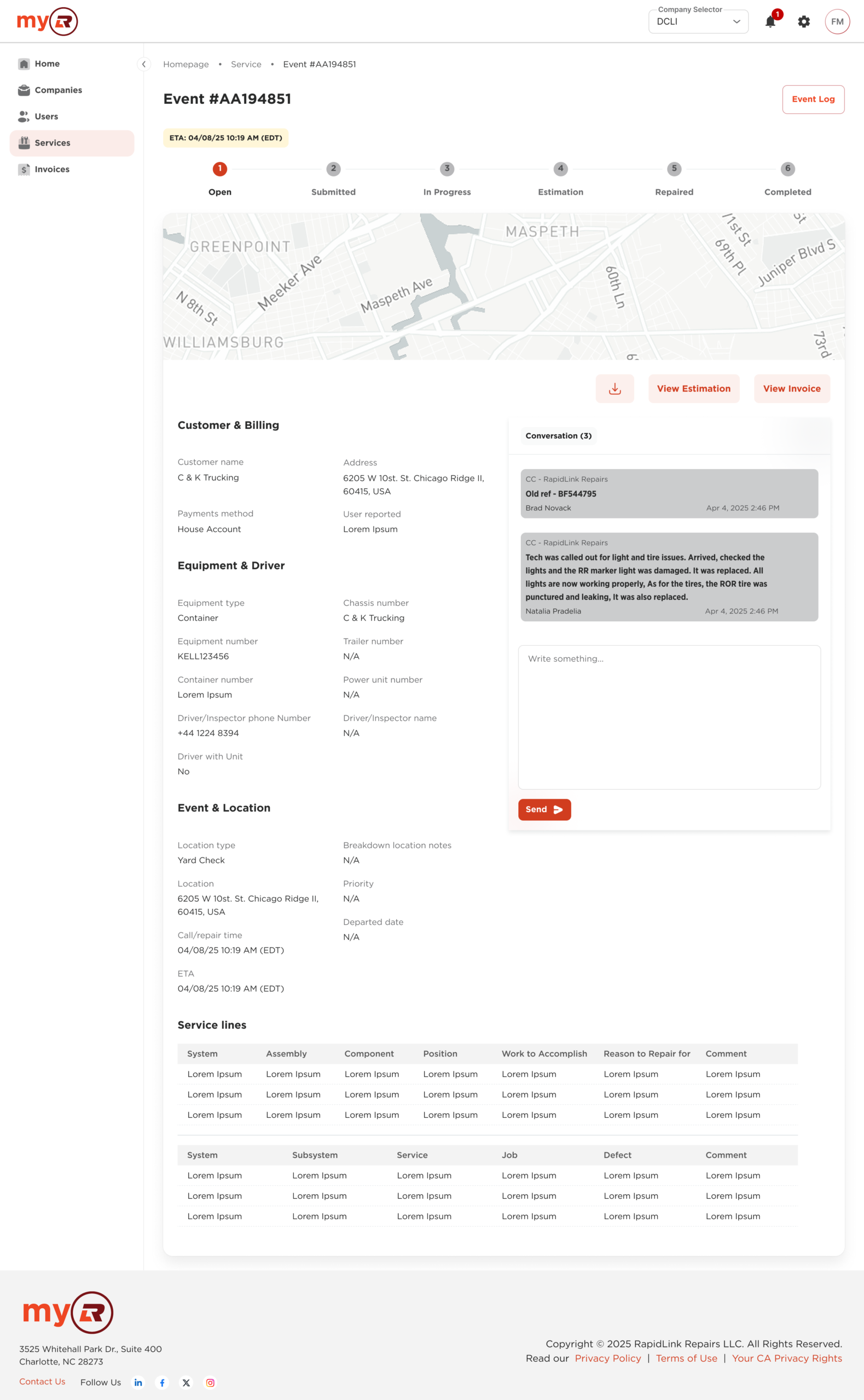
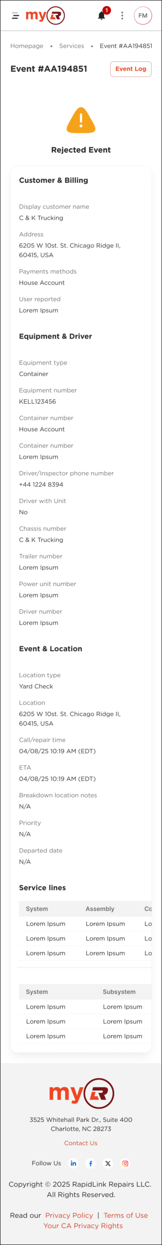
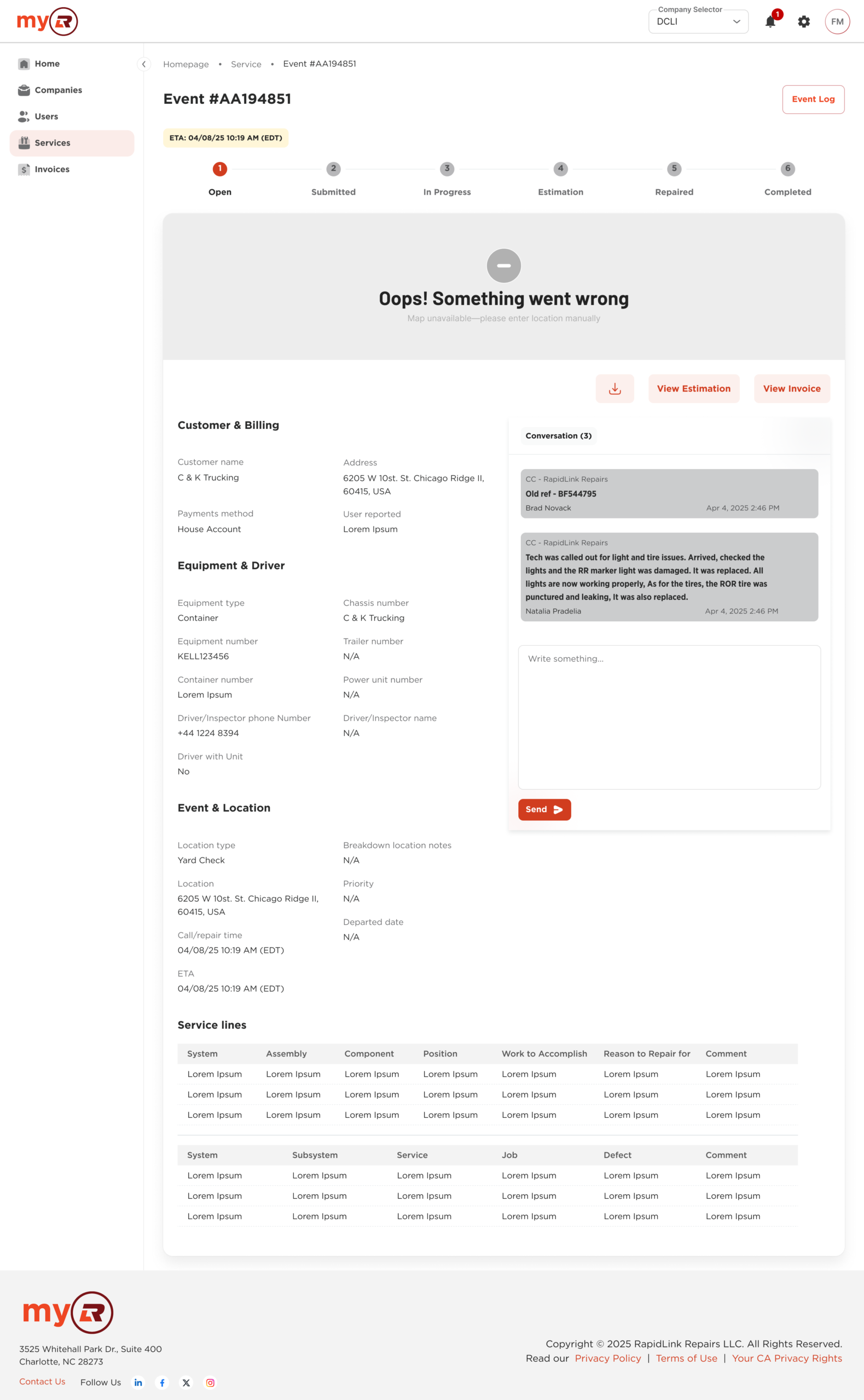
Full compositions built from system components, with real content and product context
Page-level implementations covered core product flows: payments, user and company management, role assignment, and bulk operations. Across products, the shared structure stays consistent. Variation happens at the brand layer: color, typography, and copy.
Blank

Cover
Basic
Homepage and Dashboards
List of items
Inner
How it came together
Defining what scales
Not everything belongs in a design system. A pattern earned its place by meeting three criteria: reuse potential across products, frequency in actual workflows, and alignment with recurring design problems. One-time solutions stayed at the product level.
That boundary kept the system focused and prevented it from becoming a catch-all.
Collaboration model
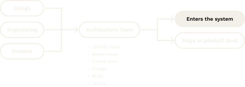
The Architecture Team was the operational backbone of the system. Every contribution went through the same process: identify the need, assess reuse potential, determine the system level, then design, build, and iterate. Having design, engineering, and product aligned on those decisions meant fewer surprises downstream.
Engineering integration
The system connected to a coded component library built on MinimalUI. Shared tokens, component specs, and interaction logic gave design and engineering a common reference point: less handoff friction, fewer implementation drifts.
Working from the same source of truth was what kept the system honest.
Key challenges
Alignment
Engineering prioritized stability; design and product pushed toward more context-specific solutions. Bridging that required shared criteria and ongoing conversation, not a one-time agreement.
Base system constraints
Building on top of MinimalUI introduced its own constraints. Extending it required constant judgment calls: when to work within the base system’s logic, and when to diverge without compromising consistency.
Variation
Supporting two brands without duplicating structure was one of the trickier problems. Brand differentiation was scoped strictly to color, typography, and copy. Identity preserved, fragmentation avoided.
Adoption
Adoption was built into delivery, not treated as a separate initiative. Component needs surfaced during regular product work, went through Architecture Team validation, and were released with documentation before teams were expected to use them.
Architecture reviews, design critiques, and product approvals reinforced usage across teams. The system integrated into the process teams already had.
Outcomes
Assembling complex flows with the system was simple. Take a component, customize it, compose it. What used to take weeks now takes days.
UX Manager, DCLI
Weeks → Days
Design time for new flows
In production
System status
Consistent interfaces, shared vocabulary between design and engineering, and faster decision-making when a component already existed.
Qualitative
Artifacts
- Component library in Figma, covering atoms through organisms across both brands
- Design token and variable architecture, built for light/dark mode and brand-level customization
- Documentation with usage guidelines and implementation specs
Notable highlights: A table system with multiple complexity levels, a form system covering field types, validation patterns, and multi-step flows, and dashboard templates built for real product contexts.
Takeaway
The most useful thing a design system can do is reduce decisions teams have to make from scratch. That’s what this one did
Over roughly a year, the system became the shared language that design and engineering actually used across four products and two brands. Not a constraint. A foundation. Still growing.