Problem
How to enroll children in Gimnasio La Monaña during the coronavirus pandemic?
Goal
Users (parents) should be able to remotely complete their children’s enrollment process.
Product
Responsive web application that allows parents to enroll their children at GLM from any device with a modern web browser.
Team
Product Owner, Project Leader, Backend Developer, Front End Developer, Data Scientist, and UX/UI Designer (me).
My role
UX/UI Designer.
My responsibilities
User and product research. prototyping, some coding and testing.
Context:
Gimnasio La Montaña Private School
Gimnasio La Montaña is a private school located in Bogotá (COL), recognized for its innovation and academic excellence. La Montaña has modern facilities and infrastructure, and uses multiple information systems and educational computer platforms developed in-house to achieve its mission: educate.

Business Goals
● Ensure students’ access to education
● Keep dropouts low
● Prevent contagion
Organization KPIs
● 70%+ enrolled students
My Team KPIs
● 100% online tool
● 4 months to deliver (8 sprints)
Process
Discover
We already had the whole story from the business perspective, but not so much from the parents viewpoint.
I started my exercise with an obvious assumption: Parents want to enroll their children in the GLM.
Define
We defined one key task to be done, the initial user story, and the business requirements from the paper-based process.
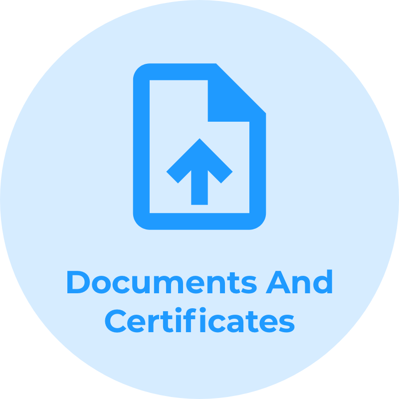
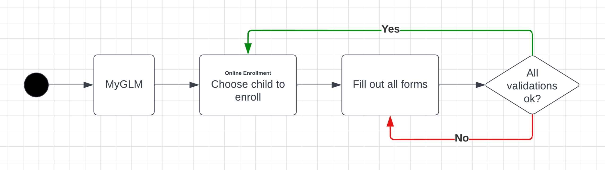
Key Task: Enroll children in GLM.
User Story: As a parent, I want to manage the forms and documents required by GLM to enroll my children remotely.
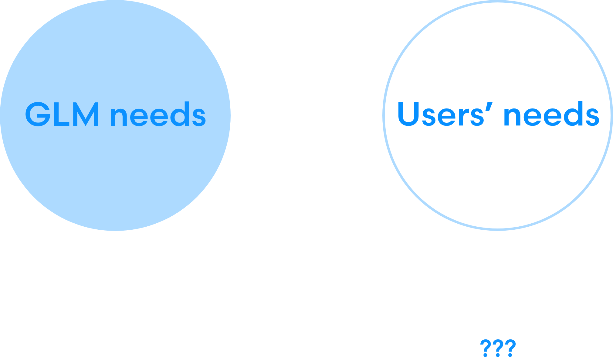
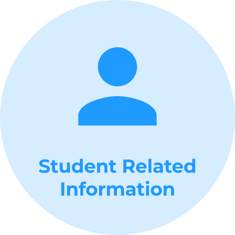
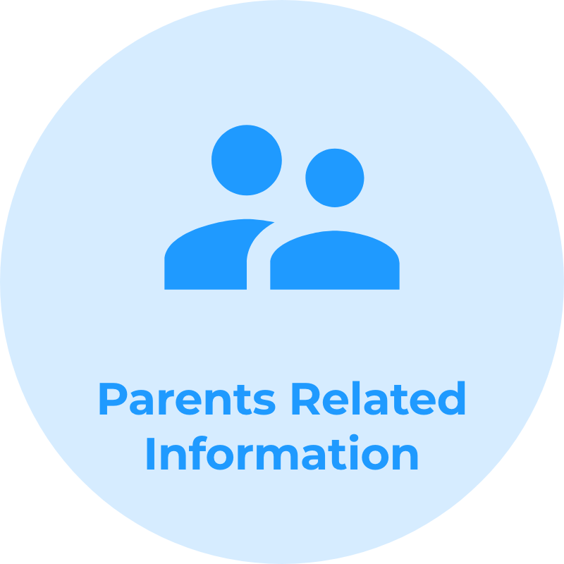
Business Needs and Requirements: We should collect data in compliance with Colombian regulations and all other data necessary to meet the needs of students within the school (i.e. food service or transportation).
Taking the old paper-based process as reference:
Ideate
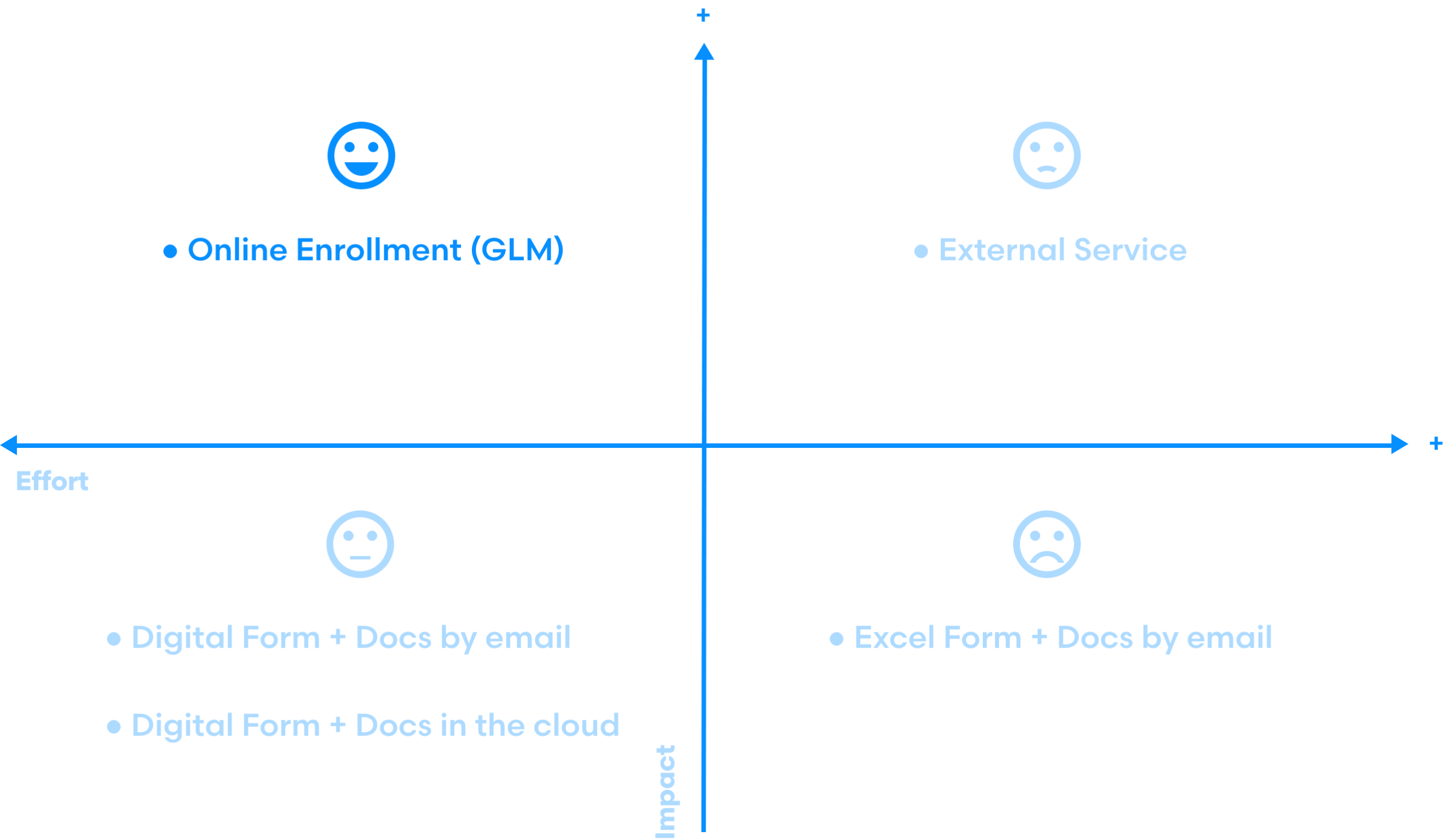
I believe that the best solutions are achieved by working in collaboration with others.
I run a stakeholder workshop where we brainstormed ideas on how to enroll children in the GLM remotely. Then, the most viable ideas were evaluated using an Impact-Effort Matrix.
Prototype #1
Prototypes allow me to empathize more easily with my users by establishing a common ground on which build the discussion.
Use the prototype by clicking on the frame
What did I want?
● Empathize with my users
● Test my first ideas
How did I do it?
● Moderated Usability Test
● User interviews
● Adobe XD
Additional remarks for the Prototype #1
● I sketched the first user flow iteration
● 7 users recruited for the test
● I interviewed the users after the test
What Did I Get From My Users?
Good start: users provided very interesting comments. I summarized the most relevant notes and sorted them into two broad categories:
Positive feedback
- Easy access to each child forms.
- Clear form labels.
- Easy to navigate.

Negative feedback ➞ Initial Pain Points
- Long, very long.
- Contact info is collected multiple times.
- Categories are not clear enough.
- “What if I don’t fill it out all at once?”
- How document uploading will work?
Empathy Map
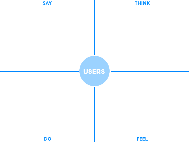
The collected intel allowed me to elaborate the Empathy Map. I aggregated data regarding experiences with MiGLM (Intranet), online transactions, and the comments about the prototype itself.
Time for Personas
I composed two user personas, Ana Maria and Francisco, embodying two archetypes respectively: The Executive and The Newcomer.
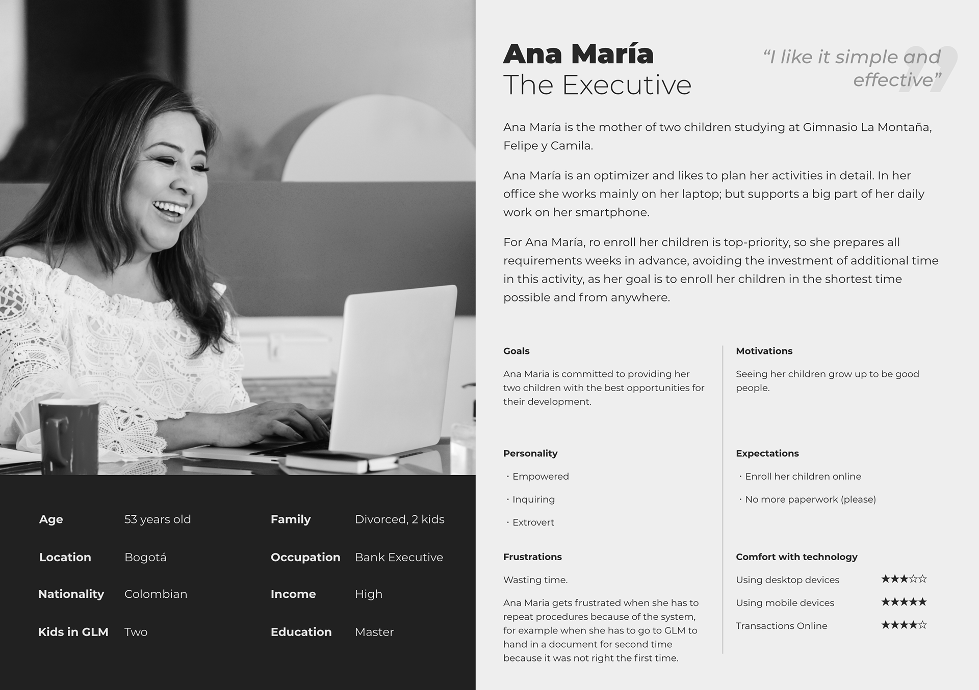
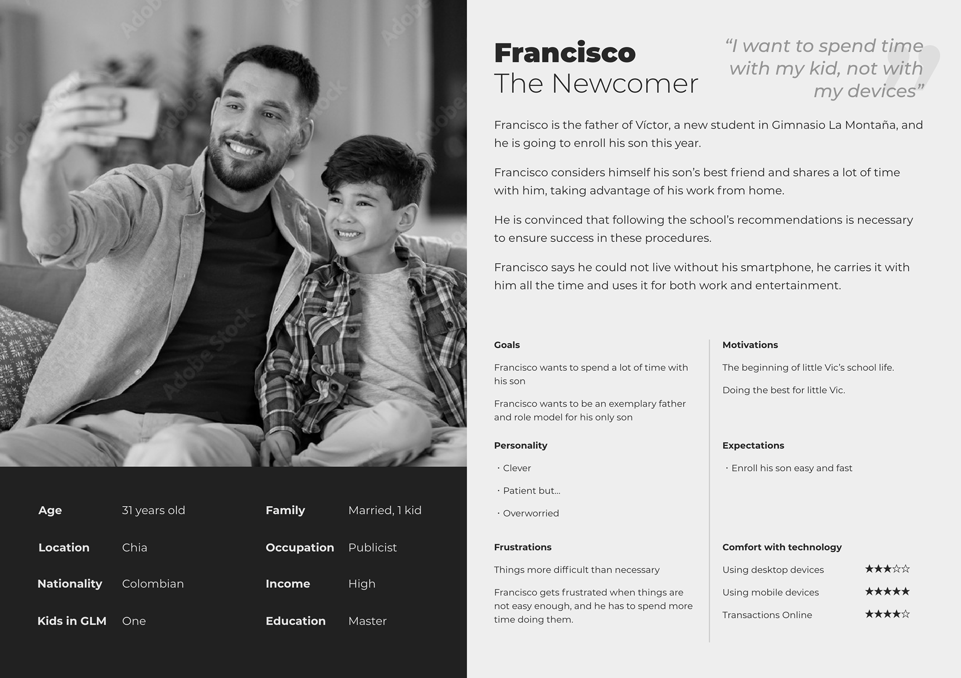
Key User Aspects to Consider
- Our users are highly educated, high-income people who are confident using their devices.
- The age range is quite wide, starting from young adults to middle-aged users, but in relation to the previous point, it does not seem to have an impact on how competent users perceive themselves to be.
- For our users, a curious situation presents itself: they want their children well-being, but at the same time, they don’t want to spend a lot of time on paperwork like this (how to blame them.)
Expectations were high.
Customer Journeys
With all parts in the bag, I proceeded to map the customer journeys of my two user personas, Ana María, the Executive, and Francisco, the Newcomer.
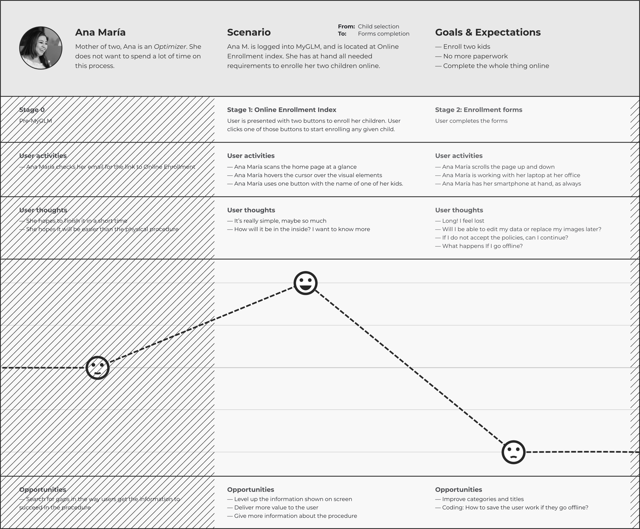
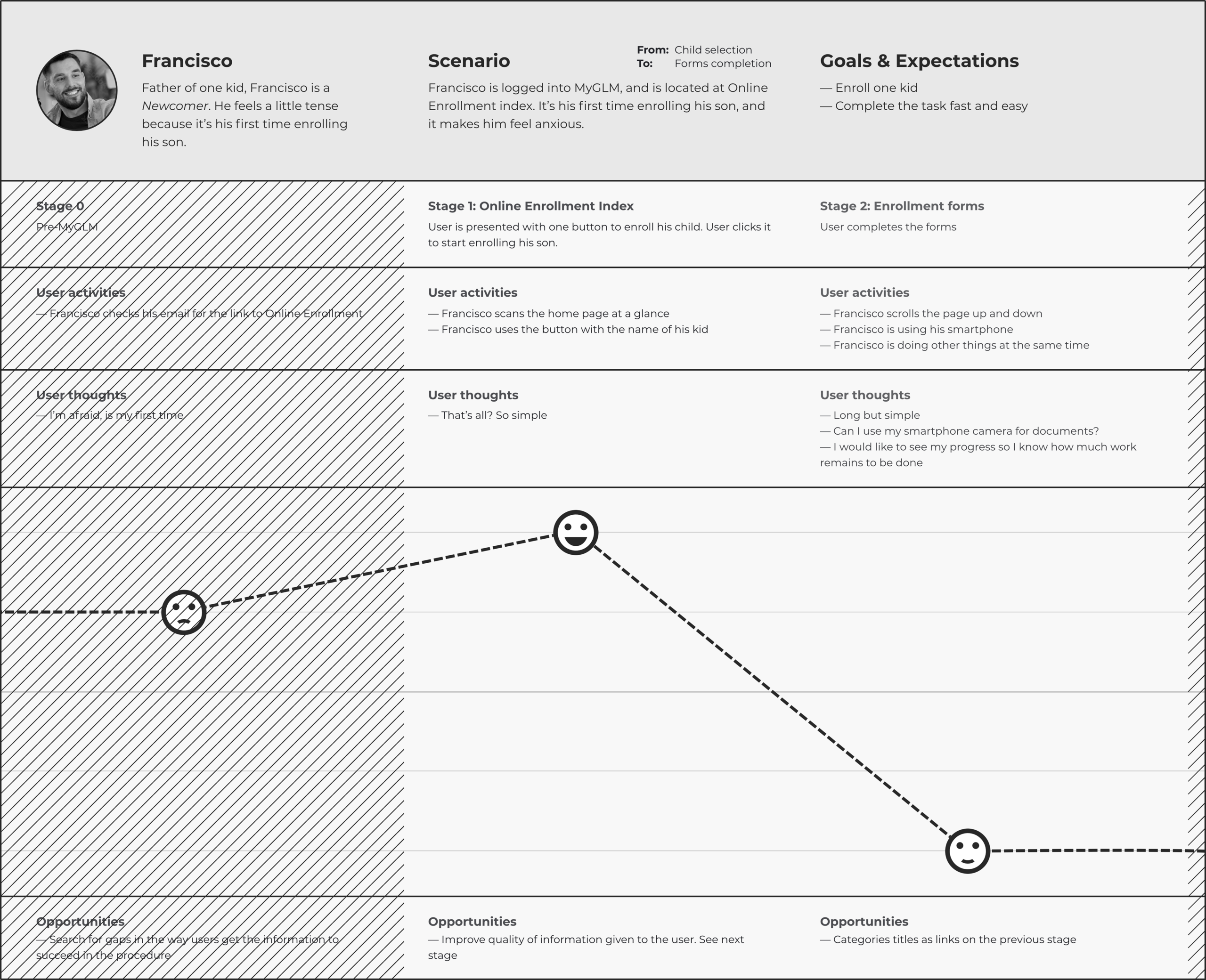
The Customer Journey exercise demanded to be iterated. More about it in a while.
Prototype #2
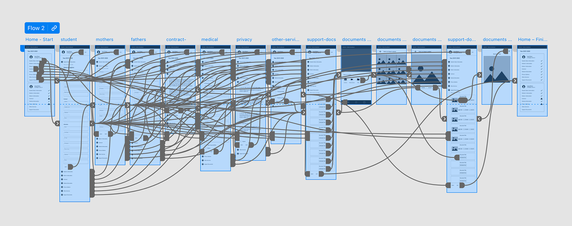
I wanted to solve the issues most directly affecting the UX that were detected earlier (i.e., very long forms and unclear categories) and integrate the new user research conveyed by the Empathy Map and User Persona methods. Then, I iterated the user flow and some UI elements before integrating them into the new prototype.
User Flow
How to reduce user fatigue on such a long journey? Initially, I segmented the flow according to the initial categories. Time for teamwork: we enriched the proposed flowchart by suggesting functionalities that could help us to improve the UX.
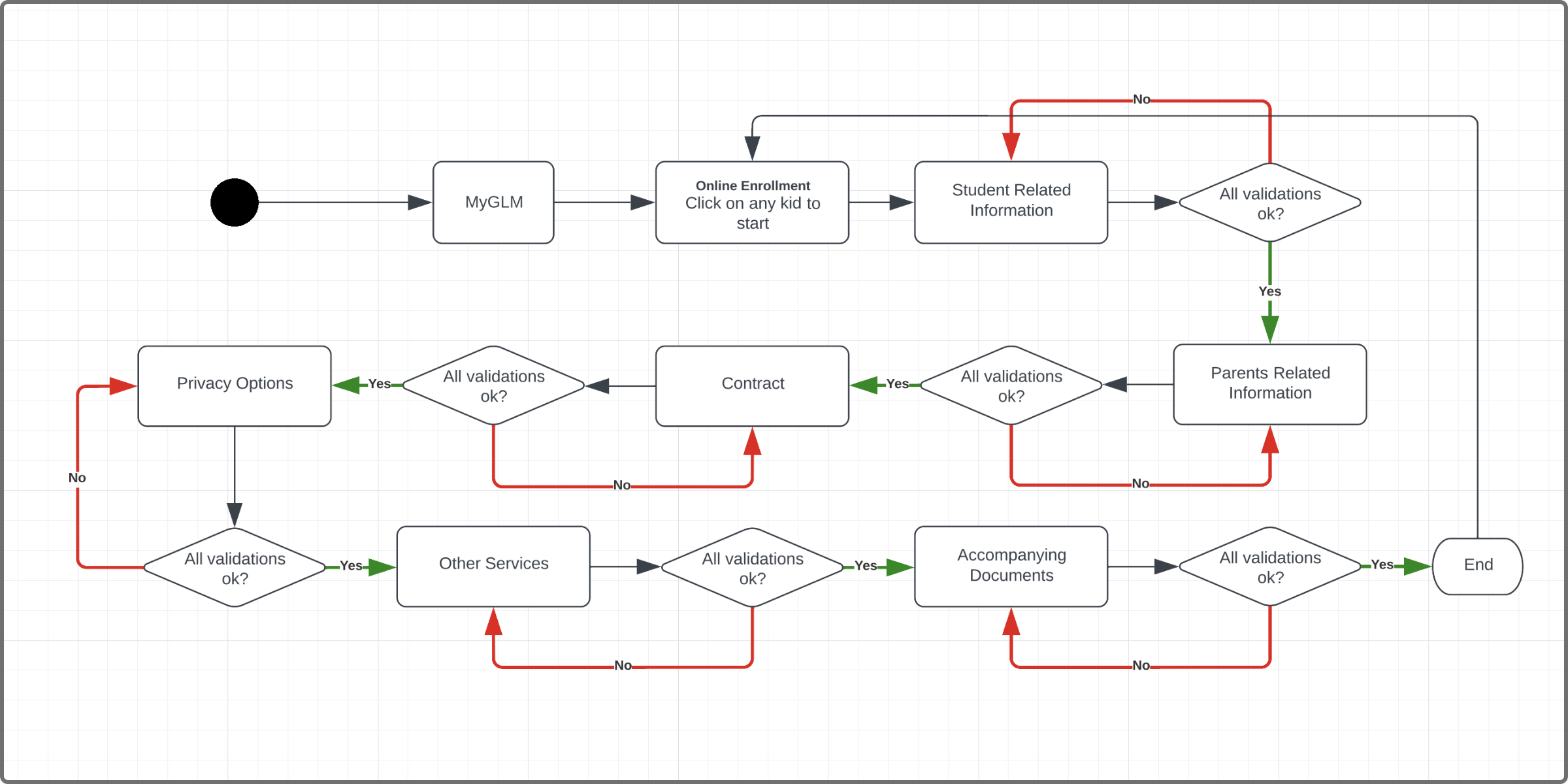
In this iteration, I segmented the linear flow according to the initial data categories. It was discarded when I simulated the flow with “pseudodata”, and identified that the long process perception emerged as with the first prototype.
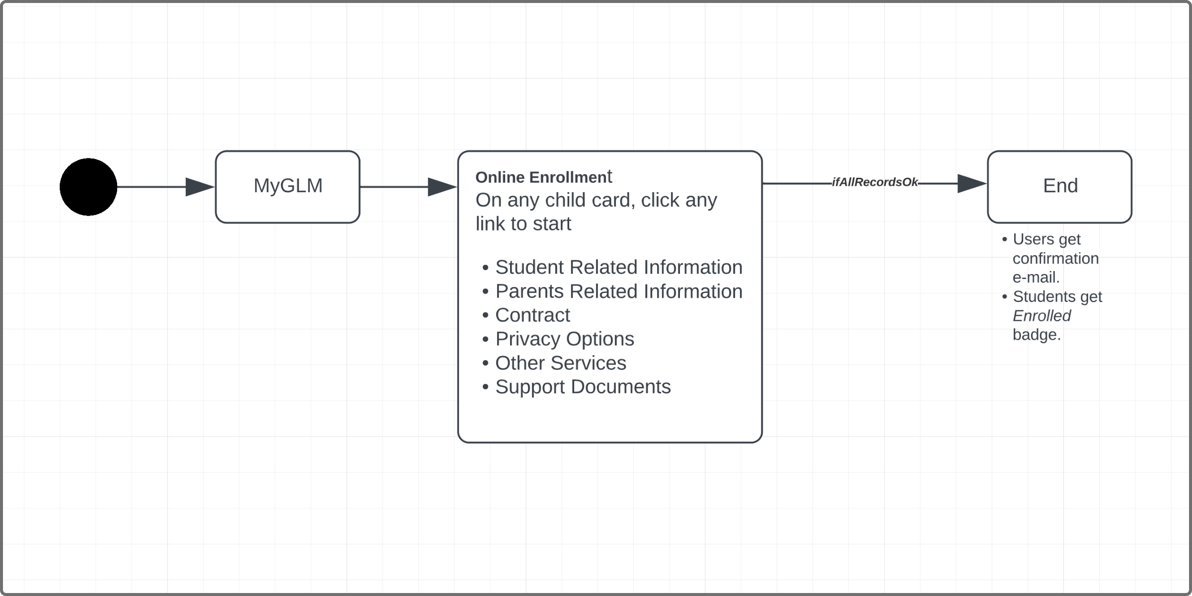
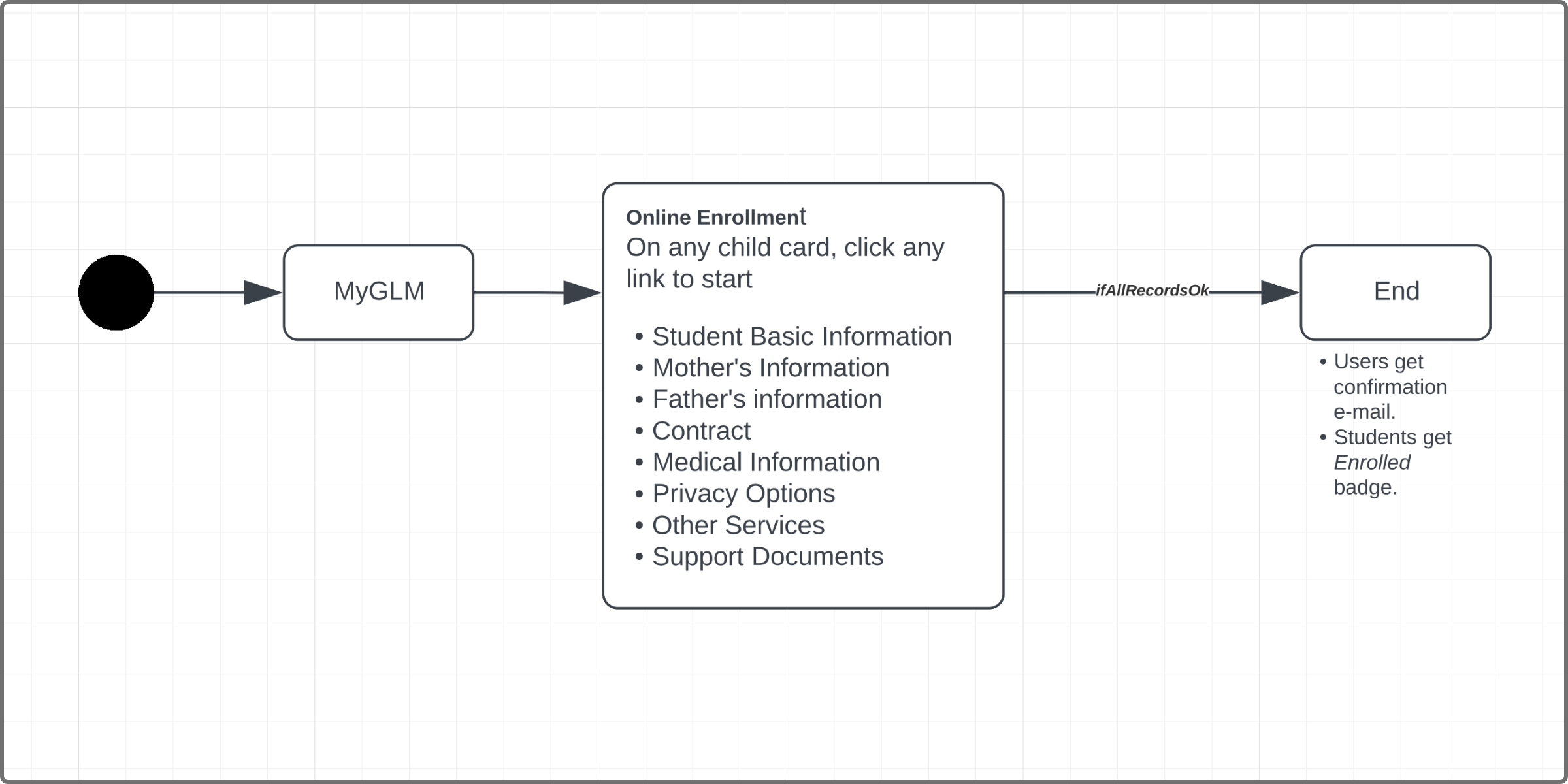
Almost there! The previous iteration showed us the possibility of providing a non-linear flow. The user could fill in any step, at any time, before GLM closes the enrollment period.
In the final stage of this iteration, I proposed new categories to replace the old ones. In addition, I complemented the process with two new items (confirmation e-mail and student badge) to round out the whole journey.
How can I give more value to my users?
Wondering on how I could provide more value to my users in the context of this product, I reviewed and iterated some UI components.
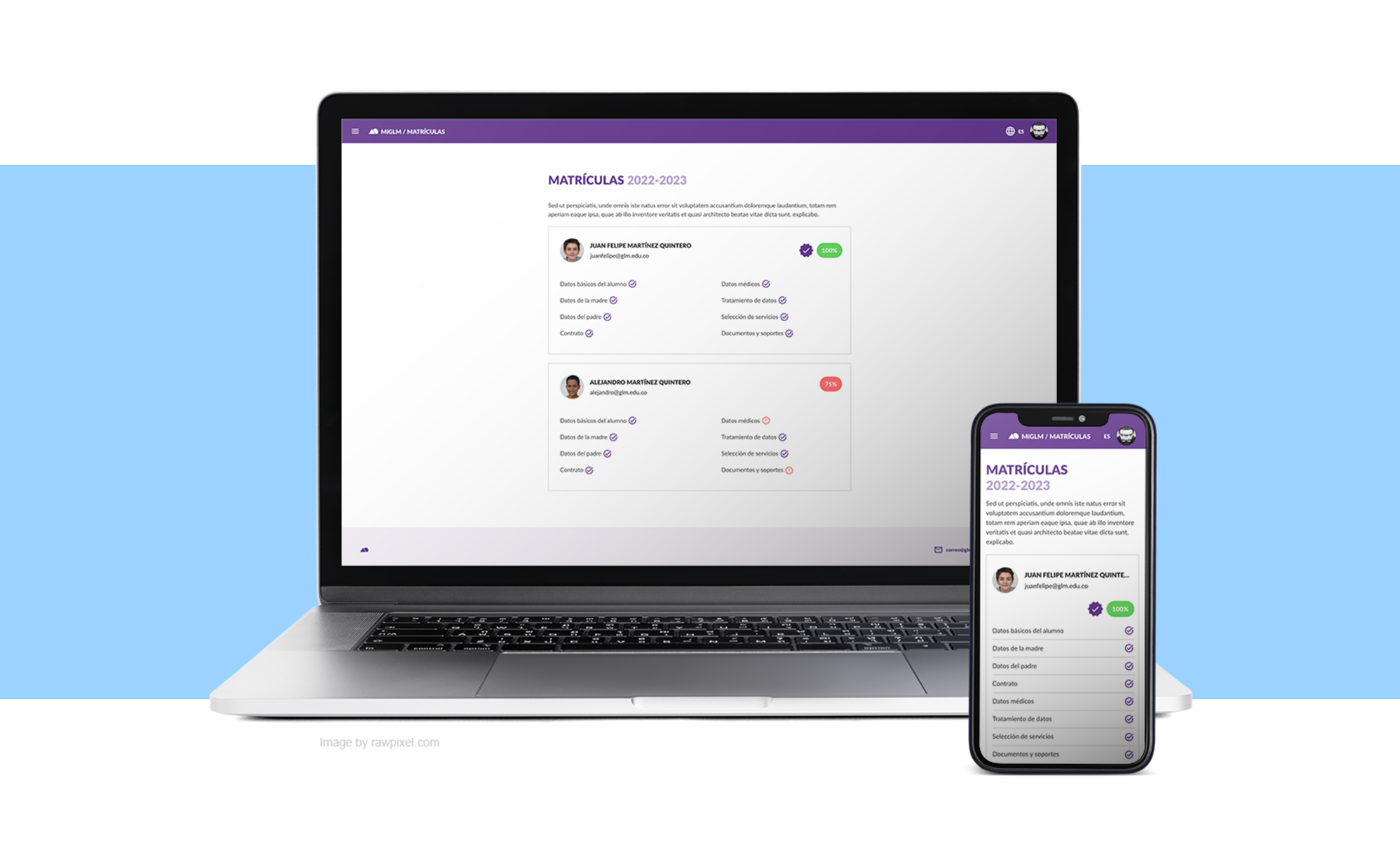
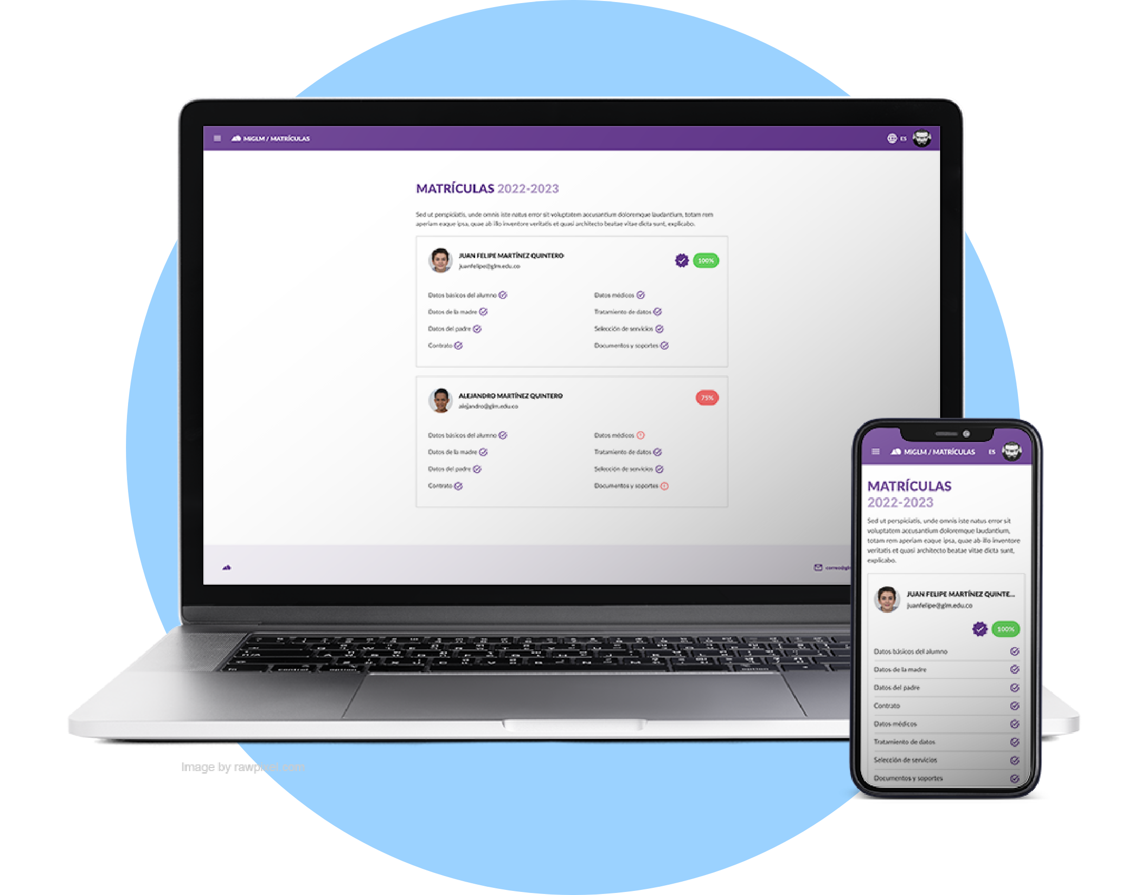
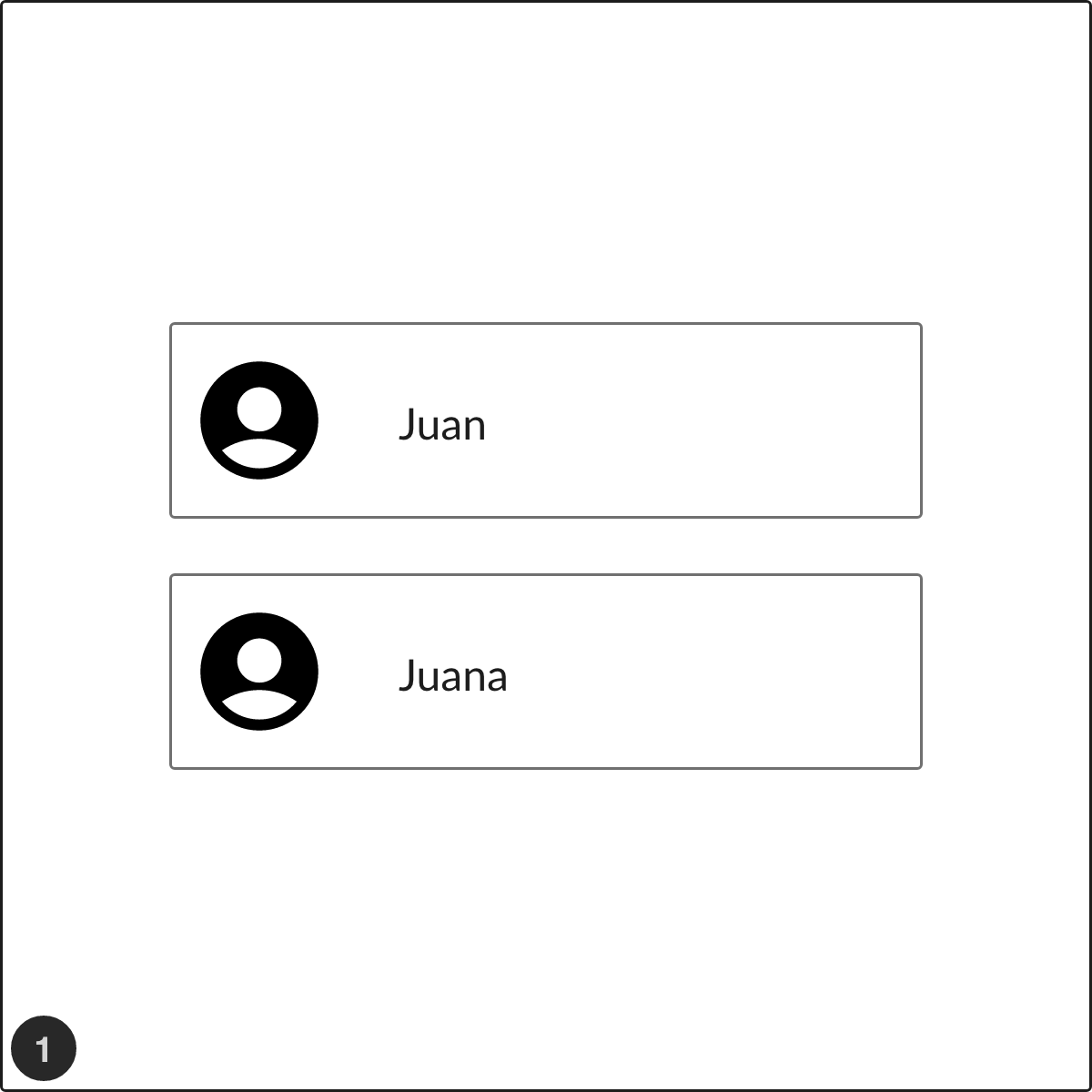
Building the Child Card
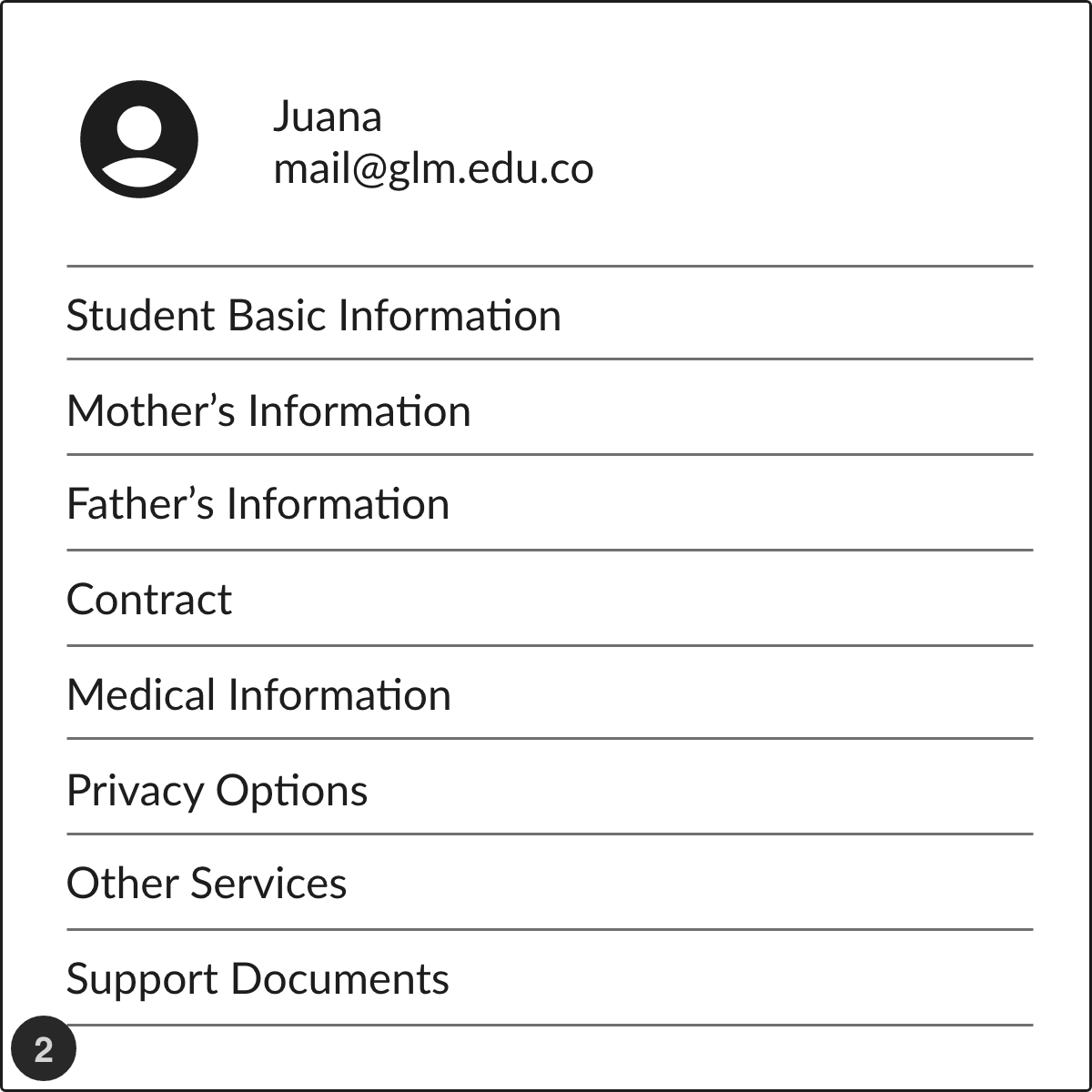
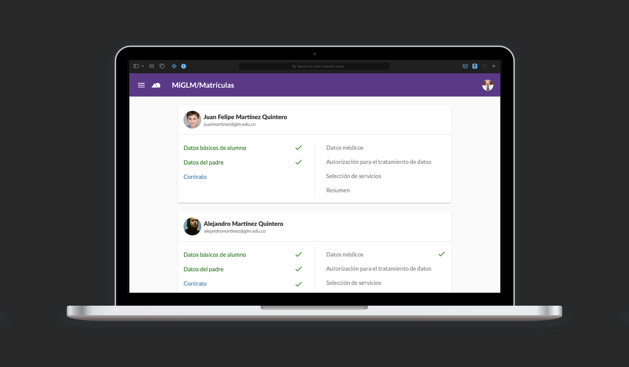
How could this component be more useful for users? Starting from the first iteration, I added some UI elements: links to each step of the process and percentage of progress to show the completion status of each child.
➊ In the first prototype, I only added one simple button for each child. Minimal functionality.
➋ Segmenting the process into several categories allowed us to link directly to each step of the process, providing non-linear navigation to users.
➌ & ➍ Percentage indicators could provide feedback to users on their progress; but we found that it was impossible to achieve 100% on much cases, leading to misinterpretations. What to do?
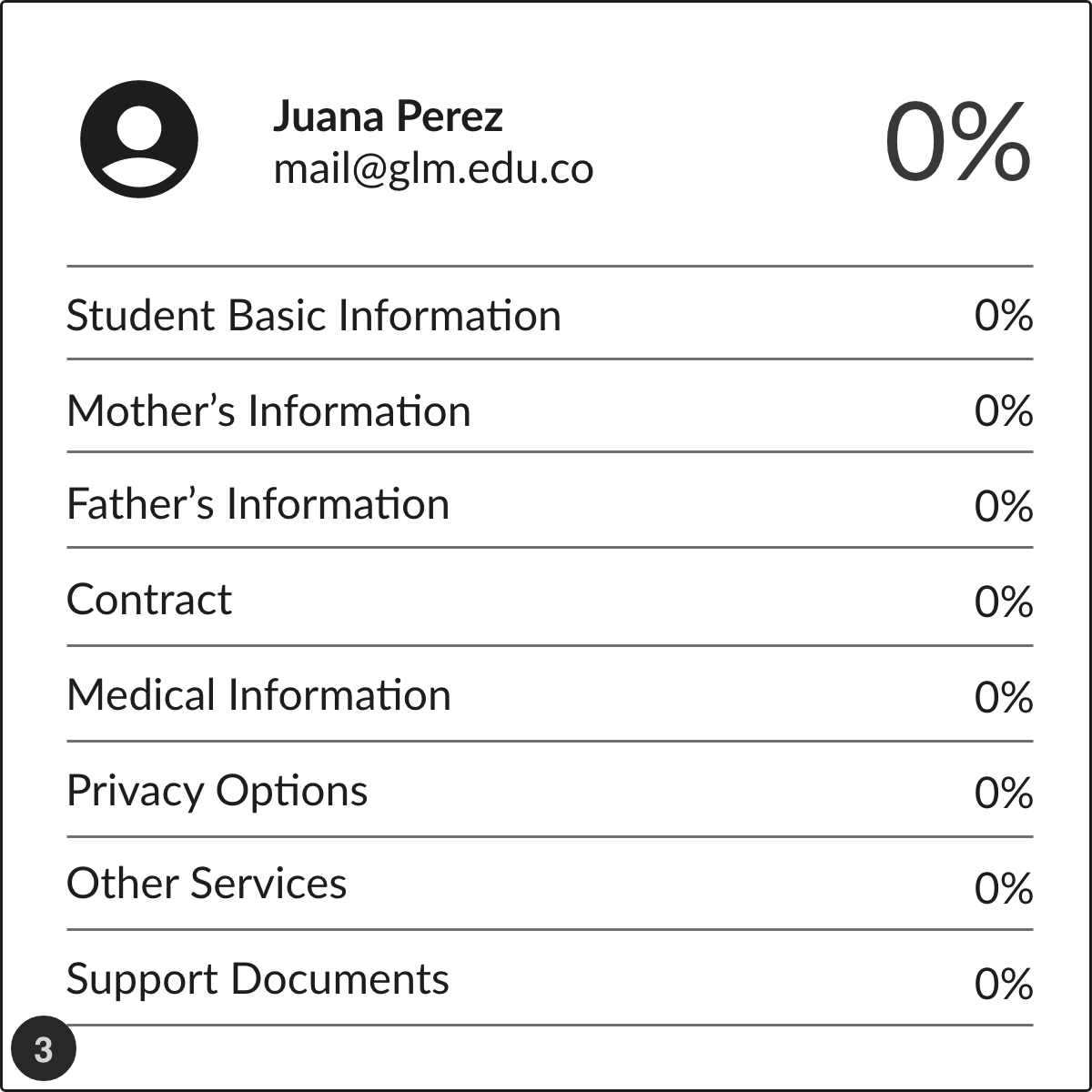
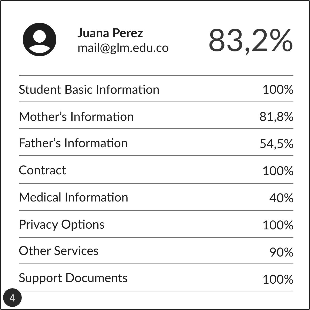
Moment of verification: Faced with the question “What does the 83.2% indicator tell you?,” most users tended to have a sense of incompleteness, and were confused when told that the process is completed even at 83.2%.
Indeed, inaccurate readings could occur when a user did not reach 100% progress, even with all forms completed.
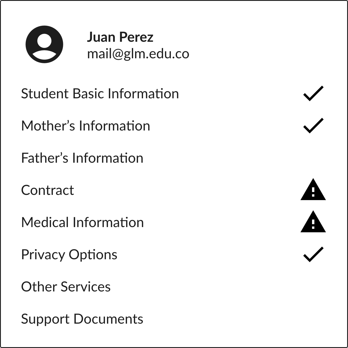
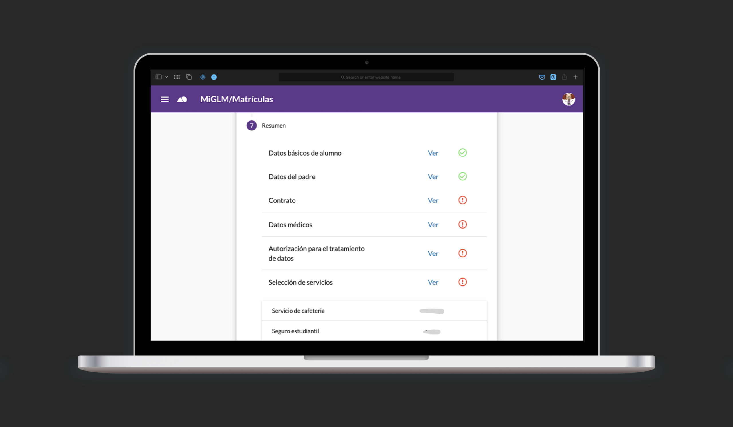
Child Card
I replaced percentages with the check icon for sections already solved. Warning icons indicate data verification problems on any category. Initial status for all categories is empty.
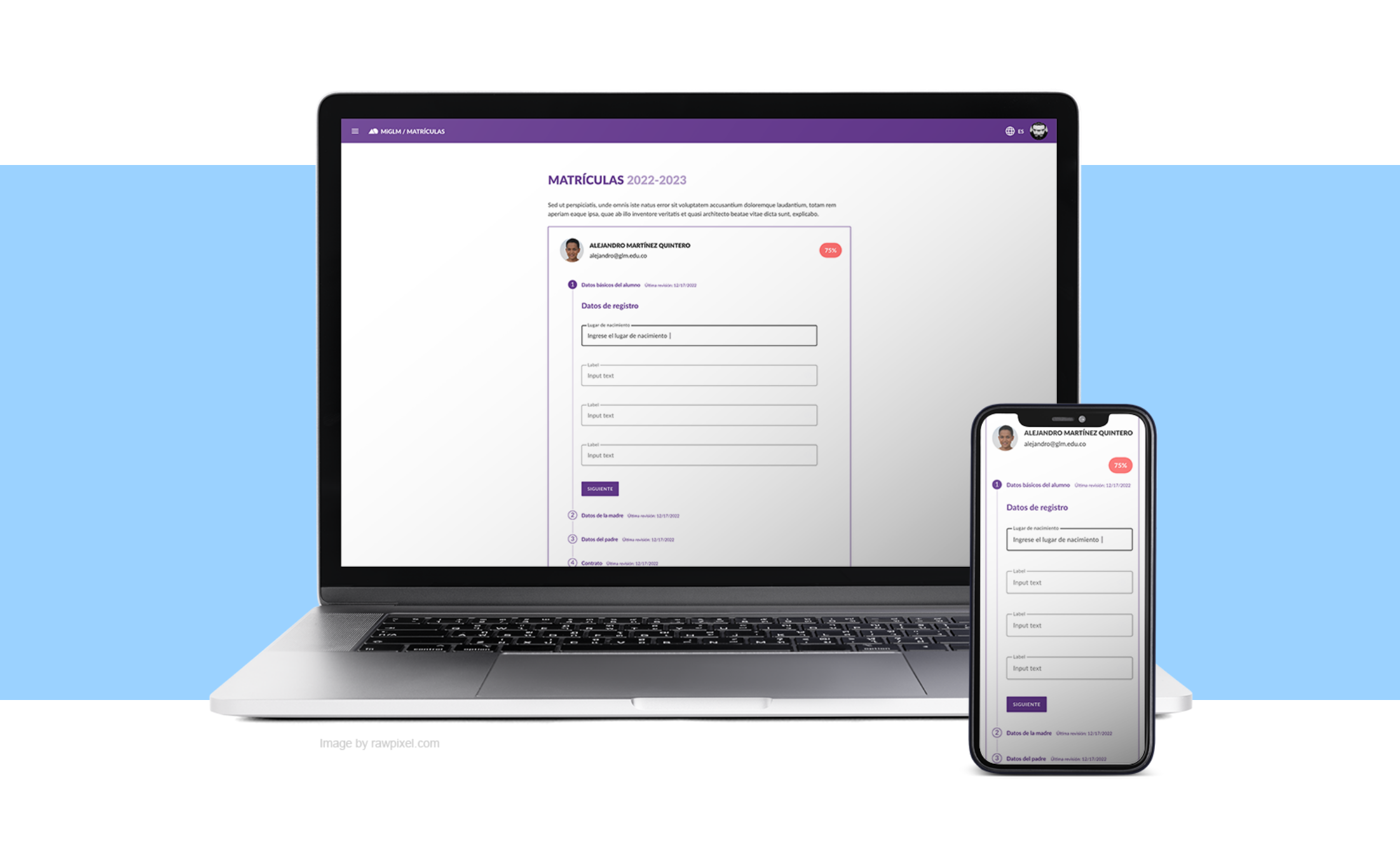
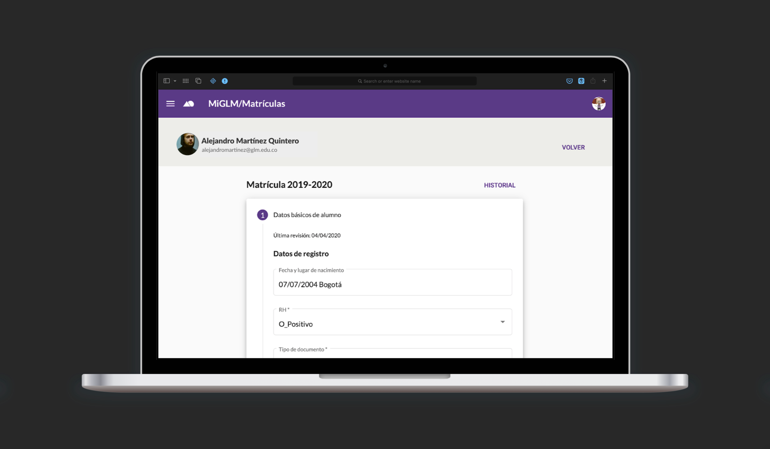
Prototype and Test
The conditions of this test were very similar to the first ones. I made this prototype by improving the presentation to get closer to the real behavior of its components. You can test the second prototype.
About test users: Same parents of past test.
Design Criteria: I scaffolded from the first prototype. This time, I segmented the whole process into more manageable pieces, all connected by using a stepper.
Test Scenario: “As a parent, I want to manage the forms and documents required by Gimnasio La Montaña to enroll my children online.”
What Did I Get This Time? I reviewed the list defined after the first prototype exercise. In general terms, the users rated the approaches positively.

More issues? Users suggested a potential issue regarding the scrolling position on each step animation.
Deploy and Conclusion
So, How did it do?
With a dropout rate of less than 1% (only 7 students out of 813 did not enroll that year,) the measures taken by the school ensured access to education for all of its students.
In the context of the COVID-19 pandemic, we prevented 813 students and their families from traveling to school, reducing the risk of contagion, and related problems.
Finally, although a small system, Online Enrollment greatly improved data management within the organization by integrating the data collected into other information systems, which contributes to the existing data-driven decision culture at GLM.
Lessons Learned
What can I say? Never before have I experienced the benefits of early prototyping in such a clear way. The shoot first, ask questions later tactic allowed me to identify problems very early in the development cycle.
It was also clear that the fidelity of the prototypes is decisive in the rounds of testing with users, so carrying out “realistic” simulations facilitates the description of the design intent and the subsequent decision making.
In retrospect, I think that although the development time was tight and put more stress on the process, the imminent arrival of the coronavirus pushed us to deliver.
Next Steps
In this new iteration I wanted to improve the visual elements to help users grasp at a glance more information about the process. I based my decisions on the data already gathered and described previously.