Context
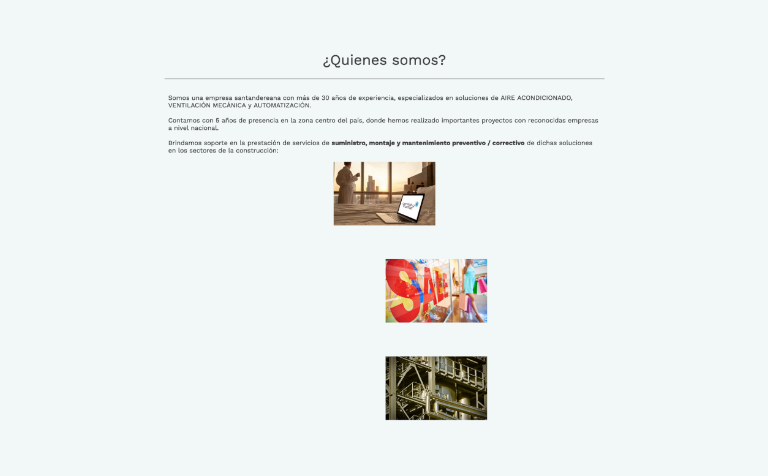
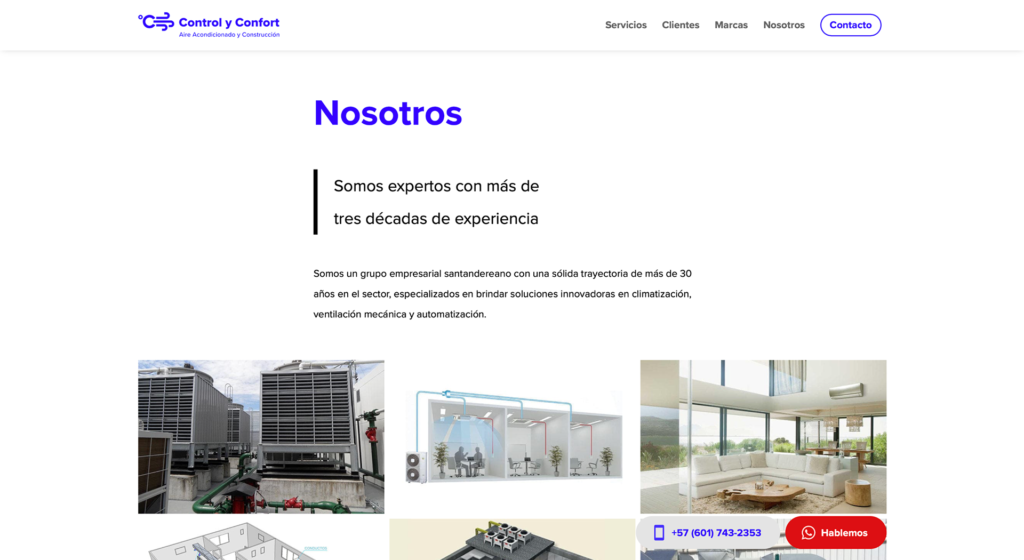
Control y Confort is an established construction company that has been operating in the Colombian market for 30 years, with a specific focus on HVAC (Heating, Ventilation and Air Conditioning) solutions.
Over the years, the company has experienced a steady growth trajectory, which has allowed it to expand its range of services and serve to much larger customers.
In this context, the organization considered that its previous website was outdated and did not accurately reflect its current business situation. Therefore, their main objective was to modernize and revamp it. During my research phase, an important opportunity emerged: developing a new logo for the company.
2 main goals


Process

As you can guess, I followed the Double Diamond Process, and I present this case study following the next steps:
- UX Audit
- UX Benchmarking
- Design requirements and brief
- Scope / IA
- Creating the logo
- Creating the website
- Prototyping: desktop, mobile
- Visual System Chart
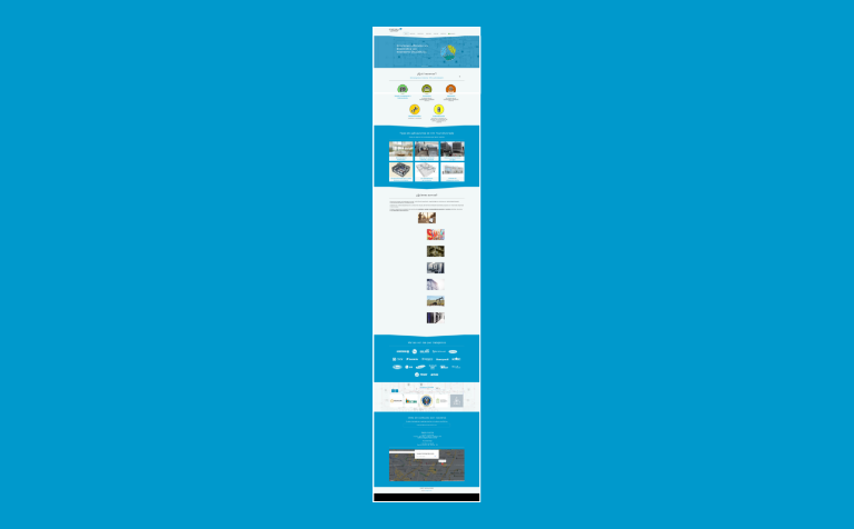
- Mobile Website
- Desktop Website
- Key Solutions
- Next Steps
Discover
UX Audit
I performed an audit to find the condition of the company’s website.
Key Findings
👍 ⎯ Simple and straightforward website flow
One-page website allows simple and easy navigation.
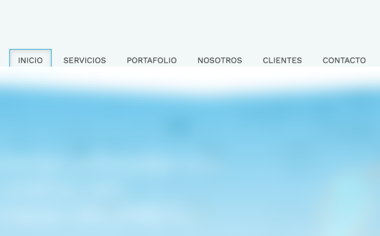
Shallow information architecture with only one level. It complements the one-page layout.
👍 ⎯ Easy customer communication

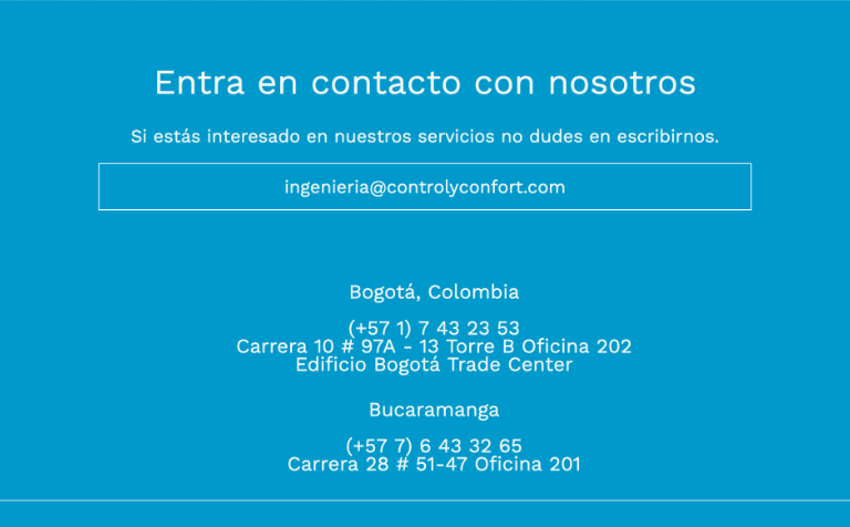
Direct contact with WhatsApp. Users can communicate easily using the main menu WhatsApp option.
👎 ⎯ Unprofessional looking design impacted customer trust and harmed the brand credibility
The unprofessional looking logo hurts the company’s brand image and credibility.
The inconsistent layout confuses visitors and hinders user experience.
Typography looks unprofessional and it’s hard to read in some cases.
Low contrast makes several elements difficult to distinguish, leading to poor readability and usability.
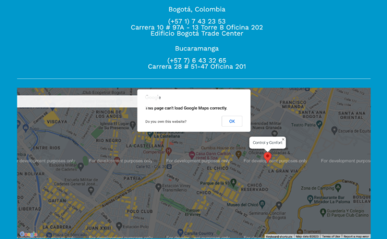
Not-working Google Map feature that confuses users.
⚠️ ⎯ Missing features

Lack of security certifications affects user trust and raises questions about the privacy of user data

No metadata hinders SEO, reduces online visibility, and limits discoverability, impacting digital marketing efforts.

Monolingual website limits potential customer reach excluding non-Spanish-speaking users.
UX Benchmarking
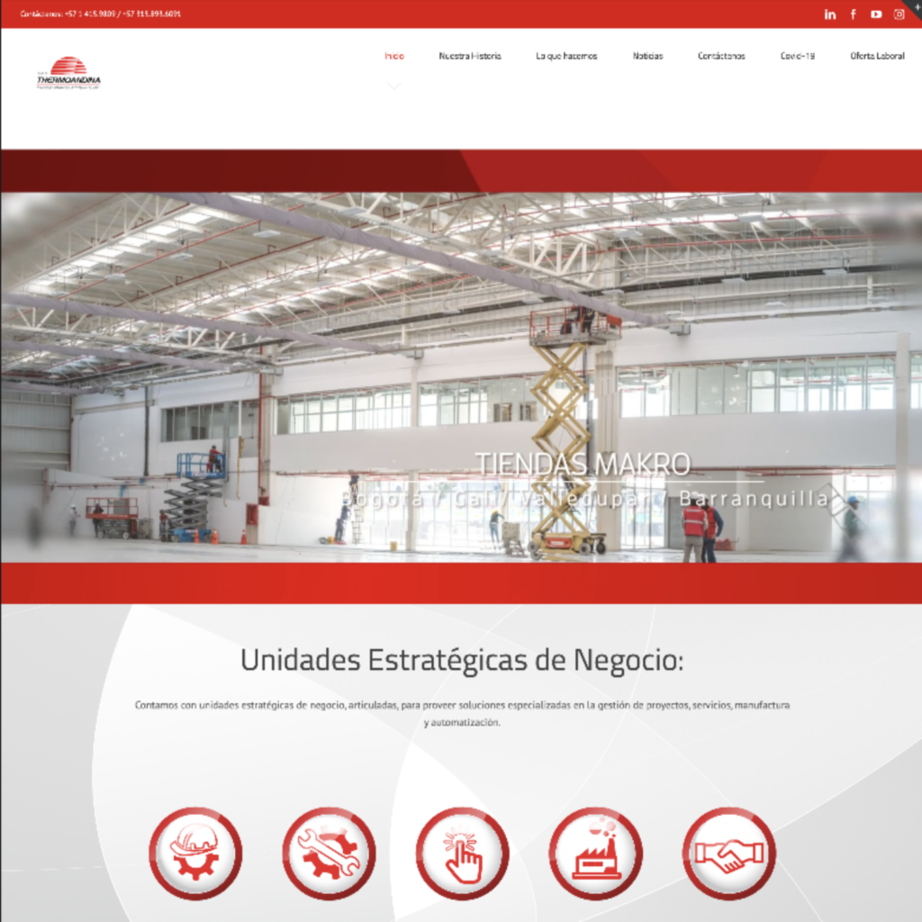
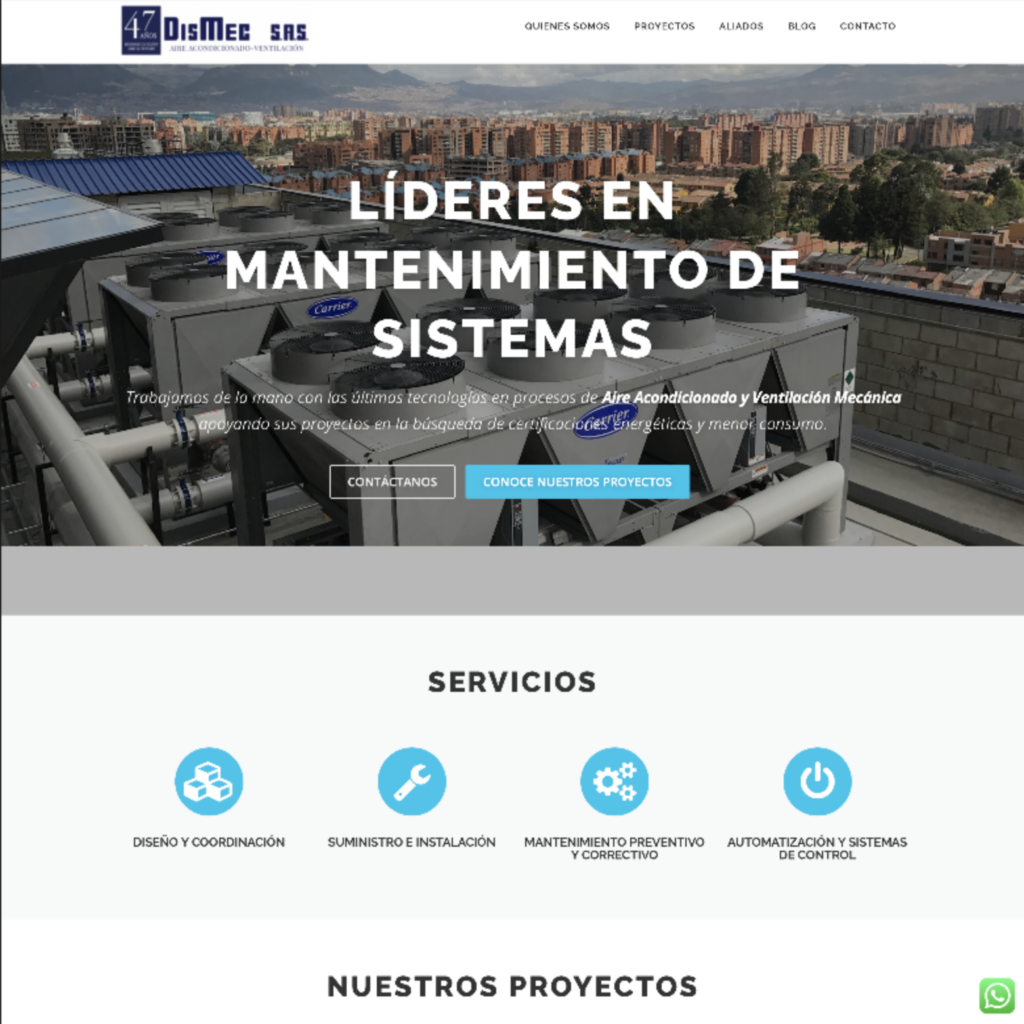
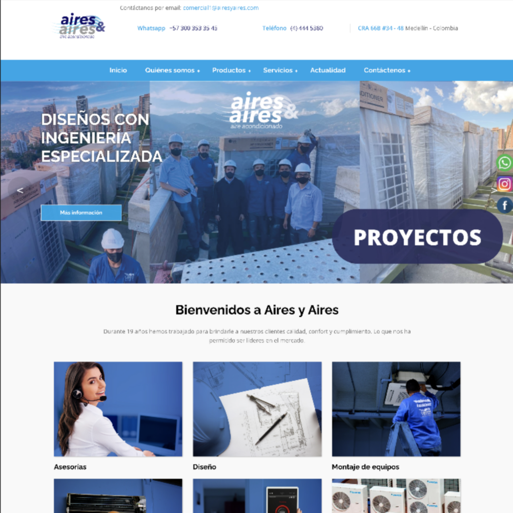
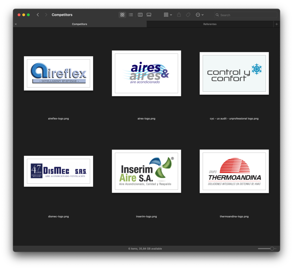
I conducted a competitive audit to gain insights into the user experience of five industry competitors. Through this audit, I assessed nine key aspects of their websites and compared them with Control y Confort own website.
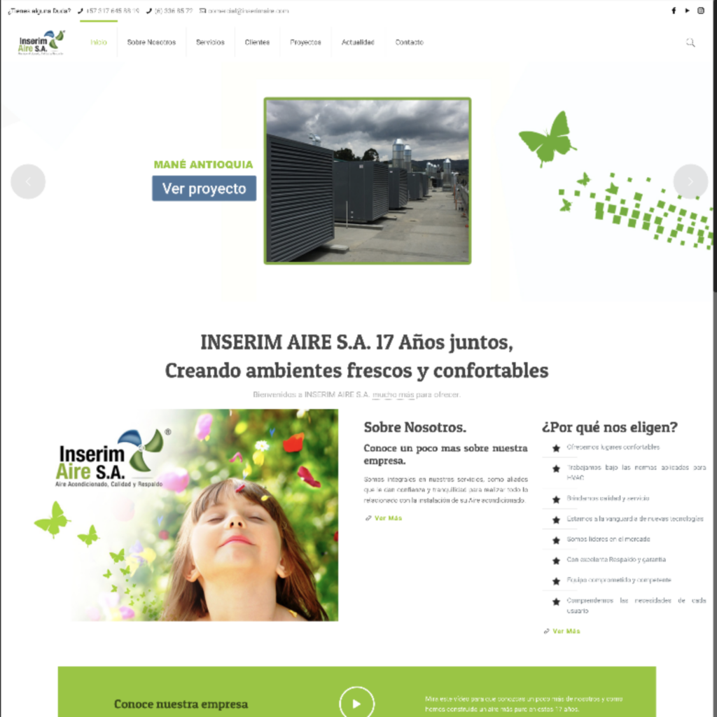
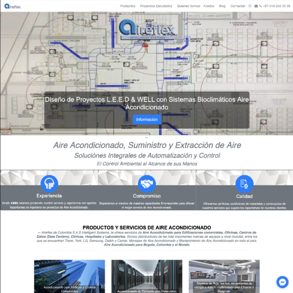
Key Findings
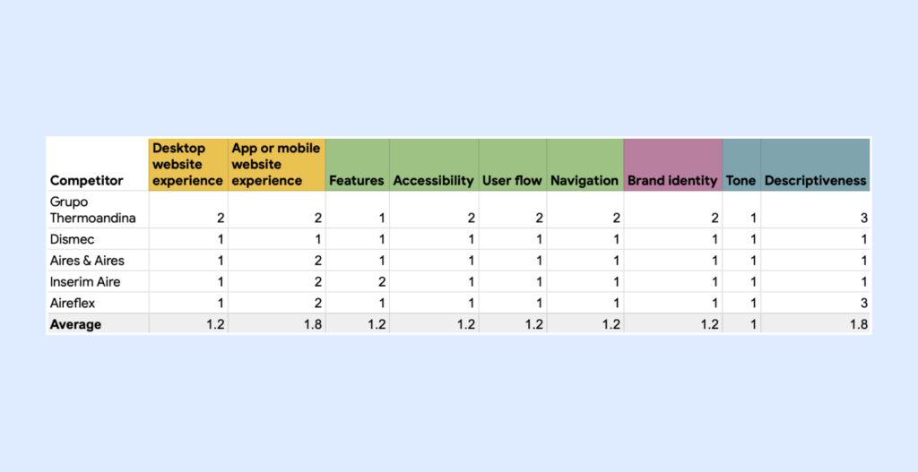
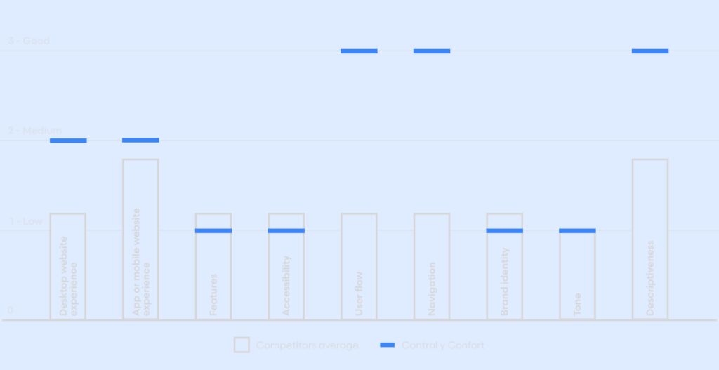
UX Related
- All websites feature simple information architectures.
- Some websites present complicated user flows.
- All websites use messaging apps to facilitate communication with users.
- All websites present virtually zero accessibility options.
- All websites are written in Spanish only.
Visual Related
- All websites use generic-looking graphics.
- Almost all websites present cluttered visuals and excessive graphic resources.
- Poorly developed branding and visual identity is commonplace to all websites.
Content Related
- All competitors effectively tell what their business is about.
- All websites use language that is both technical and distant.
Conclusions
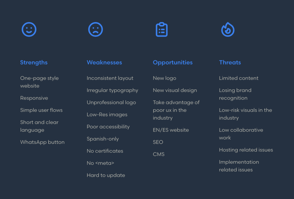
I have synthesized the previous two analyses in the following SWOT chart.
Define
I discovered several issues that Control y Confort shared with its competitors, such as poor visual identity and lack of attention to user experience. My approach was to prioritize the most prevalent issues and solve them to improve the brand’s perception and improve the relation with the users.
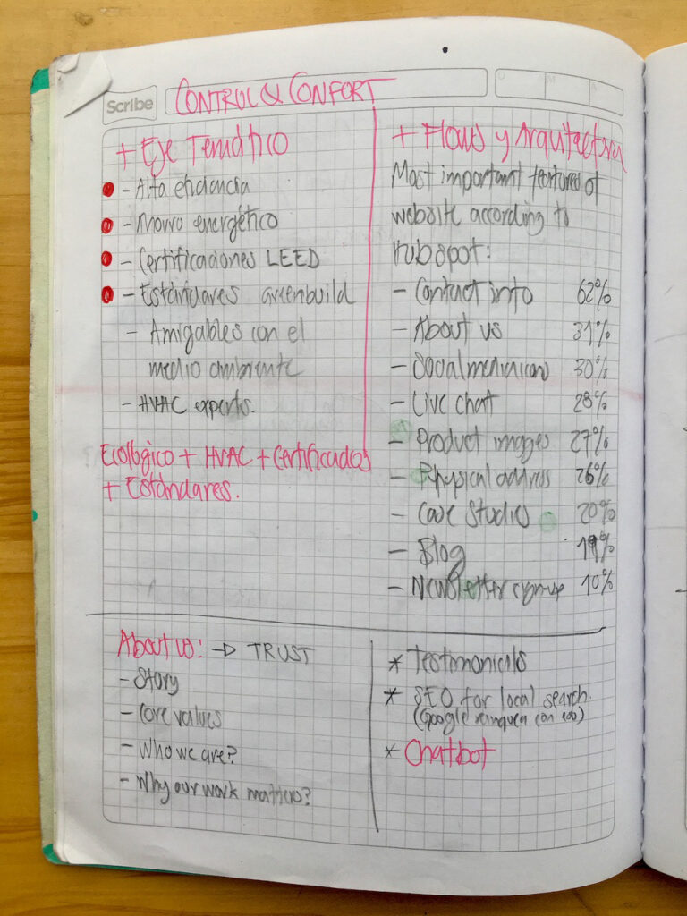
Objectives
- Improve brand identity, quality perception, and user satisfaction with the new website and logo design.
- Differentiate the company from competitors by addressing prevalent UX issues in the industry’s websites.
Requirements
- Create a visually appealing logo that reflects the brand’s identity.
- Develop a clear and accessible design that prioritizes users.
- Establish a visual hierarchy with easy-to-read typography.
- Design clear call-to-action buttons.
- Use optimized, high-quality images.
- Include English version.
- Apply SEO best practices.
- Make the new website easily upgradable.
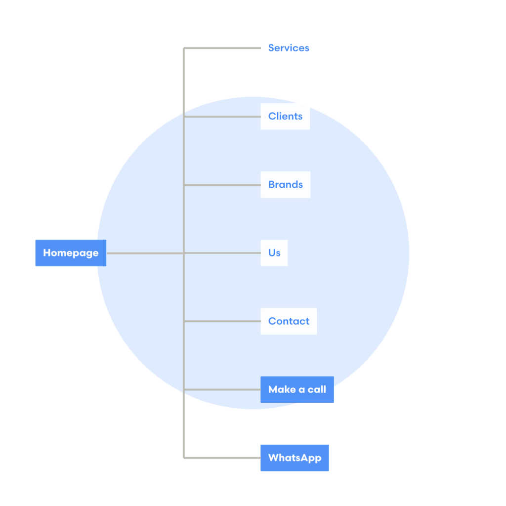
Scope / IA
- Create the new logo
- Develop a visual micro-system
- Build the new website
Develop
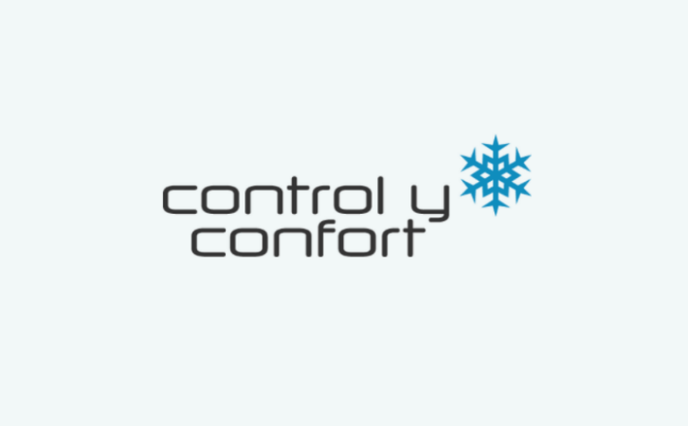
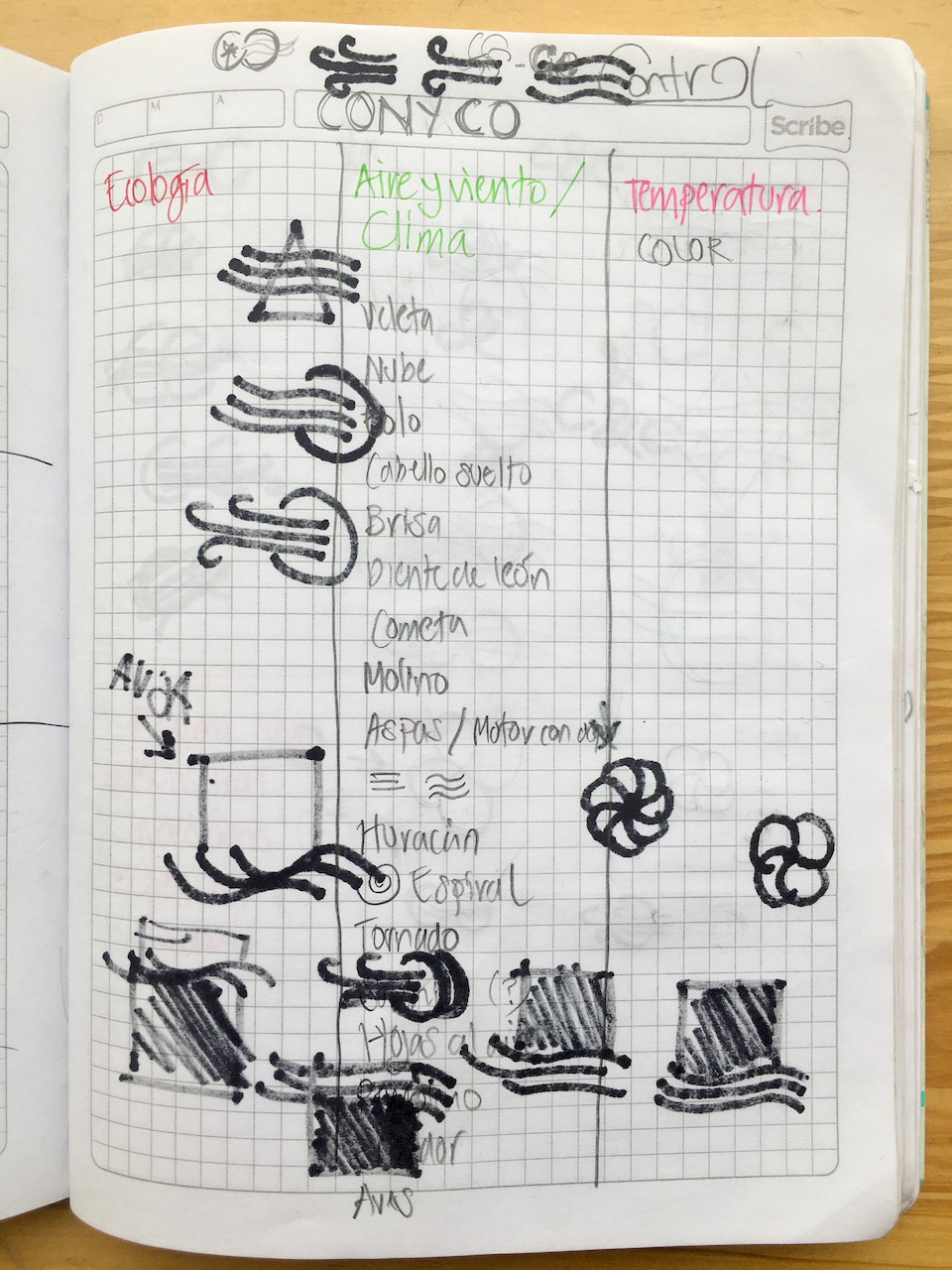
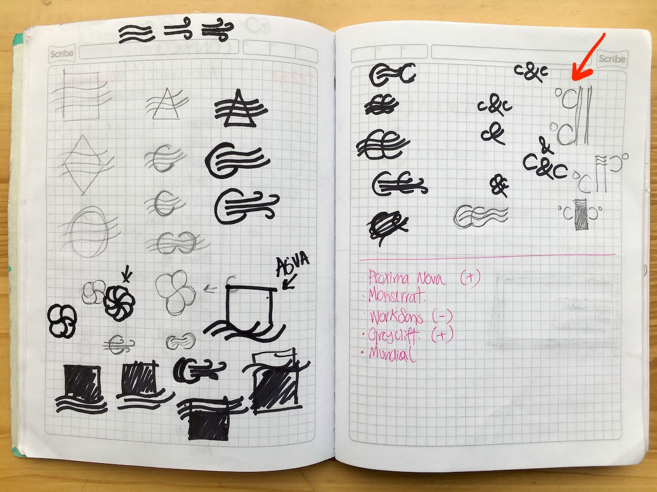
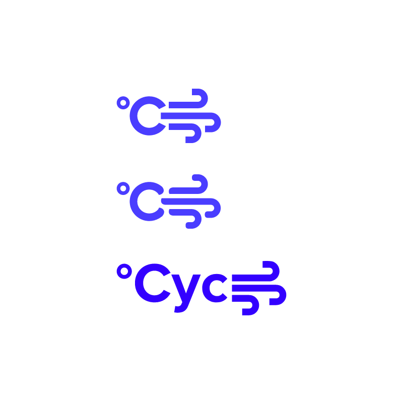
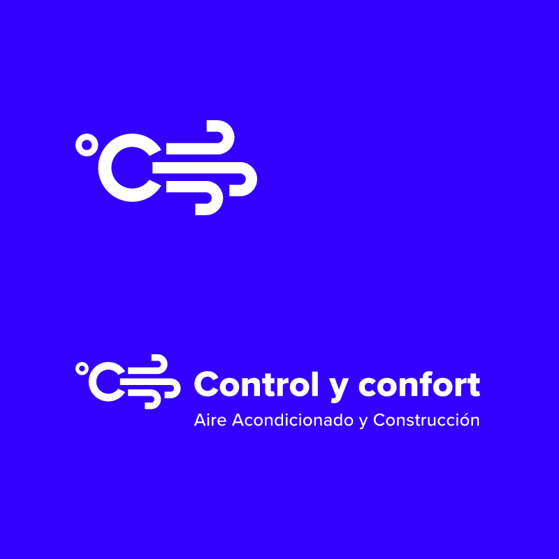
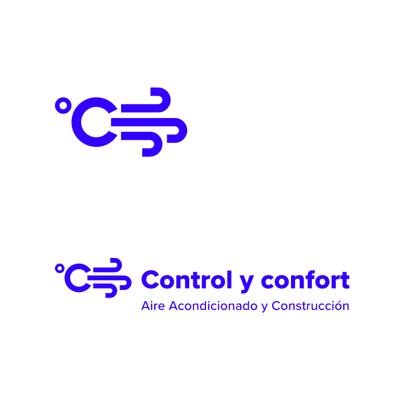
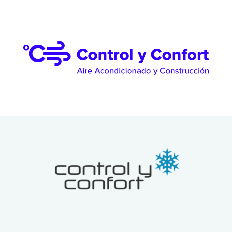
Creating the logo
Geometry * (Air Flow + Temperature)
Crafting the website
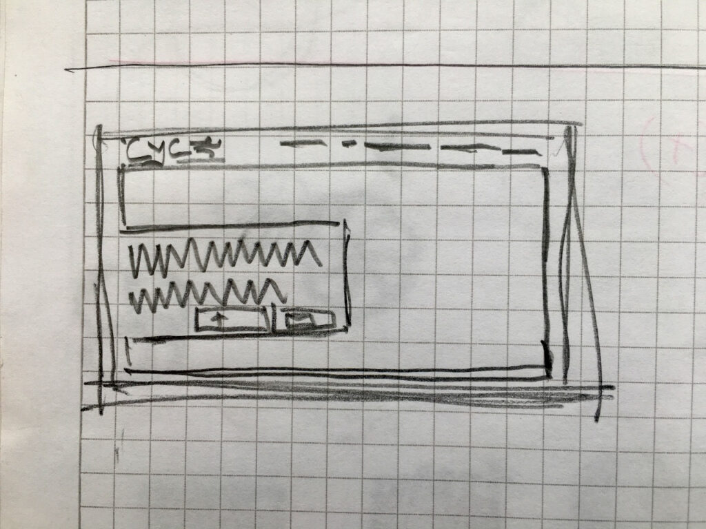
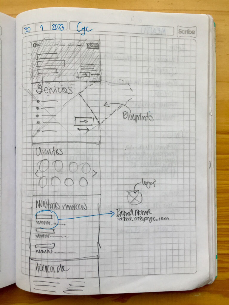
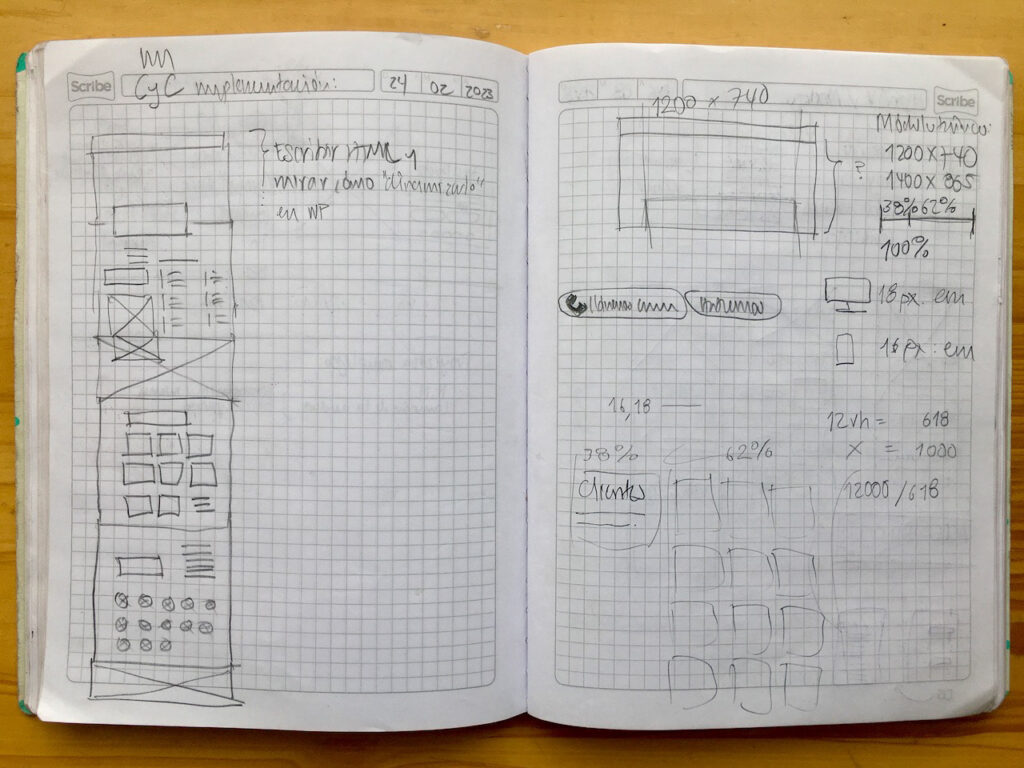
Prototyping
I built two prototypes to ground most of the ideas developed previously.
Mobile First
Needless to say, but I started this stage by solving the small screen version of the website.
@media only screen and (min-width: 1400px) { }
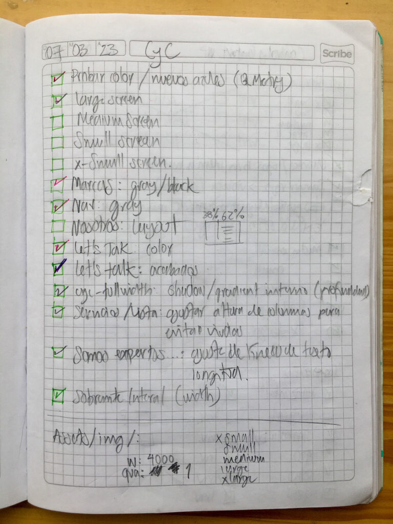
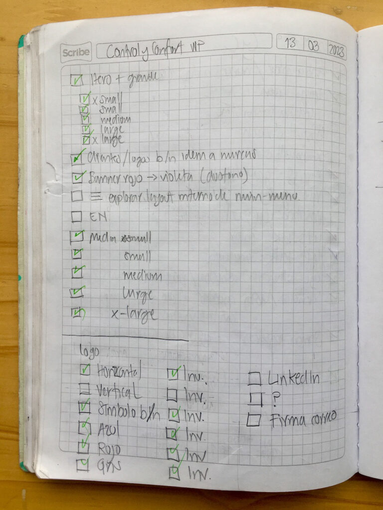
I only crafted prototypes for two screen widths. At the end, I setup five screen sizes to cover most viewport widths.
Deliver
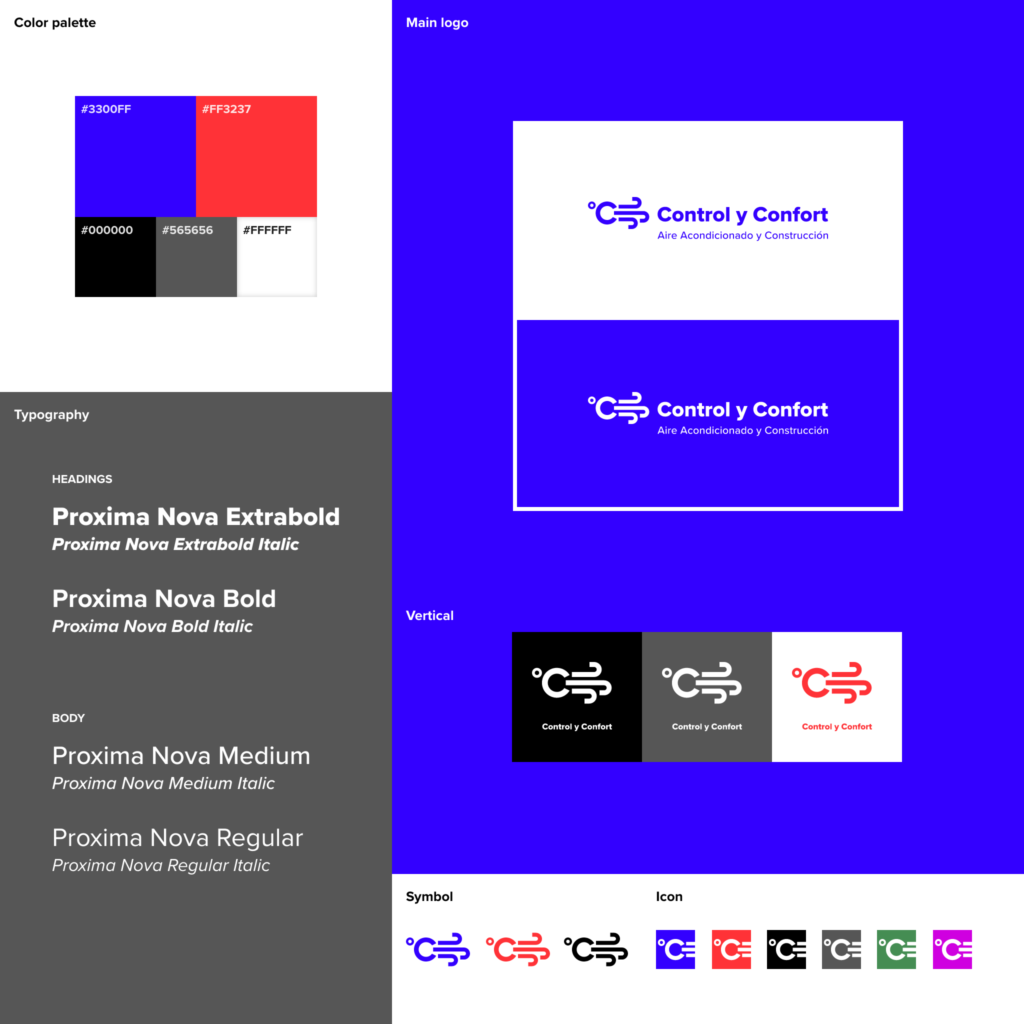
Visual System Chart
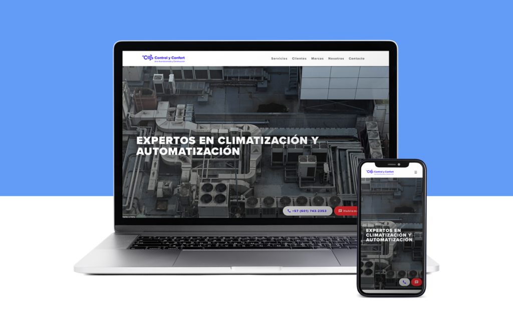
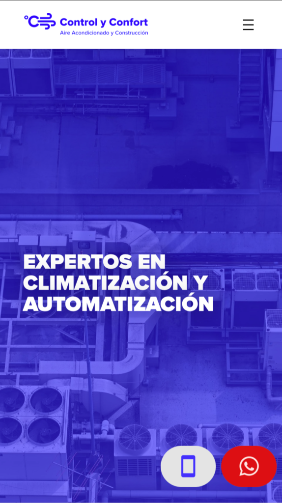
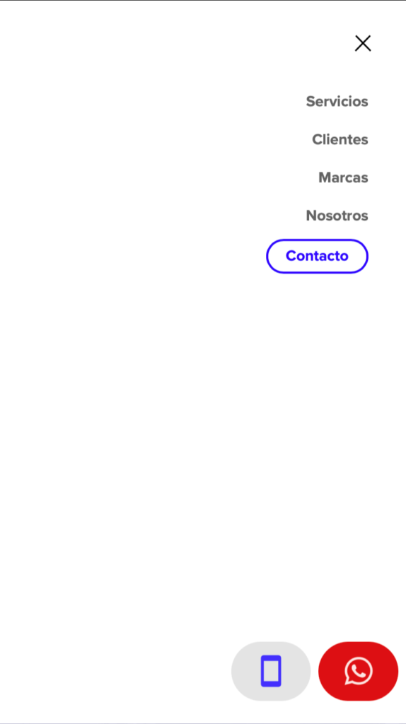
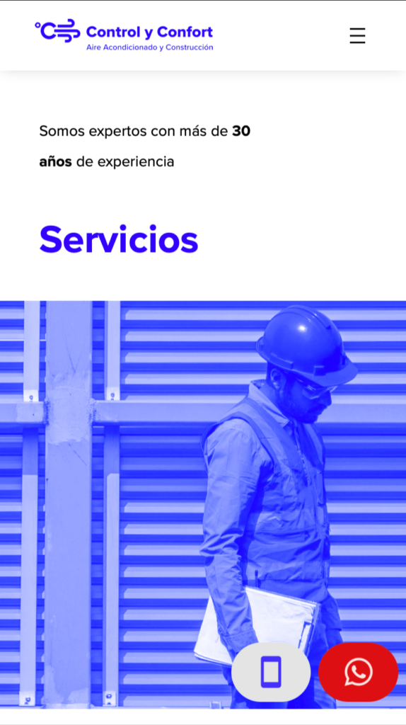
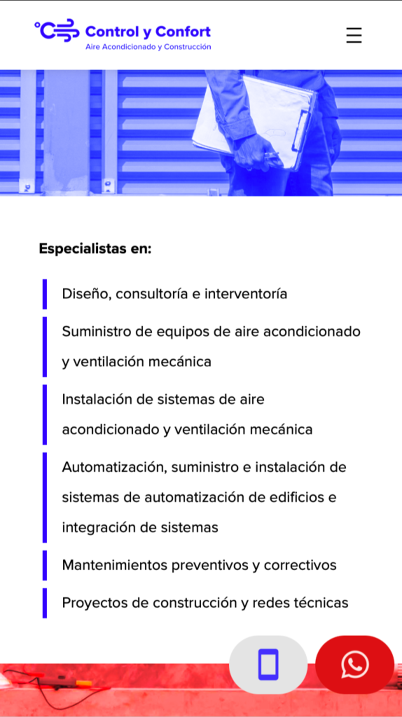
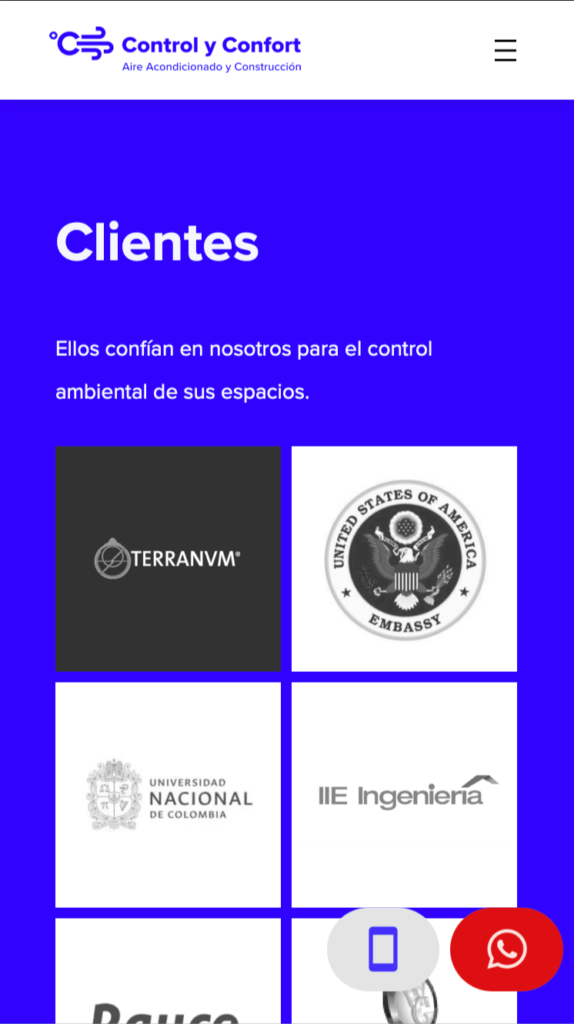
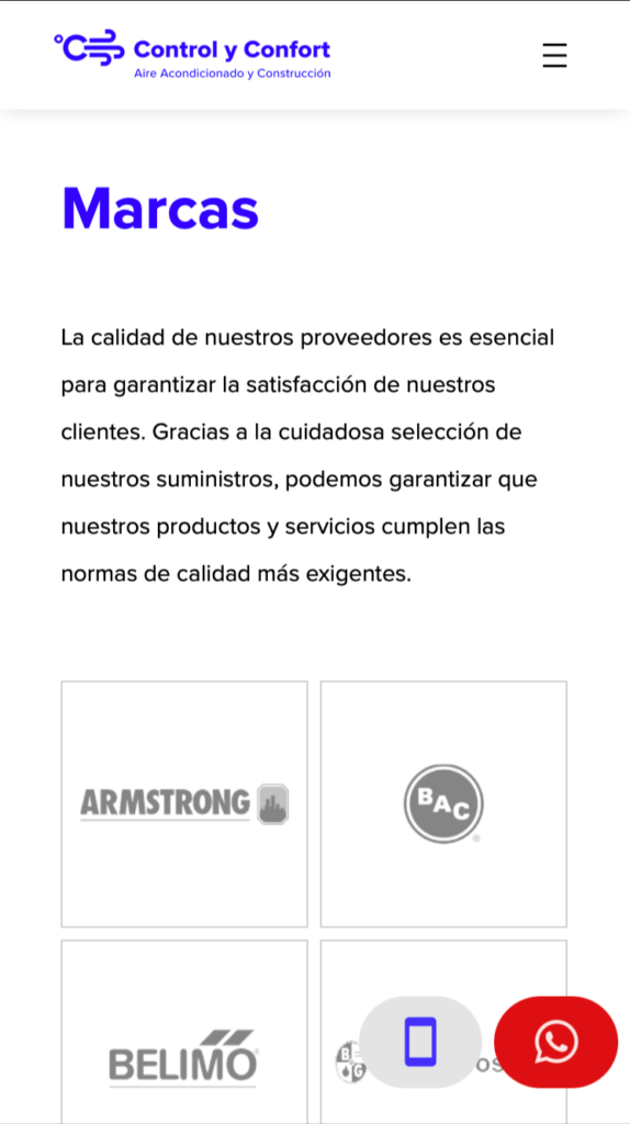
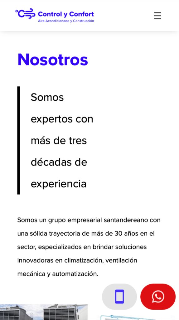
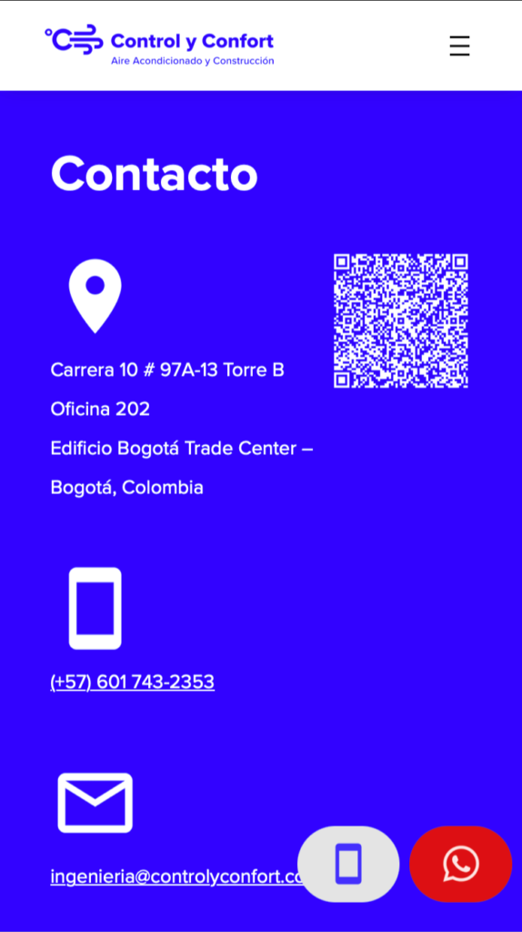
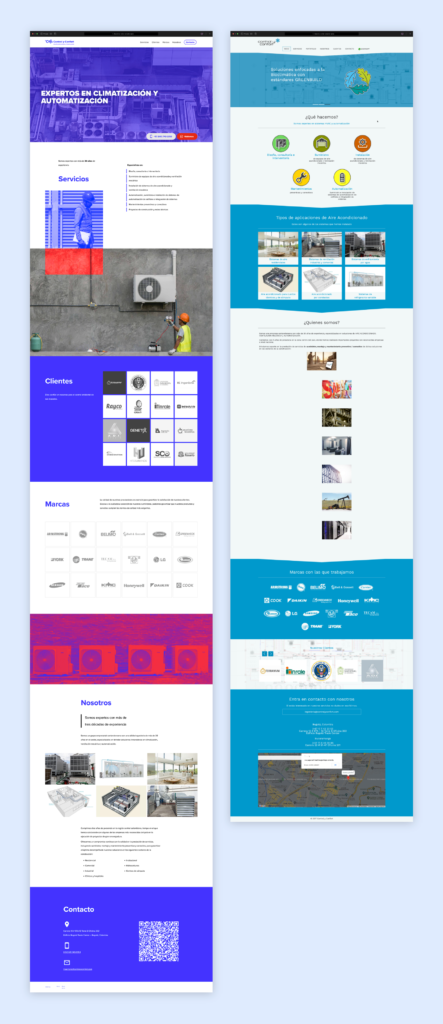
Mobile Website
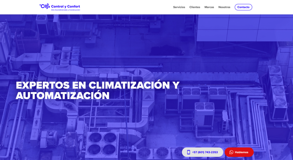
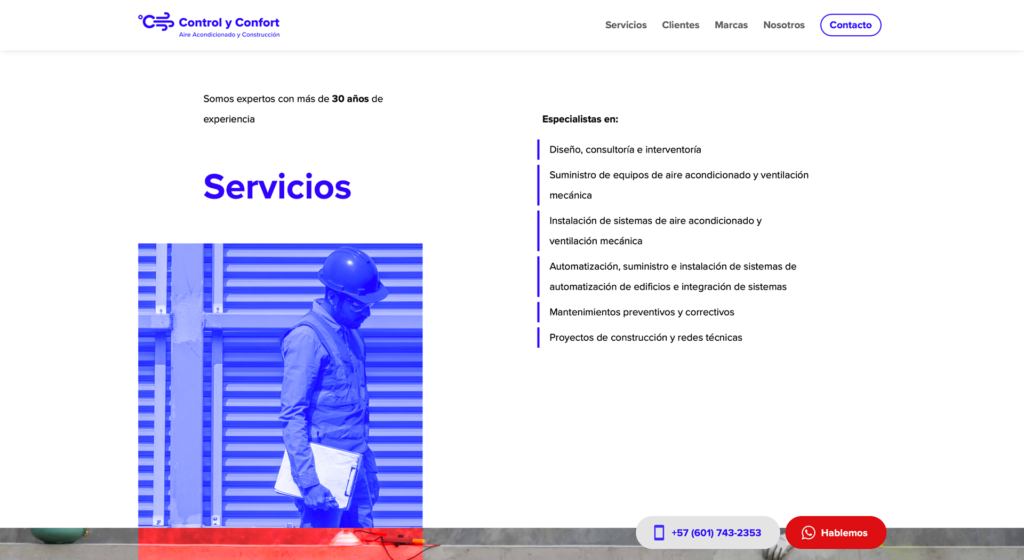
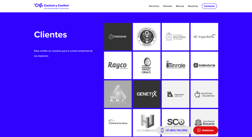
Desktop Website
Key Solutions
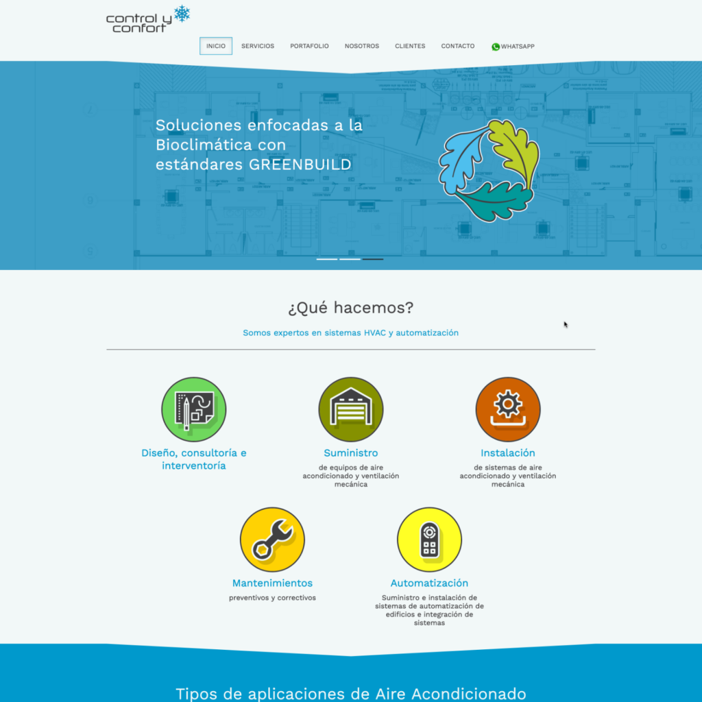
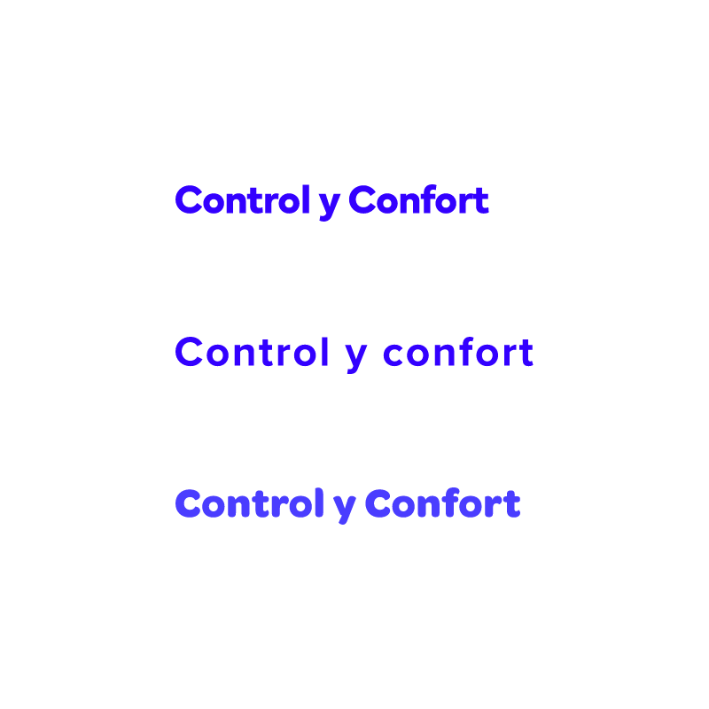
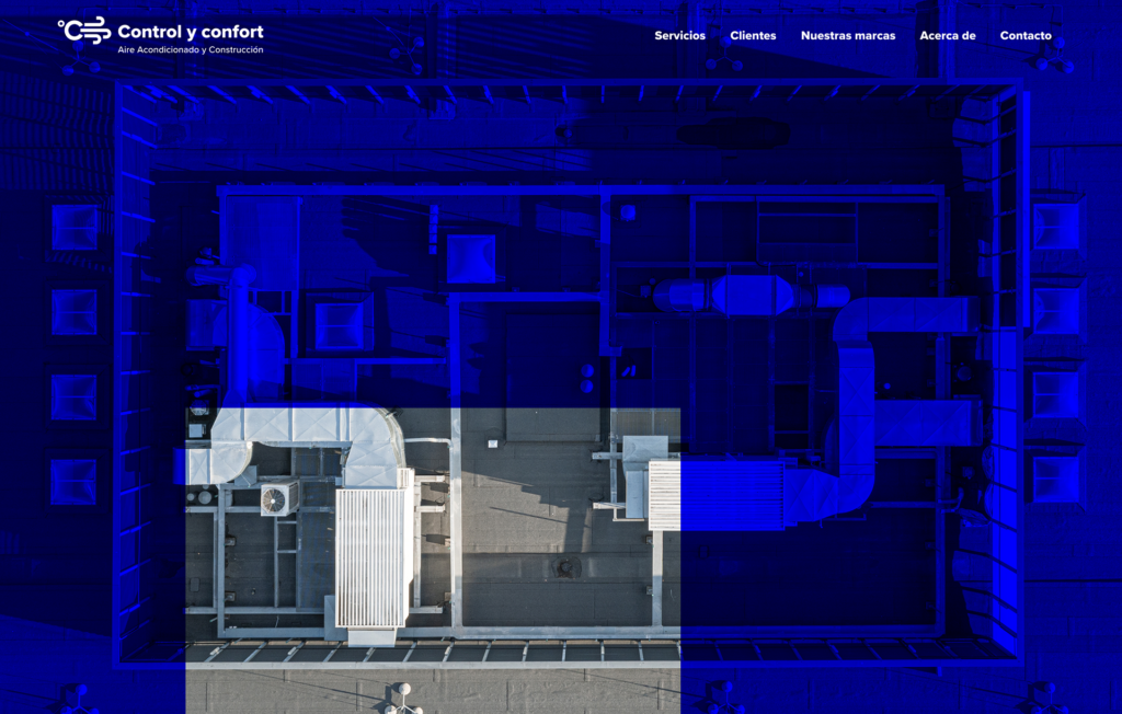
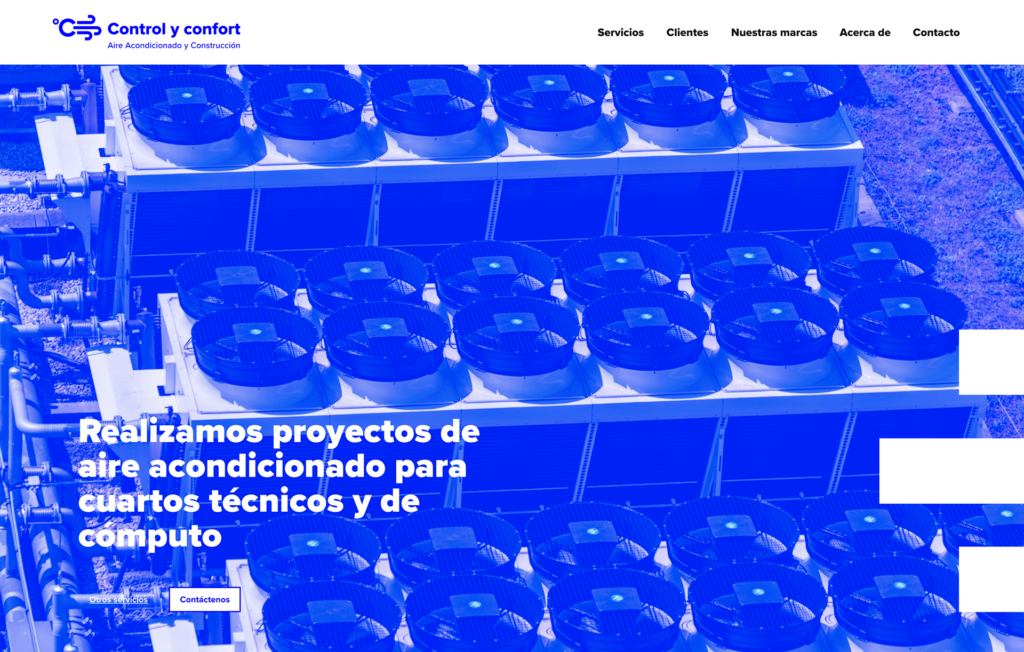
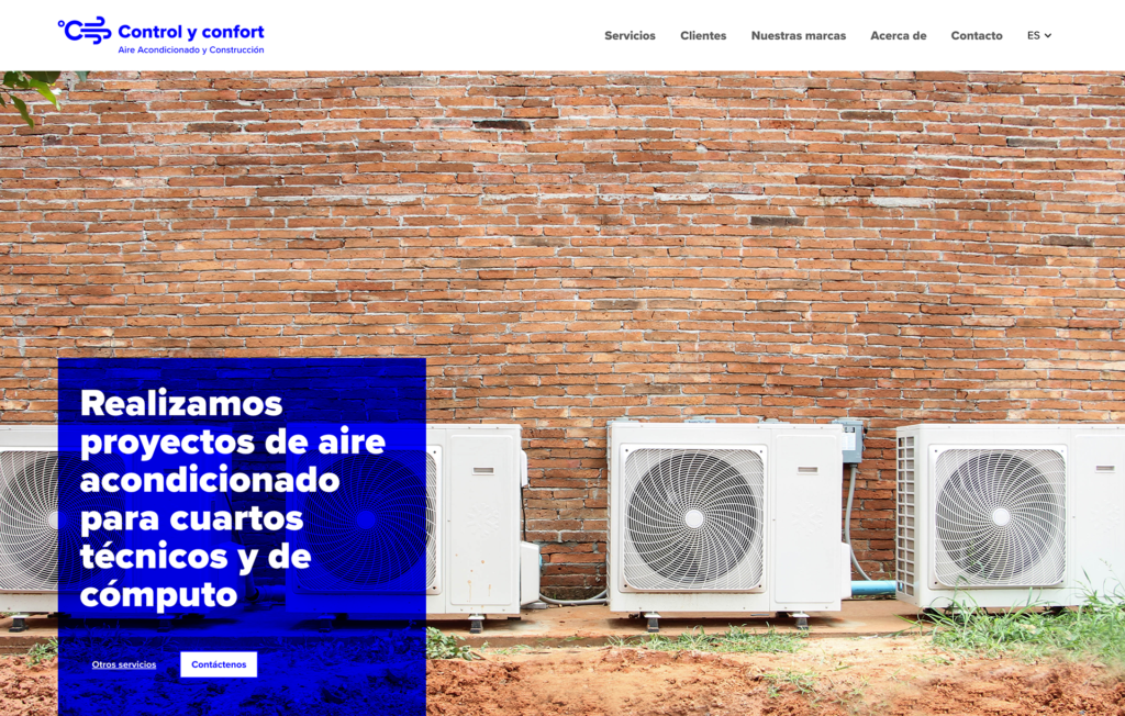
New logo
In addition to the new logo, I added the tagline to clarify the company’s sector.
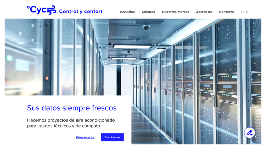
Website improvements
- Simple but consistent layout
- High contrast typography
- High contrast color palette
- Eliminated unused features
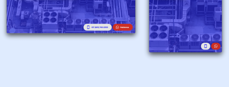
Floating CTA toolbar
The floating cta bar optimizes users interaction with the company by inviting them to chat or make a call.
Other implemented solutions
- Security certification added
- Optimized SEO and metadata
Next Steps
- Post-launch research: I want to know how the business is affected by the new image and how the website is used. This stage of the project will include a Usability Study, and I want to establish the NPS.
- Implement EN version.